Design
24 minute read
How to Fix a Bad Website Design [Case Study & 9 Examples].
LAST UPDATED:
August 15, 2023


You know that feeling when you walk into a room and the wall color is so bad, you immediately want to turn around?
You probably don’t want that to happen to potential customers on your website. And yet, it often does.
Even for a well-designed website, your bounce rate—the portion of visitors leaving after seeing one website page—can be up to 40%. If your website design is not so good? Watch out.
In the age of online, even the best business won’t stand out if its website is a bad design. If it does, it might not be in the way you would prefer.
Having a bad website is terrible for business. Companies, like Amazon, can lose millions if their user experience is bad for even a single day. But it’s not an impossible thing to overcome.
Of course, you need to understand what a bad website actually is.
So, that’s what we’ll explore. Join us for a deep dive into the elements that can turn an online presence sour, real-life bad web design examples, and a case study example of a remarkable website redesign project turnaround to undo the terrible.
Let’s start our deep dive with some ground rules. As you might imagine, websites can be a bad design for lots of reasons, and we might spend all day digging into those.
However, those reasons are generally in one of three categories: user experience, visual website design, and copywriting. Each deserves further exploration regarding how it contributes to a bad web design.
Just Want To See Examples?
If you’re just interested in seeing the examples of badly designed websites we’ve prepared for this article, jump ahead to chapter three or check out our case study in chapter two.
1. User Experience
It’s easy to think about bad website designs at their surface level (aesthetics), but it all begins and ends with your audience. If the user doesn’t enjoy your site, gets lost easily, or gets frustrated, you’ve already lost the game. Don’t make these bad web design mistakes.
Slow Website Speed
Users can get easily frustrated in any number of ways. For instance, think about what happens when your individual website pages are slow to load. It may not be a visual website design issue, but it’s certainly an example of bad website design.
Google recommends a loading speed of 3 seconds or less. Unfortunately, across the web, the average website loading speed on mobile devices is actually more than 15 seconds.
When your website doesn’t load fast enough, you get punished. Both by search engines which downgrade your quality score and search results ranking, and by users who don’t have that patience.
That’s a real problem, by the way. According to one study, every extra second it takes your site to load decreases your traffic by 11%. It’s imperative you improve your site speed to avoid this.
A fast-loading website, of course, is not the whole user experience game.
Protip
Reducing the file size of images with a tool like kraken.io and re-uploading them is typically a quick and easy way to improve website speed.
Poorly Designed Website Navigation
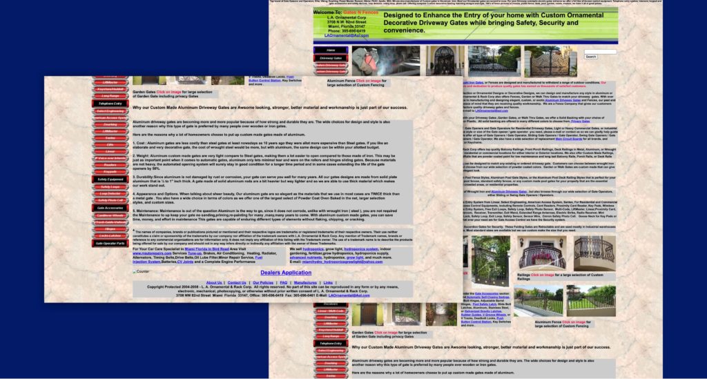
What if the user gets to your website and immediately gets confused by bad navigation?
Examples of navigation with a bad design are everywhere. It might be misleading labels for the website pages they represent, a counterintuitive placement on your landing page, or a multi-level navigation so nestled that the actual valuable information is three or four layers into the content.
Broken Internal Linking
Finally, don’t underestimate the power of broken or dead links. They’re the epitome of a missed climax.
You know the feeling. You watch that great movie, finally, get to the reveal and it’s just… underwhelming. You leave with more questions than answers.
That’s what broken and dead links do. They suppress your SEO, but they also underwhelm your audience because they are essentially dead ends.
2. Visual Design
This second category is more synonymous of what people think about when they think of bad website design mistakes.
Here are some of the things you need to avoid:
No White Space
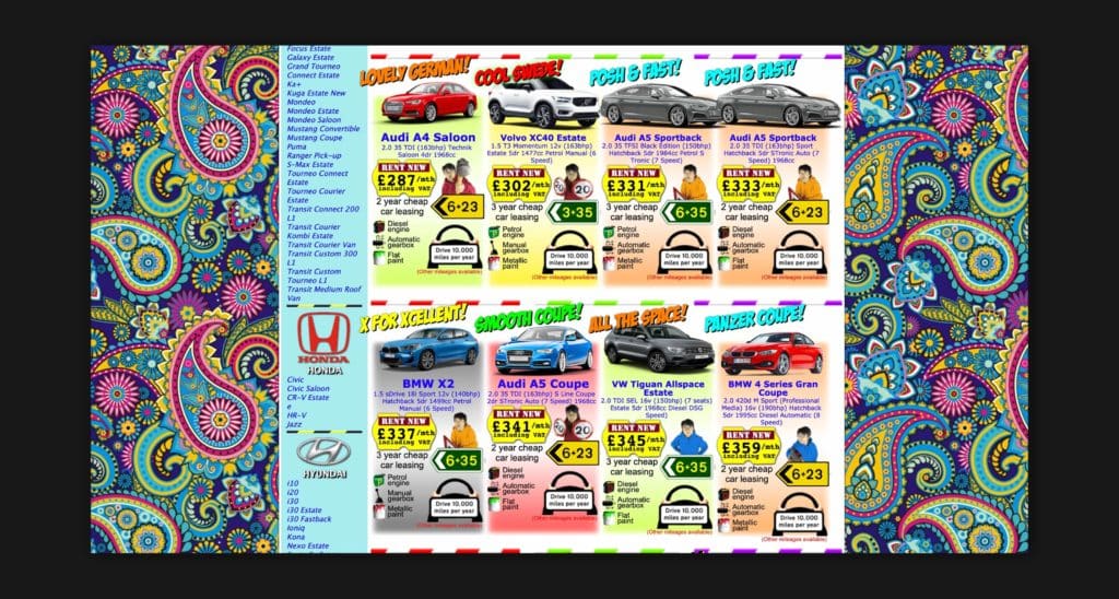
There is no white space that would focus on attention and minimize clutter. Instead, the website pages are crammed full of content in every nook and cranny.
Don’t be afraid of white space, more often than not it will elevate your website design.
Poor Image Quality
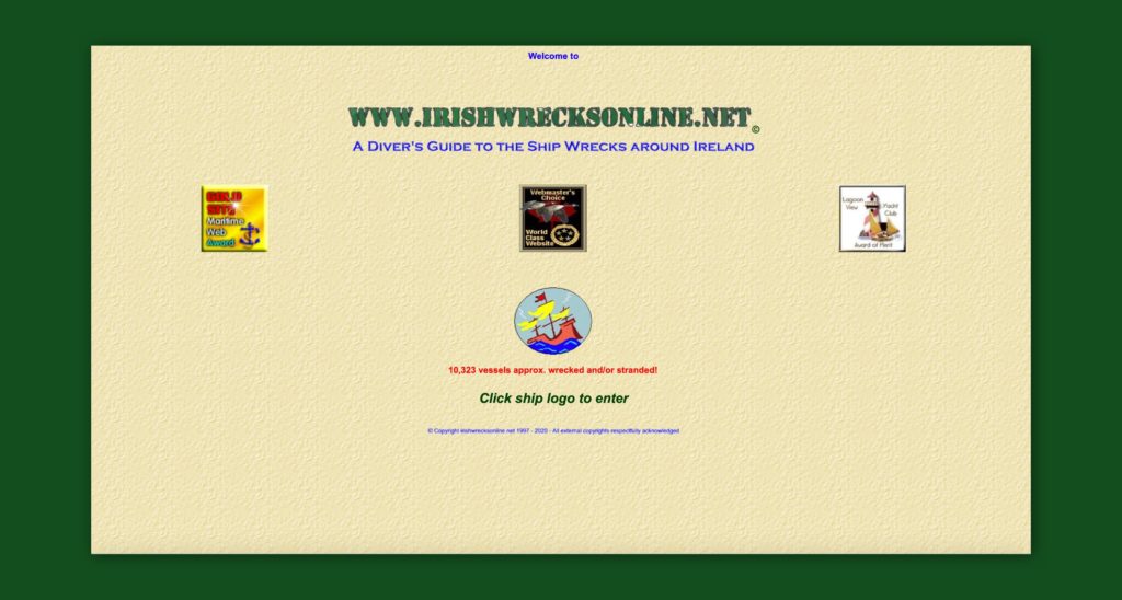
The images are pixilated or in otherwise poor quality. Visuals draw in your audience, but they need to be in high-def.
Limited Contrast
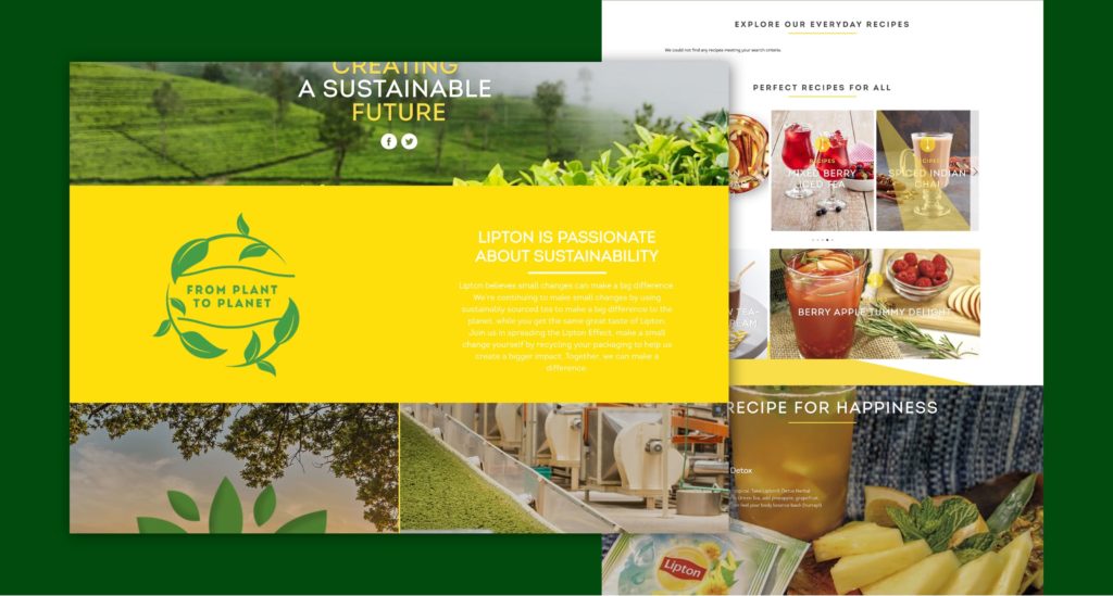
There is limited contrast within the color scheme. If text and visuals do not stand out from the background it’s not only bad for accessibility but also gives your audience a headache. Not great.
Bad Typography
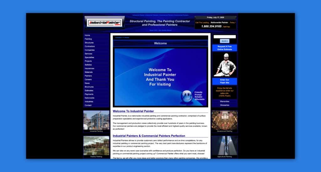
The typography is difficult to read, probably through a bad design font choice. Remember: the text is supposed to be informative, so any choice on web design over readability is probably bad.
Confusing Layout
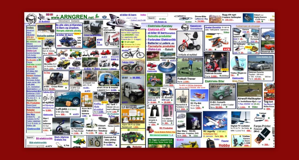
The layout is confusing. Every web page should have multiple sections. It’s the role of your layout, through grids or separating colors and visuals, to clearly distinguish these sections and build a hierarchy.
Protip
We feel the need to note that these categories are interrelated. As you’ll see, an ugly website can also impact your website design user experience, and vice versa. Avoid at all costs confusing visuals, prioritizing individual fancy, or flourish over the overall aesthetics and functionality of the site as a whole.
3. Copywriting
Should we really be talking about writing in a guide about design? Absolutely.
Website design is the full package. It’s everything together that makes up your online presence.
Yes, visual web design matters. But so does the text that you place on top and around that design.
First, it’s crucial to edit your text. Edit it, proof it, and then read it one more time. Some of the worst website design mistakes we’ve encountered have been riddled with typos and poor grammar.
You don’t want to be that site people laugh about. And you certainly don’t want your language abilities questioned when you’re trying to build credibility.
It’s not all about typos, though. On the other end of the spectrum, it’s tempting to become infatuated with jargon. Resist that temptation.
You’re going in the wrong direction when your text becomes dense or complicated. Forego technical writing in favor of marketing writing wherever you can.
That means both losing the jargon and formatting your copy. No one needs those long sentences or paragraphs. Stick with short, snackable copy instead and avoid the pitfalls of a bad website.
Got Any Tips of Your Own?
Have any pro-tips you’d like to share? Feel free to comment below.
In 2017 we were approached by seals.com (American Casting) to help them with their website redesign project. They wanted to expand their direct to consumer and wholesale business, but it was impossible with the state of their current website. This is what their website looked like at the time.
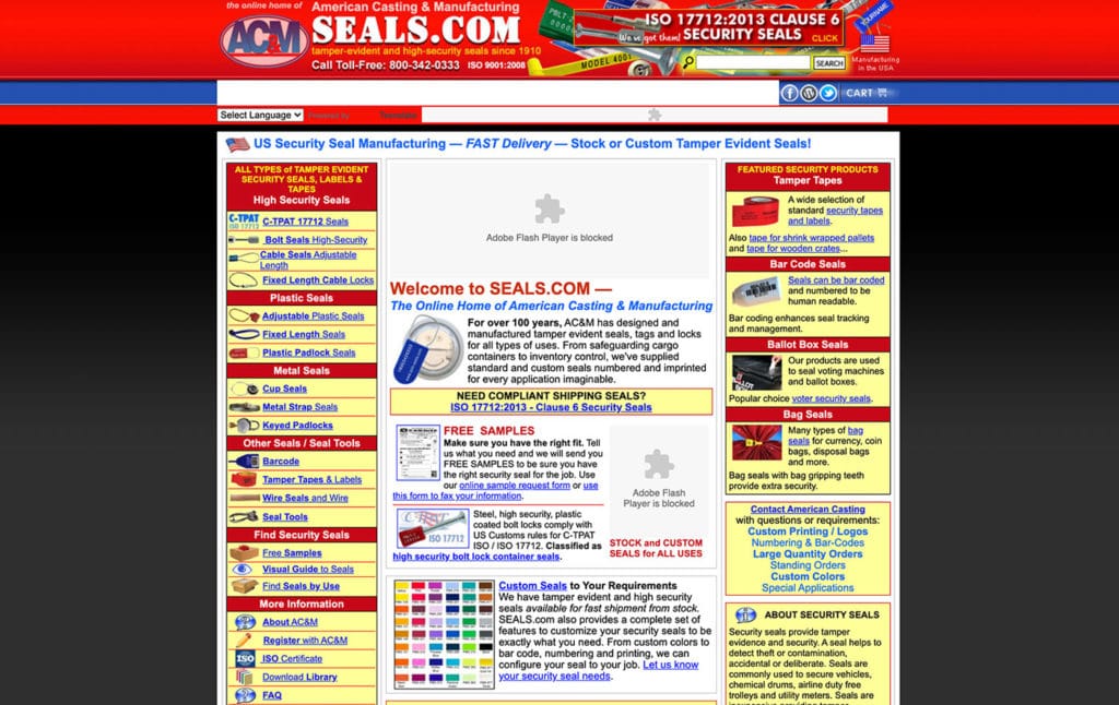
We’ve worked with over a hundred companies over the past 9 years, but this by far was the worst website starting point we’ve had. Their website had a staggering amount of technical and design mistakes. Here were some of the bigger ones:
- The website wasn’t mobile friendly for the user and did not include a responsive design.
- It was built with no back-end and was just a series of static HTML pages.
- That inherently isn’t horrible for small websites, but when you’re managing a website with more than 1,000 active pages, it’s a pretty big problem.
- The URL structure was completely flat (no parent pages), the website didn’t have the ability to rank for topics easily.
- Everything was an individual product, even if it was just a small variation of a core product. This made navigating the product library clumsy and cumbersome.
- The layouts were cramped and cluttered.
For us, the surface level user experience improvements were pretty obvious. What we spent the majority of our time understanding up front was the client’s business and products.
After a tour of the facility, combing through old product manuals, and multiple face-to-face meetings with the owners and senior staff we were able to start to devise a plan for how the website should be structured and how products should be presented to make the most out of the customers’ experience.
Here are some of the highlights and elements of making this a good website.
URL structure / SEO
The flat structure had to go. It was doing them no favors with search engines. Instead, we took an approach where we built out category pages as pillar pages and linked all of the appropriate products to those website pages.
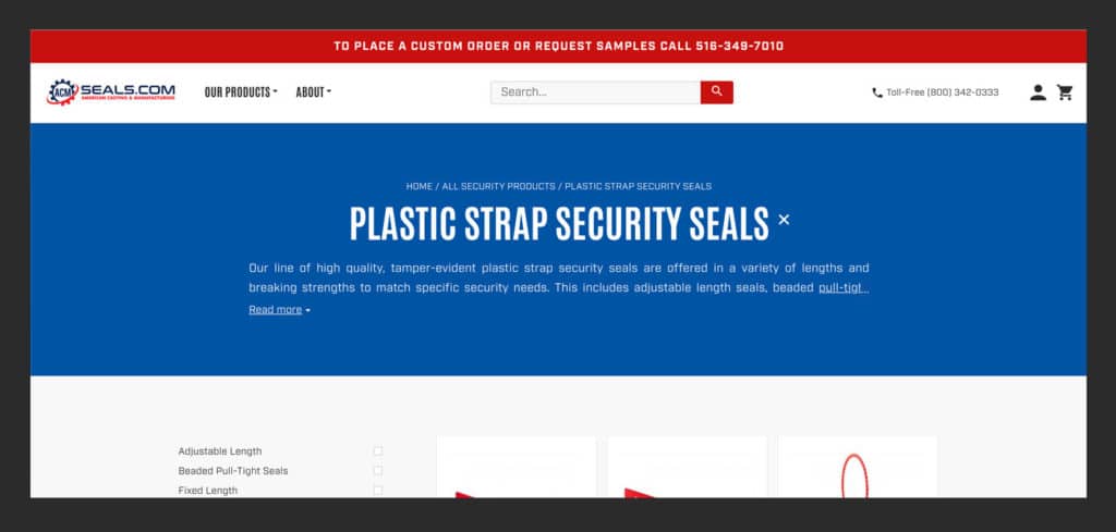
The web design for the pages were simple but effective. Bread crumbs present on each category website page helped link authority between pages together and a small description at the top of each category page helped add keyword-rich content to the website pages.
The Results:
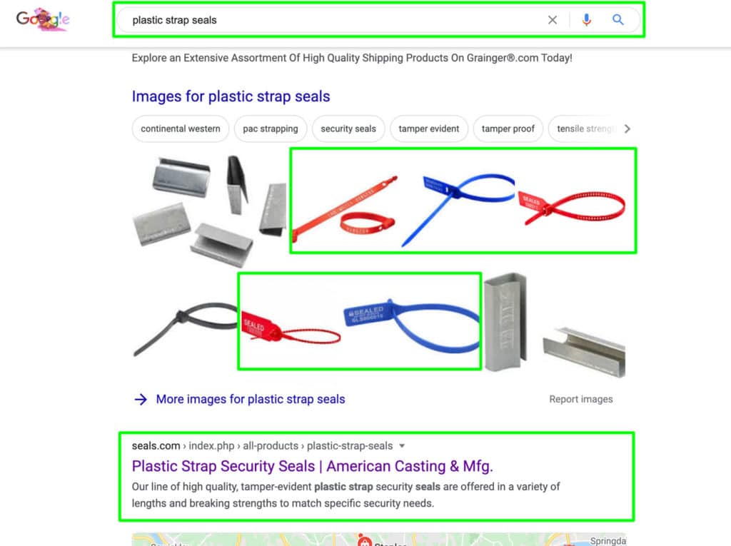
- After 3 months search results traffic overall had increased by 25%.
- After 6 months seals.com began locking in top 3 (in many cases, #1) results for key terms.
To this day, they still hold the #1 position for terms like “Plastic Strap Seals”.
User Experience / Visual Design
What we found out when learning about Seals is that they had the largest variety of colors, sizes, and options on the market.
However, it was almost impossible for visitors to understand this with the way their site was structured and designed.
We knew that this differentiator would help set them apart from everyone else if done right, so we made it a focal point of the web design.
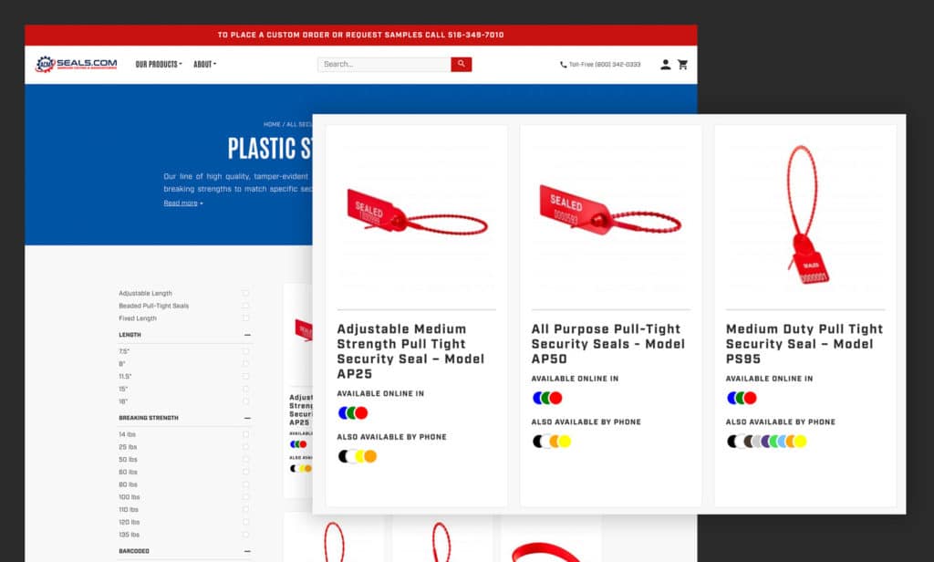
When a user lands on a product category website page they’re immediately presented with filterable options on the left hand side.
Product thumbnails then highlight what colors are available for direct purchase on the website vs a custom phone order.
The user immediately now has a sense of how vast their optionality is, but has the tools they need to quickly drill down to what they’re interested in.
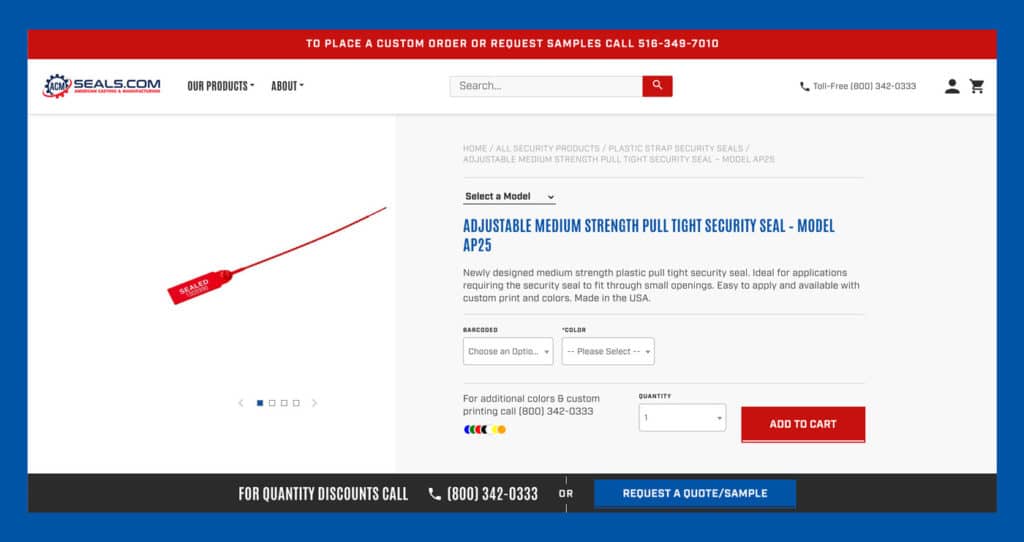
Another big challenge we had to conquer was allowing customers to quickly toggle through options on individual product website pages. At the product level we provided the users with the ability to easily toggle between models and configurations without ever having to reload.
The Results:
- Add to cart rates increased by over 400%.
- Overall conversion rates increased to over 5%.
- Within the first 3 months online sales tripled without investing more in digital ads.
- After the initial jump, sales continued to steadily increase month over month for the entirety of the first year.
Need Any Help?
Do you have a bad website in desperate need of a redesign? We may be able to help. Let’s chat.
We’d like to preface this by saying that our example of bad website designs chosen here are everyday websites we see breaking the rules we’ve mentioned above.
This is not a collection of comically bad or horribly outdated websites like some other bad design websites lists boast. Our goal here is to point out issues with bad websites that may be more relatable in an attempt to educate and improve website UI/UX design rather than hunt for the worst website out there.
Let’s get started with our evaluations.
Headhunter Hairstyling
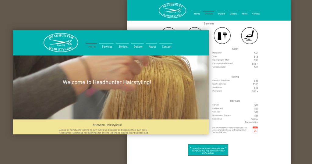
Headhunter Hairstyling is first up on being one of our bad website examples.
The logo is way too big, and is the only thing that pops out. Beyond that, the homepage has hardly any information on it, and the full-page video increases site page load time. Worse, it’s covered up by so much that it doesn’t make the impact it should.
That trend continues as you scroll. The social icons in the footer are way too big. Their other website pages don’t have too much relevant info either.
Then you get to the services page, which has too much information. The gallery meanwhile, looks more like an Instagram wall than a professional portfolio, with little organization behind it.
The navigation is also confusing. The yellow banner on the homepage, designed to grab attention, leads to a standard contact form with the custom message hidden below the fold.
How We’d Fix It
Let’s start by consolidating the website pages. For example, a site like Laracon has longer, but fewer, website pages with anchor links alleviating the scroll as needed.
It also pays to tighten up the navigation by making the logo smaller and losing the line above the links.
A services section on the homepage could be great, with tabs for different areas of the business: hair, waxing, nails, and pricing.
The gallery website page might be replaced with a simple link to social profiles, or a few sample pictures that can rotate periodically. Meanwhile, the entire site could benefit from images of staff, haircuts, and space.
Customers care about pricing. So why not provide it in a downloadable pamphlet as well? Some custom features, like an announcement bar that can be turned off, could be perfect to replace that yellow banner.
Toronto Cupcake
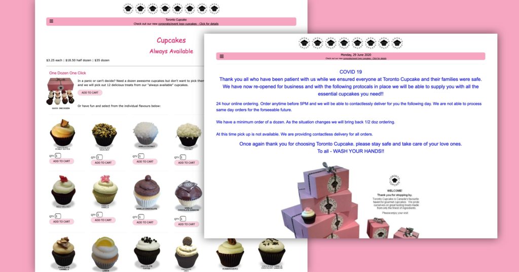
There exists a website in 2022 that uses Comic Sans as the main font.
That’s not the only issue on this site. The many logos at the top are overkill. The menu is so far away from the rest of the site at the top left that it’s almost impossible to find.
And the footer, a great opportunity for some basic contact info, is basically non-existent.
It doesn’t get much better as you get deeper into the site. We always seemed to get stuck in that cupcake submenu dropdown, which might be a display issue.
The fonts don’t match and are way too small, the images are fuzzy, the color scheme is plain, and there is no type of visual hierarchy.
Believe it or not, this is an e-commerce website. It’s difficult to find exactly where you can add products to your cart, making their audience has to search for it. And unfortunately, it’s even difficult to know that the owner is on social media, introducing a digital marketing disconnect from their audience.
How We’d Fix It
Let’s start with some basic web design guidelines. This website needs a specific (and consistent) font, always used in the right size, as well as clear rules on button design, spacing, and visual hierarchy.
Next up are the visuals. The website could benefit greatly from a better photograph of the products sold on the site, and a color scheme that’s not plain pink and white.
The frustrating part of this website is that the bones are there. This business has some high-profile corporate clients. Let’s showcase them! Let’s add social media buttons wherever they can fit! Let’s build a clear customer journey for online shoppers!
And, for the love of cupcakes, let’s build web navigation that makes everything below the website homepage easy and straightforward for visitors to find.
Studiomix
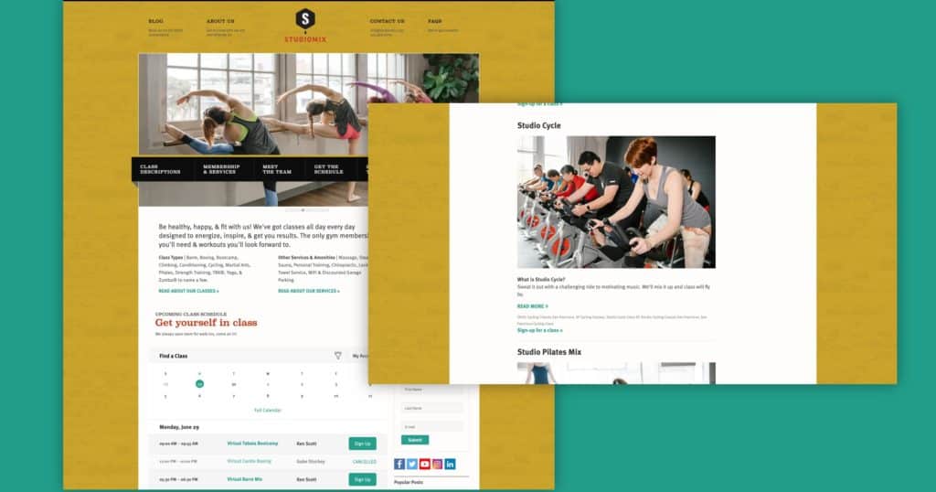
Here, we come to what looks like a great gym whose bad website does it a major disservice.
Let’s start with the menus. Having two menus here makes the site tough to navigate. The menu at the top doesn’t scroll with visitors, meaning that the crucial ‘contact us’ call to action goes away as soon as the scrolling begins.
Making things worse, the subtitles to that top menu are superfluous. Meanwhile, the secondary menu looks to be in the wrong spot, starting midway through the feature image rather than the top of the site.
That secondary menu could also be laid out better than the wall of text it is right now, offering clearer information about the many classes this gym offers. Speaking of which: all that information about services and classes, which should be the centerpiece of the site, is crammed together with small text that makes it difficult for visitors to navigate.
Sometimes, a call to action, like signing up for classes, is difficult to find. That might be because many of the buttons are gray on a white background.
Finally, the items on the right-hand column make the whole site feel like a blog, doing the business a disservice. They’re also taking up space that could otherwise be used for more important content.
How We’d Fix It
It has to begin with more streamlined menus. The information overload in these menus is clear and streamlining the way visitors navigate the site has to be a major priority.
Along those same lines, this bad website could seriously benefit from an increase in white space. It’s supposed to advertise the nice, open gym, but the crammed content communicates the opposite.
Some of that might be accomplished by widening the site content and eliminating the right-hand column on most website pages. The CTAs contained here might be better served in other spots, like a clickable announcement bar or a call to action in the sticky menu.
The idea of listing the classes of the day on the website homepage actually goes in the right direction. The entire calendar, though, is overkill. Their audience needs to see their current services, not their distant future ones.
Finally, the site could benefit from a better font hierarchy. A clear delineation of fonts, including a limitation on color and size options, can help to increase clarity and navigation for its visitors.
Richards Brothers Seafood
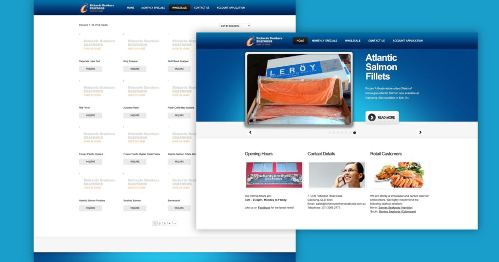
First off, this bad website is not secure. That’s a serious search engine optimization and users trust issue and should never happen.
The rest are basic design mistakes.
Let’s start with mobile issues. This WordPress website does not include a responsive design for the audience and doesn’t fit on a smaller screen. Major red flag. Another is that the dropdown menus in the navigation never show up on mobile devices. Mobile devices need the same menus as the desktop.
Let’s keep going. None of the products feature images, so it’s tough for visitors to see what they’re even like. Meanwhile, gray buttons are popping up again, blending into the background.
Some ‘Learn More’ buttons on the website homepage slides, as well as the images at the bottom of the page, just reload the main page!
That slideshow has some other problems as well. The content seems to be misused, and the slider arrows should be next to, not under, the slides.
Finally, a simple question: why is the FAQ section under Contact Us, and why are there only two questions?
How We’d Fix It
We have to start by making the site secure for their audience. Then, we’ll reduce site pages by moving monthly specials, FAQs, and contact information all into separate sections on the website homepage.
We’ll build a better hero section, with product images, better slider functionality, and the ability to advertise new or special products.
Beyond the main website page, we’ll make sure the entire site is mobile-friendly for visitors, including changing the Specials image into live text on an image background. We’ll also add product images to increase visual appeal.
We’ll add social media to the site, likely via the footer. Finally, we’ll make sure that the ‘inquire’ buttons are more visible, and dynamically fill a field in a contact form to make it easier for the business to respond.
Blinkee
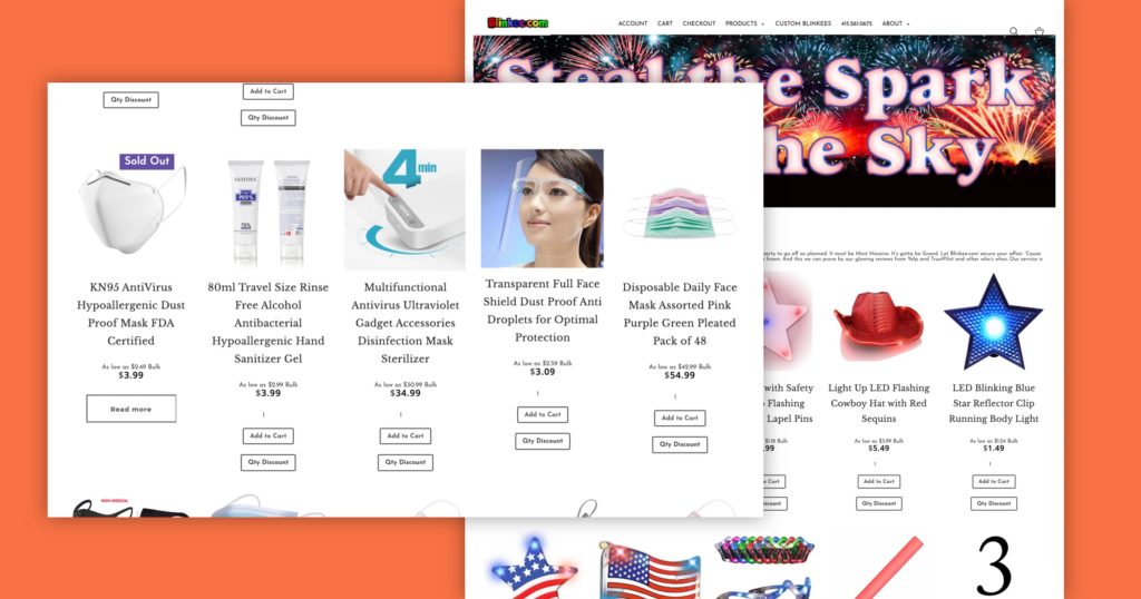
It’s all about the navigation on this one. The Cart and Search function on the left don’t seem to line up with the text.
The phone number is in the wrong spot, and the shopping cart is in the navigation twice. And why are there checkout options?
It gets worse on the mobile site. The bar isn’t touching any edges, floating instead. The ‘X’ button to close the menu is difficult to hit. There’s double-trouble with both a down arrow and + sign on nested windows, which is overkill and the cart icon is tiny.
Meanwhile, the organizational structure is nested into so many layers, individual website pages are impossible to find.
Paragraph text is too small, too close together, and tough to read. The products aren’t spaced out enough, either.
Site reviews are great, but placing them at the top of each product page is clutter. The chat function is nice but gets annoying quickly when it re-pings on every new website page visit.
The contact page linked in the footer is entirely blank.
How We’d Fix It:
The natural start is with navigation. We can simplify it by removing the checkout options and the second cart, shift the account link to the search and cart icons, and make sure they all lineup.
The site could also benefit from better information architecture, made clear through breadcrumbs that never let you forget where you are.
Part of the problematic website design is that there’s a separate cart page. The site could benefit from the more prominent use of the AJAX cart/cart drawer.
But that AJAX cart could use improvements in its own right. Remove the ‘view cart’ button, which seems redundant, and instead widen the checkout button to full width. It could also benefit from scaled-down product images.
The website homepage and its major landing pages could benefit from an announcement bar for things like quantity discounts, which also means we could remove that note from its current spot under each product.
Consolidate the reviews to a single reviews page that integrates TrustPilot and Google and migrate the custom Blinkee information to the same site to keep the user experience consistent.
Let’s also keep the item grids on the collection pages as consistent as possible and allow customers to make quantity changes in the cart itself. The button anchor link for product description on the product pages would be much better served as a dropdown or ‘learn more’ linked excerpt above the add to cart
Please build a convincing and efficient contact page.
Lipton Tea
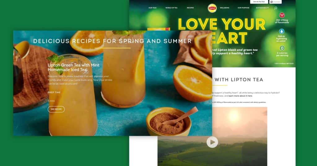
The perfect design example that a big brand doesn’t always get it right.
The journey begins on the website homepage. There’s so much info stuffed into the hero section, it’s impossible to know where to look. At least the three values on the right might be better served underneath the hero.
The site as a whole seems to be centered on the main page. And yet, it randomly features 3 products without explaining why.
Meanwhile, the recipe banner is difficult to read and doesn’t include details like prep time.
To get to the actual recipe site, you need to use the navigation. But the links look unbalanced and the seventh section (Sustainability) only pops up occasionally.
Meanwhile, the hover states (absolutely vital to help users navigate) are all over the place. The navigation places underline on hover, buy buttons go lighter, recipe buttons underline again, and social links have a highlighted box.
Then, you get to the recipe page. Unfortunately, each recipe opens with a search error message at the top. The website page itself only has 5 recipes, although others are randomly highlighted throughout the bad website.
The recipes page also is a great example of how some pages feel a bit chaotic, with multiple kinds of sections thrown in that don’t quite feel like they fit together.
Across the site, the text over photos is overused and can be difficult to read. The height spacing on larger typeface sections seems too tight, and on product pages, the “buy now” button seems to fix to the bottom when scrolling.
Lastly, some images are too pixelated. Not ideal for achieving a polished website design.
How We’d Fix It
It’s all about clarity for us. On the website homepage layout and its major landing pages, reduce the number of sections and reduce the centered text, heading, and photo/video. The use of higher-quality images is another must.
We’ll tackle readability next. That means reducing the overlapping text or increasing contrast to make sure it’s readable. And of course, we need to increase line spacing for those large-font paragraphs.
The rest of our fixes are all about user experience. We’d build a searchable grid of recipes based on the tea type that makes each of them easy to find.
We’d also move the filters on the product page, so they’re more incorporated with the products. A dropdown menu under ‘our teas’ that is organized by type would help with navigation.
Speaking of which, we’ll also propose adding two new features to the site that could truly transform it.
First, a section that highlights the types of tea Lipton offers. Each type could then lead customers to the product category pages where they can find their favorite samples.
Finally, we’d build a quiz that guides customers to the right tea for them. Factoring in flavor, caffeine level, and other variables, this quiz would both increase site interaction and help drive website visitors to revenue.
Vedder Price
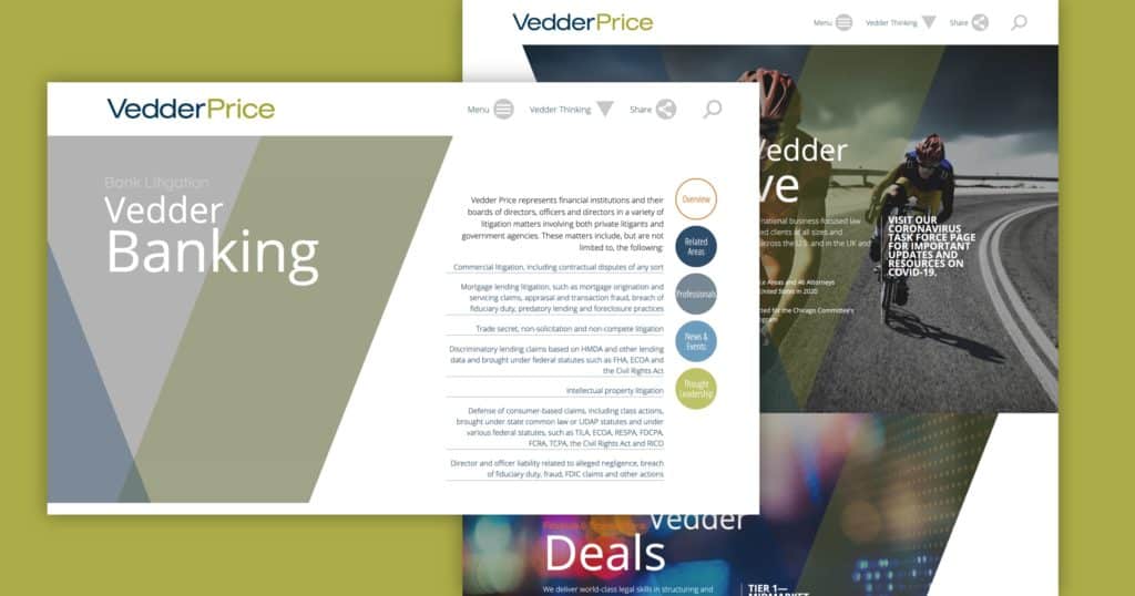
How about those hero images? Here’s a law firm that loved them so much, they integrated them everywhere on their site.
Content is either squashed into the white space opposite the image or onto the image itself. That trend continues with social images in the footer, which are too big.
On to the navigation. Do you really want to click on a ‘menu’ button before seeing your options?
Sure, that highlights the ‘Vedder Thinking’ page, a collection of articles, news releases, and blog posts. It also hides everything else, making the audience search for it. And the decision to top-level ‘share’ over a contact or location page is confusing.
Those actual pages pop off the top of the page, which is unusual. Another confusing element in the navigation: the sub-menu on the industries/services page, where the toggle isn’t sticky.
Inconsistencies keep popping up. The navigation on the diversity page is different once again, now showing up on the left and the right with different options. Meanwhile, not every link on the services page has a hover state.
Finally, brand colors introduce problems. Some orange calls to action buttons don’t have enough contrast with the photos they overlap, while the orange and gray text in the side menu is almost impossible to read.
How We’d Fix It
We’re putting a priority on simplifying the navigation. That means creating a simplified bar with submenus instead of the default hamburger menu and scaling down the icons in the navigation.
We’re also putting an end to the infinite scroll on the Professionals page so they need to apply some filters before they see the list of employees.
The rest of the site content continues to be improved user experience. We’ll change up the layout so it’s not a slashed image with squashed text. That means incorporating full-width banners along with 50/50 columns and more.
The V slash on the hero images is a nice touch, connecting back directly to the name and logo. But we’ll apply it with more moderation so that it doesn’t overwhelm the content.
Next, we’ll up the contrast on the photos or add a subtle overlay that makes the images and hover states easy to read and stand out. We’ll also lose the indicator dots and “back to top” buttons on the sides of the page.
Wow Butter
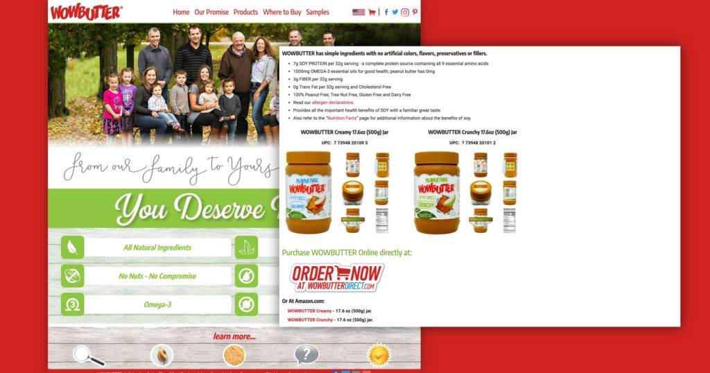
How about another CPG website that doesn’t make the product pages stand out?
That’s just the beginning. The About page, like most other pages, is a wall of text wrapped around a photo. Nothing to make it easier to read or break up the text. The same is true on the Where to Buy page, which adds three tiny links at the top.
The contact link is in the footer, instead of the navigation, while the social links are crammed into the top navigation. The value propositions on the homepage are great, but the information is in a popup instead of the page itself.
The lesson is simple: don’t make your customers dig for information. Present it to them on a golden platter. Otherwise, they’ll get frustrated quickly, like on this site where they have to click from link to link.
Also, a big No on the font hierarchy and family. It feels like the website is yelling in red, green, and black when it should be comforting as it’s comfort food brand.
The recipe feature is great, but why does the website hide it so much? Why do they make their audience search for this content?
How We’d Fix It
As with so many design examples shown here, we’ll start with simplified navigation that consolidates the many steps needed now into a few, user-friendly mega menus.
We’ll also reduce the pixel size of the navigation and remove the sticky red footer that makes it seem like you can’t scroll.
The main page gets a makeover with a static hero image, the value proposition, and banner sections that call out the other parts of the site.
The product pages will be completely restructured with a few simple steps:
- Placing the product image front and center
- Adding variants like size and texture prominently
- Including easy to skim, essential info about the product.
- Linking directly to the nutrition page and recipes page.
Adding testimonials directly to the product pages instead of burying them on their own page.
Finally, we’ll add an ‘add to cart’ button that allows our customers to buy the product directly on the site.
Throughout the site, we’ll break up the gigantic walls of Christmas-colored text with imagery or banners that the text can wrap around. A new font hierarchy reduces that color and incorporates varying sizes.
The buttons get a full redesign to look more professional. Last but not least, we’ll lay out the recipes page more like a blog and move the filtering to the top of every page to make it easier to skim.
Icenhower Oil & Gas
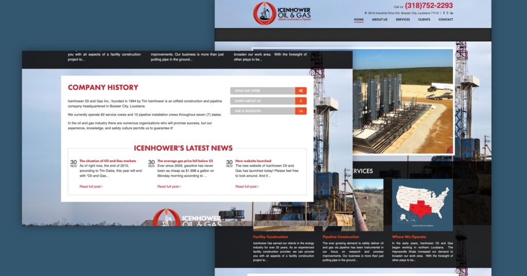
First, a question: Why is a photo hiding another photo on the homepage?
On the client page, none of the image links work. In the services columns, the text is justified to look like a newspaper. Meanwhile, all the footer navigation items are password-protected pages that ‘regular’ users can’t access.
The About page is supposed to represent the business. Instead, it’s a wall of text.
It gets worse on mobile. The menu is nearly unusable, with a close button covering the top and drop-down arrows covering part of the link names.
The mobile site doesn’t have any padding on the walls of text on most sub-pages, and little to no separation between the page content and the news feed at the bottom of each page.
How We’d Fix It
Simplifying the homepage hero and losing the background image on all the pages is an easy start.
In the header navigation, we’ll scale down the size of the logo, and move the social links to the footer. We don’t need the home page link in the navigation (the logo does that), so we can remove that, too.
Remove the phone number and address from the top navigation, but place more emphasis on the contact link by turning it into a button.
For the employee page, we’ll add images so visitors can connect faces with names.
On the contact page, the phone number and address info gets elevated above the map. The map itself gets scaled down so both columns work in better balance with each other.
We’d also add 50/50s and images so that the inner pages look less like walls of text. Adding in more text hierarchy to make it easier to skim and find the most important information.
What Would You Change?
Did we leave anything out? How would you fix these bad website designs? Drop a comment below and let us know.
So there you have it. Bad website design can be devastating, but it’s far from the end. It’s just the starting point of turning it all around and making it great.
It’s not an easy task. But it’s far from impossible.
How do you do it? By building memorable websites instead. Websites that offer visual appeal, a positive and streamlined user experience, and plenty of good and easy-to-digest information.
Over to you. What would you consider good and bad website design? Have you come across some especially terrible websites that you can’t wait to share?
This is our own call to action! Leave your thoughts in the comment. Let’s get a conversation going to collect those examples and learn from them!
Interested in learning more about how you can improve your website?
Check out our website optimization series.
For corporate or B2B websites:
- How to Design a Service Page that Converts [+10 Real Life Examples]
- 13 Top Homepage Examples & Tips to Make Your Own In 2022
- 15+ of the Best About Us Pages and How to Design Your Own
For ecommerce websites:
Get Memorable Insights.
Sign up to receive actionable web design advice directly in your inbox monthly.
Get Memorable Insights.
Sign up to receive actionable web design advice directly in your inbox monthly.
Author
Jeff Gapinski is the President of Huemor where he helps plan the long-term strategic growth of the agency. Jeff is passionate about UI/UX, demand generation, and digital strategy.
What Do You Think?
Have feedback? Maybe some questions? Whatever it is, we'd love to hear from you.




8 Comments
Hey just wanted to give you a quick heads up. The text in your article seem to be running off the screen in Safari. I'm not sure if this is a format issue or something to do with internet browser compatibility but I thought I'd post to let you know. The layout look great though! Hope you get the issue solved soon. Kudos
Oh my goodness! Impressive article dude! Thank you, However I am having problems with your RSS. I don't know why I cannot subscribe to it. Is there anybody else getting the same RSS pгoЬlems? Anyone that knows the answer will you kindly respond?Thanks!!
I really like reading through a post that can make men and women think. Also, thank you for allowing me to comment!
Nice post. I learn something totally new and challenging on websites
I do not even know how I ended up here, buut I thought this post was good. I don't know who you are but definitely you are going to a famous blogyer if you aren't already ;) Cheers!
Wonderful, what a wwebpage it is! This website presents valuable data to us, keep it up.
I truly appreciate your technique of writing a blog. I added it to my bookmark site list and will
Hello There. I found your blog using msn. This is a really well written article. I'll make sure to bookmark it and return to read more of your useful information. Thankks for the post. I will certaihly comeback.