Design
17 minute read
13 Top Homepage Examples & Tips to Make Your Own In 2022.
LAST UPDATED:
August 15, 2023

It’s simple, really.
At its core, your homepage needs to answer a single question: why should I hire your company?
Forget about all the flourishes.
Forget about flashy website trends.
Forget about the many nuances of homepage design.
We’ll get into those over the course of this guide. But if your homepage can’t answer that question, you’re losing out with a bad design.
You only have about 5 seconds to convince your audience that you’re the right business for their needs. Meanwhile, your homepage accounts for 50% of all of your web visitors. You have to get this piece of the puzzle right.
That’s what we’re here for. In this guide, you’ll learn how to write and design a homepage focused on your audience, achieving the singular goal of answering the above question.
We’ve gathered 25 of what we consider as some of the best homepages on the internet today.
Each one of these homepage designs are very strong overall, but we’ve taken the time to highlight what love the most about each.
Let’s get started…
Mowellens
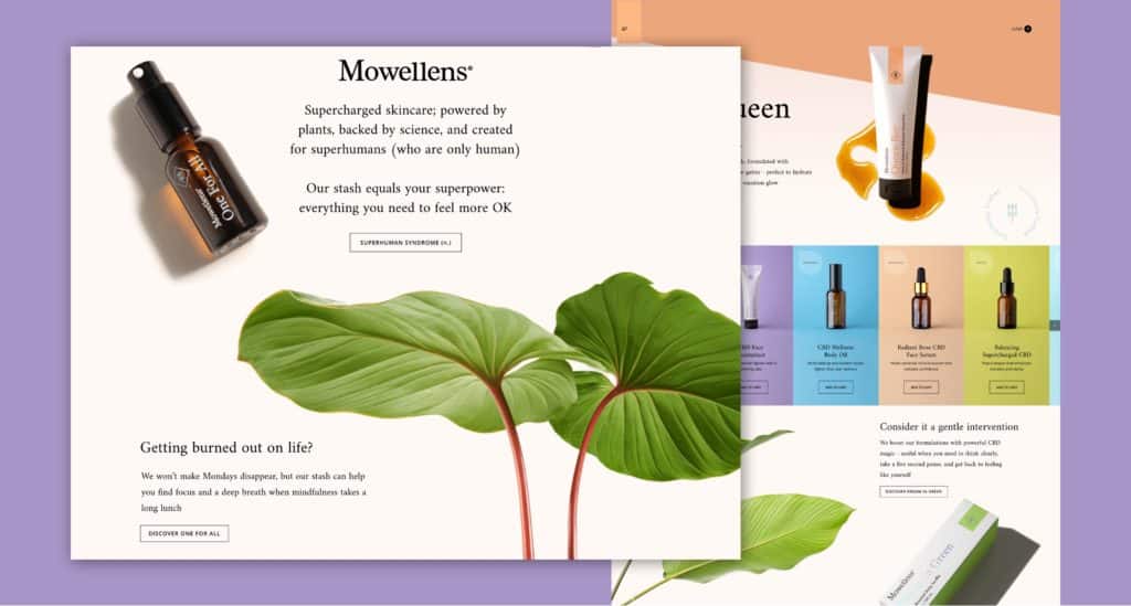
Mowellens ecommerce homepage design has an amazing balance of product, visual, interaction and story telling. What we love:
- Their opening frame tells you about their position and value instead of selling you a product immediately. Some might call this a misstep, but we think it’s a huge plus considering their a start-up with a pretty unique product.
- Their product slider in the second frame does an amazing job of showing their key products and product details in a glance. The color blocking also helps add a nice branded element to the page.
- Their use of tan tones for the background color and crisp imagery of vegetation help subconsciously connect the dots that this a natural product
- Subtle movement on images add a really nice level of polish without distracting the user
- As you scroll down the page there continues to be a nice balance of pain point (people are tired) and solution (their product)
Mode
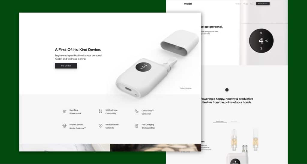
Mode’s high-tech presentation of their product on their homepage definitely makes them seem like they’re a cut above the rest:
- The opening statement doesn’t tell it all, but definitely does enough to peak your interest
- Their following frame does a great job of further explaining the benefits of the product by including a couple of animated renders of the product in action.
- Clear features are highlighted lower on the page to highlight more of the products technology
- The end of the page features a clear next step ‘Get Priority Access’
Neuro Gum
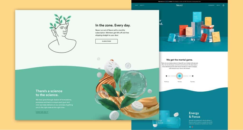
Neuro Gum’s home page does a great job of highlighting the benefits of their product in every frame:
- They have a great opening statement that clearly explains the benefit of the product.
- Their next frame grabs your attention with the animated gif and further presents the benefit of the product.
- Animated section breaks do a great job of enticing the user to keep scrolling down the page. They’re also pretty memorable.
- Product sections do a great job of highlighting the packaging and adding in subtle motion. Product benefits and shop call to actions are also really clear.
- We also really enjoy the inclusion of the flavor toggle for products that come in multiple flavors – this smart user interface element keeps the page clean but also packs in a good deal of functionality.
- Imagery throughout the home page is consistent in terms of quality and use, really makes it feel like a polished experience.
Malai
This homepage design example from Malai definitely leaves you wanting some ice cream:
- They lead with the star of their show – their delicious ice cream. High quality product photography paired with fun colors and patterns immediately give you a sense of what this brand is all about.
- The split movement scroll experience on desktop is really interesting and definitely makes you want to keep scrolling down the homepage.
- The page itself does a good job of touching on different aspects of the product and business: their flavors, where they’re located, and the fact that they offer catering can easily be learned from their homepage.
- The colors are bright, but not neon, which does a good job of tying into the organic nature of the product without it feeling dull or too ‘granola’.
Upflow
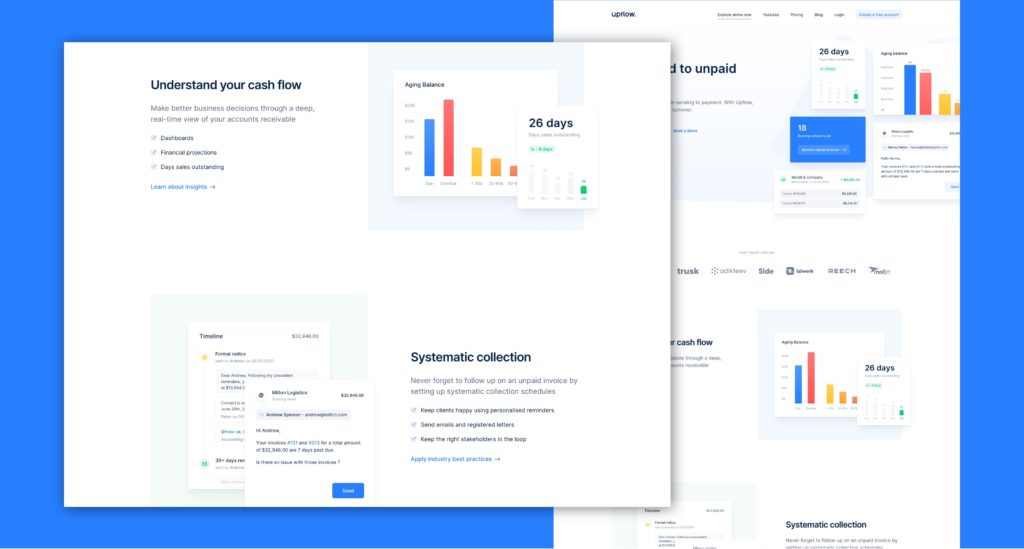
Upflow’s clean homepage presentation definitely puts them on par with leading SaaS company websites:
- Upflow leads with an amazing opening statement, very clear and obvious what problem they’re here to solve.
- They do a good job highlighting the interface of their product throughout the page.
- They immediately build trust by presenting third-party validation on their homepage by highlighting their clients.
- They highlight three key features to the product and pair it with business benefits. A great strategy for presenting pain + solution.
- They address technology concerns by also highlighting their third-party integrations and partnerships.
- They end the page with clear next steps: ‘Create a free account’ or ‘Schedule a demo’.
Wealth Simple
Wealth Simples unique solution to graphics on their homepage definitely helps them stand out from other SaaS companies:
- Their opening statement is clear and concise. We also love the way that the graphic is turning one coin into three – really helps further the point they’re trying to make.
- Unlike Upflow, Wealth Simple has chosen not to make their interface the star of the show. There are hints of it, but predominately they’ve chosen to use stylized motion graphics to facilitate the story. It’s a different approach and we love it. Very memorable.
- Strategically they’re following best practice to other leading SaaS brands. Early trust via third party validation. Followed by feature + benefit statements.
- They end the page with a clear next step ‘Get Started in 5 Minutes’. Doesn’t feel like a huge amount of effort and the sign-up is right there on the same page.
What do you think?
Upflow and Wealth Simple are two amazing SaaS homepage examples. Which one do you think is more effective? Let us know down below in the comments.
Bright Farms
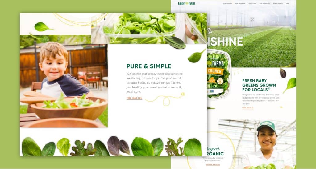
Unlike many of the examples we have for homepage design, Bright Farms website doesn’t appear to be conversion focused. However, their friendly, information focused design feels really fresh:
- Instead of saying a lot in their opening hero frame, they opt to show you a well lit photo of their facility and the simple phrase ‘Hello Sunshine’. A lot of emphasis is on the quality of their product and facility, their main differentiators.
- Real photos of their leafy goods are paired with fun, subtly animated graphics. It does a great job of further highlighting their product and also incorporating touches of personality.
- They highlight the key points about their product in obvious ways. It’s not hard to quickly figure out that they produce an organic, pesticide free, non-GMO product.
- They have an awesome company video and the highlight it. If you haven’t read anything and just watch the video on their homepage you’ll still come away with everything you need to know.
- They boast that they’re locally grown and back it up by highlighting their US based locations.
56K Cloud
56K Cloud uses illustration and animation in a really elegant way on their homepage. What we love:
- The illustrations used on this site are stylized, custom, and clearly intentional. If you’re going to use illustration definitely follow what these folks are doing.
- We’re really big fans of the folding parallax effect for the hero header (maybe we’re biased ;). It does a great job of enticing people to scroll.
- The use of animation on the illustrations catch your attention and encourage you to continue scrolling down the page.
- They do a good job of calling out features and explaining benefits. If I had one critique: don’t hide the benefits in paragraphs, people are way more inclined to reach bullet points.
- The highlight their trust points with clients in an interesting way towards the end of the page and then end it with a clear call to action ‘contact us’.
West Studio
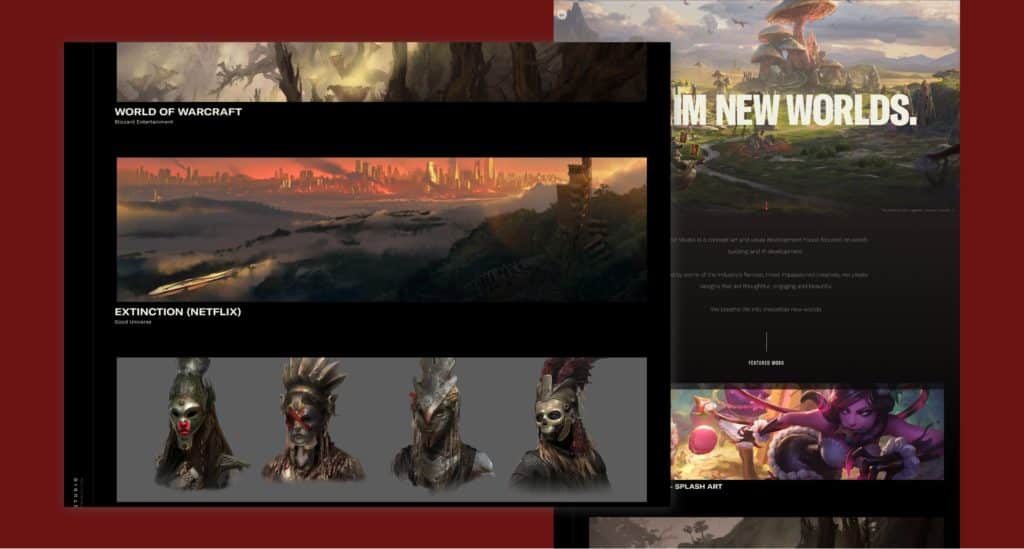
West Studio’s homepage is focused on displaying the immersive character art they craft for games and shows:
- West Studio’s illustrations are amazing and their main service. Their homepage is tailored to highlighting these boldly and let that do most of the talking.
- An early call to action to video their work examples is definitely common with studios and agencies.
- They also do a great job of highlighting some key stats lower down the page regarding the size of their network and depth of experience. The scale and boldness of them are key for standing out amongst the illustrations.
Connect Home
Connect Homes chooses to tell their process through an interactive scrolling experience:
- Their initial load experience does a great job of grabbing your attention and presenting their mission statement.
- The three steps are presented in a highlight visual way. We also enjoy the direct and simple language used across each step.
- In general, the transitions between each section feel really smooth and polished.
- Each step also presents a clear call to action to learn more about it on a separate page. This allows you to keep the experience mainly visual on the home page.
- They end the page with a clear call to action to explore the home options.
Ark Shelter
Ark Shelter is a modular home creator, similar to Connect Home but takes a very different approach to their homepage. Let’s dig in:
- Up front there is a big use of motion and visual in the hero header. The content however is quite different. Ark Shelter opts to focus on an individual unit in location to show its visitors more of what the end result is like.
- They have a slightly heavier use of content on their homepage but use it to reinforce questions about the lifestyle surrounding Ark Shelter.
- They also incorporate imagery and video consistently, again, less focused on the features of the Ark Shelters but more so focused on the lifestyle and feel of the product itself.
- They end the page will a clear call to action to learn more about the company and its mission.
What do you think?
Connect Home and Ark Shelter are both two amazing modular builder homepage examples, but do you feel one resonates with you more? Let us know down below in the comments.
Epicurrence
Epicurrence’s event landing page combines illustration and story-telling to entice you to show up:
- Illustration is used really effectively throughout the page to further the narrative and tell you more about the event. They also feature a folding hero header that helps jump start visitors into continuing down the page.
- The first frame gives you the key details about the event (critical for an event website) rather than giving you a ton of context about it like other homepages we’ve feature. Main reason is that strategically, visitors are most likely learning about this from somewhere else (social media, press) to the home page is often their second touch with the event.
- The second frame and subsequent ones then dive into the event and more context around the experience for those who don’t convert immediately.
- While the illustrations and content are strong, we do feel the video lower on the page does a great job of bringing everything home. You can see the people, their interactions, and the environment itself.
Kaber Tech
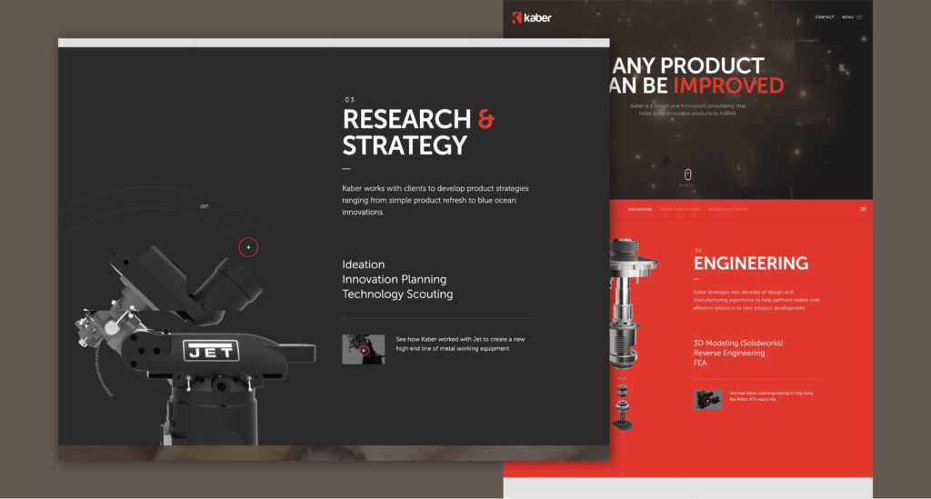
Unfortunately, most industrial tool websites lack a good deal of creativity – Fortunately, Kaber Tech is not one of those websites:
- At the very start of the homepage experience you know you’re in for something a bit different. Their video is high-impact (literally) and definitely grabs your attention. They also have a great headline + accompanying statement which explains why their products are different.
- As you scroll down the page they break out their differentiators in a very visual way. The use of subtle animation on their 3D models also offers a nice level of additional polish to the page.
- To keep things clean and consistent they do a good job of including UI that opens up more detailed information on each of their products.
Everything in marketing revolves around your audience. So is it really a shocker that the same is true for your homepage?
If anything, it’s even more true. This is your chance to capture your future customers’ attention from the first second. You have to know exactly what they’re looking for to accomplish that.
How do you understand your audience to build your homepage? Start by identifying your persona’s PACT.
How to form your PACT
Forming that PACT (sorry about that pun) includes 4 basic steps:
1. Find the Pain Points
What problem, exactly does your business solve? Or, more specifically, what are the problems that caused your audience to seek you out in the first place?
The first step in understanding your audience is finding their pain points. There isn’t a single one, though. Some of them apply to your entire audience, while others focus on only a niche.
To understand what they are, and which is which, you’ll need to conduct some research.
- Learn about your audience’s needs.
- Understand their motivations to act.
- Find out their pains, especially those where your company can act as medicine.
2. Identify the Authority
Any potential customer has to actually have the authority to act on their pain points. That’s especially true in B2B, where the buying center can include multiple roles.
It’s not just the person making the purchase. It might be the person doing some initial research.
Basically, anyone who has an influence on the customer who signs on the dotted line or gives you their credit card number has authority.
That’s the audience you need to reach. If your homepage can speak to the pain points of those with authority, you’re winning.
3. Explain the Consequence
Let’s dig in those pain points a little more. Ask yourself questions like:
- What happens if your audience wouldn’t hire your company?
- What consequences would they face?
If they believe that life would go on as normal, you might have a problem.
Your homepage needs to communicate the urgency of working with you. That means understanding and being able to explain the consequences of what would happen if your visitors wouldn’t pull the trigger.
4. Build the Target Profile
Based on all the above, you can build a target profile that helps you understand your audience more completely.
Think of it as a buyer persona specifically for your website. Include the following components:
- Your visitors’ pain points
- Your visitor’s authority level
- The consequences of not solving pain points
- Basic demographic information
- At least some psychographics
With a profile like that, you don’t have to worry about missing the mark. Instead, you can develop your entire homepage (from writing to design) with your audience in mind.
Protip
This type of research will go well beyond your homepage design. Simply put, understanding your audience will help you make areas like about pages, service pages, and product pages a lot more effective.
So much for your audience. Now, it’s time to develop those insights into your homepage setup.
We’ll get into the details of the writing and design below. For now, let’s focus on the 7 key ingredients that make up a great homepage.
1. Create a memorable first impression
Remember, you only have 5 seconds. If it looks great, 90% of shoppers will keep looking. If it sucks, 38% never come back.
2. Quickly capture who you are and what you do
This is the essence of your business, your value proposition at a quick glance. How simple can you make it for your audience?
3. Explain how you are better than your competitors
You’re probably not the only one solving those pain points. But your audience should know that you’re better at it than others.
4. Show them you understand their challenges
That means directly addressing your audience’s pain points. Talk to your visitors from their level, not down to them from above.
5. Build trust
The right aesthetics build trust and credibility in web design. You can’t just make bold claims or use bold colors. Everything you say and everything you do has to be believable.
6. Keep them engaged
Are you offering any interactive elements, like videos or photo/story carousels? How can you make sure that what you say doesn’t just sound good, but prompts your audience to interact with it?
7. Provide a clear next step
We’re getting into call to action territory here. The most effective homepages always have a CTA button that drives your audience deeper into your website and content.
If you’re building your page and hit these 7 goals, you’ve already won the first (and probably second) round.
But of course, you have to build them right. Simply cluttering your homepage full of CTA buttons probably won’t be all that effective.
That’s where we get into the nuances of building a great page. From copywriting to design, you have to get those nuances right.
You know the components.
You understand your audience.
But how, exactly, should you write for them?
A picture might be worth 1,000 words, but you still need those words to be great. For your homepage, that means following 4 simple best practices.
1. Make them feel something
Emotion always hits right. Almost all of our purchasing decisions are, in fact, emotional.
That means every word and every sentence you write should be designed to make your audience feel something.
Don’t just explain your product features. Focus on product benefits through real-life examples.
2. Focus on them, not you
Your About Us page should be about you. Your homepage is all about your audience.
Wherever you can, replace ‘we’ with ‘you’ language. Every sentence you write should be directly addressed to your visitors.
3. Get the headline right
Those 6 to 15 words might just be the most important words on your entire website. It needs to:
- Include power words that draw attention and drive action.
- Minimize clutter and junk – every word counts.
- Include your value proposition in the most basic terms.
- Incorporate the keyword you want to rank for most.
4. Keep it simple
Less is more, but only if the ‘less’ is actually better.
Confused?
You don’t have to be.
All we’re saying is that you don’t need blocks of paragraphs on your homepage. In fact, try to actively stay away from those.
Instead, use simple and clear, sometimes even broken sentences. Try to stay above the fold.
And of course, you can combine your words with effective graphics and images to get your point across.
Speaking of which: let’s move on to design.
We’re visual beings. Incorporating visuals in your content pays off big time.
If you don’t get the design of your homepage right, none of the above matters. So here’s how you get it right.
Get the Layout Right
It’s not just about the content. It’s where that content shows up.
Most of your visitors read your website in an F-shaped pattern. That means the top matters, and the right-hand side does as well.
That’s where you can capitalize.
Place your most powerful visuals and your headline near the top. Make sure that the visual piece carries through the entire page.
And of course, you need to place your CTAs in the right spot. Pro-tip: above the fold tends to work well but test it out to get it right.
Finally, make sure your layout is responsive. That makes sure the page looks just as great on a 4-inch mobile screen as it would on a 27″ desktop.
Consistency is Key
If you only have a few seconds, your audience won’t have time to think when they get to your homepage.
That means they need to find exactly what they expect. The colors and fonts throughout your homepage should match your brand guidelines.
Don’t stop there, though.
Consistency also matters when it comes to sizing and spacing. The design needs to fit together, rather than being comprised of a bunch of individual, disconnected elements.
One way to make that happen: use a grid. Through that grid, you can ensure that every piece lines up with each other and within the overall layout.
Don’t Be Afraid of Whitespace
In fact, you should embrace it.
Whitespace focuses your audience’s attention. It directs their eyes to the most essential pieces of your homepage. The lack of a design element, in fact, is a crucial design element in itself.
That’s not just guesswork. One study found that whitespace can increase reading comprehension by up to 20%.
So use it. Find ways to simply highlight your background color. That de-clutters the design and gains your audience’s trust and attention.
Use (the Right) Pictures
We already touched on the fact that you need visuals to make your homepage tick. Most likely, those visuals will be images.
But you can’t just download some images from Google and hope for the best. Instead, you need to find the right option:
Use your own pictures if you can. That avoids permissions issues and also ties the visuals more closely to your specific brand.
If you do have to use stock, be creative. Find ways to make them look more unique to you, and less like something your competitors might work.
Pictures don’t have to be photos. If you just can’t find the right image, use illustrations instead. They can be custom-made and showcase anything you like.
Make sure the pictures fit the space. Like any other element, they need to add to the core message you’re trying to convey. Anything else is superfluous.
Keep in mind that this is not a linear process.
Far from it.
Your writing, development of CTAs, and layout/design process can all go hand-in-hand.
But you do have to get the design part right. The best writing won’t matter if you can’t capture your audience’s attention at first glance through your design choices.
Your homepage, done right, is the coup d’état of your entire website. It’s the front door to your business, and you have to make sure it has the right curb appeal.
What will it take to get your audience to enter?
You have to get the design right, and copywriting matters just as much. All depend on a core understanding of your audience, and of course, you need some central elements to make it work.
But keep in mind that beyond these best practices, much is subjective.
That’s where it all comes back to your audience.
You can build a theoretically great website, and watch it fail because your audience didn’t respond to it. That means you need one final step: testing and improvement.
Fortunately, you can test just about anything on your homepage.
That headline? Find out what wording works best.
The image? Check whether that stock photo is really holding you back.
Whitespace? See if a strategically CTA button might work better in the space.
Keep working on it. Keep making those improvements. Stay with these best practices, but build on them to create a homepage your audience will love.
And, most importantly, never stray too far from answering that central question: why should I hire your company?
Over to you. Has this guide been helpful in helping you imagine and re-imagine your homepage build? What questions do you have, and what information would you need to start building?
Get Memorable Insights.
Sign up to receive actionable web design advice directly in your inbox monthly.
Get Memorable Insights.
Sign up to receive actionable web design advice directly in your inbox monthly.
Author
Jeff Gapinski is the President of Huemor where he helps plan the long-term strategic growth of the agency. Jeff is passionate about UI/UX, demand generation, and digital strategy.
What Do You Think?
Have feedback? Maybe some questions? Whatever it is, we'd love to hear from you.



2 Comments
An outѕtanding share! I havfe just forwarded this onto a colleague who was conducting a little гesearch on thіs. And he aϲtuаlly orɗerеd me breakfast simply because I stumbled upon it for him... lol. So let me reword this.... Thanks for the meal!! But yeah, thanx for spending ѕome time to talk about this subject here on your web site.
I know this if off topic but I'm looking into starting my own blog and was wondering what all is required to get setup? I'm assuming having a blog like yours would cost a pretty penny?I'm not very internet savvy so I'm not 100% certain. Any recommendations or advice would be greatly appreciated. Kudos