Conversion Optimization
32 minute read
15+ Shopify Speed Optimization Tips to Boost Ecommerce Revenue.
LAST UPDATED:
April 3, 2024


The web design of your site can have a big impact on how successful it is.
And part of that design includes your site’s loading time. If your site takes too long to load, you’ll lose a lot of potential customers. In fact, 53% of people abandon mobile websites – including ecommerce stores – that take more than 3 seconds to load.
That’s over HALF your potential customers.
We quizzed our web developers and created this list of tips to help you get your Shopify store beneath that 3-second benchmark.
Some of these website speed optimization tips will take 5 minutes. Others might require a couple of hours.
Just do one and you’ll be on track to a faster, better Shopify store that sells more. Ready to speed up your Shopify store?
Let’s get started.
Before You Proceed
We created this comprehensive guide for store owners/managers who like to get their hands dirty.
If you’re not ready or prepared to DIY, we suggest checking out our DFY (done for you) service specialized in speeding up Shopify E-commerce websites.
Do you ever think about how convenient the supermarket is?
Everything is in one place. You don’t have to go to the milk farm to get milk, the chicken farm to get eggs, or the farmer’s market to get vegetables anymore.
The amount of time you spend shopping is so much lower because you only need to visit one Shopify store.
Google Tag Manager is like that, but for your Shopify store. You can think of it as having a Shopify theme inspector. It loads all the external scripts (tags) your Shopify theme uses in one request instead of making seventeen different HTTP requests.
Think tracking codes, analytics, etc.
Google Tag Manager also loads JavaScript files asynchronously so that they don’t force other elements of the page to wait for them to finish. It looks like this:

But don’t take our word for it—Airbnb increased their site’s page speed by 8% (and got a better insight into their analytics) after they used Google Tag Manager.
Here’s how to get set up to speed up your Shopify stores:
Step #1. Create a Google Tag Manager account
First, open up Google Tag Manager.
You’ll see a screen like this:

Click “Create Account” to create an account with GTM.
On the next screen, you’ll need to fill out some information:
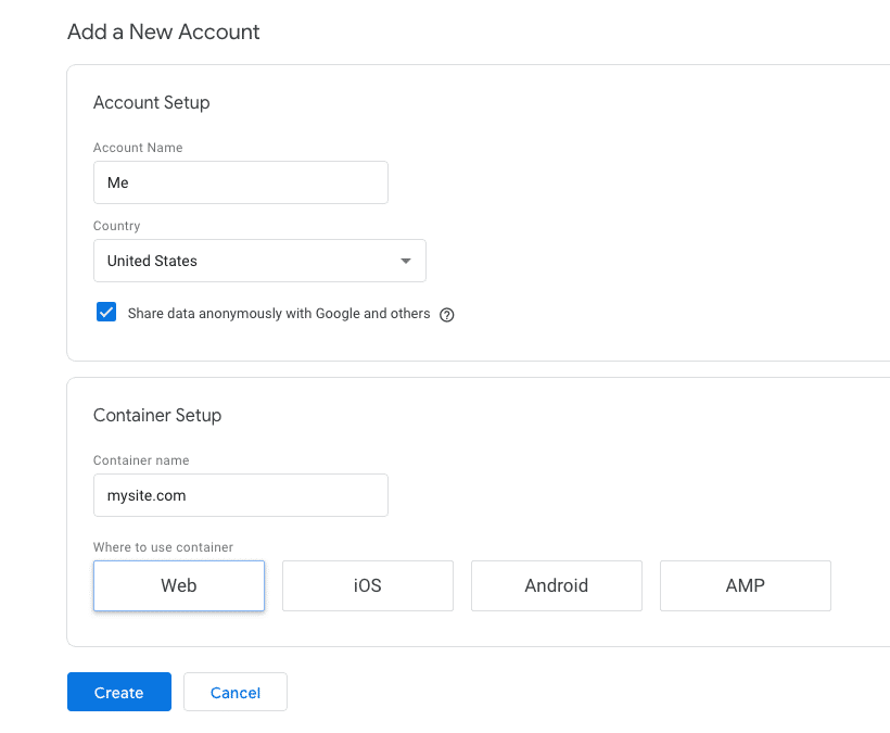
Then click “create.” (Don’t forget to agree to the GDPR conditions checkbox!)
After that, you’ll arrive at a new dashboard where a lightbox with your Google Tag Manager tracking code will appear. Ours looks like this:
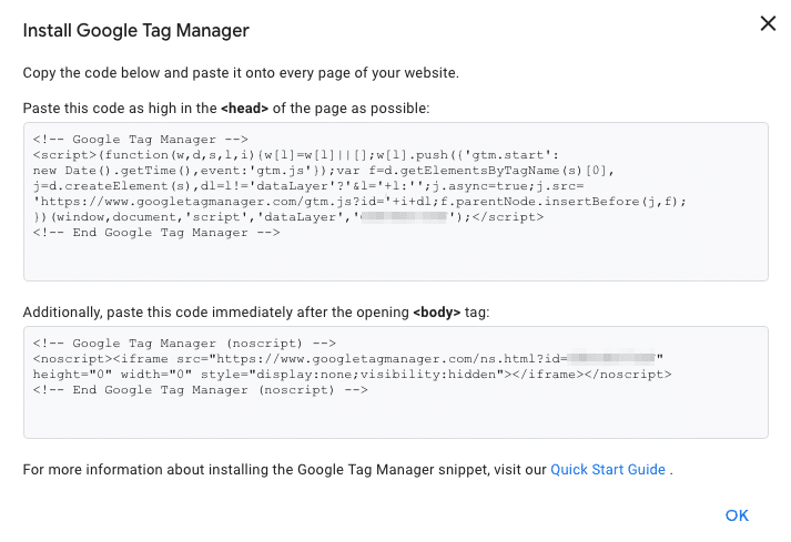
Keep this tab open! You’ll refer to it in the next step.
Step #2. Paste the Google Tag Manager Code in Shopify
(A little scared of editing code? Don’t be. We’ve got you.)
In a different window, go to your Shopify admin portal (should be yourstore.shopify.com/admin).
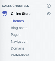
Navigate to your Shopify Theme menu on the left-hand sidebar (Sales Channels → Online Store → Themes).
From there, select “Actions,” then “Edit code”:
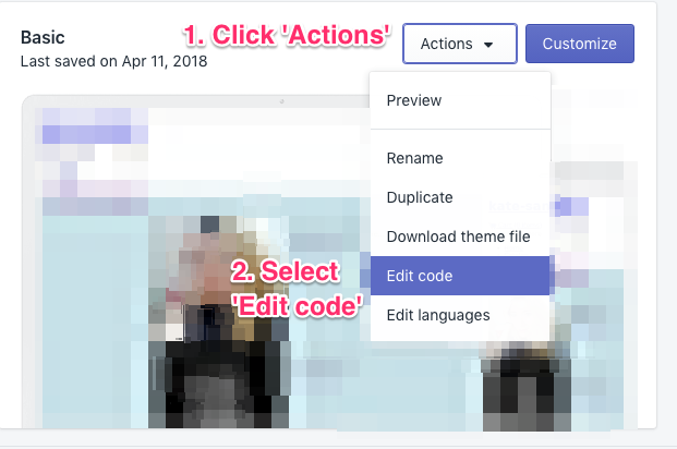
You need to paste the first Google Tag Manage code block into <head> section of the “theme.liquid” and “checkout.liquid” files.
First, find your “theme.liquid” file.
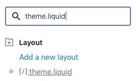
Click on the file name to open the code in the right editor.
Look for the <head> HTML tag.
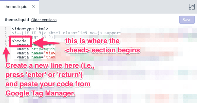
Now all you have to do is paste your Google Tag Manager code.
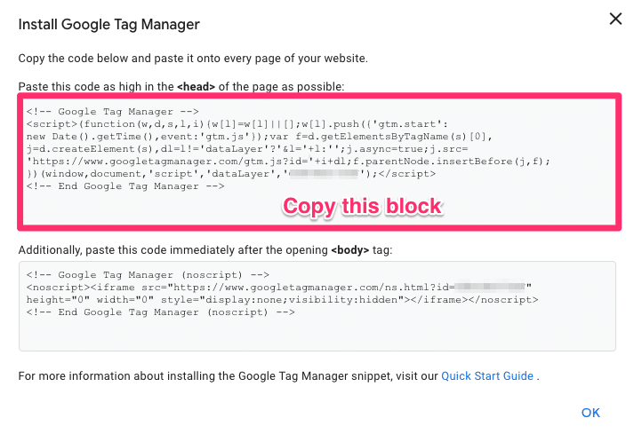
When you’re done, your code should look something like this:

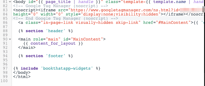
Now you need to copy the second block of code into the <body> section of “theme.liquid.”
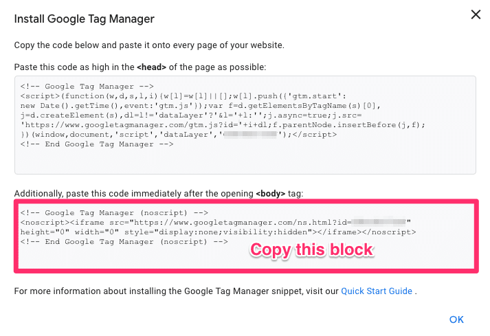
You’ll find the <body> tag the same way you found the <head> tag.
When you’re done, your code should look something like this:
Click “Save.”
Now repeat this exact process for the “checkout.liquid” file.
Once you save, you’re done!
Now that you’re set up, it’s time to actually use Google Tag Manager.
Step #3. Adding Tags in Google Tag Manager
First, go to Google Tag Manager and select the container you created back in Step 1.
On your dashboard, click “Add Tag.”
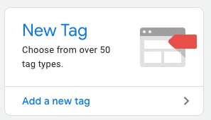
Now you get the option to add either a tag or a trigger. Click the top block—the Tag Configuration—to add a new tag.
You’ll see a sidebar like this:
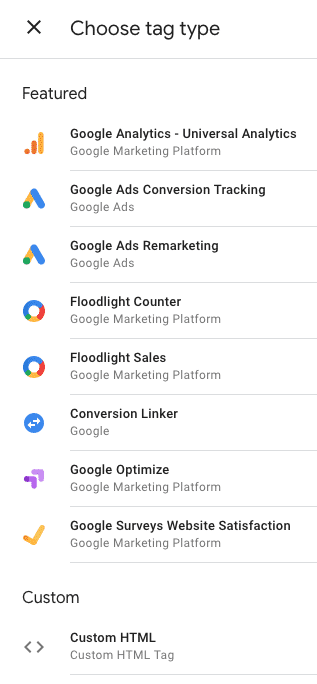
For this example, we’re going to add a Customer HTML tag. But if you’re using a service that Google Tag Manager supports, you should use their native integration.
From there, all you have to do is paste your tracking code in the text box. Like this:
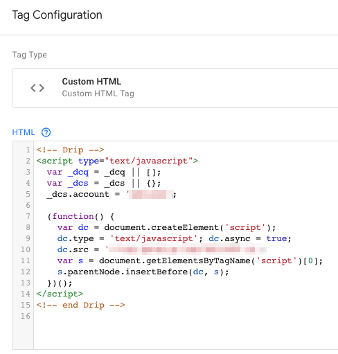
Now it’s time to add a trigger. If you scroll down from the text block where you just pasted your code, you’ll see a box where you can add a trigger. Click it.
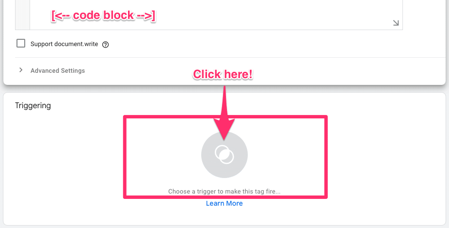
In most cases (say, for site-wide tracking codes), you’ll want to click the default “All Pages” trigger.
Once that’s done, it’s time to hit the “Save” button.
You should be back on your dashboard now. In the upper-right hand corner, click the blue “Submit” button.

Before you publish, Google Tag Manager wants you to review your changes. Scroll down to make sure everything looks good, then click “Publish” in the upper-right-hand corner.
Congrats! You just added a tag.
Now all you have to do is repeat this step for each of your tracking codes to speed up your Shopify store.
No matter how much optimization you do, it’s a general rule of thumb that more stuff (sections, code, images etc.) =’s a slower page speed.
With this in mind, one of the first things we do when we form a new Grow partnership is study their visitors’ user experience and determine how much of their homepage actually gets viewed.
The result? Typically only 50% of most stores’ homepage is actually viewed. Even less of the pages are interacted with.
That means their typical customer ignores half of their home page.
You already know that people don’t like slow-loading pages.
Why risk losing customers by making them wait for something they’re never going to see?
In this tip, we’ll show you how to clear out the dead wood and speed up your Shopify store.
Step #0: What Makes a Good Homepage?
An ideal ecommerce homepage design contains only high-value elements that add to the user experience, so it’s time to take stock of everything, from copy to images, videos to widgets.
When you’re assessing the sections on your homepage, use these criteria to evaluate their value:
- Accessible: Your Shopify store needs intuitive navigation with a clean interface. This is key for good user experience.
- Desirable: Every image should create a desire to explore or buy; your ideal customer should see themselves (or their desires) in your imagery and design.
- Valuable: People want homepage content that addresses their questions, pain, and desires.
- Actionable: Your call to action should be clear, bold, and easy to spot and understand.
- Credible: Social proof (testimonials and reviews) go a long way towards building your credibility as a brand and as a trustworthy merchant. The best testimonials are from your ideal customer to your ideal customer.
Now it’s time to grab some data and test your assumptions.
Step #1: Add Tracking Analytics to Your Homepage
We recommend Hotjar for learning more about how potential customers interact with your home page.
Once you sign up, you’ll see a dashboard that looks like this:
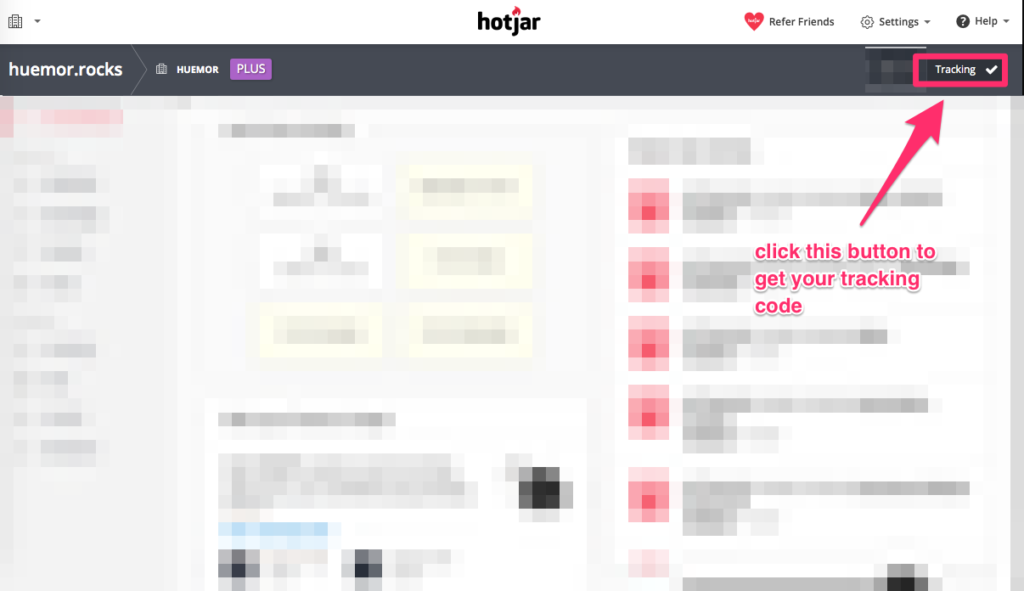
Click the “Tracking” button in the upper-right hand corner to get your tracking code.
Now all you have to do is paste that code into your homepage’s <head> section.
…If you set up Google Tag Manager, then this should be an easy win.
Step #2: Creating a Heatmap
Back in Hotjar, click on “Heatmaps” in the left sidebar menu. Then click the green “New Heatmap” button.

The rest is pretty straightforward.
- Give your heatmap a name.
- Select the number of views you want to track (in this case, 2,000 is plenty).
- Enter your homepage’s URL so that Hotjar only records data from that page.
- Click “Create Heatmap.” You’re done!
How long you need to wait depends on how much traffic your Shopify store gets.
Step #3: Interpreting Your Heatmap
This one’s pretty easy.
First, open your heatmap.
The parts of the heatmap that colored dark red—those are the parts that got the most clicks.
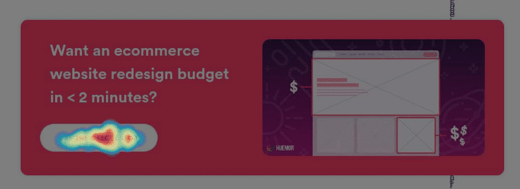
If a section of your homepage looks ignored, that’s a clear signal that you should remove it.
Here’s a common mistake: people skip Shopify image optimization completely.
You upload static images that are so huge your user’s browser has to scale them down when it loads the page.
This is a huge drag on your load time and your website performance (Especially for mobile devices.)
In fact, you want smaller images and smaller file sizes.
First, know that Shopify recommends using 2048 x 2048 pixels for product photos. If your images are larger than that, they’re prime candidates for dimension reduction.
The good news is that resizing them is a cinch. Use the following steps to do that:
Option #1: Use Shopify Image Optimizer
Shopify’s image optimization tool is an amazing option.
First, navigate to Shopify’s Image Resizer tool.
Upload the photo you want to resize.
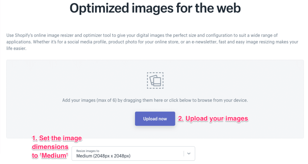
Then click “Submit.”
If it was successful, you can download the resized image.
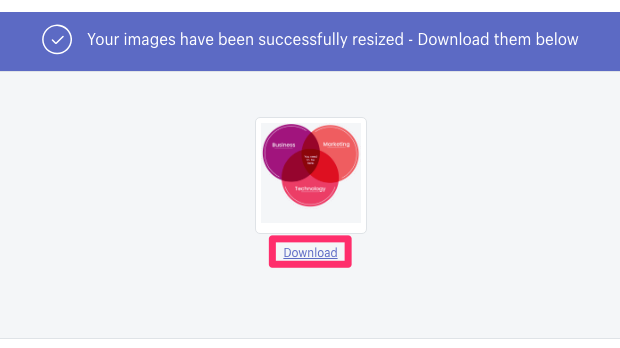
Now all you have to do is replace them on your Shopify store.
Option #2: Photoshop
Of course, if you’re using Photoshop to edit your product photos, you can also ensure they’re the proper dimensions before sending them off.
First, open your image in Photoshop.
Then to go to File –> Export –> Save for Web (Legacy)
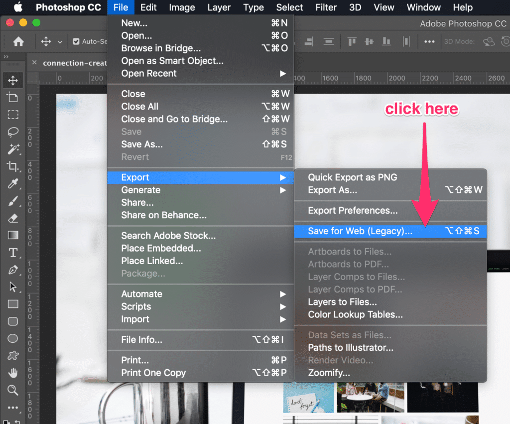
A new modal will pop up where you can specify dimensions, among other things for image optimization.
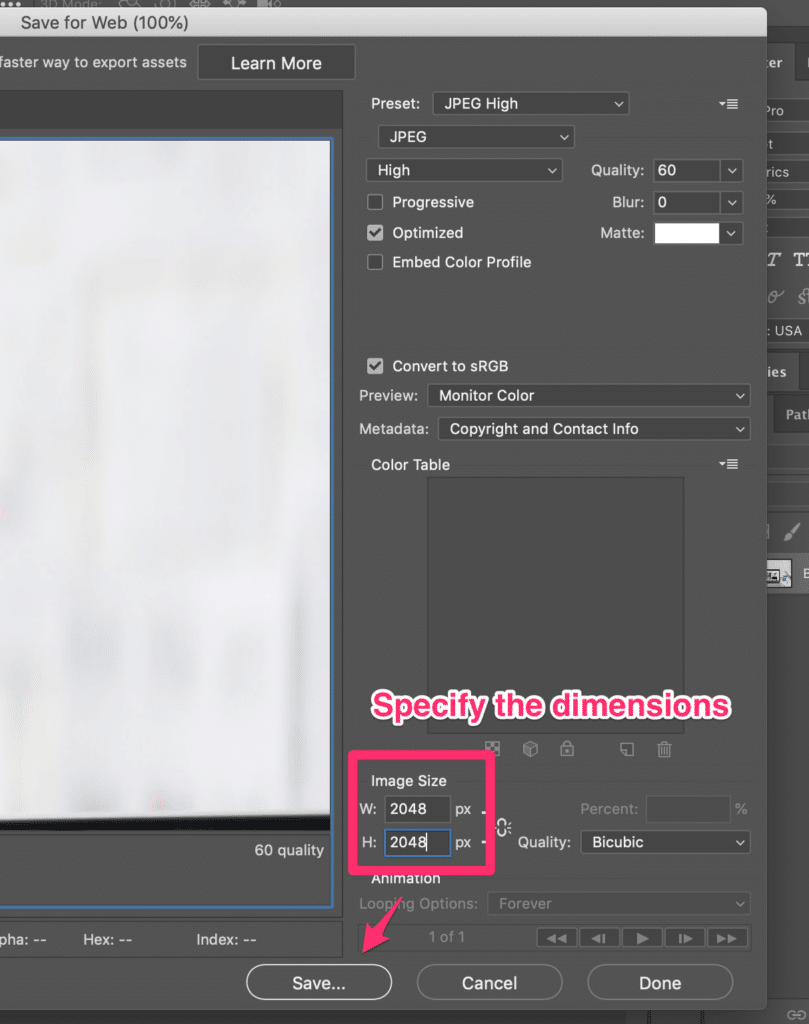
Then click “Save.” All done!
Code can be scary to mess with.
CSS (the code that controls how your Shopify store looks) and JavaScript (the code that controls how your store functions) are essential to running your websites’ speed and performance. But the file sizes can be a burden.
Fortunately, there’s a process called “minification” that can reduce these file sizes by a TON.
(Without modifying the code!)
Minification deletes excess white spaces (including newlines) in the code. By minifying the code, we can speed up Shopify sites.
Your Shopify website, which is a computer, doesn’t need white space to read code. White space is for humans.
The quickest way to minify your asset files is to use a paid app like Plug in Speed. This app offers a 7-day free trial; then it’s $39/month.
If you’d rather save on costs, here’s how to do it yourself.
Step #1: Download Your CSS and JavaScript Files
Just to be safe.
In your Shopify Theme folder, you want to look for any files that end in “.css” or “.js.”
Do NOT minify your theme.scss.liquid file. Shopify automatically minifies it.
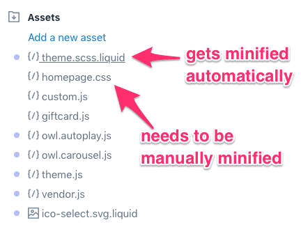
Copy each file to a safe space (e.g., your Dropbox or hard drive) just in case something goes awry and you need to revert to the original.
Then it’s time for the next step.
Step #2: Minify Your Code
If you’re compressing CSS, use the CSS Compressor. If you’re compressing JavaScript, then head over to the JavaScript Minifier.
Copy your code into the tool and click “compress.”
You’re done! Now all you have to do is replace your unminified code with your newly minified JavaScript and CSS code.
Step #3: Check Your Page Load Time
Once you’re done, run another page speed test to check that the file is no longer listed under the “Minify CSS” section.
We recommend GTMetrix to do this analysis.
It’s simple to use – pop your Shopify stores URL into the tool and read the results below.

If you expand any of these benchmarks, they’ll show you any files you missed.
Sometimes you won’t be able to access or minify a specific file, and that’s okay. If you’re scoring an A, you’re good to go.
Sometimes it’s the hosting.
Maybe a simple hosting upgrade is all you need to take your Shopify store to the next level.
Moving up to a better Shopify plan can potentially halve your loading time. (After all, there’s no reason to wait for the inevitable crash that’ll come when thousands of future customers overwhelm your store on Black Friday.)
With a simple upgrade to a better Shopify plan, you can stop worrying about any page speed struggles or devastating downtimes on busy days.
Here’s how:
Option #1: Upgrading Your Shopify Plan
Shopify has a few different hosting plans.

If you’re on Basic Shopify or just plain Shopify, you should consider moving to the next tier.
If you’re already on the Advanced Shopify plan, then you need to look into Shopify Plus.
(And if you’re already on Shopify Plus, then this is not the tip for you.)
Here’s how to upgrade:
First, navigate to your account settings in your admin portal.
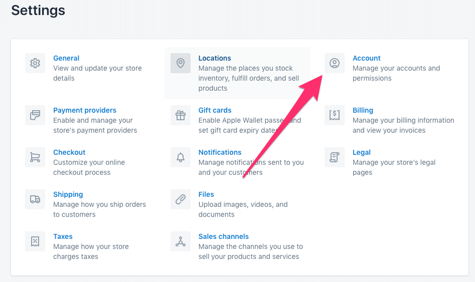
From there, click “Compare Plans.”

Now you can see each of the existing plans and upgrade to the one that feels best for you:

Then click “Choose this plan” and follow the steps to finish upgrading.
Option #2: Upgrade to Shopify Plus
Shopify Plus is a huge asset…but it also comes with a $2,000/month price tag.
Our friends at The Shop Pad created a detailed buyer’s guide to Shopify Plus that you should read if you’re seriously considering upgrading.
But if you just want the skinny, keep reading.
Step #1: Talk to Shopify
One does not simply upgrade to Shopify Plus.
That’s because Shopify Plus is only for a specific set of users. If that’s not you, then you have to wait until it is.
To get started, head over the Shopify’s upgrade page.
You’ll see all the benefits of switching to Shopify Plus:
- Unlimited accounts
- API access
- Access to Shopify Plus Partners
- Unlimited Bandwidth
- Tax automation
- Dev environments
- Wholesale order management
- Scheduled campaigns
…and etc. It unlocks Shopify’s full power.
If your business is ready, talk to one of their experts.
At this point, faster load times are just a perk.
Step #2: Talk to Us!
The truth is there’s no need to do anything after you upgrade to Shopify plus.
But you should know we’re Shopify experts ourselves.
In fact, we helped our client CoverFx more than double their mobile conversions, grow their sales by 27%, and even see a modest 10% boost in their average order value.
Shopify Plus Client Spotlight: CoverFX

Ecommerce Marketing Manager
CoverFX
If you’re spending all this time and effort on your Shopify store, then you should talk with us. With results like CoverFx’s, your redesign will pay dividends for a long time to come.
(Plus, we’ll ensure you’re under that 3-second benchmark!)
According to the HTTP Archive, the median page size for mobile web pages in April 2019 was 1682.4 KB, or up 76% from the 955.8 KB it was in April 2017.
This is directly related to the growth of video content.
And although page size isn’t the best metric to track, it’s still worth talking about (and thinking about).
Thankfully, you can free up your server and keep your Shopify store running at top page speed by using an external platform like YouTube or Vimeo to host videos.
Here’s how to feature videos the right way.
Step #1: Check for Uploaded Videos
It’s entirely possible none of the videos you use are actually on your Shopify store.
To check, go to Settings → Files.
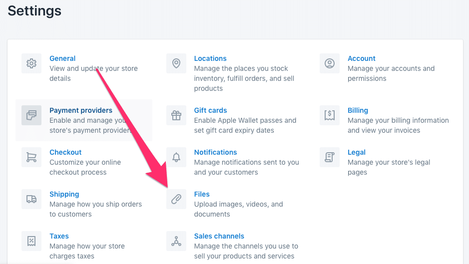
Now search for the most common video extensions (“.avi,” “.flv,” “.mp4,” “.mov,” and “.wav”) to bring up all videos that could be uploaded to your Shopify store.
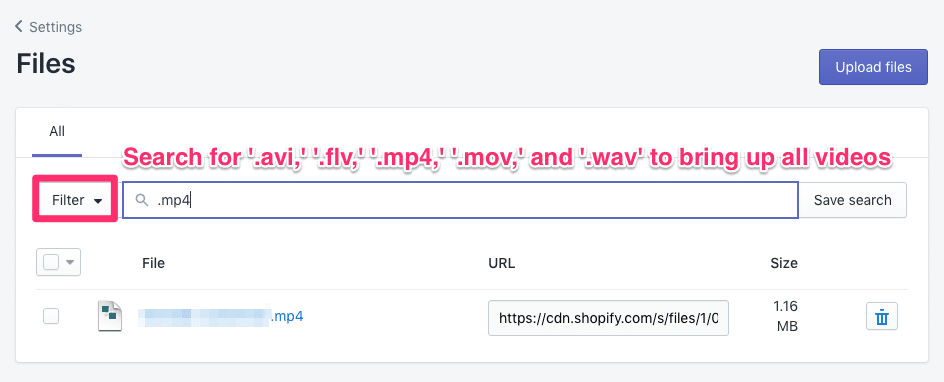
Unfortunately, you have to download a video file before you can store it somewhere else.
That’s what you’ll do in step #2.
Step #2: Download your videos
If you have any videos uploaded to your Shopify store, downloading them is pretty easy.
First, click the video’s name right on the Files page. That’ll take you to where the video lives on the Shopify CDN.
Now you can download the video.
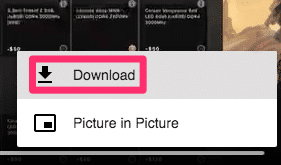
Click the 3 dots in the bottom right corner of the video.
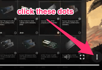
Then press “Download.”
Super easy. Now it’s time to upload them on a dedicated server.
Step #3: Upload Your Videos
Any of the premier video-hosting services – YouTube, Vimeo, and Wistia – work perfectly with Shopify. The platform you choose is up to preference.
(We’re going to use Vimeo.)
After creating an account, upload your video.
On Vimeo, click the blue “Upload” button either in the navigation or right below the logo on the home page.

Then follow the on-screen directions to upload your video.
Once that’s done, navigate to your video and click the “Share” button.
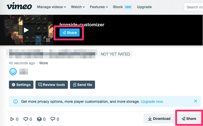
Click on the Share button and grab the embed code.
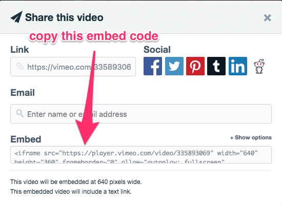
Now you’re ready to embed the video on your Shopify store.
Step #4: Embed the Video on Your Shopify Store
Here’s how to embed a video in Shopify.
Navigate to the blog post or page where you want your video to be.
Click on the code editor button to switch to the HTML editor.
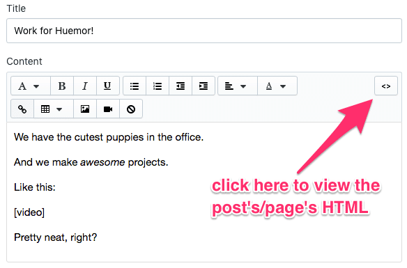
Then paste the embed code you grabbed from Vimeo.
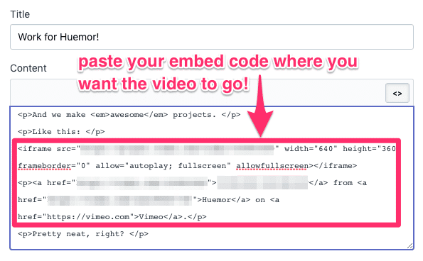
Finally, switch out of the HTML editor to ensure everything looks good.
If it does, time to hit publish!
Bonus: Lazy Load Your Video
If you’re really serious about optimizing your load times, then moving your videos from Shopify to a dedicated video hosting platform isn’t enough.
You should also lazy load your videos so that they don’t load before they’re visible on your customer’s screen.
To do that, check out the lazy loading section of this post.
It’s crucial to connect with mobile users.
And a responsive Shopify theme can make all the difference.
You should test your theme for potential issues across devices and screen sizes.
This is easy to do with Google Chrome.
Step #1: Get Set Up
If your mobile performance isn’t good, it doesn’t matter how fast it loads. Nobody will buy from you.
…after all, a Google study found that 79% of smartphone users used their mobile device to make an online purchase in the last six months.
(That was in 2010.)
The number today is probably MUCH higher.
And if your Shopify store looks like it was hacked together by an amateur, it’ll hurt your credibility.
Let’s double-check your store across a few different devices.
First, go to the developer tools from the View → Developer → Developer Tools menu.
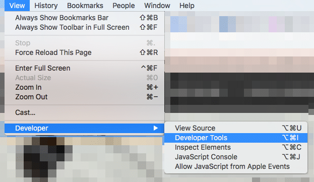
You’ll see something that looks like this as a popup or on the right side of your screen:
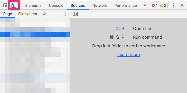
Click on the icon with the cell phone and the tablet on the menu. That lets you toggle between desktop and mobile views.
See where it says iPhone X? You can open that drop-down menu and select the device you want to test from.

Now you can test for different devices.
Step #2: Check for Mobile Responsiveness
Ask yourself the following questions as you evaluate your Shopify theme:
- Do all images look good on mobile?
- Does the navigation look clear on mobile devices?
- Are the buttons big enough and user-friendly? (Think about people with big fingers!)
- Is it easy to scroll up and down? Does it scroll at a reasonable pace?
- How is the checkout page experience?
- Is it a seamless customer journey with minimal touchpoints?
- Is it easy to check out on a mobile phone?
If any of those are a “no,” it’s either time to hire a developer to fix them or find an entirely new Shopify theme.
Step #3: Test and optimize Your Shopify Sites Page Speed
Pingdom is the best tool for an at-a-glance benchmark of your Shopify store’s page speed. It’s very easy to use, too.
First, pop your store’s preferred URL into the tool.
Then select the location you want to test from.

Now click “Start Test.”
Then you’ll see a list of optimizations Pingdom wants you to make:
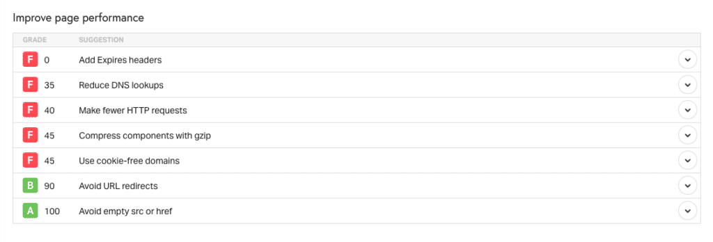
You can even see which files take the longest to load, so you can hand that off to a developer and ask them to reduce those wait times.
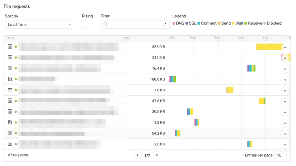
But most importantly, you can see how long it takes your Shopify store to load.
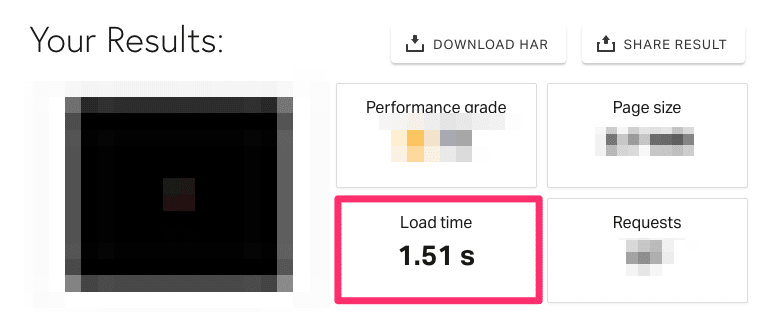
If it’s under 3 seconds, congratulations! You’re in the clear.
Ever go to a government building and learn that you’re in the wrong place and need to go somewhere else?
(Rhetorical question, we know.)
That’s kind of like a redirect on your Shopify store.
And it makes your store take much longer to load.
To make your store as fast as possible, you need to throw the DMV workflow out the window.
Here’s how:
Step #1: Identify Your Redirects
First, open up your Shopify store’s backend and navigate to your URL Redirects portal.
Like this:
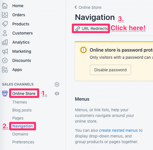
This displays most of your store’s active redirects.
You can even filter for specific pages, like this:
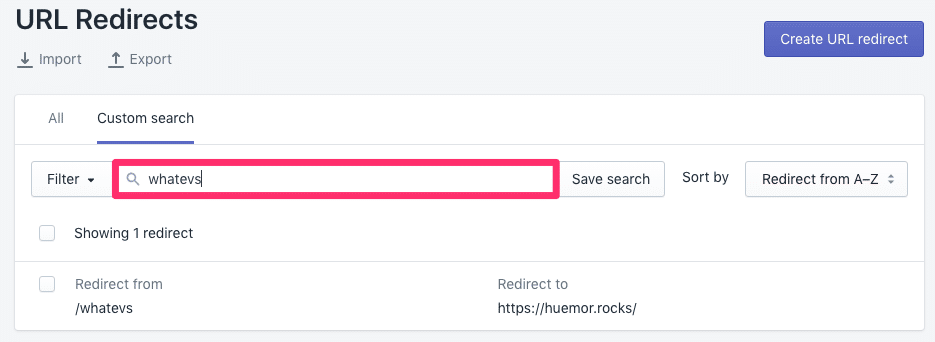
Pretty neat, right?
Now it’s time for the next step.
Step #2: Fix 404s and Errors
A 404 error means a page couldn’t be found.
While it’s a good strategy to create a 404 page…

(like this)
…it’s also a good idea to add redirects away from anything that points to a 404.
How can you find these elusive pages?
Use the Broken Link Checker. It’s easy.
Enter your Shopify store’s URL and let it run.
If the tool finds any broken links, you’ll get a list.
The best part?
You can click on the little “src” link and it’ll show you exactly where the link is in the page’s code.
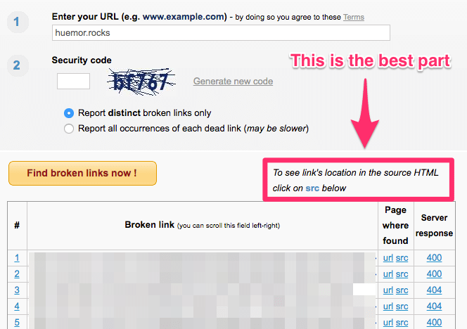
Now that you know where your broken links are, you can correct the URLs in Shopify.
Step #3: Find Redirect Chains
Sometimes you have to move a page or resource, so you create a redirect to keep people from landing on a 404.
But then you move it again.
Like that time in your 20’s when you lived in 7 different places in a single summer and the postal service had to keep forwarding your mail.
Someone tried to reach you in Boston but you forwarded your mail to Denver…but by that point, you were living in Pittsburgh. And so on.
This is called a redirect chain. (They’re awful.)
It looks like this:

Instead of flying your rocket all the way from Hala to Xandar and being told you need to head to Terra, just skip the pit stop and go directly to Terra. Much faster, right?
If you already subscribe to an SEO tool like Ahrefs or Moz, you can go ahead and use them for this process.
If not, download the ScreamingFrog website crawler.
You can only crawl 500 URLs with the free version, but that should be enough (unless you have a large Shopify store).
Here’s how to run the crawl:
In ScreamingFrog, at the very top, enter your store’s URL.
Then click “Start.”
Easy so far, right?
Once that’s done, get the redirect report from the menu by going to Reports → Redirect & Canonical Chains.

That should export a .csv file. Open it in your favorite spreadsheet app.
This displays your Shopify stores redirects.
To check for redirect chains, find the column that says “Redirect URL 2.”
If there’s anything there…you have a redirect chain. Eww.
(If it’s empty, congratulations! You don’t have any redirect chains.)
Fortunately, ScreamingFrog makes it easy to fix those.
Your report has 2 columns that tell you exactly how to optimize your redirects—”Address” and “Final Address.”

Now you can search each item in the “Address” column and make sure it points directly to the destination in “Final Address.”
Bye-bye to the DMV workflow. Hello to happy customers.
Your Shopify store must be ready for users on mobile devices because they won’t hang around for a store that moves at a snail’s pace.
Lucky for you, it’s easy to create Accelerated Mobile Pages that load in the blink of an eye.
You just need a killer AMP App.
In fact, the team at Chartbeat found that people read AMP content for longer than they read standard web content.
And the longer someone engages with your Shopify store, the more likely they are to buy… and they’ll buy more, too.
Shopify has a few you can install:
(We assume you chose AMP by Shop Sheriff.)
Once you’ve installed your app, scroll down in the Dashboard and publish your AMP pages.
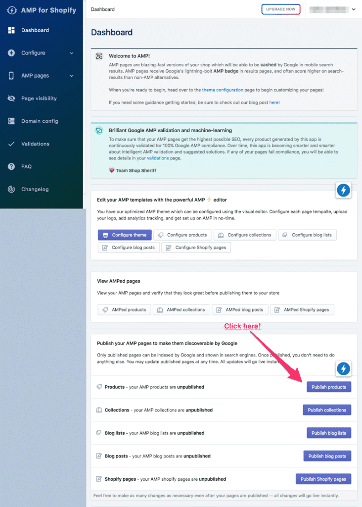
The app does most of the heavy lifting for you, which is nice.
…But you can also customize how your pages look for that extra level of control.
Once you’re done, all you have to do is wait about a week for Google to crawl your new AMP pages.
Apps are great. But more apps means more code.
More code means a slower Shopify store.
A slower store means less revenue.
Eww.
In this tip, you’ll learn how to ditch the dead weight apps that are costing you dollars.
Step #1: Find Your Currently Installed Apps
Head over to your apps.
Shopify displays your currently installed apps.
Step #2: Audit Your Apps
For each app in your Shopify store, ask:
- How often do you use this app?
- Does this app help you hit your goals?
- How would your store suffer if you removed it, if at all?
If an app isn’t essential, it’s time to shortlist it for deletion.
(…just make sure that it’s actually not essential.)
Step #3: Delete Your Apps
Deleting apps from your Shopify store should be safe.
But you want to protect yourself in case you make a mistake.
For that reason, we recommend you check in with a developer before you start deleting apps.
Sometimes an app that you don’t think you’re using is actually integral to your Shopify store!
Quick view pop-ups are great. Just a little rollover + click and the product info appears.
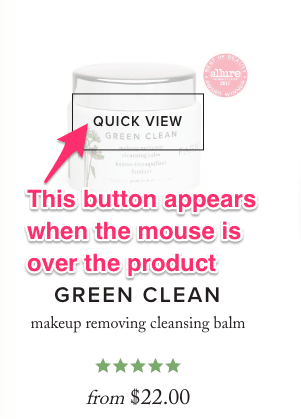
But they add a ton of data…which is a drag on your load time.
Are they worth it? Are your customers even using them?
Better get some data to see which pop-ups are worth keeping.
Step #1: Identify the Pop-Ups to Examine
While it might be tempting to analyze all the pop-ups, you should pick the 30-35 most important product pages to test your sites’ speed score.
Which products do you sell the most of?
Which products do you think you should be selling more of?
Those are the product pages you want to examine.
Step #2: Collect Your Data
Did you set up Hotjar?
If you did, then make sure you create a heatmap for each product page design or product category page design you want to test.
Then all you have to do is hang back and wait for the data to collect.
If you didn’t (or if you don’t like Hotjar), then Hindsight and Lucky Orange work as substitutes.
(Apps like Lucky Orange will slow down your Shopify store during this analysis. Remove them when you’re done!)
Step #3: Test, Test, and Test
Now that you have your data, turn off the pop-ups and wait for the data to collect again.
Make sure you collect your sales data separately from the previous test.
(This is called an A/B test or split test, by the way.)
Step #4: Analyze Your Data
Now you have your data. (Hooray!) But you have to analyze it.
Sometimes, the results are clear. You remove the popups and sales increase.
Other times, you see no effect. (Or a negligible effect.)
If you’re handy with stats, we recommend using a simple correlation to determine the effect of removing popups on your sales.
Step #5: Take Action
If the analysis shows an uptick in sales when popups are gone, then it’s pretty clear where you need to do.
If there’s no difference, what you need to do is still clear—get rid of them. They’re not contributing.
The only time you shouldn’t remove these popups is when you would see a clear decrease in sales.
Big Shopify stores sometimes use collections to create a hierarchy of items.
And while that can be great for UX, nested collections with large numbers of items are sluggish to load.
Why?
It’s because of the code. Bear with us.
There’s this code structure in your Shopify store called a for loop. It works like this:
For every item in your collection, starting at the first and going to the last:
 Step #1: Check some condition.
 Step #2: If that condition was false, do nothing. If that condition was true, do some action.
 Step #3: Move to the next item.
 Step #4: Return to Step #1.
That “do some action” in Step #2 is sometimes another for loop.
In other words, one for loop is sometimes nested inside another for loop, kind of like those Matryoshka Russian nesting dolls. (Or a gag gift.)
In this case, your Shopify store runs the inner loop for each item in the outer loop.
So if you have 50 collections with 2,000 products each, that’s 100,000 (50 x 2,000) operations.
Your store is fast…but it’s not that fast.
The solution?
(One that doesn’t require hiring a developer to refactor your store’s code?)
It’s Findify.
Findify is easy to integrate, is capable of processing large collections in seconds, and even supports multiple languages.
Instead of making your loop smarter, Findify uses an entirely different solution: smart searching.
Now you don’t have to loop through your collections and products to show what your customer wants: Findify does it faster.
But that’s not all. Findify doubles as a personal shopper—it analyzes your customers’ behavior and learns to recommend the products they’re most likely to purchase.
The result? Your customers see more products that they like, so they buy more.
That’s how they get amazing results for their customers, like helping Mexican pet supplies company Pet n’Go up their conversions by 35%.
Here’s a quick (and adorable) video from Findify about what they do and how they solve this problem:
If big collections are your pain point, they’re worth reaching out to. You’ll get a faster Shopify store and smarter filtering in one package.
Slow-loading images are torturous.
Why make people wait for a page to load because something at the bottom of the screen got jammed in traffic?
Lazy loading optimizes your Shopify site speed because it forces your store to only load the immediately visible parts of the page.
Lazy loading works by displaying low-quality placeholder images first.
Then, as you scroll down the page, the high-quality image replaces the placeholder once it comes into the view.
Way more efficient, right?
Lazysizes by aFarkas is a fast and SEO-friendly lazy loading JavaScript library for images, videos, and iframe assets. It can also help you implement responsive images (images that adapt to different screens sizes), which is a huge bonus.
Unfortunately, it takes a bit of effort and a lot of time to set up, especially for Shopify store owners owning a larger store with many images.
Here’s how to get started with Lazysizes.
Step #1: Navigate to Your Assets Folder
Log into your Shopify store’s backend. Then go to Online Store → Themes → Edit Code → Assets.
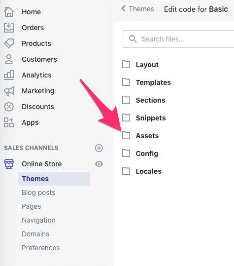
Super easy. You’ve done this before.
Step #2: Create a Lazysizes.min.js File
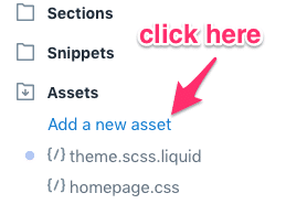
Click on “Add New Asset.”
This will launch a modal with two tabs. Click the “Create a blank file” tab and fill out “lazysizes.min.” Then select the “.js” extension, like this:
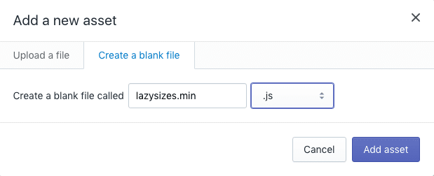
Click “Add asset.”
Step #3: Add the Lazysizes Code
Navigate to the content of the lazysizes.min.js file on Github.
Then copy and paste it into the new asset file you just created on your Shopify store.
Click “Save.”
Step #4: Call the Lazysizes.min.js File from Your Shopify Theme
Head to Themes → theme.liquid.
At the bottom of the <head> section (right before you see </head>), paste the following line of code:
<script src="{{ 'lazysizes.min.js' | asset_url }}" async=""></script>
This means your store will execute the code in the Lazysizes library right before it loads.
Now we’re all set up.
Step #5: Add the Lazysizes Class to the Images You Want to Lazy Load
This is the most time-consuming step.
You need to add the class="lazyload" snippet to every <img> and <iframe> tag on your Shopify store that you want to lazy load.
First, go to the page or post you want to edit.

Then go to the HTML editor in the post.
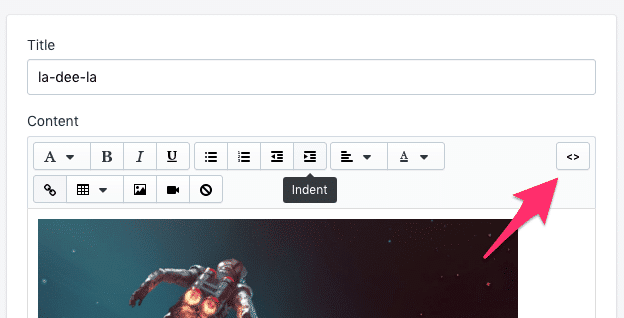
From there, do a Control + F (or Command + F) for all <img tags. Then add the class="lazyload" and replace the src tag with the data-src tag, like this:

Remember to save your changes!
Carousels—those automated marquee slideshows that display different images—look great…but have a negative impact on the website speed.
Here’s some tough love for all Shopify store owners:
Your customers don’t care about carousels.
They look bad on mobile devices, add distracting movement to the page, and don’t inspire people to take action.
It’s time to throw the carousel in the compactor and get with the times. Use a Hero Layout.
Here’s how:
Step #0: What’s a Hero Layout?
A Hero Layout, or Hero Image, is a large image with catchy text.
It’s usually at the top of the homepage because it’s meant to capture attention and deliver a gut-punching impact to the potential customers that arrive to your Shopify store.
A winning Hero Layout has three key components:
- High-Quality Image: Use a captivating, high-resolution visual that catches the eye. Remember: you can resize your image down, but never resize up. High-resolution images rarely look fuzzy.
- Clear Message: A great hero image must represent your brand mission to users as soon as they arrive. What are you offering? Why should users care about you?
- Call to Action: Inspire some action with a strong CTA that encourages users to browse your products or check out a special deal.
Your hero layout is your you-get-it-or-you-don’t power play. It’s your nonverbal signal to your #1 buyer persona: this is what we’re about and we’re perfect for people like you.
Here’s an example of a Hero Layout we created for our client, To Have or to Borrow:
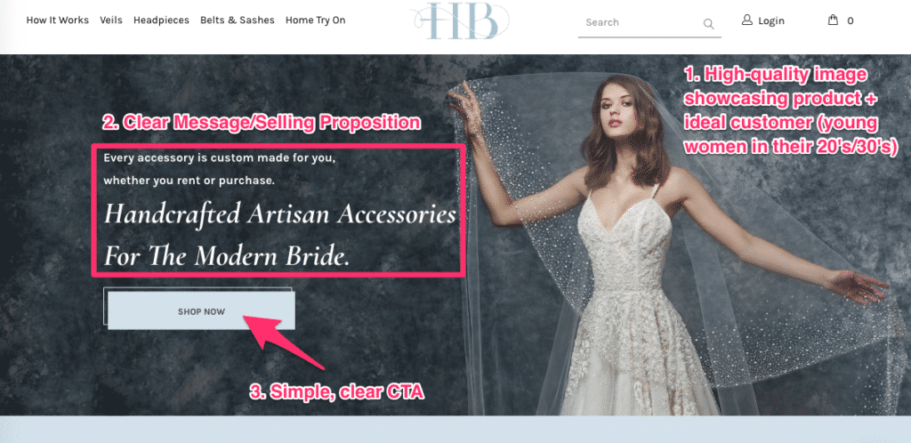
Pretty effective, right?
Here’s how to make one:
Step #1: Identify Your Buyer Persona
You probably have one of these already, but just in case you don’t—a buyer persona is a demographic/psychological profile of your ideal customer.
The reason you identify the buyer persona you want to target is because it lets you get specific with your messaging.
Once you know what your ideal buyer is looking for, it’s time to move on to the next step.
Step #2: Deconstruct Your Carousel
Which image in your carousel appeals the most to your ideal buyer persona?
That’s the image you want to use for your hero layout.
If you aren’t sure, talk to your customers and ask them.
Or you can put up a different section each week, record the click data, and then make your decision.
Either way, you should leave this step with a single winning layout idea.
Step #3: Create Your Hero Layout
If your slider already looks like a Hero layout, then most of the work is done for you.
But otherwise, here’s how to make one:
Hero Layout Step #1: Select/Create an Image that Features Both Your Product and Ideal Customer
You probably have some product photos that already fit the bill.
But in case you don’t, you’ll have to collaborate with your product designer or photographer to take some.
Don’t have access to a photographer? You can substitute a stock photo from Unsplash or Pexels that fits your brand, but generally featuring one of your products is a better idea.
(Make sure you optimize it for the web! Large images kill your load speed.)
Also, it should have plenty of room for your copy and call to action, like the one from To Have or To Borrow. Notice how the entire left half of the image is empty space for the text and button? That’s about right.
Once you’re happy with your image, it’s time for the next step.
Hero Layout Step #2: Craft a Compelling Message
Your current tagline or message might be converting well. But take this opportunity to revisit it and make it better.
Let’s look at the message from To Have or To Borrow:
Every accessory is custom made for you, whether you rent or purchase.
Handcrafted Artisan Accessories for the Modern Bride.
To Have or To Borrow knows what their ideal customer wants: custom-made, high-quality accessories for the special day that’s all about them.
But they also know their audience wants to feel modern and unique—hence that headline: the presence of the words handcrafted, artisan, and modern are subtle hints that what you get from To Have or To Borrow is contemporary, crafty, and unique.
Stuck on some examples? Our friends over at Wordstream have a great post on how to create hero layouts.
Hero Layout Step #3: Create your Call to Action (CTA)
Simple is better.
The best calls to action are clearly visible and promote a benefit—while “Shop Now,” “Order Now,” and the like are classics because they work, you should also test things like “find your perfect fit,” “snag it now,” and “yes, I want a new x!”
Your CTA should stand out from the rest of the page—you can test this with live users or heatmaps to ensure people see and click on it.
Hero Layout Step #4: Make and Test
Once you (or your coder/designer) have built the hero layout on your Shopify store, make sure to test it.
Test the call to action to make sure it actually takes your customer to the right place, yes, but also test that it’s converting better than your slider.
(Of course, your page should load a lot faster now too.)
And that’s how you create a Hero Layout.
…and if you have to keep the carousel (although we think you shouldn’t), at least lazy load your images.
GTMetrix is a free tool to help you benchmark the load speed of your Shopify store (and any other websites you might own/want to study).
It’s easy to use, too—just pop in your store’s URL and click “Analyze.”

Interpreting the results is where things can get a bit confusing.
That’s what the rest of this tip is for.
The Overview: What Is a Good Shopify Speed Score
Once your analysis is finished, GTMetrix gives you an at-a-glance overview of your store’s performance.
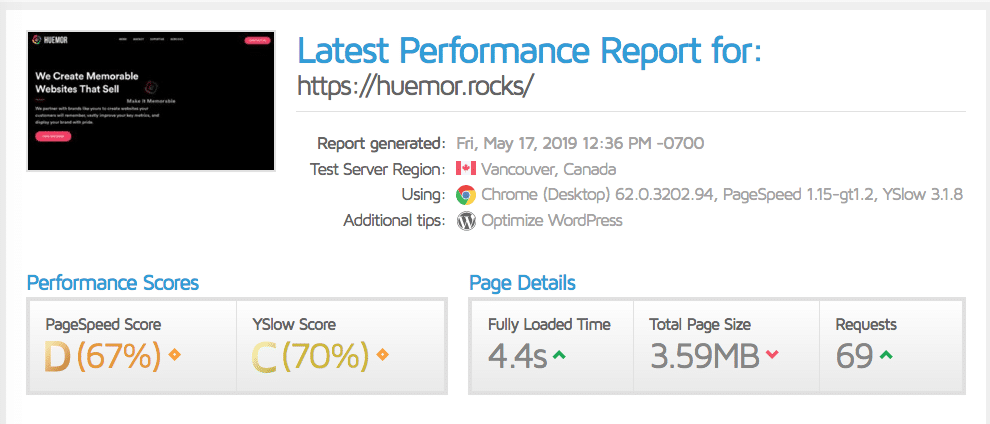
Take a look at the two bottom sections—Performance Scores and Page Details.
A Performance Score is an overall grade your Shopify store gets from the 2 tools GTMetrix uses to perform its analysis—Google’s Page Speed Insights and YSlow, an open-source website loading testing kit/browser extension.
We typically don’t pay too much attention to the performance scores.
The Page Details are the more granular data points: the number of seconds it takes to fully load your store, the size of the page, and the number of requests your store had to make in order to fully load.
As you may have guessed, getting these scores as low as possible correlates with a faster store (and fewer lost customers!).
The arrows next to your scores are indicators of how your store measures against an average website; you can hover over the arrows to get more specific information.

Shopify Speed Test: The Waterfall Chart
The next section shows you a breakdown of suggestions and scores from Page Speed Insights and YSlow. This is pretty self-explanatory, and we don’t think it’s the most valuable piece of information.
Instead, click the tab to go to the waterfall chart.

A waterfall chart is a request-by-request visualization of how your store loads.
In other words, you can visually check which of your store’s elements take the longest to load speed.
(And therefore you know where your greatest returns are!)
The chart, at first glance, can be a little overwhelming:
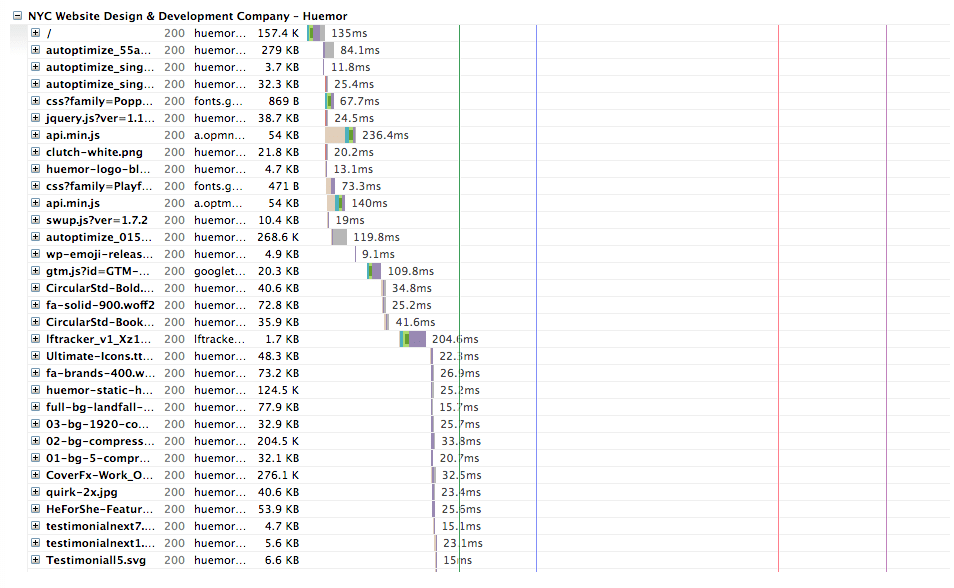
We suggest looking at GTMetrix’s guide to reading a waterfall chart.
The two most important things to pay attention to are the brown and purple colors.
Brown is for blocking elements. JavaScript and CSS can sometimes be render-blocking; that is, they prevent the rest of the page from loading until they’re done.
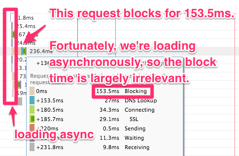
This creates a bottleneck unless you’re loading asynchronously. Not ideal.
Using Google Tag Manager to asynchronously load your tracking snippets and minifying your JavaScript and CSS can reduce or eliminate the amount of blocking time.
Purple is for waiting. In GTMetrix, it refers to something called the time to first byte (TTFB), which is how long it takes for your store to receive the first byte of data from whichever resource it’s loading from.
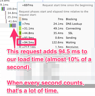
You can reduce your waiting times by upgrading your Shopify hosting plan. (You could also switch your content-delivery network (CDN), but the Shopify CDN already performs quite well!)
For a more thorough breakdown of how to read the GTMetrix waterfall chart, head over to the fantastic guide at Kinsta.
When you learn how to use GTMetrix’s waterfall chart, you can spot treat your store’s performance and see the biggest performance gains for the least amount of effort.
That’s efficient.
Wrapping Up: Your Lightning-Fast Shopify Store
There’s your list of actionable Shopify speed optimization best practices.
Improving ecommerce sites’ speed performance takes time, but you’ll notice the difference in your Shopify store’s page speed after you tackle a few of these.
And your customers will too.
(Which means you’ll sell more products!)
Which tip will you try first? Drop a comment below to tell us or to ask any questions you still might have. We’re here to help.
Want your Shopify website to be amazing? Talk to us about our Shopify audit services.
A list of Shopify speed expert best practices and examples.
Thinking about growing your business on Shopify? Here are some additional resources and information. If you have further questions don’t hesitate to reach out.
Questions about Shopify speed optimization best practices?
Here we cover some web design basics, including Shopify speed optimization best practices.
What is the best speed for Shopify store?
There’s no single answer to the question of what is the best speed for a Shopify store. However, there are some important things to keep in mind when optimizing your site for speed.
First, every millisecond counts when it comes to page load times. Every bit of speed you can shave off will improve the user experience and may lead to more sales.
Second, speed optimization is an ongoing process. You can never rest on your laurels when it comes to speed; there are always new ways to improve.
Finally, remember that speed is just one factor in the overall success of your store. Don’t sacrifice other important elements, such as design or functionality, in the name of speed.
With these considerations in mind, you’ll be well on your way to creating a fast and successful Shopify store.
Why is my Shopify store speed so low?
If you’re noticing that your Shopify store is loading slowly, there are a few potential causes. One common issue is render-blocking JavaScript and CSS. This occurs when the code for your website’s visuals is prevented from loading until everything else on the page has finished loading.
Redirects can also add unnecessary delays. When a visitor tries to access a page on your site, they may be redirected to another page if the original page has moved or no longer exists. While redirects are occasionally necessary, too many can slow down your store’s loading time. So try to minimize redirects as much as possible.
By identifying and addressing these potential issues, you can help ensure that your Shopify store loads quickly and efficiently.
Further Reading On Website Design and Development.
Looking for Shopify web development and design inspiration? These articles should help.
- How to Design an Effective “About Us” Page
- Guide to Shopify Image Sizes
- Design Essentials for Ecommerce Conversion
- Our Shopify Web Design Process
- Basic Website Design Principles
- Our Top Picks for The Best Shopify Stores
- Examples of Bad Website Design and How to Do It Better
- Website Launch Checklist Essentials
- Website Footer Design Best Practices
- Ecommerce Web Design Tips You Need to Boost Sales
- Proven Ways to Boost Your Mobile Ecommerce Conversion Rate
- 24 Great Website Examples for 2022
- Tips to Make Your Ecommerce Business Successful
Get Memorable Insights.
Sign up to receive actionable web design advice directly in your inbox monthly.
Get Memorable Insights.
Sign up to receive actionable web design advice directly in your inbox monthly.
Author
Jeff Gapinski is the President of Huemor where he helps plan the long-term strategic growth of the agency. Jeff is passionate about UI/UX, demand generation, and digital strategy.
What Do You Think?
Have feedback? Maybe some questions? Whatever it is, we'd love to hear from you.





No comments found