Design
28 minute read
Ecommerce Homepage Design: Best Practices Guide (for 2022).
LAST UPDATED:
March 8, 2024

One of the most important aspects of ecommerce web design is how it drives conversions. That is why everything on your ecommerce homepage should bring customers closer to a purchase.
You don’t want people hanging out on your homepage.
You want them browsing your product pages.
By following the website design tips in this ultimate guide, you’ll avoid bad design habits, learn how to create an effective ecommerce homepage design and use best practices to boost conversions and sales.
Keep reading.
Quick: someone lands on your homepage.
Where do you want them to click?
What’s the most important thing they should know?
According to the Norman Nielsen Group, almost everyone lands on your homepage at some point.
Don’t be boring. Boring doesn’t sell.
In this chapter, you’ll define your #1 goal for your ecommerce homepage so that you know exactly how to design it to bring in the results you want. You’ll learn how to take into account different web development elements, user experience, and web design principles that are necessary for an effective ecommerce homepage.
Know Your Problem(s)
Unless you’re a new store, you already have a homepage.
- What’s not working right now?
- What do you want to fix?
- Where do you want people to go?
Before you further, you need to write down your #1 problem.
Then turn it into a goal.
Let’s say your problem is that people bounce from your homepage. They land there and then leave without checking out your individual products.
Then your goal is to get more people to transition and check out your related products. Luckily, there are a number of things you can do to optimize your homepage and improve conversions.
One (main) CTA
A bad website design habit ecommerce brands often fall into is pointing users in too many directions. Remember, the user experience should always be your top priority when designing your ecommerce homepage.
Focus on design elements that will guide users towards your desired conversion goal.
Don’t introduce too many twists and turns. Use a visual hierarchy that makes their journey simple and gives them a good shopping experience.
What’s the one action you want somebody to take from your ecommerce homepage?
In other words: what’s your CTA?
Let’s look at a few examples:
Solillas
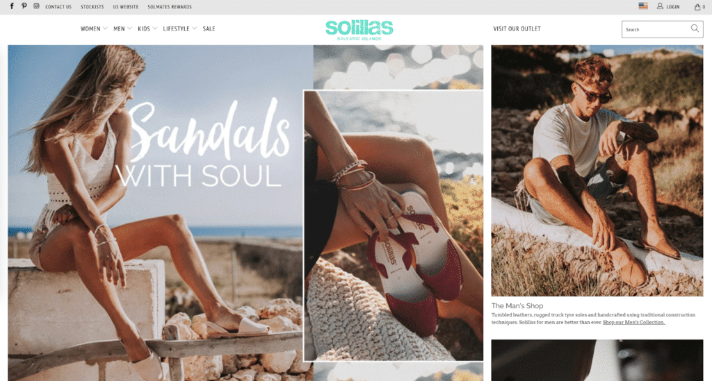
Solillas has no CTA button above the fold on their Shopify store’s ecommerce homepage design. All the images are clickable, but nothing except the small “Visit our outlet” at the top of the screen directs you anywhere.
If Solillas told us they had low engagement, we wouldn’t be surprised. An ecommerce homepage with no CTA (or a vague CTA) leaves site visitors confused and unsure of what to do next.
Primal Pit Paste (Good)
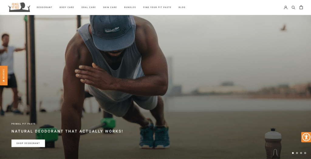
Primal Pit Paste uses an auto-rotating carousel (which we are not fans of—at least, don’t auto rotate) but their CTAs are much clearer:
It’s obvious what they want you to do: shop their popular products (deodorant).
But you don’t have to send visitors to a category or collection page and tell them to buy now.
Peak Design (Good)
Peak Design asks you to pre-order something:
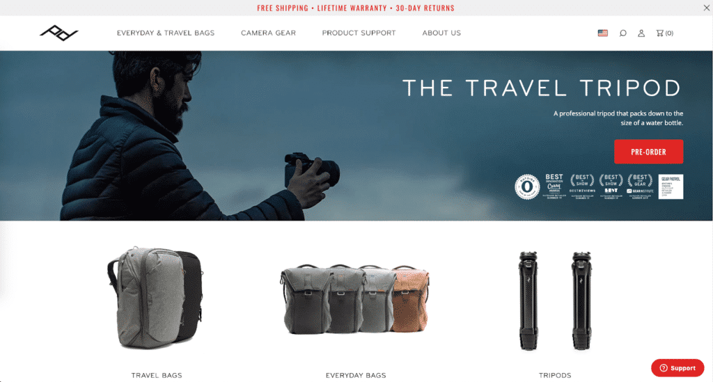
We don’t love that the static image and the text aren’t congruent (is this a photo of the tripod, or is it a camera lens? We can’t tell), but the red ‘PRE-ORDER’ CTA contrasts well with everything else on the homepage UX and it’s pretty obvious what next step you should take.
Andie Swim (Good)
Do you want to promote a sale, like Andie Swim?
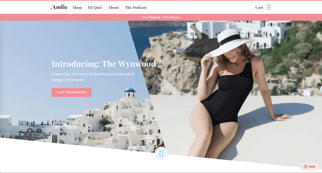
This is a common ecommerce homepage tactic: a new collection arrives and you announce it on your homepage. Andie Swim does a fantastic job of creating a single CTA and making its design simple and visually salient.
Third Love (Good)
Sometimes you want to talk to buyers at different stages in the buying journey.
Are they ready to buy now? Or are they new?
Third Love provides personalized recommendations to their customers in order to help them find the perfect bra.
Check out how they speak to their different customers:
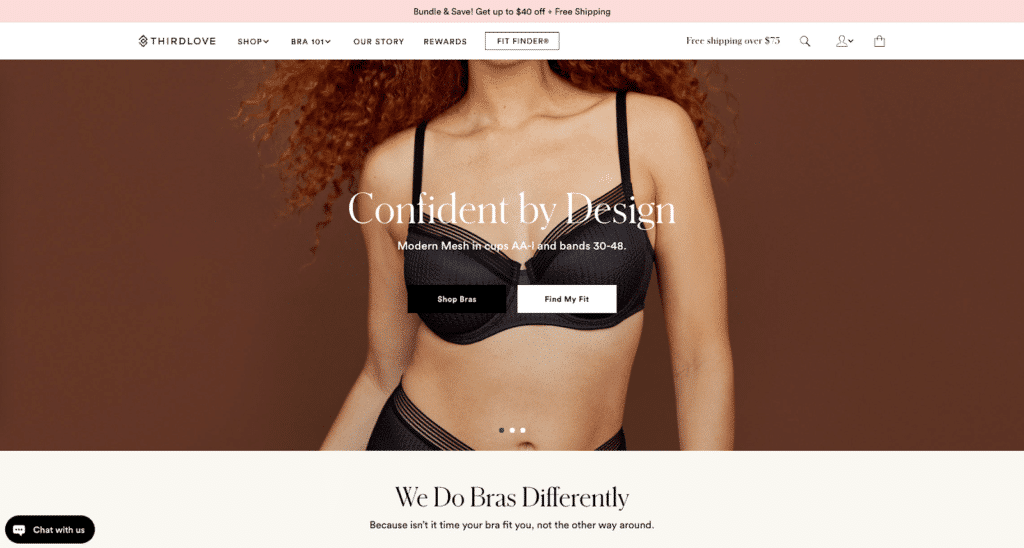
But wait—isn’t this 2 CTAs!?
Well, yes and no.
The people who click “Find My Fit” will eventually get another CTA asking them to shop bras.
Even though there are two different options for online shopping, the end result is the same.
Allbirds (Good)
The easiest way to segment? Gender. Check out what Allbirds does:
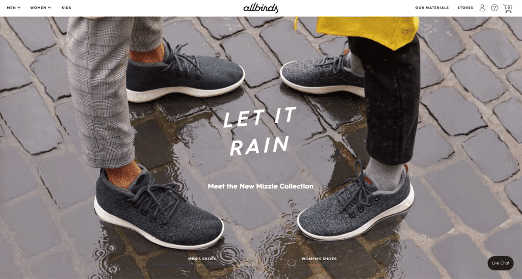
They show off their product categories and ask visitors to go to the correct part of the store.
We wish the actual copy on the links was a bit more actionable, but for what it is, this works.
The Baymard Institute found that the typical ecommerce homepage navigation misaligns with user behavior and leads to higher numbers of site abandonment.
This means: your menu might be what’s killing your sales.
In this chapter, you’ll learn how to sharpen your navigation menu to keep shoppers engaged.
Reduce Choices to Create Action (The Jam Study)
They set up 2 booths in an upscale supermarket: one had 24 different selections of jam. The other had only 6.
The researchers were interested in 3 factors: (1) how many people stopped by, (2) how many flavors they sampled, and (3) how many people made a purchase.
- Who stopped by?
They found that 60% (145) of people stopped by the extensive jam display (the one with 24 flavors) while only 40% (104) of people stopped by the limited display (the one with 6 flavors).
This difference was statistically significant; that is, it’s almost certain displaying more choices will grab more attention.
- What did they sample?
Both groups sampled around 1.5 flavors.
- How many of them bought?
Nearly 30% (31) of the people who stopped at the limited jam selection made a purchase.
But only 3% (4) of the people who stopped at the extended selection of jam bought anything.
Just 4 people out of 145 bought!
That’s an awful conversion rate.
What does the Jam Study mean for you?
When they had fewer flavors of jam to choose from, more shoppers made a purchase.
…this is true outside the lab too.
Back in 1997, Procter & Gamble cut their hair-related SKUs in half and sales have grown every year since.
It’s pretty clear. Fewer choices increase conversion which means more action.
Capture more Shoppers with Thematic Product Browsing
According to the Baymard Institute, 34% of mobile ecommerce sites don’t offer “thematic” product browsing.
What does this mean?
It means customers who shop differently from what you enforce with your navigation will have a difficult time finding a specific item.
For example, if you just have ‘hair care’ in your menu, how are customers supposed to find the right product for their split ends?
When you go into a brick-and-mortar, it’s easy to ask a sales associate for a specific item:
“I’m looking for a light spring jacket that won’t be a pain to dry if I get caught in the rain.”
But you can’t do that with a website. The closest you can get is smart search.
The next best thing is to segment your menu.
Storq (Good)
Storq sells maternity clothing. They segment their menu into ‘maternity’, ‘nursing’, and ‘parenthood’.

It’s simple and makes it easy for shoppers to go exactly where they need to go. Good.
Since it’s simple, there’s less chance Storq will overwhelm their shoppers with choices.
Lulus (right idea, could be better)
Lulus definitely sorts thematically…but it’s a lot to take in.
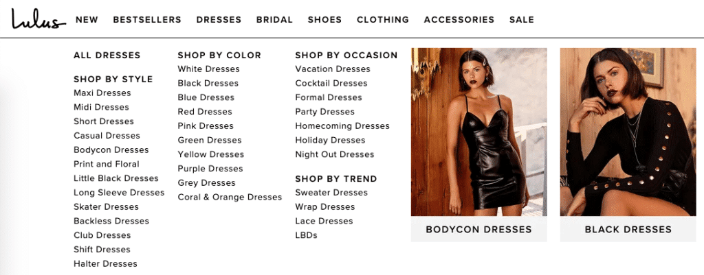
What’s going on here?
First, Lulus asks you to make the jump to decide how you want to shop. By style, color, occasion, or trend?
This is normally fine—Storq does this too—but Lulus’s compact layout and excessive use of “dresses” (in the dresses category—we get it!) creates a lot of visual clutter and makes the menu feel overwhelming.
(To say nothing of the images on the right that crowd the text.)
Ministry of Supply (Good)
Ministry of Supply keeps a simple menu:
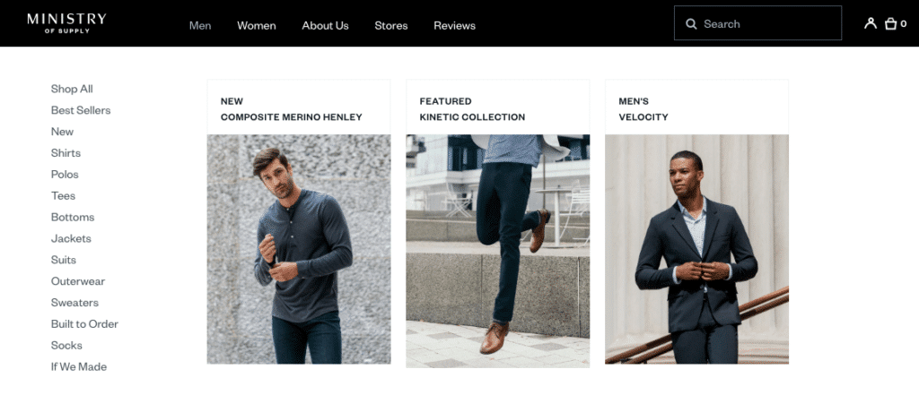
The real magic happens once you advance through to the category pages:
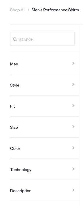
When searching for men’s shirts, you can browse and filter down by style, fit, size, color, and technology.
This is great for the shopper who needs, say, a gray button-down dress shirt with a specific type of fit. It saves them time during the shopping process.
Cart abandonment is a huge issue for ecommerce businesses, and one of the main reasons for abandoned carts is customer overwhelm. When faced with too many choices, customers can get overwhelmed and decide to abandon their cart rather than continue with their purchase. By implementing a tagging option, Lulu’s could dramatically reduce the number of choices customers have to consider, making it more likely that they’ll complete their purchase.
Avoid Overlapping Category Hierarchies to Reduce Shopper Confusion
Likewise, you want to avoid overlapping hierarchies that could confuse visitors.
Let’s look at Lulus again.

So many of these categories overlap. Some of them could be the same (What’s the difference between a club dress and a night out dress? Is one a subset of the other?)
There’s no reason for this navigation to be so extensive.
- What do you sell?
- Who is it for?
- Why is it right for me?
If customers can’t discern that in seconds, they’ll leave your store.
But how to word it? How do you know what to say?
By knowing your market.
Who are the people you sell to? What’s their state of awareness?
In this chapter, you’ll learn how to craft a message that reels shoppers in hook, line, and sinker. With a well-crafted content marketing strategy, you can turn casual shoppers into loyal customers who are hooked on your products or services.
The 5 States of Awareness
Someone’s state of awareness is their understanding of 2 key concepts:
- Their Desire
- Your Product(s)
Shopify’s Editor-in-Chief Aaron Orendorff lists 5 states of awareness:
- The Most Aware: They’re committed to buying: all you need to give them is a price.
- Product-Aware: The know a specific solution to their problem.
- Solution-Aware: They know a solution to their problem.
- Problem-Aware: They know they have a problem, but they don’t know the solution.
- Unaware: Ignorance everywhere.
How do you know your customer’s most common state of awareness?
Well, it depends.
If they’re on your email list or they’ve bought from you before, they’re Most Aware.
If they’ve abandoned their cart, they’re Product-Aware.
They might be Solution-Aware or Problem-Aware if they land on your content from an ad, social media, or Google search.
Similarly, depending on the ad/social media post/search query, they could be Unaware.
…how does this help you convey your value proposition?
In other words: how do you take this framework and turn it into something that makes customers stick?
Here’s the thing:
You MUST know your market.
And you MUST know their desire.
…but how do you know their desire?
Your Market’s Desire
First, recognize that people buy because of emotions, not logic.
Here are some emotions that might motivate a shopper to make a purchase:
- Joy
- Anticipation
- Frustration
- Elation
- Fear
- Anxiety
- Self-loathing
- Embarrassment
- Envy
- Accomplishment
- Satisfaction
- Desire
- Pride
- Comfort
- Self-confidence
Then turn those into specific reasons.
For example, perhaps you sell skincare products for ambitious, professional women. What does she fear? What emotions does she want to move away from or towards?
- Does she want to avoid the embarrassment of acne flare ups during work presentation?
- Does she want to feel more comfortable in a professional setting?
- Is she afraid of being judged by a supervisor or client for having “unprofessional” skin?
- Is she preparing for a professional photo/video shoot and wants to look back on that project with pride and satisfaction?
- Does she want to feel confident when she walks into an interview, an important work meeting with a client, or to ask her boss for a raise?
(Asking your customers and reading their reviews is the best way to learn these things: don’t make them up!)
Value propositions aren’t effective unless they speak to something your customer already feels or knows or believes.
You’re not there to tell them what to think or believe.
You’re there to add to the conversation they’re already having with themselves.
Now it’s time to write your value prop.
How to Write Value Propositions that Convert
Now that you know your customer’s state of awareness and you know the market desire, it’s time to actually write your value proposition.
If you have reviews or 1-on-1 interview notes from customers, that’s a good place to start. Mine that language—if it came from your customer, others like your customer will see themselves in it.
Otherwise, we recommend being direct.
There’s a reason “How to Win Friends and Influence People” is such a popular book. Same with “The 4-Hour Work Week” and “The Life-Changing Magic of Tidying Up.” You know exactly what you’re getting.
Fortunately, there’s a pretty easy strategy to follow based on your market’s state of awareness:
| State of Awareness | Strategy |
| Most Aware | Tell them the deal. |
| Product Aware | Demonstrate superiority |
| Solution Aware | Identify their desire; don’t mention the product. |
| Problem Aware | Identify the problem, agitate it, and pitch a solution. |
| Unaware | Identify your market and give them a community. |
Let’s look at some examples.
Examples: Most Aware
This is the gutsy move: going straight in for the deal.
4moms
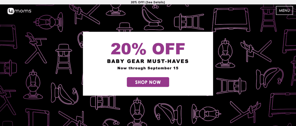
4moms knows why you’re here: you’re a mom and you need baby gear. They have 20% off. You’re already ready to buy.
4moms can get away with this because of strong brand name recognition. If you’re a smaller shop, it’s probably best to choose another approach to recommend products unless you have highly targeted traffic.
Examples: Product Aware
Most ecommerce homepage designs fall into this category. That shouldn’t surprise you—it’s easiest to talk about your products.
Product-Aware messaging should talk about the superiority of the product. What makes it the best choice? Why is it right for your customer?
Let’s look at how some ecommerce stores accomplish this.
Away Travel (Good)
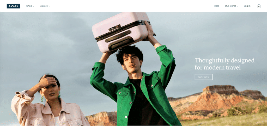
Away Travel—created by two Warby Parker alums—has always been known for their modern, utilitarian, and minimalist design. They sell that in the value proposition: “thoughtfully designed.”
And it gets better.
These suitcases were thoughtfully designed for modern travel.
We don’t know exactly what modern travel entails (air travel? Road trips? Backpacking through Southeast Asia?) but at the same time, we understand what it means: tech-friendly, adventurous, a little off the beaten path. It appeals to millennials and younger travelers.
Andie Swim (Good)
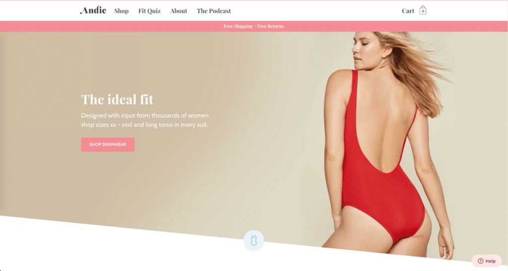
Andie Swim knows their target market is frustrated. Their unique value proposition is: this is the swimwear that will finally fit you—perfectly.
How are they better? They tell you 2 reasons: “Designed with input from thousands of women” and “shop sizes xs – xxxl and long torso in every suit.”
Their CTA tells you exactly what to expect when you click on it: we told you why we’re better, so come in and shop.
Kith (Good, with a small issue)
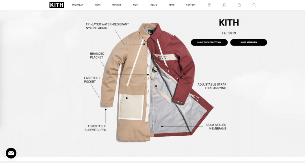
The name of the game is demonstrating superiority, and Kith takes a utility-focused approach. Showcasing a single product’s design suggests they made the rest of their collection with similar attention.
Where Kith falls off is the double CTA: there’s nothing about this image to suggest the jacket is meant for only women, but they have a CTA aimed specifically towards men. (Maybe it’s a men’s jacket?) It’s not clear. Removing the gender-specific CTA will eliminate the source of that confusion.
Primal Pit Paste

Primal Pit Paste sells natural deodorant. The catch? This one actually works.
This is a decent attempt at demonstrating superiority, but there’s nothing here to support the claim. “Actually works” is a low bar to clear—otherwise, they’re selling snake oil.
We would change the value proposition to something that actually addresses the problem customers have—body odor, overactive sweat glands, etc.
Peak Design

Front and center from Peak Design: the travel tripod. The accompanying text reads: “A professional tripod that packs down to the size of a water bottle.”
This is a clear value proposition that addresses the problem photographers have: space is at a premium, but tripods are inherently large, bulky, and awkward to carry.
Of course Peak Design’s tripod is superior: it packs down to the size of a water bottle. Biggest pain in the neck? Solved.
Where this falls off is the lack of image. There’s no tripod in this image. The whole thing feels off because of it.
Greats
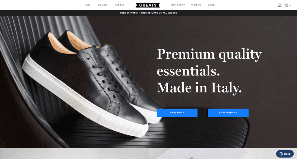
Greats sells shoes. Their benefit? Better materials. Italian craftsmanship.
Which is all fine, but we think it’s a weak value proposition unless Greats’s customers specifically care about Italian craftsmanship.
We haven’t reached out to the Greats team to verify anything we’re about to say, but let’s think for a second.
Option #1: Greats did the research, asked their customers what they care about when shopping for shoes, and those customers said “premium quality essentials” and “made in Italy.”
Option #2: Greats thinks this is what people desire and sales seem to be doing well, so they’re going to leave it up.
The second option is what many online stores do. Don’t be like most stores.
Third Love (Good)

Third Love gets specific. There’s nothing here that claims objective superiority, but that’s not the point. The point is they’re better for you.
The utilitarian copy is also good: it lets customers know exactly what sizes they carry and gives a little context to the “Find My Fit” CTA.
Plus the placement…you were going to look there anyway.
Allbirds (Good)
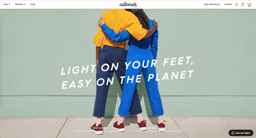
Allbirds sells shoes that are comfortable and environmentally friendly. The superiority angle here isn’t so much about the product as it is about the impact the consumer can make.
Allbirds customers are eco-conscious. If you’re not yet an Allbirds customer, how can they let you know that you’re part of their culture?
Again: we’re better for you.
Examples: Solution-Aware
Solution-aware means your ideal customer knows they want what the product does…but they don’t know the product yet.
It’s your job to present the solution that the customer wants and introduce your product as the vehicle.
Luxy Hair (Good)
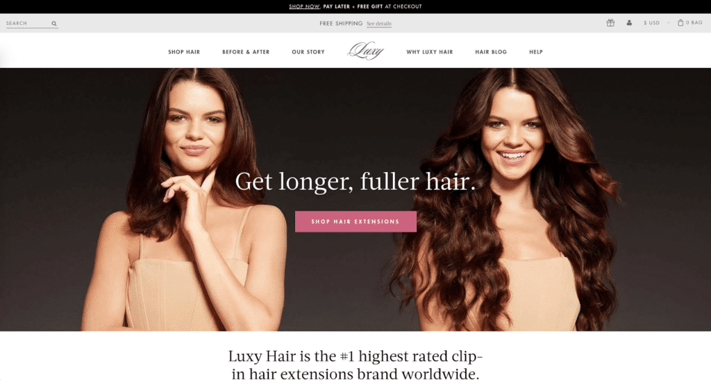
Luxy Hair does a great job leading with a solution and pitching their problem. The before/after photo does a great job of showing off the product.
But to make this even better? We’d test a step that agitates: their ideal customer wants longer, fuller hair—what happens if they don’t get that?
Wouldn’t lowering the boom—Shop Hair Extensions—be much more impactful?
Hers
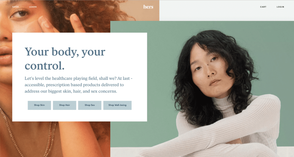
The copy at Hers is fantastic. Let’s break down what they did.
Headline: Identifies a desire. Women want control over their bodies.
Body: Agitates that desire—here’s what it looks like. Here’s the solution. Prescription-based products delivered to your home that address your body concerns that are spiraling out of control.
CTA: The choice to select a different problem to solve gives their shopper a feeling of control.
To make this better? We’d introduce an outcome: what does life look like on the other side?
Examples: Problem Aware
Problem-aware shoppers don’t have a desire yet. Most people in this state of awareness have an intuition that something isn’t how it should be.
Your job when you create the copy for your ecommerce homepage is to help them realize the problem.
Identify the problem.
Exacerbate it: make them realize it’s bigger than they think.
Then offer a solution.
(The copywriters call this PAS: Problem-Agitate-Solution.)
Let’s look at an example:
Storq
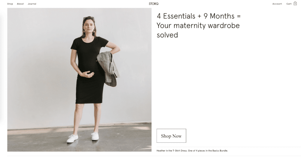
Storq follows PAS.
Problem: you’re pregnant. Or planning to get pregnant. And you’re not quite sure what that’s going to mean for clothing—if you’ve even thought about maternity clothes at all.
Agitate: 9 months. That’s all they have to say—and it’s genius.
Solution: The other side of the equals sign and the CTA at the bottom of the hero. (We could call this PASA: problem-agitate-solution-action.)
We’d strengthen this by making the problem more evident. What’s the fear? Why are you here, on this homepage?
What if Storq acknowledged the anxiety around the financial strain of buying new clothes (on top of saving for a baby)? What if they agitated that and said: 9 months of new clothes that might not fit?
Would you be more willing to click “Shop Now”?
Examples: Unaware
When your ideal customer isn’t aware of their problem, they certainly aren’t aware of a solution or your products.
They don’t care about benefits or desires or needs.
So what do you do?
You call out your market.
Let’s look at an example.
hims
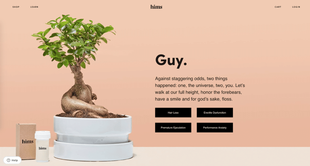
Who is Hims’s target market?
Some dude. Guy.
Hims is trying to unify and make an appeal to their market. Unfortunately, we don’t see the connection between the body copy and the CTAs. This example is all the weaker for it.
Stop me if this sounds familiar…
- Customers don’t engage with your home page
- You have a high bounce rate: people leave without entering your store
- Shoppers don’t clearly understand why they should buy from you
One part of improving this is to test out different hero banners, based on your copy and your customer’s persona.
A hero banner is the screen-wide image at the top of your homepage that:
- Complements your value proposition and
- Provides clarity and context to your visitors.
It’s the first thing shoppers see when they enter your store. Since you only have 50 milliseconds to make a good impression, you need to nail this.
We got you.
Hero Banner Examples
There are 4 kinds of hero images: product images, hero shots (contextual images), famous founders, and non-contextual shots.
Famous founder shots are not you—unless you are your brand (Tom Ford, Kate Spade, Calvin Klein, etc.).
Let’s look at some examples of product images, hero shorts, and non-contextual shots.
Product Images
Product images keep the focus on the product. They tend to be utilitarian which might help with selling very high end products but we feel that most companies pick this strategy because it’s the easiest and cheapest to produce.
And, as we’ll see, it doesn’t always make the most sense.
Tommy John Bras (Good)
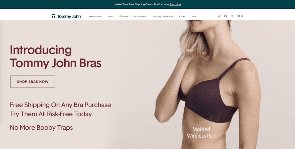
Tommy John Bras is all about the product—the hero is actually a short video that highlights different features of the product.
This is the classic product-aware strategy too: demonstrate superiority.
…if it weren’t for the weak copy on the left (“no more booby traps”? What kind of pun is this?) and the Camel Casing That Can Get Distracting And Slow Down Your Reading.
(Slightly unrelated, but it’s worth nothing that we do NOT recommend including text as part of the image like Tommy John Bras does here on the left. See how it looks a little pixelated?)
Chubbies
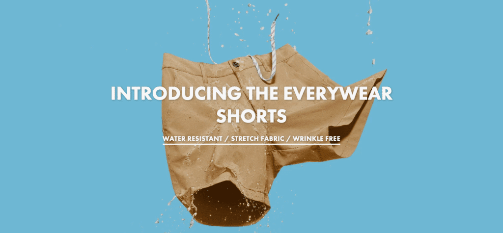
Chubbies shows no people—only shorts with water droplets to show off the water resistance.
But there’s no context for fit here, so newcomers to the Chubbies brand have to click around the site to see more images of how the shorts will actually look on them.
The lack of a person is extra bad here because shoppers will want to see how water resistance (the main benefit Chubbies describes) looks on people.
Daily Harvest
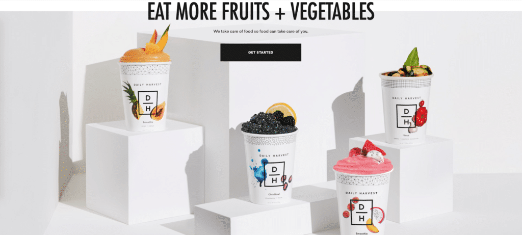
Daily Harvest’s hero banner is all product poses. While these smoothies look delicious, the sub-header has a weak benefit (“so food can take care of you”—what does this mean?) and we’re not exactly sure who they’re marketing to.
The result is a hero banner that falls flat of making any sort of impact. At least the food looks good.
Contextual Images (Hero Shots)
Contextual images include a person (who is wearing/using the product) and a setting where the product makes sense.
This kind of hero banner gives shoppers the most added value because it’s immediately obvious how to use the product. They see the product in context.
Away Travel

Away Travel keeps the focus on the product (the suitcase) but pairs it with a background that screams “ADVENTURE” and a headline that ties it together nicely.
Shoppers might not literally carry the bag over their heads as they walk through the American Southwest, but the meaning—you can take this bag anywhere—lands.
This image would be more contextual if it showed the suitcase in an airport, on a plane, or even if there was a cabin or campsite in the background of this photo.
Sunday Somewhere

Sunday Somewhere sells glasses—and the hero image shows someone like their ideal customer sitting outside, on the grass, in a warm and sunny place. They’re not just selling sunglasses—they’re selling sunglasses that fit the experience their customer wants to have.
Gymshark
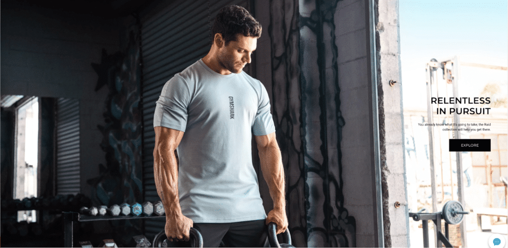
Gymshark sells athletic wear—and their hero image is a man (in what looks like an independent gym) holding kettlebells.
This is a good hero banner, but we think it would be better if the model was actively working out instead of just posing.
Peak Design

While they don’t show a tripod in the hero, Peak Design opts for a photographer with a camera—which is close enough.
This hero shot would be better if we got some more context beyond a cloudy background. Did they have to hike up a mountain at 4am to get this shot? Are they on a rooftop? What’s the value of the tripod being so small?
Storq

Storq’s hero is the perfect marriage of product placement and customer showcasing: a pregnant woman (their ideal customer) posing casually in front of a blank wall. There’s nothing specifically lifestyle here, but that’s fine: it’s a normal woman in an everyday space.
Luxy Hair

Luxy Hair sells hair extensions, and their hero banner is a great example of how a beauty and cosmetics website design should show off the benefits of their product.
Beardbrand
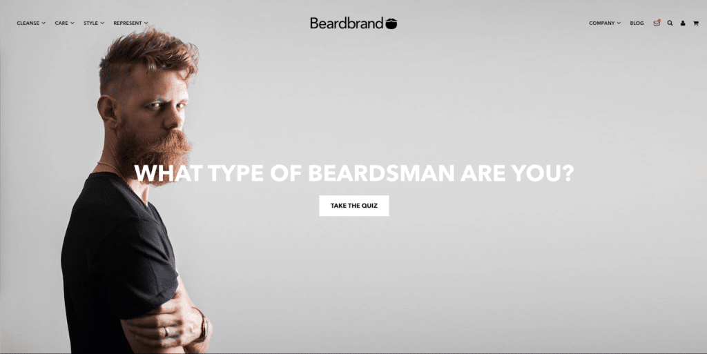
Beardbrand doesn’t even show off their products—instead, they show off their ideal customer.
This works fine as a hero image, but since we’re not sure what Beardbrand sells, the entire thing falls flat—we’re left with guesses.
(Fortunately, there’s more to the homepage, so we can scroll.)
This is a point where you have to realize you can’t have everything: Beardbrand probably realized that getting customers to fill out their quiz led to higher product purchases down the line.
Non-contextual
Non-contextual images are a mismatch between the image and the copy.
They don’t add anything to the message and can even confuse your shoppers. Avoid these.
Let’s look at some offenders.
Peak Design

Another from Peak Design: the copy doesn’t match the image: they’re asking you to pre-order a tripod, but we only see a camera lens.
(If you’re paying attention, we keep harping on this because you should NOT do this and they did it TWICE.)
The mismatch between the image and the text here doesn’t do them any favors. Any customers looking for a reason not to buy just found it.
American Eagle
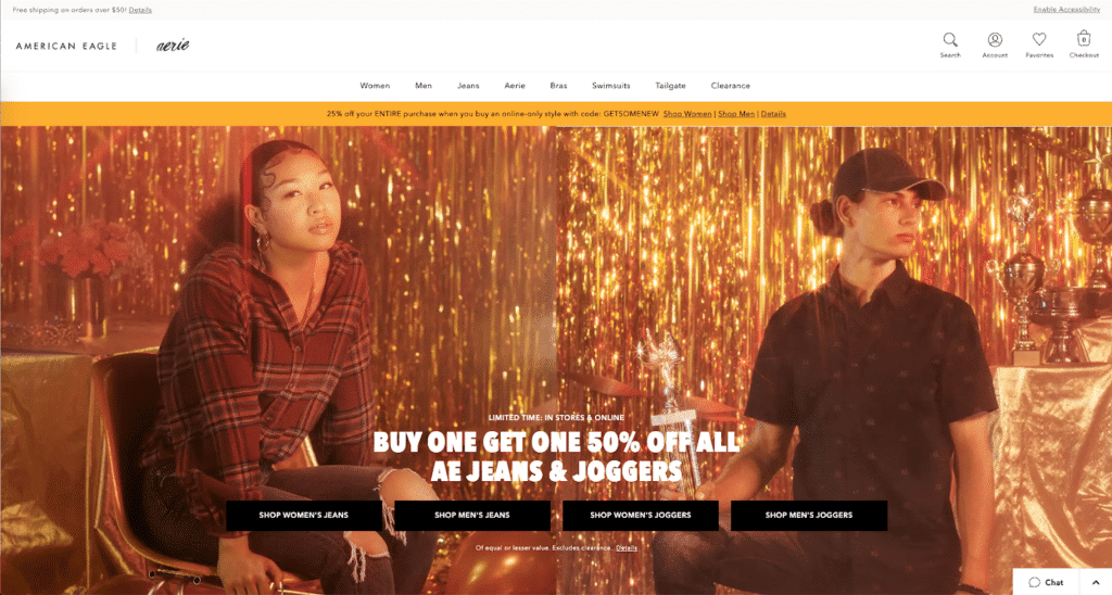
American Eagle wants you to buy their jeans, but the product is both largely below the fold and obscured by the CTAs. The main focus of the image (the models, the gilded background) isn’t congruent with the messaging. It’s mismatched all around.
Add in poor contrast between the background and the text and multiple CTAs (that aren’t even grouped with the gender of the model) and the entire homepage design starts to feel like an incoherent mess.
Carbon Beauty
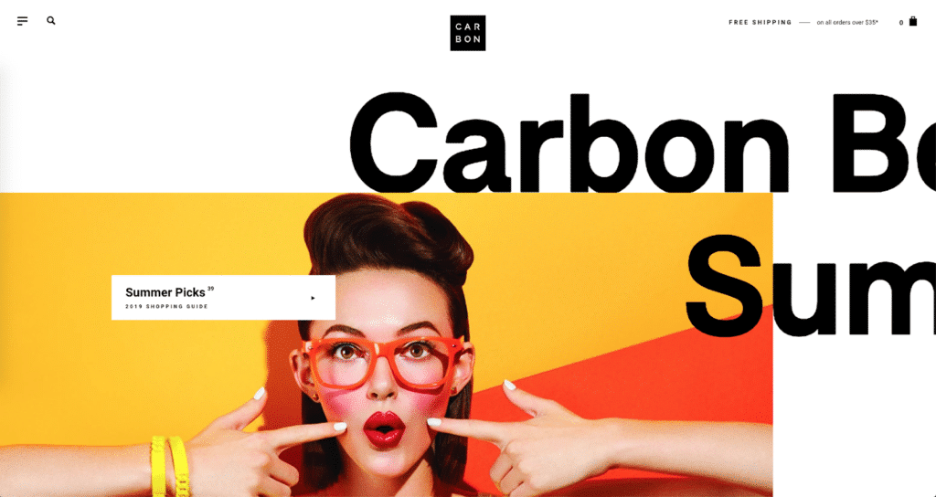
It’s hard to tell what Carbon Beauty sells. (Our office, when shown just this image, was split between ‘makeup’ and ‘sunglasses.’)
The CTA tells shoppers to shop the Summer Picks…but it doesn’t give any context as to what’s included in that collection.
Rent the Runway
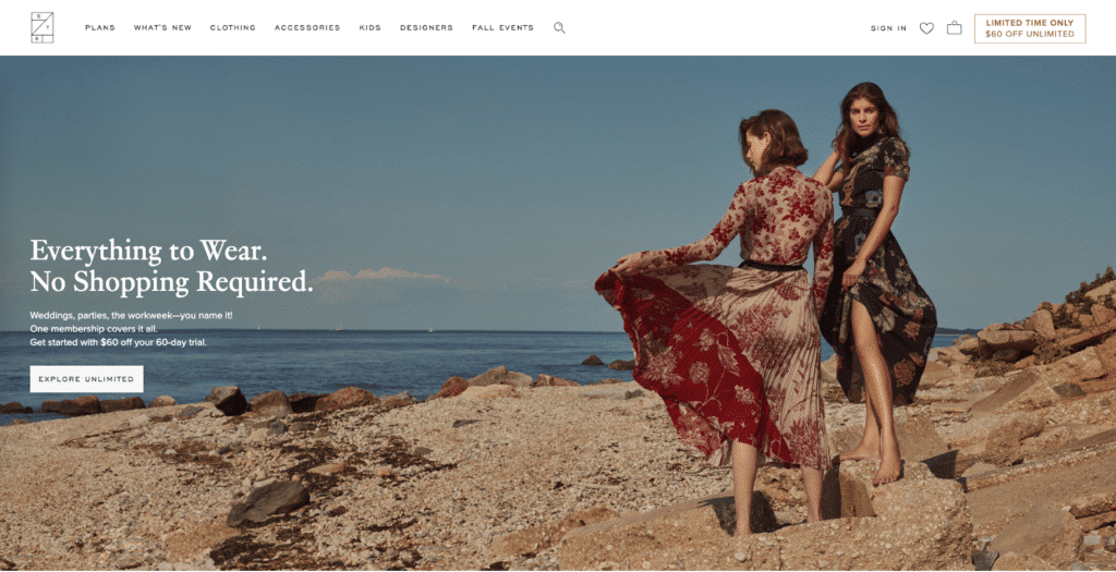
Rent the Runway’s model shot features their products, but the text doesn’t quite match the image. (We also don’t know why they’re at a beach.)
The 7 Factors of a Successful Contextual Image (Hero Shot)
A hero shot is a more specific take on a hero banner.
It works like this:
Every hero needs a weapon of choice. Harry Potter had his wand. King Arthur had Excalibur. Buffy had her scythe.
Without their weapon, the hero is still great…but their problem is unnecessarily challenging. With the weapon, things are starting to look realistic.
You want to position your product as a weapon of choice.
You do that with a hero shot.
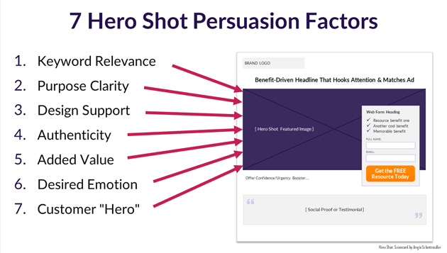
- Keyword Relevance: What is the referring link text or search query that will bring them to your ecommerce homepage? (Are you maintaining scent?)
- Purpose Clarity: Identify what the page is about. What words does the image evoke? How would you caption that image if it was in isolation? Does it match the CTA?
- Design Support: Does the image lead your shopper’s eyes to the CTA? If we can see your hero’s eyes, are they looking at (or in the direction of) the CTA?
- Authenticity: Does it represent your brand in a credible way?
- Added Value: Does the hero shot show relevance, answer questions, or demonstrate benefits?
- Desired Emotion: Does the hero shot evoke and specific emotions that you want to associate with your brand or that you know your shoppers seek?
- Customer “Hero”: Did you show the customer as the “hero” now that they have your weapon of choice?
Don’t worry about getting all 7 of these perfect: one of them will always be the most important.
Instead, use these as benchmarks for your own efforts. Did you nail 5 out of 7? Did you get 4 really well and kinda sorta do okay on the remaining 3?
There’s no “best length” for an ecommerce homepage.
Some brands have incredibly short pages—others have long ones.
What matters is what’s above the fold and what’s just slightly beneath it.
81% of visitors only see the first 3 screen-fulls of the homepage.
In this chapter, we’ll give you some guidelines for length so that you can create the most effective ecommerce homepage possible.
The Ask
We talked about the #1 goal your ecommerce homepage should have.
There should be a specific action you want somebody to take.
If you did you job well on the hero, your messaging should be enough.
But what if it isn’t?
What if you:
- Were talking to just a specific subset of your audience?
- Weren’t talking to returning customers?
Those might be indications that you should target another segment of buyers in the next screenful.
But…there’s still something worse.
Are making such a big ask that customers still aren’t buying?
Are you asking them to check out a $250 product or collection when you normally sell for around $50?
Are you pushing something new (like a subscription box) that needs a little introduction to make customers comfortable?
That’s an indication that you need a little more on your ecommerce homepage.
The Goldilocks Principle
How long?
As long as it needs to be and as short as possible.
(Real specific, we know.)
But here’s the thing:
4 out of 5 visitors only see the first 3 screenfuls of your homepage.
So you can’t make it too long. Your customers won’t scan that far down (unless you have heatmap data to support that they will).
Length doesn’t have to mean more words. Away Travel‘s homepage is heavy on imagery but light on copy: we counted fewer than 200 words on their ecommerce homepage.
Your Customer’s Psychology
If you identified your market’s state of awareness, you’re already one step ahead.
You can spend the rest of your homepage trying to advance them to the next state.
Here are some ideas:
- Use reviews, user-generated content (UGC), and media mentions to plug into the social currency and public share triggers
- Show off features to demonstrate superiority
- Ask them to take a quiz (or something else interactive)
It depends on what you sell. If you sell high-end clothing, like Ministry of Supply, a shorter homepage with less copy works—their ecommerce homepage, by our count, is 6 screenfuls. Allbirds, who has pretty good brand name recognition, has a shorter ecommerce homepage (with less copy).
In this chapter, you’ll learn a few quick eccomerce design tips that are working especially well right now.
Tip #1: Have a prominent search bar
Econsultancy reports that 30% of visitors use the on-site search box. They also report that, specifically for niche retailers, the use of on-site search is a good indicator of purchase intent: only 5.75% of users used on-site search, but they converted 80% more frequently and contributed to 13.7% of the site’s total revenue.
You read that right: 5.75% of the visitors to your ecommerce homepage bring in 13.7% of your revenue because they use on-site search.
Instant Search Plus found that shoppers who use on-site search are 3 times more likely to complete a purchase when compared with shoppers who navigate using categories or promotional banners.
It’s clear: on-site search works.
Now, does that mean using search leads to making a purchase? Or is it merely associated with making a purchase?
We don’t have data that says one way or the other.
How to Improve Your Search
You can improve your on-site search experience with premium services like Instant Search Plus or Findify. Autocomplete, semantic search, and AI personalizations will boost your sales.
Take this one step further and check out ConversionXL’s guide to refining your on-site search experience.
Tip #2: Make it obvious what you sell
The Baymard Institute found that 42% of ecommerce websites risk setting the wrong expectations for their users.
This means that the homepage doesn’t give shoppers a thorough overview of what the store sells.
Take Lush USA’s (Halloween-themed) homepage:
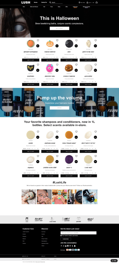
The only indication that a sizeable portion of their catalog is skincare comes from the UGC at the bottom and a single item on the nav.
Lush is losing out potential customers looking for skincare products because their ecommerce homepage doesn’t make it obvious that they sell skincare products.
Bonus Ecommerce Homepage UX Best Practices
And that’s the best practices guide to creating an ecommerce homepage design.
What did you think? Did we miss something? What was new or extra helpful for you?
Leave a comment and let us know.
Want your ecommerce website to be amazing? Talk to us about our website redesign services.
A list of ecommerce homepage examples best practices.
Ready to improve your homepage design? Here are some additional resources and information. If you have further questions don’t hesitate to reach out.
Questions regarding ecommerce homepage design best practices?
Here we cover some web design basics, including best practices for ecommerce homepage.
What should an ecommerce homepage contain?
Ecommerce homepages should contain a number of key elements in order to be effective.
It is important to have a strong and effective headline that accurately reflects what the site sells. The headline should be followed by a clear and concise description of what the site offers.
Beneath the description, there should be a selection of featured products or best sellers, along with accompanying photos and pricing information.
Finally, the ecommerce homepage should contain links to the various sections of the site, such as the about us page, the contact us page, and the shipping & returns policy. By including all of these elements, ecommerce homepages can effectively showcase what the site has to offer and encourage potential customers to browse further.
How do I optimize my ecommerce homepage?
Ecommerce homepages need to perform a variety of functions in order to be effective.
First and foremost, they need to clearly showcase the products or services that are available for purchase. This can be done through high-quality product photos, clear descriptions, and easy-to-use filters and search features.
Ecommerce homepages also need to provide visitors with a seamless and enjoyable user experience. This means having a well-designed interface that is easy to navigate, speedy loading times, and helpful customer support features.
Finally, ecommerce homepages need to be optimized for conversion. This means including strong calls to action, visible payment options, and guaranteed security features.
By following these guidelines, ecommerce businesses can create homepages that are optimized for conversion and provide an enjoyable user experience.
What is a home page in ecommerce?
In ecommerce, a home page is the main web page that serves as the starting point for a website. It is typically the first page that a visitor will see when they arrive at a website and it is often used to give visitors an overview of the site’s purpose and content.
The home page may also feature links to other pages on the site, such as product pages, category pages, and blog posts. In some cases, the home page may be the only page on a website, or it may be one of many pages that make up a larger ecommerce site.
Regardless of its size or complexity, the home page is typically designed to be user-friendly and easy to navigate.
What are the most important pages on an ecommerce site?
Ecommerce sites are businesses that sell and distribute products or services online. To be successful, ecommerce sites must have a number of key features that allow customers to easily find and purchase the products they are looking for.
Some of the most important pages on an ecommerce site include the home page, product pages, category pages, cart page, and checkout page.
The home page is typically the first page that visitors will see when they arrive at an ecommerce site. It should provide a brief overview of what the site offers and make it easy for visitors to navigate to the other pages on the site.
Product pages are where customers can learn more about individual products that are available for purchase. Each product page should include high-quality photos, detailed descriptions, pricing information, and customer reviews.
Category pages help customers narrow down their search by allowing them to browse through products that are grouped together by type or category.
The cart page is where customers can view all of the items they have added to their shopping cart.
Finally, the checkout page is where customers will enter their payment information and complete their purchase.
Further Reading On Website Design and Development.
Looking for web development and design inspiration? These articles should help.
- How to Design an Effective “About Us” Page
- Metrics Product Teams Can Use To Improve UX
- Design Essentials for Ecommerce Conversion
- Our WooCommerce Web Design Process
- Our Top Picks for The Best Shopify Stores
- Business Website Setup Cost
- Tips For Creating an Effective Case Study
- Website Footer Design Best Practices
- Ecommerce Web Design Tips You Need to Boost Sales
- Proven Ways to Boost Your Mobile Ecommerce Conversion Rate
- 24 Great Website Examples for 2022
- Tips to Make Your Ecommerce Business Successful
Get Memorable Insights.
Sign up to receive actionable web design advice directly in your inbox monthly.
Get Memorable Insights.
Sign up to receive actionable web design advice directly in your inbox monthly.
Author
Jeff Gapinski is the President of Huemor where he helps plan the long-term strategic growth of the agency. Jeff is passionate about UI/UX, demand generation, and digital strategy.
What Do You Think?
Have feedback? Maybe some questions? Whatever it is, we'd love to hear from you.




No comments found