Strategy
1 minute read
The Ultimate Website Redesign Project Plan.
LAST UPDATED:
February 7, 2024

If your company website is dated or underperforming, it might be time for a website redesign. A successful website redesign depends on a number of considerations: cost, time, functionality, business goals, performance, and other factors.
Unfortunately, 3 out of 4 brands aren’t happy with their site redesign. That statistic sucks. The good news: there’s a secret to being in that 25% of brands who are over the moon with their website revamp.
(Spoiler: It’s all about your website redesign project plan.)
Why You Need a Website Redesign Project Plan
Imagine navigating an unfamiliar city without a map. Or constructing a building with no blueprint. Sounds challenging, right? Same with redesigning a website. You need a roadmap to help you arrive at where you want to be: an awesome website that acts as a sales machine for your business.
In this guide, you’ll get a clear, step-by-step website redesign project plan full of best practices on how to pull off the most effective redesign process of your ecommerce store, SaaS website, or B2B website.
Whether you’re on Shopify, Magento, WordPress, Webflow, or any other platform, getting your site redesign right is crucial.
Before we dive into the ‘How’, it’s worthwhile to make sure you’re in the right place and understand the scope and benefits of the journey you’re about to embark in.
What Is a Website Redesign?
In a nutshell, a website redesign is the process of making radical changes to your website.
It’s basically applying the principles of web design to an existing website to give it a refresh.
The amendments or overhauls to your side can be in the coding, content, structure, or site layout. During a website redesign, you may also change the aesthetic aspects of your site like the media and color palette.
As the site owner, you want to redesign your website for one purpose: to attract and retain your audience or clients. A better user interface or experience is the goal of a site redesign.
A site with improved design will have considered data and current best practices. As a result, the product of site redesign is a site that delivers a superior page experience, fast loading times, low bounce rates, and an all-around amazing experience for you buyer persona.
Plus, page experience carries over to better online visibility and traffic.
Why do companies redesign their websites?
In many ways, your corporate website is like a pair of shoes. You need them. They can be worthwhile investments-at least, until you outgrow them.
As your business evolves and scales, changes occur. Your brand persona changes, and, so does your customer base. When shifts in your clientele and business goals occur, your website needs to follow suit.
It is for this reason that you may need to redesign website design in key areas. The website services we offer, including our web development services, allow your website to evolve with the times and your changing goals.
Why Is a Site Redesign Important?
It is crucial to give your website a make-over for several reasons. The first reason is to improve the user experience.
As the needs and desires of your clients change, their navigation habits and their tastes can follow suit. Hence, changing your site’s features to appeal to your clients’ needs and tastes will contribute to more traffic and conversions.
Another reason is to create an image of authority. Site visitors are usually quick to judge based on appearances. It is no coincidence that credibility and better site design are co-terminus with each other.
Getting Started
Alright, so now that we’ve got that out of the way, do you still feel like you’re at the point where a website redesign is the next right step for your business? If so, read on.
Performance is at the heart of every website.
Every effective website design contains 7 elements. Knowing what they are is a great way to set yourself up for success before you head into your website redesign and help you develop a more effective project plan.
Let’s dive in.
Messaging
What do you do? Who is your business for? What products and services do you offer? What’s the benefit/result you get people? Your messaging should answer those questions at a glance for your target audience.
Your target customer should be able to land on your home page and immediately know what you do and whether they are or aren’t the perfect fit for your brand.
Remember: your new site is supposed to convert website visitors into customers. Your messaging can make or break that goal.
…this means you should invest in a digital marketer or copywriter to help you nail your messaging. This is one of the most important changes you’ll make during your website redesign. Don’t skip it.
Messaging should be benefit-driven

Protip
Need help with your messaging? This guide’s website redesign project plan has an exercise that’ll tell you how clear your messaging really is…and how to fix it.
Structure
A website with a good site structure is easy to navigate.
Put yourself in your visitor’s shoes: if you were landing on your site for the first time, would you want to stay? Click around? Read a blog?
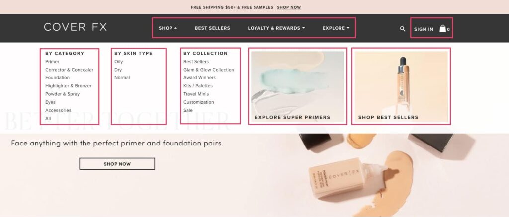
Your site structure should encourage people to view your product pages and click “Add to Cart.”
If your traffic numbers are high but you aren’t making as much money as you think you should-if your visits aren’t converting-your structure could be the problem.
Protip
Now sure where to start to improve your current website structure? (Or if you even need to?) This guide’s companion worksheet contains two exercises to help you get clear on your site’s structure.
Identity/Design
It’s easy for most of us to spot bad website design. Great website design does more than look good-it also tells your prospective customers about you.
User experience is paramount to your success.
If your web site is difficult to navigate, confusing, or disorganized, then that’s how you’ll appear to potential customers: difficult, confusing, and disorganized.
(Probably not what you’re aiming for.)
Here’s an example:
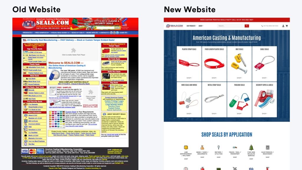
Your site’s design gives prospective customers a key insight into your brand personality.
…What’s a brand personality?
Your brand personality is your ‘it’ factor. It’s the thing that will tell someone, with no more than a glance, that your brand is a fit for them.
It’s kind of like your messaging…except it’s visual instead of verbal.
Check out this website redesign we did for a client-we focused on clarifying their brand personality to appeal to their target market.
Spoiler: Their sales tripled.
Case Study
A brand identity-focused redesign helped Ironside Computers TRIPLE their sales and increase the average order value by 40%.
Funnels
A funnel is a sequence of steps designed to turn a prospect into a customer. Funnels are the reason many online businesses work today.
Funnels rely on strategic messaging and customer touchpoints. A typical funnel looks like this:
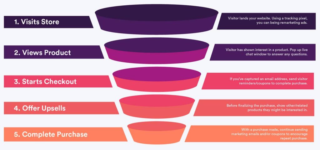
Funnels remove a lot of uncertainty from your business.
For example, say that 1 in 10 people in your funnel makes a purchase of about $50. If it costs $2 to get 1 person in your funnel…that’s a $30 profit for every $20 you spend. We’d do that all day.
You can (and should) automate your entire funnel. Once someone finds you from your website content or your ads, you don’t need to make any more manual actions. That liberates a lot of time to focus on your business.
If you don’t already have any funnels-or if this talk of funnels makes your head spin-check out this post we think does a good job of explaining funnels.
Protip
Funnels can feel overwhelming…but they’re effective. Our worksheet has exercises to help you conquer funnel overwhelm and start making a LOT more money from your new website design.
Trust
You have to earn your customer’s trust before they’ll buy from you. A strong design makes you look legitimate, but there’s more to it.
Here’s the truth-
Developing trust online is hard.
While testimonials and reviews show you’re trustworthy, being accessible is also important.
On average, product page visitors who react with review content show…

In other words: show up. Show up in Google search. Show up on whichever social media network your ideal customer uses.
Show up in their email inboxes. It is critical to not lose your sent emails, such as becoming a victim of phishing or hacking. To avoid such issues, track your DMARC report and other security measurements.
You build trust online by making the effort to create a connection.
Encourage your customers to write positive reviews and comments. Then respond to them…even the bad ones.
Testimonials and success stories are the most important pieces of social proof on your current website. Collect as many as you possibly can.
Conversions
A conversion is an action you want someone to take.
Signing up for your email list. Following you on social. Buying a product. These are all conversions.
Conversions are based on trust and messaging. When a prospective customer converts, they move down the funnel and progress along the journey to become a customer.
Messaging, a strong brand, a logical funnel, and social proof will net you more conversions…but it’s ultimately about what you offer and what your customer wants.
…so how does a website redesign project plan help?
Low conversion rates are often a symptom of some issue with your messaging, structure, identity, funnel, or ability to build trust. A website redesign strategy that improves all of those aspects will improve your conversion rates.
Case Study
A 1250% conversion rate increase from a website redesign? We didn’t believe it either, but the numbers on HeForShe’s new website don’t lie.
Speed
53% of people abandon mobile websites-including online stores-that take more than 3 seconds to load.
Simply put, a modern website needs to be fast, so your redesign needs to account for that.
The structure of the website should be built to support combined and compressed HTML, CSS, and JavaScript.
Images should be minified, optimized, and lazy loaded.
Videos should be hosted by a third party and lazy-loaded.
Protip
If you’re considering a website redesign for an online store, we suggest you read out Shopify speed optimization guide. A lot of the how-tos are specific to Shopify, but the suggestions about how to improve site speed can be applied to any store.
Remember we told you that 75% of website redesigns fail?
The biggest reason a website redesign doesn’t take off is because of poor planning.
In this chapter, you’ll learn the 3 biggest reasons behind redesign failure…and how you can avoid them throughout the website redesign process with a strong project plan.
Keep reading.
Reason for Failure #1: Focusing on Technology before Website Strategy
Your website exists to grow your business. Every choice you make should serve that goal.
We get a lot of questions from business owners who ask about the tech before they’ve considered their business goals. It’s absolutely the wrong approach for determining your current website needs.
Don’t start your process worrying about WordPress vs. Magento vs. Shopify.
Instead, focus on things like:
- What is this new website’s purpose?
- How can a redesigned website accelerate my business’s growth?
- How can we (the people at your organization) ensure the website stays successful?
Business goals and website strategy come first. Then pick the best tech for the job.
WARNING!
If you talk to a web development company for a website redesign and they don’t focus on your business and project goals in the early conversations, run far, far away. It’s the most important part of your website redesign project plan – it can’t be marginalized.
Protip
Haven’t thought about your goals for a website redesign project plan yet? Don’t worry-this guide’s companion worksheet has exercises to help you get clear on and refine your goals.
Reason for Failure #2: Vague Project Goals
A goal is a measurable outcome that defines success.
One of the biggest mistakes you can make is to approach a redesign with vague goals like “I want my site to look better” or “I want to get more leads”.
Those are fine goals to work towards…
But you need to examine what they mean and how you can measure them.
For example, when you say “I want my new website design to look better,” you mean:
- I want my brand to look appealing.
- I want my brand to be recognizable.
- I want to give my customers a positive experience.
Distilling your goal’s true meaning will tell you exactly what to measure.
Vague (weak) vs. Specific (strong) Goals
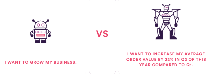
You have no way to measure your website redesign’s success if you lack clear business goals and your website redesign project plan won’t be effective.
Protip
In the next chapter, you’ll create goals and make them S.M.A.R.T. This guide’s worksheet has exercises to help you clarify your goals. Download it to get started.
Reason for Failure #3: Inadequate Budget
If your total budget is lower than $60,000, then you’re setting yourself up for a disappointing end result.
Why so much? Think about the costs associated with each of these services for a website redesign:
- Strategy
- Mobile Friendly Design
- Full-stack Web Development
- A Content Management System
- Search Engine Optimization (SEO)
- Licenses
- Copywriting
- Visual asset creation
- Project management
- QA (quality assurance)
- Photography (spaces, models, props, editing, etc.)
- Video production
It’s rare to find a single agency that has all the expertise you need. Most of the time, you’ll need to find a few different partners.
If your budget is too low, you’ll make mistakes. You’ll hire someone who isn’t the best fit for your brand…or you’ll run out of money and cut corners.
It might seem like you sank a lot of money into something you don’t want.
…You see how easy it is to land in that 75% of business owners who are unhappy with their redesign.
(Jump to this guide’s section about crafting a budget to start talking numbers.)
Want to know how to be really unhappy with a project you sank thousands of dollars into?
Go in without clear goals.
In this chapter, you’ll formulate a single win condition to measure your website redesign’s success.
Business Goals
Knowing your business goals lets you set expectations for your website redesign project plan.
A redesign should do more than make your site look better-it should help grow your business and make your entire operation more efficient.
Your redesigned website will help you…

You have no way to measure your website redesign’s success if you lack clear business goals.
Protip
Need help identifying your win condition…or want to start at the beginning and hammer out some solid goals for your website redesign project plan? The worksheet for this guidebook has space for all of that.
Marketing Goals
You’re leaving a LOT of money on the table if you forget to think about how your redesign will improve your marketing.
Do you want to…

Your marketing success directly affects your business goals and bottom line. Take the time to think about some marketing goals you want a new website to accomplish.
Protip
Spend a few minutes thinking about what marketing goals you have for your redesign. Keep track of them with our handy worksheet.
Technology Goals
A website redesign is much more than a makeover.
In fact, you should view a redesign as the opportunity to get an entirely new site.
…that means changing any of the tech problems on the backend that make you want to pull your hair out.
(And we know you have a few in mind.)
Some of our clients’ technology goals…

If you’re struggling to come up with some ideas, think about all the marketing you want to do but haven’t done because of technical restrictions.
(Like setting up conversion events and tracking snippets. Or creating landing pages for lead generation campaigns.)
Now is the time to set those up.
Protip
This guide’s companion worksheet has exercises to help you get clear on your technology goals (and the other goals in this chapter). Download it to get started!
Aligning Your Goals
Now you have some goals-great! But a smörgåsbord of unrelated objectives means your redesign might feel like it’s being run by a multitasking alien with one too many tentacles.
In other words: stuff is bound to get messy if your objectives aren’t aligned.
Your goals should flow into each other. Technology goals should lead to marketing goals. Marketing goals should lead to business goals.
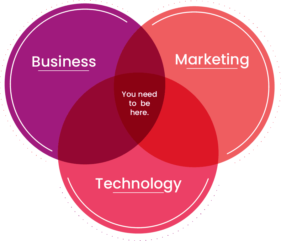
Here’s an example:
Technology
I want to create + customize user friendly landing pages with ease.
Marketing
I want to increase conversion rate from Facebook ads by 25%.
Business
I want 33% more leads on my website compared to 2018.
Make them S.M.A.R.T.
S.M.A.R.T. goals are measurable goals.
The Guiding Principle For Your Website Redesign – Setting S.M.A.R.T. Goals
The goals you have for your business will determine what you need to change in your site. Anybody can pick and choose which page to change; effective website redesign starts during goal-setting.
During goal-setting, it is important to have goals that are specific, measurable, attainable, realistic, and time-bound. This is where data comes in.
Data in the form of key performance indicators give you a measurable yardstick for your efforts. By setting certain targets you can measure numerically, you can have a better idea of how to redesign your site.
For example, let us imagine that you want more leads for your business. This is not a bad goal to have, but it can be tough to measure. After all, your website can have thousands of visitors a day, and not one will signify further interest.
However, by targeting click-through rates and dwell times, you can design your site in a way that encourages navigation. As visitors click on other pages and stay on your site, you will know that you have succeeded. These rates are:
- Measurable
- Specific (not ambiguous)
- Can be achieved
- Can be subject to a time frame
A good example of S.M.A.R.T goals are KPIs or Key Performance Indicators.
If you don’t have specific KPIs yet, now’s the time to think of them.
A vague goal like “I want more conversions” is a good place to start but not where you want to end up. It’s a bad goal because it’s not quantifiable.
Protip
This worksheet has dozens of exercises to ensure you get crystal clear on what you want from your website revamp.
Your Win Condition
A win condition is how you’ll measure the success of your redesign.
…but what is a win condition?
A win condition is the single most important business goal on your list.
The take-it-or-leave-it item on the agenda. The yardstick you’ll use to measure your success. The cake itself.
Ready for the win condition formula?
Win Condition = #1 Most Important Business Goal supported by Marketing + Tech goals.
That’s it.
Protip
Need help identifying your win condition…or want to start at the beginning and hammer out some solid goals? The worksheet for this guidebook has space for all of that.
Additional Considerations
While the previous items cover overarching goals well, there are some specific questions that you and your marketing team should consider as well.
Questions To Ask at the Beginning of the Website Redesign Process
In keeping with the S.M.A.R.T principle, here are some questions worth asking when you plan your site:
- “Who makes up my ideal or current audience?”
- “What pages cause visitors to leave the site?”
- “What numerical metrics can I use to determine the success of my redesign efforts?”
- “What parts of the site receive the most visitors?”
- “What are the design features of the pages that do well?”
(Re)Establishing Brand Persona With a Site Redesign
Presenting your company in a certain light begins with your website. A website can convey your brand persona or identity to visitors. A brand persona can be understood as personality traits you wish to convey to your visitors. It is based on how you want your audience to see your company.
The traits you wish to convey can be represented by changes to your site’s aesthetic and functional features. For example, you would not use red for a color palette if you were marketing sleep aids. Nor would you position online forms away from your landing page if you are selling an emergency service.
The last thing you want is to get slapped in the face with a price tag that’s way above what you imagined.
That’s why you take stock of your resources so you can direct your spending where it counts.
In this chapter, you’ll learn what a website makeover costs and put together a realistic budget for your website redesign project plan.
This shouldn’t be surprising…
But different websites and industries have different needs.
So you might need to calculate your budget differently than someone else.
If you’re an ecommerce venture, jump to the ecommerce budget formula section of this chapter.
Otherwise, keep reading.
Pricing for B2B Websites
There’s no one-size-fits-all for web design pricing.
We prefer to price website redesigns by the value of an improved web presence instead of at standard tiers.
Why?
Because some companies and industries value a strong web presence more than others. A single sticker price ignores that nuance.
…so how can you figure out the value of your business’s web presence?
You’ll need to gather/calculate some numbers first:
1. Total Website Traffic
In other words, how many people visited your site last year?
If you have Google Analytics installed, you can quickly grab this number.
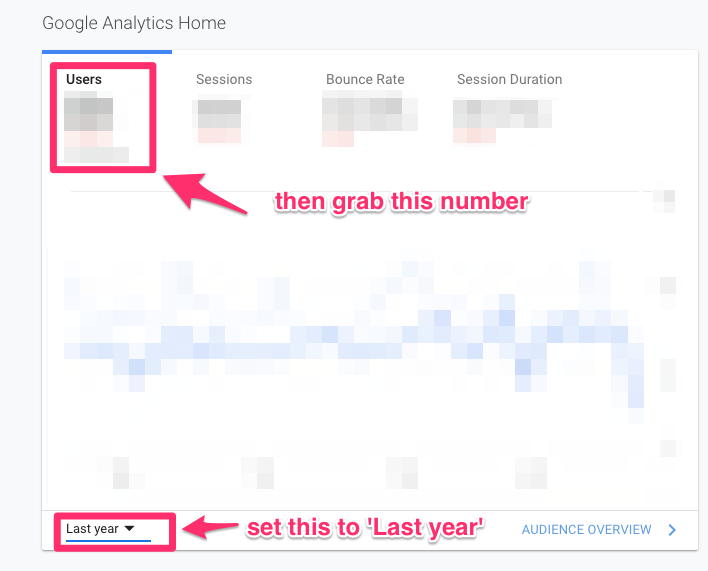
If not, sign up for a free trial of SimilarWeb and grab that number.
(Only want to run this analysis with search engine traffic? Sign up for a free trial of Ahrefs.)
2. Total Number of Customers
Really simple-the total number of customers you served over the past year.
You shouldn’t have to dig too hard to get this number.
3. Top Line Revenue
How much did your business earn last year? (You shouldn’t have to dig too much to get this number, either.)
Now you have 2 choices.
You could try to crunch the numbers by hand…
(Ew.)
…or you can plug them into our website budget calculator and let that do the math.
The Ecommerce Budget Formula
We use an ROI-focused formula in lieu of a fixed number to determine the cost of an ecommerce website redesign project plan.
We’ve used this formula internally at Huemor for years. We call it the “Ecommerce Budget Formula” (EBF).
Let’s hop to it.
You’ll use the following numbers in your calculations:
- Annual ecommerce revenue
- Average product value
- Total number of products
- Total number of customers
- Total number of orders
Additionally, you should list out any necessary 3rd party integrations or other logistical complications you foresee.
This will help you get an accurate idea of what you’ll need to budget for a successful redesign.
If learning about the formula and running the numbers by hand sounds like your idea of a good time, check out our article about ecommerce website costs.
Finding the right fit for a redesign can be the toughest part of the process.
With the thousands of professionals out there, how do you find the right fit for your needs?
We’ll show you exactly how in this chapter.
3 Evaluation Factors
You might already have a partner (or two) in mind.
But a web redesign is a long project. It’s important to find someone who feels like a fit in terms of personality, expertise, and humility.
1. Personality
You’ll work with this vendor for a long time. It’s important that you like them.
An ideal partner will understand and emulate your values. Many agencies list their values on their website; double check that they align with yours.
It’s also important to pay attention to how they treat you-do they show up late? How do they respond to your questions and concerns? Trust your intuition.
There are a lot of web design agencies. If someone gives you a weird vibe, back away and look for someone else.
2. Expertise
Plenty of agencies with impressive portfolios might not be the best fit for you.
Your ideal partner should have some success (re)designing websites in your field.
One company might build an awesome travel agency website but lack the acumen to build a stellar ecommerce website.
Another might not have the A-list clientele you’d like to see but their ecommerce work might speak for itself.
That’s why it’s important to evaluate each potential partner on their own merits and not in competition with each other.
3. Humility
Be adamant about getting the best possible product.
The best agencies to partner with will be humble. They understand that, as the client, your needs come first.
Beware the agency whose ego conflicts with your business interests.
If a vendor immediately talks about their technical prowess or accolades instead of asking you questions about your goals, challenges, or overall strategy, run away. Far away.
That is not the agency you want to manage your website redesign process.
Protip
Need some more help figuring out what you want in a dream partner? Our companion worksheet has several activities to help you get clear on who you want to work with.
Size Matters
How do you choose the best type of partner for you? Here are our recommendations:
Bootstrapped Startups
Less than $1 million/year in revenue
1-5 Employees

You should partner with a freelancer to redesign your existing website. You can find one at:
Exception: If you have a very high-value product/service or a highly unique business, you should consider a specialized agency.
Small Business
$2 – $10 million/year in revenue
5-30 Employees

You should partner with a freelancer to redesign your existing website. You should partner with a small agency instead of a freelancer to manage the project and ensure a cohesive end product. Find one at
Exception: You might be able to get away with several freelancers if your business isn’t complex. But you’ll need clear expectations and good project management to succeed.
Small-to-Midsized Business
$10 – $50 million/year in revenue
30-150 Employees

Consider a small-to-medium-sized agency to tackle your website redesign project plan. We recommend searching through:
At this stage, you probably have sophisticated processes that require some care and thoughtful planning. You’ll need an organized and versatile team.
Mid-market +
More than $50 million/year in revenue
150+ Employees
Consider a large agency that specializes in strategy, design, and development. Look at:
Exception: A small-to-medium-sized agency can still be a strong candidate if their personality, expertise, and values match your needs. Don’t rule them out!d agency.
Talk to Existing Customers
You know the best way to vet someone?
Talk to their previous customers or clients.
Chances are you’ll talk to someone who had a great experience. Awesome! Ask them about how they worked with this agency you’re considering. Would they recommend them to you?
That should give you a sense of whether this arrangement will work.
Protip
Don’t know which questions to ask? Don’t worry-we prepared a few on your worksheet.
Wrapping Up
That’s your ultimate website redesign project planning guide.
After you download the worksheet and complete the activities, you’ll have clear goals, a good idea for a budget, and a list of potential vendors to get started with.
Now we want to turn it over to you: what did you think about this guide? What questions do you still have? Do you have additional advice for redesigning your website? Let us know in the comment section below.
BTW, if you’ve found this guide helpful and you’re gearing up for a website redesign, feel free to also check out our website design RFP guide. We outline a number of helpful tips for creating an RFP that will weed out low performing agencies and find your perfect partner.
PS. If you’re curious how we could help you out with our website redesign services, don’t hesitate to reach out!
Get Memorable Insights.
Sign up to receive actionable web design advice directly in your inbox monthly.
Get Memorable Insights.
Sign up to receive actionable web design advice directly in your inbox monthly.
Author
Jeff Gapinski is the President of Huemor where he helps plan the long-term strategic growth of the agency. Jeff is passionate about UI/UX, demand generation, and digital strategy.
What Do You Think?
Have feedback? Maybe some questions? Whatever it is, we'd love to hear from you.




No comments found