Design
11 minute read
Shopify Image Size Requirements: What You Need to Know.
LAST UPDATED:
March 20, 2024


Optimizing Shopify image sizes is important.
Let’s face it: visuals can make or break your Shopify website design. Get them right, and you have your audience’s attention. Get them wrong, and they might just jump ship.
View the ecommerce web design of an iconic brand like Apple or Nike, and check out how the images grab you from the start. That’s your goal post. The right images drive your audience down the funnel, generating leads and customers almost on their own. The right image dimension is a key part of this, as it keeps each image loading fast while looking great.
In this post, we’ll focus on Shopify image sizes, and how you can improve your visuals to convince and convert your audience.
Before You Proceed
We created this comprehensive guide for store owners/managers who like to get their hands dirty.
If you’re not ready, or prepared to DIY, we suggest checking out our DFY (done for you) service specalized in speeding up Shopify E-commerce websites.
You want to go big, but you can’t go too big. So let’s start there. Shopify allows you to upload images of up to 4,472 by 4,472 pixels, with an allowed file size of up to 20 megabytes (MB).
You should stay well below the maximum. Shopify recommends 2048 by 2048 pixel images for square product photos, for example. At that size, images are still high-resolution and will give your ecommerce store a professional, sleek look.
Extra-large Shopify product images, blog images, and other images slow your site’s load times and hinder your UX. A fast Shopify website is paramount for conversions. The key is to find the best compromise between image size and image quality.
It’s 2022. That means your optimized images need to look good not just on a regular or traditional computer screen. They need to display in high quality everywhere. Technologies like Apple’s retina display and other high DPI devices demand high resolution image format.
Starting in 2011 with the iPhone 4S, smartphones, in general, have continued to improve display quality. To make sure your Shopify logo image or feature image is just as sharp on that new Pixel or Galaxy as it is on a desktop, you need high resolution images (aka Retina images).
How to Create Retina-Ready Shopify Product Images
Creating a retina-ready Shopify product image is quite simple. You’ll need to start by understanding what the native display for a recommended Shopify image on your website may be. I suggest you start by installing a ruler tool for your web browser like Page Ruler Redux for Google Chrome.
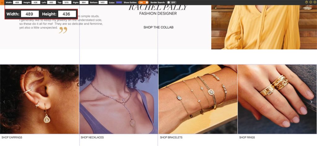
Next, turn on the page ruler tool and measure the image you’d like to convert to a retina Shopify image. For our example, the display size is 489×340.
Retina image sizes will be 2x the native image display. So using our example, we’ll need to save an image at 604×680 to maintain the right aspect ratio.
How to Create Retina Ready Icons and Logos
You could use the same approach we’ve outlined above for other images for icons and logos. However, we’d actually suggest approaching it a little differently.
SVGs (Scalable Vector Graphics) is a lossless image file format that you can use for icons and logos instead of something like JPGs or PNGs.
Due to the fact that these are lossless, they’re natively retina friendly because they’re designed to scale. Even better, SVGs file size tend to be smaller than JPGs or PNGs on average.
So if you’re purchasing a pack of icons, first check if they offer SVG versions of those icons. Same goes for obtaining press or partner logos, try to find an SVG variant if you could.
If you already have a batch of icons and logos in PNG or JPG format without an option for SVG you could use a service like this one to easily convert the files to SVG.
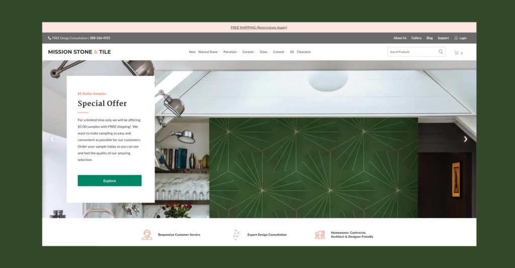
Your Shopify hero banner tends to be the biggest visual on your website. It’s where you get to show off your brand and products in a visually engaging way. Use it.
According to Stat Counter, the most common Shopify banner image size for desktop, worldwide is as follows:
- 1366×768 (23.27%)
- 1920×1080 (20.53%)
- 1536×864 (8.47%)
- 1440×900 (6.55%)
- 1280×720 (4.73%)
- 1600×900 (4.19%)
We suggest optimizing your Shopify hero banner for the largest screen size (1920×1080).
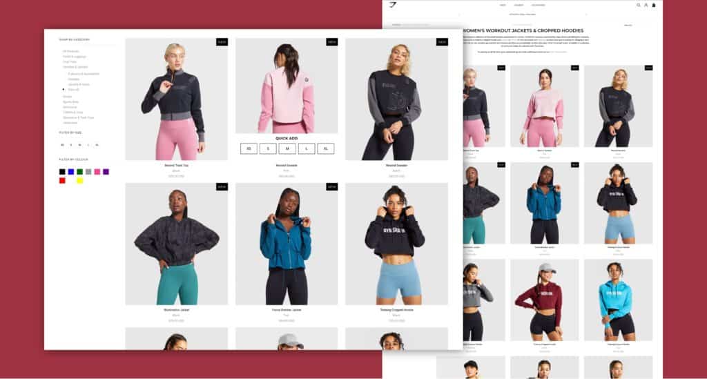
You need to optimize your Shopify image for each product you sell on the platform. You might think that Shopify product image sizes don’t matter because they show as thumbnails. But that’s a little too simplistic.
Shopify recommends square images for products, 2,048 pixels in width and height. Personally, we feel this is overkill in most cases.
In most cases Shopify automatically will display the website images in a square format at around 300×300 or 600x600px. Using the benchmarks we notated above for sizing requirements of retina images, this means you’d want the photo size of your product thumbnails to be somewhere between 600px to 1200px in both width and height.
The only exception to this rule would be if you chose to use a zoom feature for products to focus on product details. If you choose to implement a feature like that because it aligns with your products (think fashion, leather goods, ornate goods etc.) then the recommended size of 2,040px will be appropriate.
You might want Shopify slideshow images for various parts of your website. If you do, you have to be careful about the slideshow image size. Sliders should stand out, capturing your audience’s attention, much like a single hero banner image. However, it’s easy to overload these banners.
Sliders Used For Hero Banners
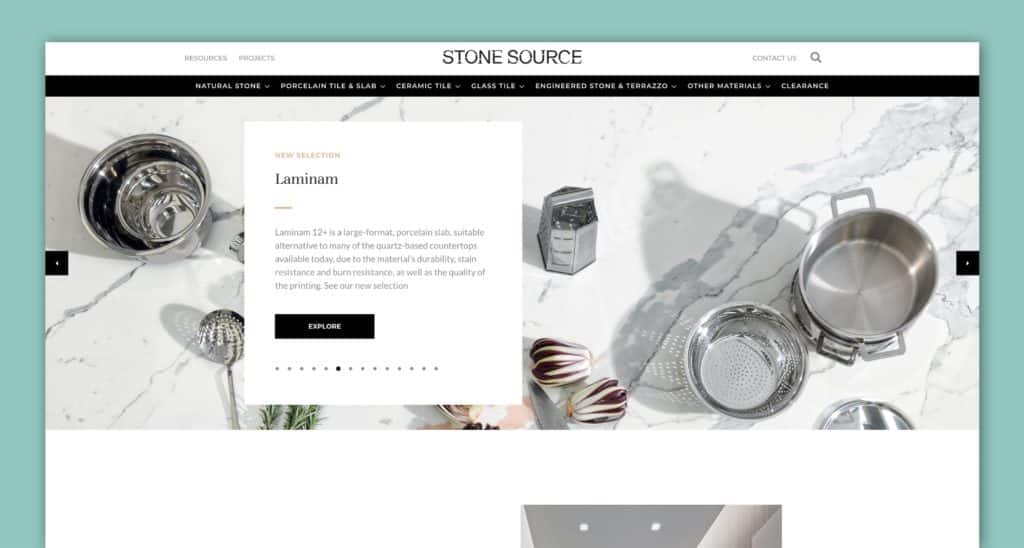
If you’re choosing to use a slider for the hero section of your homepage, or other key pages on your website we’d encourage you to limit the number of slides you use to 3. This should strike a nice balance between optionality but also manage the overall weight of the page.
From a dimensions perspective, we’d suggest sticking to the 1920×1080 figure referenced above for Shopify banner images.
Slider Used For Products
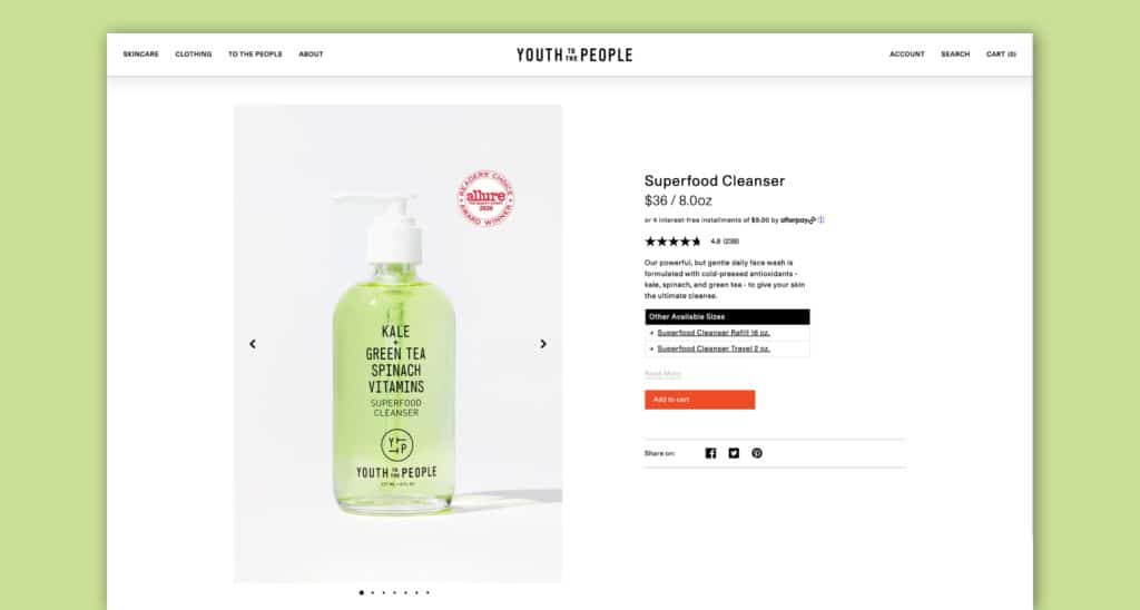
It’s not uncommon to want to use a Shopify slideshow for your product pages. These could be used to highlight a combination of product photos from multiple angles, or lifestyle shots of the product. Similar to the hero banners, you do need to be mindful of how many slideshow images you choose to include. Since these images tend to be smaller, we’d suggest a maximum of 6 images per slide.
From a dimensions perspective, we’d suggest sticking to the ideal Shopify 600-1200px figure referenced above for product images.
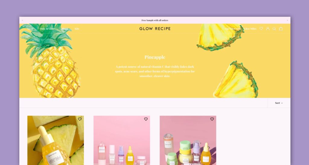
In the Shopify web development ecosystem, categories are called Shopify collections; they’re a group of products that belong together in some way. Many audiences will visit a collection to see the scope of products you offer.
A Shopify collection, ideally, needs a header. As with the Shopify slideshow image size recommendation, that header image should be at least 1,600 pixels wide to stretch across the screen. But a short vertical height is just as vital; the more panoramic the image, the less it will interfere with actual product depictions.
With basic dimensions out of the way, let’s talk about some basic best practices on how to properly optimize your visuals on any Shopify page.
That starts with consistency. All images on your website should be “of a piece,” so it might make sense to bring in a photographer who can take care of that for you.
If your business depends on online sales, avoid the urge to perform the photography yourself unless you’re professionally qualified. The investment in a professional tends to pay off.
If you don’t already know one, a product photographer is relatively easy to source. Online marketplaces like Thumbtack and Upwork are great places to find freelancers. Just make sure you ask for samples of past work to gauge their quality. Your web developer may also have photographers they trust.
Beyond your products, you’ll want to think about some more esoteric photography as well. Your homepage heroes, sliders, and category headers all deserve some special attention here.
Lifestyle imagery, as long as it fits your brand, could be a good match for these. Done right, they should put your product in action and give your target audience an easy reference point of seeing themselves. Just make sure it’s relevant to the message you’re trying to convey.
Depending on your web design aesthetic, you might also be tempted by a Shopify background image. But be careful: it only makes sense if the visual is simple, and doesn’t take away from the core message you’re trying to convey.
The best background image means little if it’s too busy or distracts from the main content. And you definitely want to make sure that your text remains easily readable.
Speaking of text: avoid adding text to images when you can. Instead, use HTML or CSS coding to create a text overlay, which makes your site more ADA accessible and improves UX. It also makes the text easier to manipulate and update with the image in place.
Here’s a common mistake: people skip image optimization completely.
You upload images that are so huge your user’s browser has to scale them down when it loads the page.
This is a huge drag on your load time. Especially for mobile devices: it drags down their loading speed massively.
In fact, you want smaller images and smaller Shopify image file sizes, especially for mobile.
First, know that Shopify recommends using 2048 x 2048 pixels for product photos. If your images are larger than that, they’re prime candidates for dimension reduction.
The good news is that resizing them is a cinch. Shopify automatically resizes your images to fit smaller screens, but certain images can sometimes require manual editing. Here’s how to do that:
Option #1: Use Shopify’s Image Resizer
Shopify’s image optimization tool is an amazing option.
First, navigate to Shopify’s Image Resizer tool.
Upload the photo you want to resize.
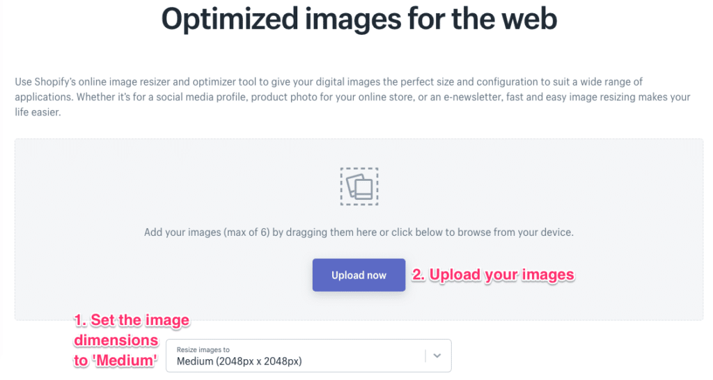
Then click “Submit.”
If it was successful, you can download the resized image.
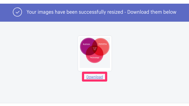
Now all you have to do is replace them on your Shopify store.
Option #2: Resize Images with Photoshop
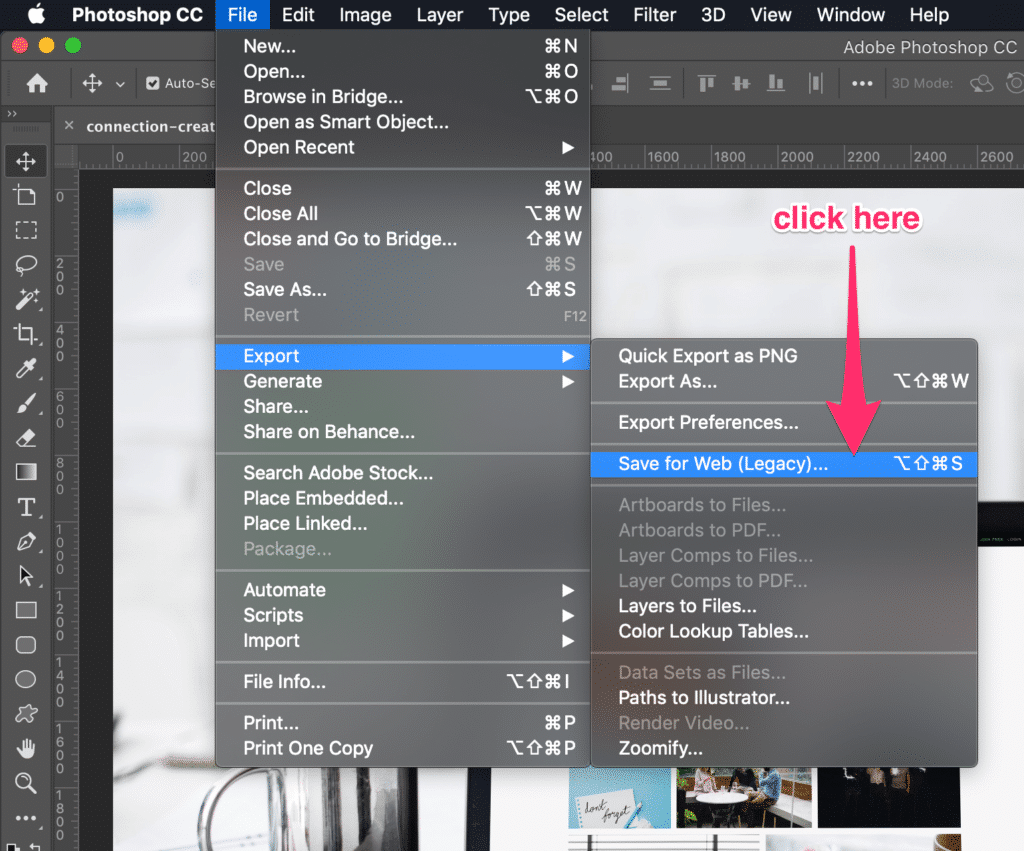
Of course, if you’re using Photoshop to edit your product photos, you can also ensure they’re the proper dimensions before sending them off.
First, open your image in Photoshop.
Then to go to File –> Export –> Save for Web (Legacy)
A new modal will pop up where you can specify dimensions, among other things for image optimization.
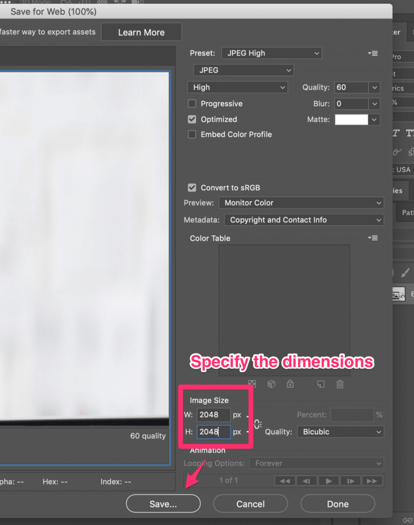
Then click “Save.” All done!
Over to you: how do you use images on Shopify and other ecommerce websites? Have you discovered some image sizes that work particularly well in showcasing your product and brand? Share your thoughts in the comments, or shoot us a note.
Thinking about growing your business on Shopify? Here are some additional resources and information. If you have further questions don’t hesitate to reach out.
Shopify Image Best Practices and FAQ
Here we cover common questions about Shopify images and other Shopify topics.
What size should product images be?
If you’re selling products online, high-quality product photos are essential. With that in mind, here are a few pro tips for meeting common image requirements for major e-tailers.
First, most stores require sizing for your Shopify product images to be at least 500 x 500 pixels. For best results, aim for an image size of 1000 x 1000 pixels or more.
The image size recommended by Amazon is at least 1000 x 1000, and Walmart recommends 2000 x 2000 for the best zoom function with different devices.
Second, the most popular image type is JPG, but other common file types include TIFF, JPEG, PNG files, and BMP.
Third, the most common aspect ratio is square (1:1), but some sites or specific departments may require portrait orientations. Finally, different e-tailers allow different numbers of product images, but a good rule of thumb is to use at least four or more.
Pro tip: Following these straightforward image requirements from the start will save you a lot of time and money down the road.
Do you redesign Shopify ecommerce stores?
Yes, we provide website redesign services for Shopify stores, as well as for WordPress websites, Drupal websites, HubSpot websites, and WooCommerce stores.
What is the file size for Shopify?
Large image files can weigh down your site, slow your page loading times, and affect your visitor’s shopping experience—even if they don’t realize it. That’s why it’s important to optimize Shopify images. Use these tips to ensure your image file sizes are just right:
- Start with high-quality images. The better the quality of your original image, the less compression and resizing you’ll need to do (which can often lead to a loss in quality).
- Use an automated tool like ImageOptim (for Mac) or JPEGMini (for Windows) to optimize your images for the web. A tool like that compresses your images and helps reduce file size without compromising quality.
What aspect ratio is best for Shopify?
When it comes to Shopify, the ideal aspect ratio for product images is 1:1. This ensures that your images are perfectly square, which is optimal for display on all devices. With a 1:1 aspect ratio, you’ll never have to worry about your product images being stretched or distorted. The best aspect ratio for hero or homepage images is 16:9, which means they should be landscape.
In general, you want to avoid using images with a lot of empty space around the subject. This can make your product appear small and unimportant. Instead, try to fill the frame as much as possible with your product.
If you need to use additional images to show off different features, consider using a carousel feature on your product page.
Does Shopify automatically resize images?
To keep load times fast, Shopify automatically compresses the images when they’re displayed on your online store. Compressing an image means reducing the file size to allow for faster page loading.
When you upload images to your Shopify website, it automatically generates multiple versions of that image in various sizes. This is so that your images will look sharp no matter what device they’re being viewed on – from a small mobile phone screen to a large desktop monitor.
Are stock images bad for SEO?
SEO image best practices are to always use original images when possible. Google’s advanced image recognition capabilities have most likely catalogued that sleek stock photo you’re eyeing. When you use it, Google will automatically classify it as having been used elsewhere on the web. Studies indicate that original images outperform stock images, so you’re better off going that route when possible.
Further Reading On Shopify Website Design and Development
Looking for ecommerce web development and design inspiration? These articles should help.
- Get our micro Shopify speed audit
- Top Shopify speed optimization tips
- Reasons brands move from Magento to Shopify Plus
- Our Shopify speed guide checklist
- Design Essentials for Ecommerce Conversion
- Ecommerce Web Design Tips You Need to Boost Sales
- Proven Ways to Boost Your Mobile Ecommerce Conversion Rate
- Tips to Make Your Ecommerce Business Successful
- Our top picks for the best Shopify stores
- How to Create a Compelling Case Study
- How To Create A Careers Page Design That Attracts Talent
- 24 Great Website Examples for 2022
Get Memorable Insights.
Sign up to receive actionable web design advice directly in your inbox monthly.
Get Memorable Insights.
Sign up to receive actionable web design advice directly in your inbox monthly.
Author
Jeff Gapinski is the President of Huemor where he helps plan the long-term strategic growth of the agency. Jeff is passionate about UI/UX, demand generation, and digital strategy.
What Do You Think?
Have feedback? Maybe some questions? Whatever it is, we'd love to hear from you.


No comments found