Conversion Optimization
14 minute read
How To Improve Mobile Ecommerce Conversion Rate.
LAST UPDATED:
July 11, 2023


It’s no secret that more and more people are shopping on their mobile devices.
Last year, a third of all online purchases were made via mobile devices, and on Black Friday, Cyber Monday, and the holiday season, mobile sales made up 40% and 54% of total online retail sales.
So if you’re an ecommerce store owner, it’s essential to make sure your ecommerce site is optimized for mobile browsing. Otherwise, you’ll miss out on a lot of potential sales.
Fortunately, there are several things you can do to improve your mobile conversion rate.
In this blog post, we’ll discuss some of the most effective tactics for increasing mobile conversion rates. Keep reading to learn more!
Your ecommerce conversion rate is the number of conversions divided by the number of visitors, multiplied by 100. If you get 100 visitors, and out of those you get 4 purchases, your conversion rate is 4%.
The conversion rate is a key metric for businesses to track, as it indicates how well they are doing at turning web traffic into paying customers.
There are a number of factors that can influence the conversion rate, such as the website design, the quality of the product, and the price. Conversion rates can be improved by using A/B tests for different versions of the website and by providing users with an incentive to convert, such as a discount or free shipping.
By tracking and improving the conversion rate, businesses can increase their sales and revenue.
The ecommerce conversion rate benchmark across all ecommerce sectors in the United States is between 2.5% and 3%, according to BigCommerce.
Shopify, in the meantime, reports that “the average ecommerce conversion rate for Shopify stores is 1.4%.”
One basic definition of a good ecommerce conversion rate would be one that is higher than the average conversion rate for ecommerce businesses–or higher than 3%.
To really understand what is a good ecommerce conversion rate for your industry, you’ll need to benchmark your industry’s average—not just the aggregated average of all industries combined.
Ecommerce Conversion Rates by Industry
Ecommerce conversion rate benchmarks vary for different industries, so if you want to compare your own ecommerce website’s conversion rate with someone else’s, here are conversion rate benchmarks from different industries.
- Food and drink: 0.90% – 1.00%
- Baby and child: 0.71% – 0.87%
- Fashion, clothing, and accessories: 1.01% – 1.41%
- Kitchen and home appliances: 1.61% – 1.72%
- Health and wellbeing: 1.87% – 2.02%
- Sports and recreation: 1.18%
- Electrical and commercial equipment: 2.49% – 2.70%
What Is The Ecommerce Conversion Rate Formula?
The ecommerce conversion rate formula is as follows:
Conversions ÷ visitors * 100 = conversion rate.
In simple terms, your conversion rate is the number of conversions (usually sales) on your website, divided by the total number of visitors, times 100.
To calculate the ecommerce conversion rate, you first need to track how many people visit your website and then track how many of those visitors make a purchase.
You can use various tools to track this information, such as Google Analytics or Kissmetrics. Once you have this data, you can calculate your ecommerce conversion rate.
If you want to get a more accurate picture of your ecommerce conversion rate, you can also include average add-to-basket rates. This will tell you what percentage of visitors add items to their cart, and can be a useful metric for understanding the customer journey, and find out where people are dropping off in your conversion funnel.
Additionally, including cart and abandoned cart rates can give you further insight into why people aren’t completing their purchase.
As the world becomes increasingly digitized, businesses are feeling pressure to optimize their online shops for both desktop and mobile shopping.
The desktop experience is still important for many users, especially when it comes to making purchasing decisions.
A mobile shopper, on the other hand, is constantly on the go and may not have the time or patience to navigate complicated websites.
Should you optimize for desktop over mobile, or vice versa?
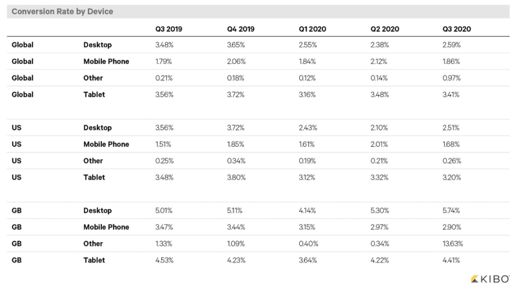
Let’s take a quick look at these graphs below which highlight average ecommerce conversion rates by device:
If you build or manage ecommerce stores, you’re probably aware that mobile use is increasing at a very rapid rate.
However, data based on more than 1.9 billion shopping sessions collected by Monetate, clearly shows that ‘traditional’ (aka desktop) web users have decreased in terms of conversion rates.
So, that brings up the question: How do we increase mobile conversion rates for smartphone users?

I think we need to start to answer the question of “How do we improve the average mobile ecommerce conversions?” by first identifying what desktop experiences do really well.
- Internet connectivity on desktop experiences tends to be strong, thus allowing pages and assets to load quickly
- The main menu is often robust, with multiple category options
- Search bars are large and prominent
- Product category feeds often contain multiple products which are visible at once, as well as advanced filter options
- Product images tend to be large including detailed product description
- Social proof is also often included on desktop experiences, in the form of customer reviews or ratings
- The shopping cart and the payment options are usually easy to access, and calls to action are clear and visible.
Despite the fact that trends for mobile use continue to rise year over year, many continue to build platforms for desktops first because it’s more comfortable and familiar than the alternative.
Web Teams, In General, Have More Experience With Desktop Websites
The rate of online shoppers is constantly increasing. They are now accustomed to buying everything from clothes to groceries online. However, a big percentage of them are used to the standard layout of a desktop website.
The truth of the matter is, that we’ve had more shopping experience working with the desktop computing platform because it’s been around longer.
The psychological triggers that entice customers to buy are more pronounced on the desktop. It’s easier to include “fear of missing out” (FOMO) and other psychological marketing tactics when shoppers are using a larger screen.
As a result, web experiences have effectively been standardized on the traditional platform. Consumers know what to expect. They know where to go. They understand how to operate a desktop website with little learning required.
Traditional Platforms On Average, Have Better Connectivity
Furthermore, wifi/ethernet is a much more stable environment to shop on.
Now, I’m not saying that this type of customer experience is exclusive to desktop and laptop computers, but it’s almost always a given when using these devices.
It’s been proven, through a number of studies, that quicker load times increase conversion rates.
Until wireless internet connections stabilize further, traditional devices will always inherently have an edge over mobile phones.
Bigger Screens = More Opportunity
Lastly, space is a huge advantage. UI designers can get away with a lot more on a desktop device simply due to the fact that the canvas to work with is larger. Bigger images, more menus, more product pages and onpage product recommendations can be seen as an enhancement to the online shoppers’ experience.
Barriers And Hurdles For Smartphones
Despite the constant advancement of technology, many of these things are limitations of the smartphones that have to be worked around.
- Computing power on mobile devices is not as strong as on traditional platforms
- Wireless connectivity for many is unreliable at best
- The platform limits how much space you have to work with
- Due to how rapidly devices and operating systems change, there is a much wider net to what defines a mobile user
- Mobile users are typically experiencing more than one instance of media at any given time
We’re not trying to knock smartphone manufacturers. They’re developing products that have literally revolutionized how modern society works.
That said, desktops offer better digital experiences to shoppers. There still seems to be a pretty big lack of mobile standardization and functionality which forces us, as ecommerce website developers, to discover effective workarounds.

So, despite the deck being seemingly loaded in traditional computing’s favor, there is still a lot of hope for smartphones to match or increase conversion rates.
Now that we know why traditional platforms have an advantage, and where smartphones fall short, let’s discuss how we, as store owners and store creators, can make improvements that in turn, improve mobile conversion rates.
This becomes less about UI hacks and tricks, and more about removing impediments to conversions.
Prioritize Website Performance Above All Else
The biggest hindrance to mobile ecommerce conversions is website performance. Slow to load, laggy mobile experiences kill the user’s drive to use the website.
Ensuring website assets are as compressed as possible should be a given.
Using tools such as Kraken to shrink images down in bulk can immediately create an uptick in mobile conversion rate optimization. Also ensuring CSS/Javascript/HTML is compressed where necessary is a big deal.
Protip
If you have a Shopify website, you should definitely check out our article focused on how to speed up your Shopify store.
Don’t Just Focus On File Size, Focus On Requests Too
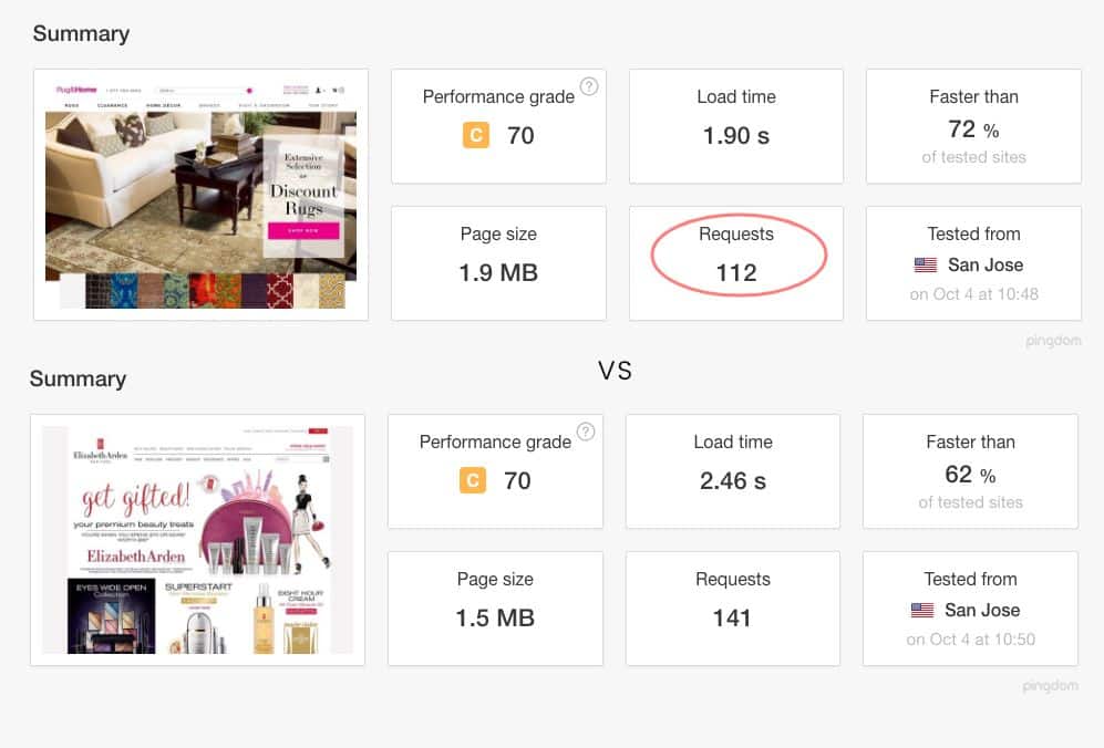
Despite the fact that the Rug & Home home page is 25% larger, it still loads .5s faster on average than the Elizabeth Arden UK site. Why?
What often goes overlooked is the number of requests a website must make in order to fully render the page. To explain it simply, each request requires the session to loop, drawing on the server and the ISP. Each loop takes time, and that time can add up quickly.
This problem is often more difficult to fix, as all on-page assets such as images, video, scripts, and style sheets create these loops.
It’s easy for ecommerce websites to get out of control with these types of assets, after all, your average online store usually requires many third-party tools to run smoothly (shipping, fulfillment, marketing, etc). It’s also common that over time this issue becomes exaggerated as things get tacked onto the platform.
Careful design and development planning can help combat these issues by prioritizing doing more with less from the get-go. Regular audits of the website’s performance should be made over time to ensure that these things are in line and the website is as lean as possible.
Your average users typically have their attention split across multiple channels at any given time. Many users may be in transit, such as a car, train, or plane. Or sitting on their couch with the TV in the background unwinding from a long day.

Phones are often a source of people’s entertainment, but not the sole focus. This often creates a passive mindset to purchasing, which naturally drives down average mobile conversion rate of online stores.
Since they’re interested, but not necessarily ready to buy, we need to prioritize the creation of user experiences that allow customers’ interest to peak, increase the clickthrough rate, and facilitate a longer buying process.
Optimize How Your Products Are Displayed On Category Pages
Most mobile websites default to a single-column view of category pages. This optimizes the size of the product’s thumbnail photo but diminishes the ability to quickly browse through various products. For many online retailers, we’ve found that displaying products in two columns rather than one actually increases the average session duration overall for our customers.
If you have a product that can work as a smaller thumbnail, take advantage of the device’s screen space and reduce the size of the thumbnails to get more product recommendations in front of your customer per scroll.

Make It Easy To Save Orders
Also, keeping within the mindset of an in-transit potential customer, the ability for customers to save their orders easily and effectively is critical. They may find a few items they like on their initial pass-through but won’t have the time or availability to make the purchase on the spot.

A persistent cart, and even better yet, e-mail notification for shopping cart abandonment can go a long way toward catching this customer when they do have the availability to make their purchase leading to higher average order values and more loyal customers.
Be Diligent With Providing Clear Tactile Response
“Tactile Response” is a fancy way of saying: Every action has a reaction.
In ecommerce, tactile response ensures that users are being rewarded for their actions on the website. It also has been proven to improve order accuracy. Tactile response is especially important when it comes to interacting with the checkout process.
If someone adds something to their cart, they need an obvious visual cue to ensure that the product has been added successfully.
If someone completes form fields, there should be visual indicators that those fields are valid. Lastly, if someone submits their order, there should be a clear indication that the order has been received.
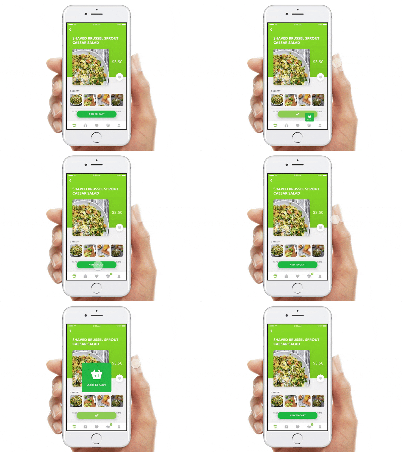
By adding things like discount code or free shipping offers, you can increase the likelihood that a user will complete their purchase. Similarly, using visual cues like progress bars can let users know that they are making progress and help to keep them engaged.
This digital marketing strategy is important for all modes of shopping (traditional, tablet, and mobile) but we find it even more important for increasing average mobile conversions because we’re dealing with an ecosystem that’s limited by poor connectivity.
Sometimes an action might fail due to a network connection dropping momentarily, strong tactile cues make it clear for the user when that happens, and if they should try to submit their order again.
Consider Updating Your Stores Platform

In the last 10 years, many improvements have been made to improve how ecommerce platforms perform. Shopify websites, and other modern templating systems, provide structural advantages to online stores and help improve their benchmarks.
If your store was built more than 5 years ago, it’s time to consider a website redesign. A cleanly built website on a modern platform will most likely have a dramatic impact on performance improvements over a legacy system.
Since page speed is such a huge factor in buying decisions, this alone could create a solid increase in mobile ecommerce conversion rates for your store.
Desktop and tablet experiences still outperform average mobile conversion rates by double or greater. There are a number of limiting factors surrounding technology that inhibit the full potential of smartphone conversion rates.
However, there are a number of fundamental issues with ecommerce platforms today that can be corrected to optimize average mobile conversion rates on smartphones.
Also, understanding how, and when customers use their smartphones to shop is also key to raising conversion rates.
Start with a clear plan for your store, avoid common web design mistakes, and learn how to easily optimize your ecommerce conversion funnel both for desktop and mobile.
Here are some best practices and further info on mobile ecommerce conversion rate, web development and website design. If you have further questions, don’t hesitate to reach out.
Mobile Ecommerce Conversion Rate FAQ
Questions about how to improve your mobile ecommerce conversion rate? We try to answer them here.
What’s a good conversion rate for ecommerce?
There’s no one answer to the question of what’s a good conversion rate for ecommerce, as it can vary depending on factors such as the product being sold and the target audience.
However, a general guideline is that a conversion rate of 2-3% is considered good, while a rate of 5% or more is considered excellent. Of course, these are just averages, and some businesses may convert at rates above or below these benchmarks.
Ultimately, the best way to determine whether your conversion rate is good or not is to track it over time and compare it against your goals. If you’re seeing a consistent increase in conversion rates, then you’re on the right track.
What is a good conversion rate for mobile apps?
A conversion rate is the percentage of users who take a desired action, such as making a purchase or signing up for a newsletter.
When it comes to mobile apps, the average conversion rate is about 2-3%. Of course, conversion rates can vary depending on the type of app and the nature of the desired action.
For example, apps that are designed to be used for a specific purchase (such as an airline ticket or a hotel room) will typically have higher conversion rates than general-purpose apps.
Conversion rates can be affected by factors such as the price of the product or service and the user’s level of interest in the app.
Ultimately, there is no “perfect” conversion rate for mobile apps; instead, it is important to track conversion rates over time and look for ways to improve them.
What is a mobile conversion rate?
The mobile conversion rate is the percentage of mobile users who take a desired action, such as making a purchase, signing up for a newsletter, or downloading a mobile app.
Mobile conversion rates can be affected by a number of factors, including the design of the mobile website, the user experience, and the perceived value of the product or service being offered.
In order to maximize the mobile conversion rate, businesses need to focus on creating a seamless user experience and ensuring that mobile users can easily find what they’re looking for.
Is a 30% conversion rate good?
Yes, a 30% conversion rate is very good for almost any industry for sales.
However, if the conversion rate is the percentage of visitors who sign up for a newsletter, then a 30% conversion rate would be considered less stunning.
In general, a high conversion rate is indicative of a successful marketing campaign or product, while a low conversion rate can indicate that improvements are needed.
It is also worth noting that conversion rates can vary significantly depending on the industry.
For example, the average conversion rate for ecommerce websites is around 2-3%, while the average conversion rate for lead generation websites is around 10-15%. As such, it is important to compare the conversion rate to others in the same industry in order to get an accurate gauge of its success.
Overall, whether or not a 30% conversion rate is good depends on the context in which it is measured.
Further Reading On Website Design and Development.
Looking for web development and design inspiration? These articles should help.
- How Much Does It Cost to Build a Website?
- A Step-by-Step Website Redesign Project Plan
- Our Approach to WooCommerce Web Design
- How to Build a Web Design System
- WooCommerce Web Design with Huemor
- WooCommerce vs Shopify: Who Comes Out as a Winner?
- Our Approach to WordPress Web Design
- Choosing the Right Product Metrics Using UX Research Process
- Our Top Retail Website Examples
- Understanding Web Design and Web Development
- Our Top Beauty Website Examples
- Our Shopify Speed Guide Checklist
- Guide to Optimizing Shopify Image sizes
- Our Service Page Layout Examples
- Best SaaS Websites of 2022
- Our Approach to HubSpot Website Design
- New Website SEO Foundations
- Our Approach to Startup Website Design and Development
- WordPress Performance Optimization Best Practices
- 100 Ecommerce Website Design Tips
- How to Use Dynamic Website Content
- How to Design a Good About Us Page
- All About SaaS Website Design
- How We Approach Drupal Website Design and Development
Get Memorable Insights.
Sign up to receive actionable web design advice directly in your inbox monthly.
Get Memorable Insights.
Sign up to receive actionable web design advice directly in your inbox monthly.
Author
Jeff Gapinski is the President of Huemor where he helps plan the long-term strategic growth of the agency. Jeff is passionate about UI/UX, demand generation, and digital strategy.
What Do You Think?
Have feedback? Maybe some questions? Whatever it is, we'd love to hear from you.





No comments found