Design
20 minute read
The Best About Us Page Design: 15 Examples.
LAST UPDATED:
January 30, 2024

In general, your website design choices should be all about your customers.
Except in a few cases when it has to be about you. And when it’s about you, you really have to get it right.
While it’s great to touch on these points on your homepage design, you’ll need a dedicated area of your small business, B2B or ecommerce website to expand on them to really get the points across.
What do you absolutely need your website visitors to know about you? What single takeaway should they have about your brand? What’s the essence of your business and the reason it exists? Your about us page should answer all of these questions.
In short and compelling content, that about us page design needs to accomplish a few things:
- Tell your brand story
- Help your target audience understand why they need to buy from you
- Put a face (or faces) to your business
- Establish credibility through your accomplishments
You’re not alone. Every business, regardless of industry, has a page designed to hit these marks. That’s why we’ll start this guide with some of our favorite examples across industries before helping you learn how to write and design a great about us page.
We’re big proponents of ‘show, don’t tell’, so as a starting point we’ve gathered 15+ about page examples spanning across multiple industries.
As you go through these examples you’ll notice they are vastly different in terms of contents, interface design, and positioning, yet, each Shopify website design or WordPress website is uniquely effective.
We’ll talk about how to narrow down to what makes the most sense to highlight for your online store or B2B website design in chapter two.
Let’s get started…
About Us Page Examples
Cellular Agriculture Society
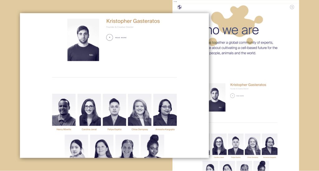
The Cellular Agriculture Society’s WordPress web design includes a stellar about us page. What we love:
- The opening value proposition statement is super clear and lets us know exactly what this organization does.
- The subtle idol animations in the background are a nice nod to cellular movement. The added interactivity with mouse movement also makes you want to engage with the page immediately.
- Each web design element on the page meant to be interacted with has a micro-interaction associated with it to let you know it’s clickable.
- They do a great job of highlighting their partner program in distinct sections.
- They provide you with a step-by-step guide at the end of the page to give you the confidence you need to take action.(Get Involved)
Bonfire Red
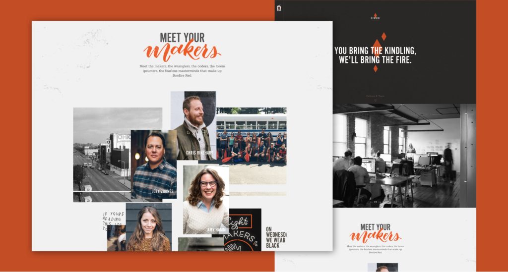
Bonfire Red’s about us page design is a great example for a brand looking to show off their brand’s value, people and culture. What we love:
- The key element of their website development is their opening statement, which is ethos focused and does a good job of explaining what their core values stand for.
- The photo section is really well done. The scrapbook UI design works really well with the photos they’ve chosen to display. Each shot shows a good deal of personality.
- The use of motion via gifs is well done and not over the top.
Laracon
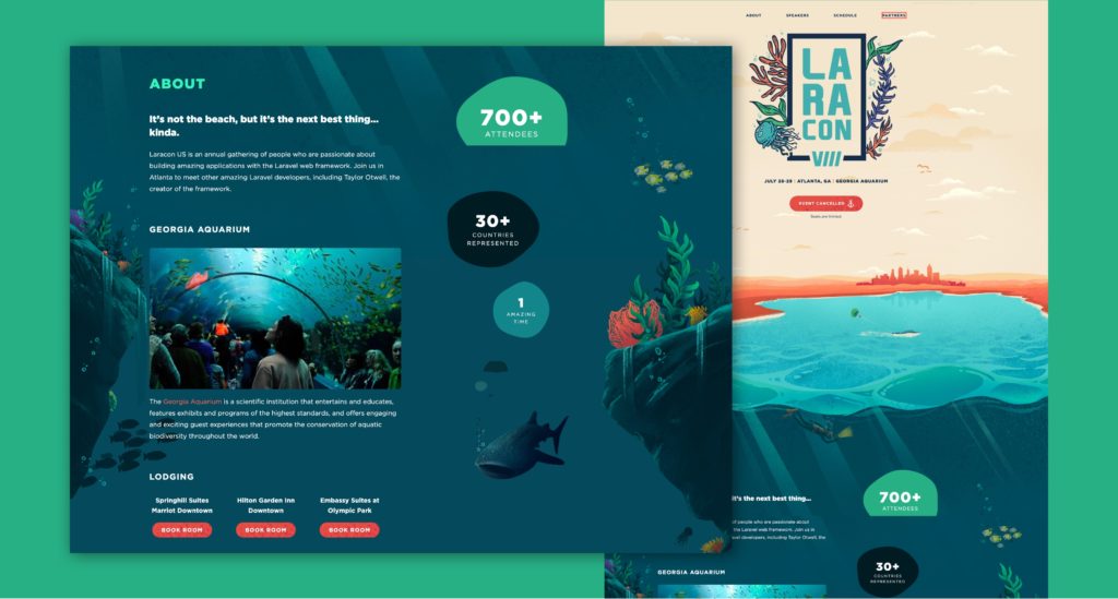
Laracon’s about us page design literally takes you on a deep dive of what the event is all about. What we love:
- From top to bottom the page is presented with unified design patterns through the use of illustration.
- Very quickly they introduce the key information about the event itself.
- Throughout the page they’re using motion subtly to build on the narrative and keep people scrolling.
- Despite being illustrated and animated, it doesn’t feel completely over the top.
Plug & Play
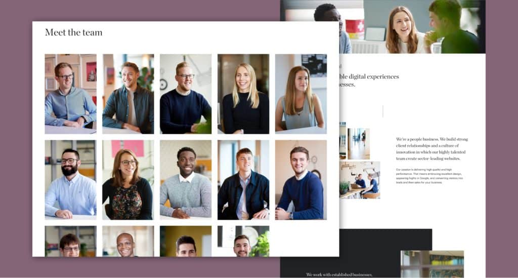
Plug & Play’s design is a great example of what a B2B website’s about page should look like. What we love:
- Copy throughout the page does a good job of explaining their business ideas, but ultimately, is client focused. The design of the about us page reflects their purpose, and the homepage content reinforces their message.
- They do a good job of identifying who they work best with.
- Photos used throughout the page have a nice balance of personality and professionalism.
- They’re touching on a lot of the key website design standard techniques a B2B business should focus on: mission, people, clients, and past success stories.
Basic
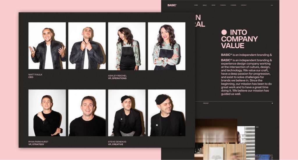
At first glance, Basic’s about us page design may seem simplistic. However, upon closer inspection it is clear that a great deal of thought and care has gone into making this an effective agency website design. What we love:
- An immediate focus on ethos and mission.
- A clear and effective way of presenting important stats surrounding the agency.
- They provide social proof by highlighting their past accomplishments and their key capabilities in a clear and effective way.
- They show some personality with their leadership team.
Alfa Charlie
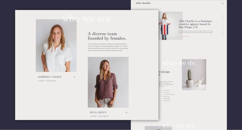
Alfa Charlie introduces some pretty interesting UI elements to their about page. What we love:
- The vertical anchor navigation on the right-hand side of the screen is an example of effective graphic design. It provides users with a quick understanding of what the page contains and makes it easy for them to jump between sections.
- They’ve modified the page cursor to act as a progress bar showing you how far down the page you are.
- They do a good job of following the requirements of most B2B about pages, they focus on people, capabilities, and past successes.
Acme
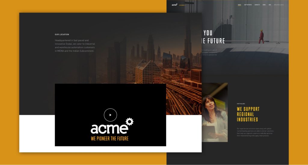
Acme is a great example of enterprise web design executed well. Their about us page presents a strong and elevated aesthetic. What we love:
- They present a clear mission statement in the first frame of the page.
- They use high-quality imagery to depict the scale of their operation.
- The choice of fonts and colors feels uniquely industrial, but elevated at the same time.
- Smart use of video to further explain what Acme provides to their customers.
Digital Horizon
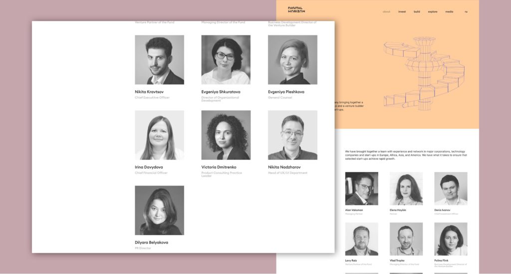
The about page design for Digital Horizon takes advantage of animation in an interesting way. What we love:
- The opening statement is accompanied by an animated 3D illustration that helps capture your interest.
- As a venture capital firm the people behind the scenes are highly important, they present their team immediately in a clear and consistent way.
- They present their portfolio of brands and cross promote them.
- They end off the page by reinforcing their global reach.
DSX Global
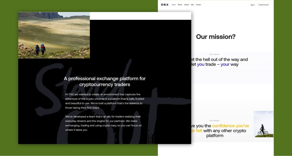
DSX Global’s about page design takes you through their mission in an interactive way. What we love:
- The overall initial experience makes it clear what you’re about to read. The scroll experience that follows encourages you to keep going.
- Well written, short blurbs of content get the point across very quickly.
- Language and photography do a good job of both humanizing and demystifying cryptocurrency.
Zenefits
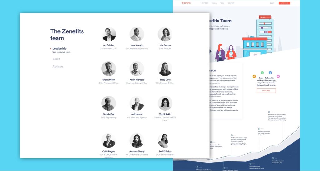
The about page design for Zenefits takes advantage of illustration in an amazing way. What we love:
- The opening statement is very people focused, which makes total sense for an HR company. They quickly follow it up with a well written, benefit driven mission statement.
- Illustration is used to make the company feel friendly and approachable.
- They highlight the company history, the organization’s timeline and key stats.
- They do a great job of presenting their team, in particular, we like the tabbed approach dividing up leadership, board, and advisors.
- As a start-up, investments are key–they put theirs towards the bottom of the page to further build credibility.
- Last but not least they present a clear next step to their careers page.
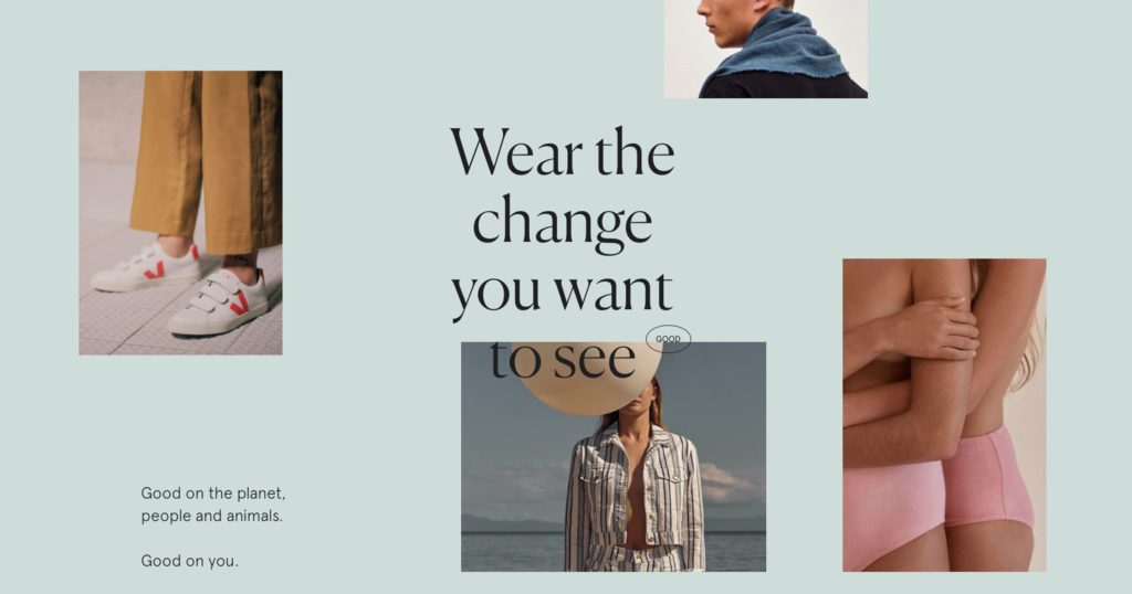
Good On You
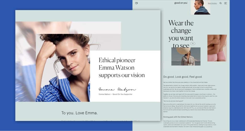
Good on You’s about page is just as great as the brands they support. What we love:
- Their online marketing does a great job of calling out what this organization is all about.
- Aesthetically, the product design photos they choose and the way the pages are laid out asymmetrically really aligns well with the editorial style fashion brands have adopted. This subliminally helps reinforce the fact that this is a cause for fashion.
- They actually present a good deal of copy on this page but it doesn’t feel extremely overwhelming due to how they’ve balanced it out with photography.
Stord
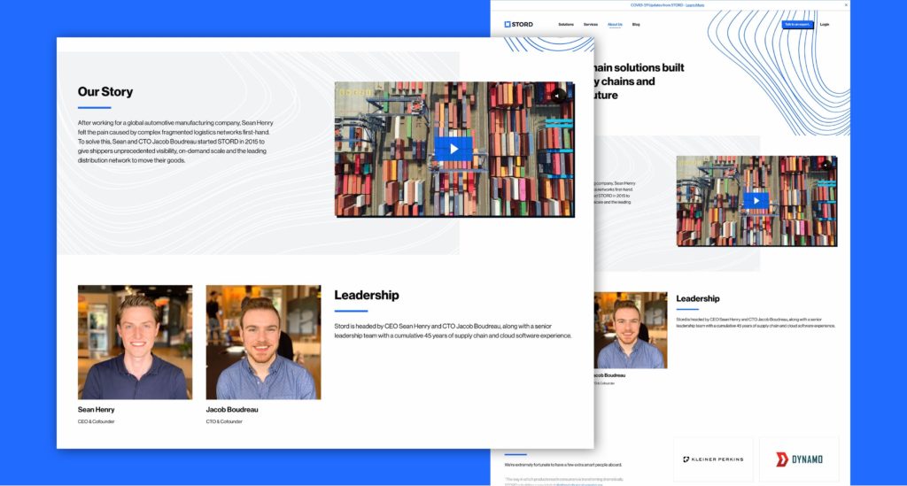
Stord exemplifies good SaaS website design, and delivers a great about page. What we love:
- Supply chain logistics is a complicated topic to discuss, they smartly use video to tell the story of their software solution rather than just trying to rely on text.
- Overall, the aesthetic is clean, bright, and has a nice balance of simple illustration and high-quality photography.
- The construction of the page itself is well thought out, they quickly touch on their mission, leadership, investors, values, and benefits to job candidates. All critical things a modern start-up should focus on.
Centivo
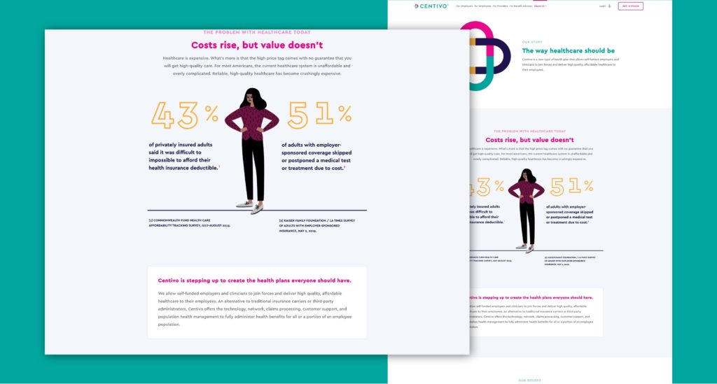
Centivo’s about page design balances information and illustration effectively. What we love:
- There’s a clear opening statement immediately followed by a mission statement.
- In the second frame they dig into the problem at hand supported by a clear visualization of stats.
- The page does a good job of speaking to their key demographics (employers, employees, and healthcare professionals).
- They further highlight key stats that show the differences from traditional healthcare solutions.
- The page ends with clear next steps to either meet the team, join the team, or learn more about Centivo’s notable press.
Kanarys
Kanarys about page design offers a highlight interactive experience. What we love:
- The initial frame both makes a clear statement and grasps your attention through the use of animation.
- Lower on the page they use video effectively to further communicate their mission.
- They highlight key value points for the software with clear next steps presented.
- They highlight key members of the team and advisory board – a staple for any start up.
Red
Red’s about page level up your expectations of what a real estate company’s website can be. What we love:
- The opening scroll experience isn’t over the top, it does just enough to grab your attention and make you want to scroll further down the page.
- If you’ve ever purchased or developed a home or commercial real estate, actually liking and trusting your agent’s really important. They do a great job of highlighting the personality of each of their employees in their team section.
- Overall the presentation feels very professional without feeling stuffy.
Don’t just start writing. Start by knowing exactly what you need your About Us page to accomplish.
Visitors on this page want to know more about you. That means everything on this page has to be about you, the business, not your customers.
That might be counter-intuitive if you’re trained to think about customers first. This page is one of the few exceptions.
This chapter will help you define 5 core goals that every About Us page needs to accomplish.
1. Telling The Story of Your Business
Every superhero has an origin story. Every business does, too. Yours might not be quite as exciting or tragic as that of Bruce Wayne, but your company story is still worth telling.
Bulldog Skincare, for example, was founded by two friends who were frustrated by the lack of natural options in the men’s skincare market. It’s a great example of what beauty website design can be. Cupcakes and Cashmere started as a DIY blog and has since become a multimillion-dollar business.
Lonely Planet was founded by two Aussies who quit their jobs, sold all their possessions, and set off on a round-the-world trip. And Yellow Leaf Hammocks was started by a former fashion executive who was looking for a way to give back to her native Thailand. These businesses have all achieved success thanks to their unique stories.
Your about us page content wins if it successfully tells the story of your business. Where did you come from, and why did you start it? How did you get where you are today? It needs to use your brand voice and convey the core brand messages you want the world to know.
As you build the page, put it to a test. Show the text to someone who’s not familiar with your business.
After reading it once, can they recount your story? If so, you’re on the right path.
2. Explaining Your Cause and Core Mission
The second goal of this page has to do with the deeper mission you have. This is your opportunity to explain your motivations.
This is your reason for existence, and it’s closely connected to your story. Think of it as the reason behind why you started a business, to begin with.
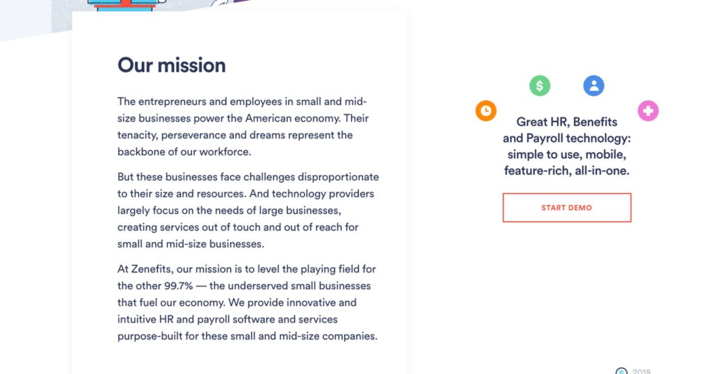
Don’t think of it as your mission statement, though. Instead, think of it as your core audience, and your mission in a more abstract sense.
Accomplishing this goal is an opportunity to set yourself apart from your competition. Your cause might just be unique enough that it convinces your audience that you’re the right choice for them.
Ultimately, your about page should be an extension of your content marketing efforts and overall content strategy: you want to promote the unique value proposition of your brand.
3. Revealing Your Business Model
What can you say about the way your business is run now? This goal gets you from history and hypotheticals into the presence.
Talk about exactly what type of business you are.
You can even get into how your products are made.
Those details matter, especially if your business model is in itself a selling point.
It can add transparency that your competitors don’t offer. It allows you to go into sustainability or domestic manufacturing. You can even talk about low price in a way that doesn’t seem cheap.
4. Showing the Face(s) of Your Business
Don’t forget that your About Us page is about… Well, you.
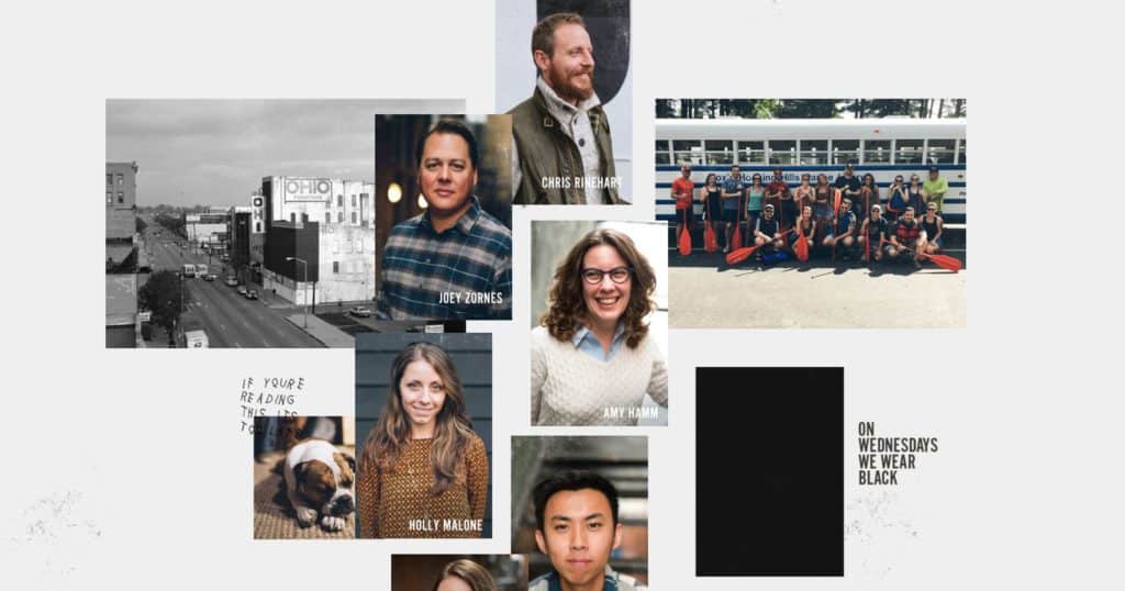
In other words, this is your opportunity to show off exactly who’s behind the curtain. Showcase your team, from its founders to the people answering the phone when a customer calls.
Simple pictures can go a long way to accomplish this goal. You can also add some unique facts about each team member to add some personality.
No matter the direction you choose, this goal helps you make sure your audience can get to know you just as you try to learn about them. Your about page should be a pillar of your brand voice and brand storytelling, somewhere folks really learn…about you.
5. Suggesting a Clear Call to Action
Don’t forget about this page’s potential as a way to keep your visitors moving forward.
Your copy needs to include links, if only to improve your SEO strategy so you can get traffic from search engines. But you’re doing even better when those links are natural next steps for your audience.
- Guide them to your social media profiles for more info.
- Invite them to check out your products, now that they know the background.
- Allow them to opt into your email list for regular updates.
- Send them to your blog post for long-form content that builds their trust.
Including a contact form on your website is a great way to ensure that potential customers keep moving down the buyer’s journey instead of bouncing off of your page.
Before moving on to the next chapter, make sure you know how each of these goals relates to your business. After that, it’s time to dig into the writing.
A great website design, with an amazing about us page, will complement all of your digital marketing efforts.
Protip
Keep the conversation focused on you, your history, and your brand values. Keep the more service and product-driven language to your service page and product page designs.
You need to start with your goals, but you can’t stop there. They only matter if you can translate them into compelling writing.
Copywriting can make or break your About Us page. Get it right, and your audience won’t be able to forget about you. Get it wrong, and your visitors will forget you even exist as soon as they close their browser window.
The pressure is on. Fortunately, you can follow these 5 best practices for great copywriting on your About page.
1. Show Your Personality
Let’s face it.
Your audience doesn’t want to read bland statements that they could find anywhere.
If you go that route, they’ll forget about you in a heartbeat.
To be memorable, you need a compelling brand personality. Writing can give you that personality.
Building a personality means being memorable. That includes being clear about your values, leaning into instead of shying away from strong opinions, and being human.
If your writing can consistently hit these points, you’re on the right track.
2. Avoid Jargon and Business Speak
Jargon is the death of good copywriting.
You might know what that word means. Your audience doesn’t. They’ll just get upset that you are making them think.
That’s why the About Us page should avoid jargon and business-speak at all costs.
It’s easier said than done. We all slip into this habit naturally, because we live those topics we’re writing about.
Again, the best test is getting your text in front of someone who isn’t familiar with their industry. Can they easily understand every sentence you write? Good.
3. Don’t Be Afraid to Focus on You (Not Them)
Focusing on your audience has become such an important best marketing practice, it’s almost a cliche. For your About page, you’ll need to break that habit.
This is your chance to talk about you. Not your customers. Not even your industry or larger environment. Just you, the company they want to learn about.
Don’t be afraid to brag. Add badges, testimonials from clients, and accomplishments or milestones. Putting the focus on yourself takes some practice, but it goes a long way towards writing a compelling page.
4. Weave in Personal Stories
To call storytelling a trend in marketing would be misleading. It’s been around as long as humanity.
But it’s just beginning to re-enter the marketing world. That’s because emotions drive purchasing decisions, probably because they’re much more memorable than facts.
On your about page, you can become a storyteller. Talk about your personal journey and that of the company. Make it a compelling narrative your audience can’t stop reading.
5. Follow a Story Framework
Speaking of stories: they only work if they follow the classic 5-part storytelling framework.
- Problem: The protagonist (your company) encounters something that hinders or handicaps them.
- Epiphany: There’s a groundbreaking idea that can solve the problem in a way that’s never been done.
- Challenge: It’s not easy to turn that idea into reality, but the protagonist works hard on it.
- Success: With hard work, the protagonist overcomes the challenge and solves the problem.
- Future: The protagonist takes steps to make sure that no one has to encounter that same problem again.
Sounds a lot like a business origin story, right? Follow that framework, and you’re on the right path.
The writing is done.
If you’ve followed these best copywriting practices while staying within your goals, you’ve won half the About page battle.
Time for the other half.
With the text in place, it’s time to focus on the visuals. That means getting your page design for the About Us page just right.
Not every piece of the story you tell is text-based. Nor should it be. Some crucial components are much better when told visually.
In this chapter, we’ll help you avoid a bad website design by focusing on the design and layout steps you can take to maximize the potential and user experience of your About page.
1. When in Doubt, Go Visual
Your audience loves visuals. They’ll be 4 times more likely to remember images than text. You can use an AI image generator tool to create visuals and give them what they want.
It’s easy to add logos and icons for any brands you’ve worked with. Including the icons of any press mentions should be straightforward. You need images of your team and leadership.
But you can also get more complex. Use graphics to show your business model or how your products are made.
When in doubt, trend visual. If you can represent it in a graphic and not lose its essence, you’re probably better off.
2. Design for Skimmers
Never assume that your audience reads every word of this page or others. Heck, even in this guide you’ve probably skipped around and landed on this page title.
A 2008 study found that the average web user reads less than 20% of a page’s content.
Meanwhile, a usability study from the same year showed that if a piece of content wasn’t placed in a scannable place like a headline or subheader, only 1 of 15 users could remember it.
Chances are that in the last 12 years, it’s only gotten worse. You simply need to assume that your audience won’t read everything you write.
Instead, design your About Us page for skimmers. Include lots of whitespace, keep the paragraphs short, and highlight key points and numbers with graphics.
Most importantly, make it abundantly obvious who you are and what you do. If you think you’ve gone far enough, take it further.
3. Match Visuals to Your Personality
Stock photos are never enough. Playing it safe won’t get your audience’s attention. Instead, your photography and any visual assets on this site need to match your personality.
If you’re playful, be playful.
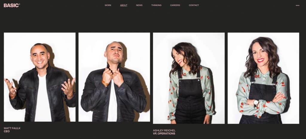
If you’re suited up and traditional, don’t show your CEO in a t-shirt.
Consistency is key. The personality you’ve built in your writing needs to shine through in your visuals as well. Anything else introduces cognitive dissonance and turns off your audience.
4. Adjust Content-Length for Your Brand Type
You might have expected an ideal length for About pages in this guide. In truth, there isn’t one.
Instead, it all depends on both your business and your audience.
For personal brands, for instance, long form letters tend to work well. They allow you to explain your background and connect you (the person) with you (the brand).
That’s not true for entertainment or consumer good services, which have to work with audiences who’s attention span is minimal.
The same skimmable best practices from above always apply. Beyond that, make sure you match your content length and layout to your audience.
That’s it! With the right goals, writing, and design, you can create a great about us page. The impact you’ll have with that page is significant.
This is the page that sets your business apart. It positions you as different and unique, while the tone for the entire buyer’s journey.
Make it a core piece of your website. One study found that visitors to about pages are more likely to make purchases, and spend more when they do. Another found that 75% of a company’s credibility is based on its website and a large chunk of that comes down to this one page.
Getting there means starting with your goals, but it also means writing with a distinct personality and telling a compelling story. You have to be memorable.
And of course, you need to make sure that your content is visually appealing and easily skimmable.
Your turn: does this help you build your own about us page? Do you need any other information to get started? Are you already using this page in your communications with prospects and customers?
Want your Shopify website to be amazing? Talk to us about our website redesign services.
A list of about us page design best practices.
Ready to improve your about us page design? Here are some additional resources and information. If you have further questions don’t hesitate to reach out.
Questions regarding about us page design and website best practices?
Here we cover some web design basics, including best practices for an about us page.
How do I write a page about us?
Many businesses have an about us page on their website, but few take the time to truly make it reflect their brand and story.
The about us page is an important way to connect with your audience and give them a sense of who you are, what you stand for, and what makes you different. Here are a few tips to help you get started:
- First, focus on your story. Why did you start your business? What drives you? What are your values? An about us page is the perfect place to share this information in a way that is both informative and engaging.
- Next, be sure to include images and visuals that help bring your story to life. People are attracted to visuals, so make sure your about us page includes striking photos or videos that capture the essence of your brand.
- Finally, don’t forget to include a call to action. What do you want people to do after reading your about us page? Make it easy for them by including a clear call-to-action, such as subscribing to your newsletter or following you on social media.
By following these tips, you can create an about us page that perfectly reflects your brand and helps you connect.
How do you design about us?
An about us page should be designed to give your audience a snapshot of who you are as a company. it should include information about your history, your mission statement, and your values. You can also include information about your team, your customers, and your partners. A well-designed about us page will help your audience understand what you do and why you do it. It should be easy to navigate and easy to read. And it should provide links to additional resources if your audience wants to learn more about you.
What is included in about us page?
Most about us pages include basic information about the company, such as its history, mission statement, and contact information. However, some businesses also choose to include additional information, such as an overview of the company’s products or services, testimonials from satisfied customers, or even a list of awards and accolades.
No matter what approach you take, the goal of the about us page is to give visitors a better understanding of who you are and what you do. By including accurate and up-to-date information, you can help build trust and credibility with potential customers.
FREE ANALYSIS
Request Your FREE Website Analysis
Further Reading On Website Design and Development.
Looking for web development and design inspiration? These articles should help.
- How to Design an Effective “About Us” Page
- Metrics Product Teams Can Use To Improve UX
- Design Essentials for Ecommerce Conversion
- Our Shopify Web Design Process
- Our Top Picks for The Best Shopify Stores
- Business Website Setup Cost
- Tips For Creating an Effective Case Study
- Website Footer Design Best Practices
- Ecommerce Web Design Tips You Need to Boost Sales
- Proven Ways to Boost Your Mobile Ecommerce Conversion Rate
- 24 Great Website Examples for 2022
- Tips to Make Your Ecommerce Business Successful
Get Memorable Insights.
Sign up to receive actionable web design advice directly in your inbox monthly.
Get Memorable Insights.
Sign up to receive actionable web design advice directly in your inbox monthly.
Author
Jeff Gapinski is the President of Huemor where he helps plan the long-term strategic growth of the agency. Jeff is passionate about UI/UX, demand generation, and digital strategy.
What Do You Think?
Have feedback? Maybe some questions? Whatever it is, we'd love to hear from you.




No comments found