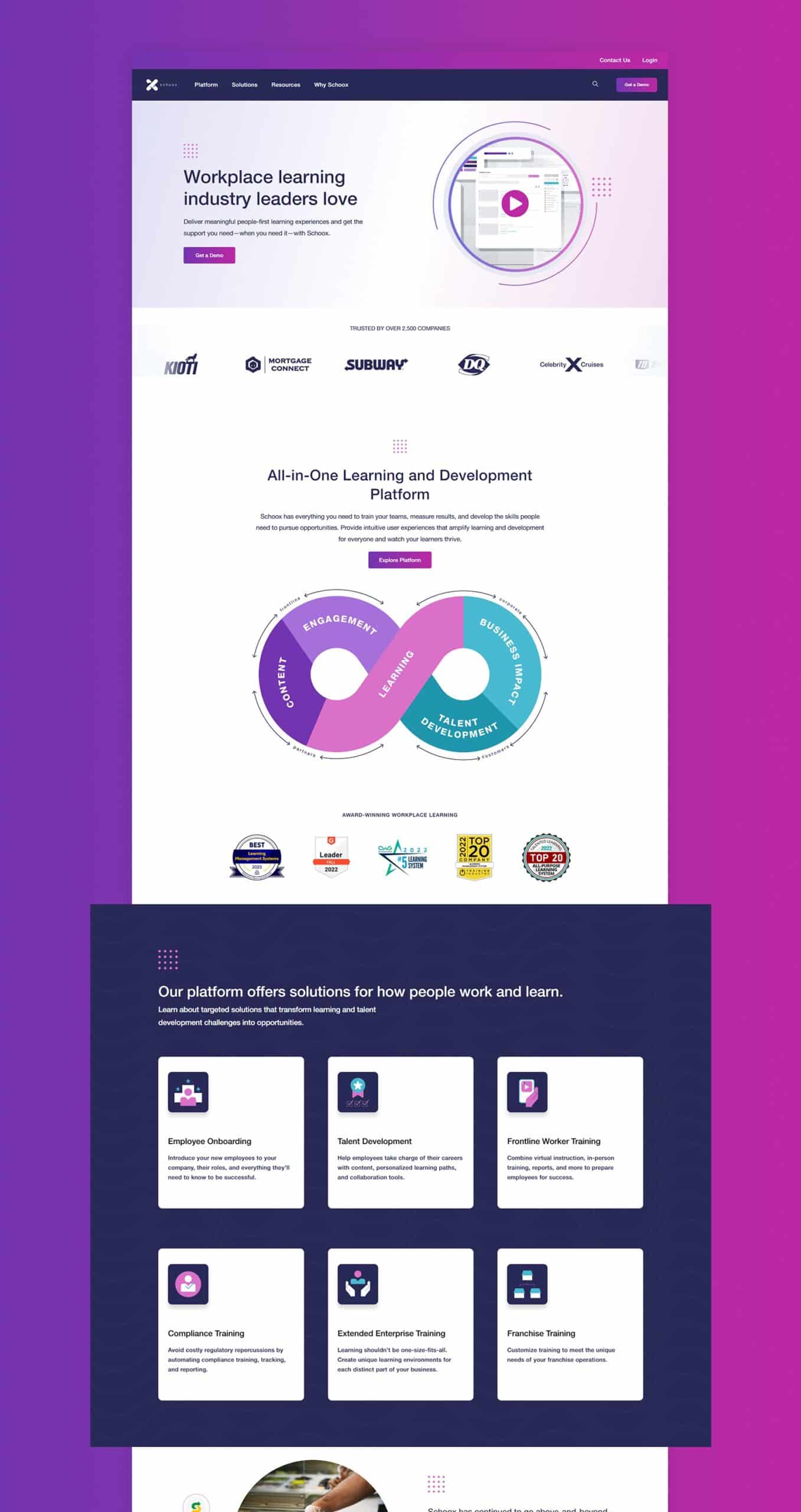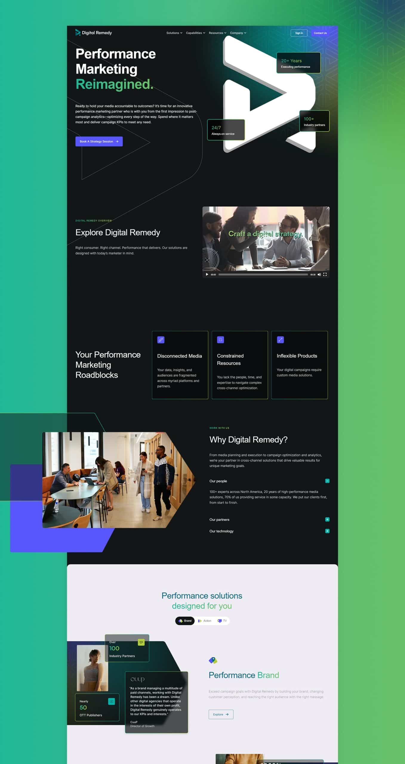
Government Website Design
DESIGNED FOR CHANGE.
Are you tired of your underperforming website?
It's time to build a site people will remember.

Get Started Today
Your Website Is Your Marketing Foundation.
Investing in digital marketing without having a great website will only result in lost time, lost revenue, and poor brand perception.
Ready to avoid that headache?
Good, because we're ready to help.

FAQS
Top Government Website Design Questions Asked
What are the key elements for successful government website design?
Government Website Design: The Key Elements for Success
Creating an effective government website can be a challenging endeavor. With over 5 billion page views on federal websites in the past quarter, it's clear that these portals are essential for citizens seeking information and services.
Our post will guide you through the crucial elements needed to design a successful, user-friendly government website. Isn't it time your site becomes more accessible and engaging? Let us help!
Understanding Government Website Design
Government website design differs from private sector design in several ways, including the need to focus on usability, accessibility, and content that serves a diverse audience.
Differences from Private Sector Design
In the vast digital landscape, government website design starkly contrasts with private and public sector, counterparts. They cater to a diverse populace, shunning the luxury of having a specific target audience.
The challenge lies in crafting varied navigation systems and design patterns that accommodate all users without causing frustration. This is where U.S. Web Design Standards (USWDS) come into play, offering guidance for creating consistent, visually appealing, and accessible government websites as mandated by the 21st Century Integrated Digital Experience Act (21st Century IDEA).
Unlike most private entities focused on sales or brand promotion, usability, website navigation, accessibility and content remain the key focus areas for designing governmental digital platforms.
Furthermore, overlooking mobile-friendly interfaces isn't an option considering over half of traffic stems from mobile devices.
Key Elements for Successful Government Website Design
Successful government website design relies on several key elements that prioritize the needs of users. From focusing on the target audience to embracing accessibility, these elements are crucial for creating a user-friendly and effective government website.
Discover how these elements can enhance your website's performance and engagement.
Focusing on the Target Audience
In the realm of government website design, a well-defined target audience does not exist. Instead, these digital platforms must cater to all citizens, encompassing diverse demographics and unique needs.
This broad user base necessitates a design approach prioritizing usability and accessibility for everyone - including those with disabilities as directed by Section 508 and WCAG standards.
It's no small task considering that government websites clock in more than five billion page views within three months. Therefore, any design or content strategy should be human-centric, addressing the varied requirements of its users while providing an engaging digital experience to foster resident engagement and trust among all website visitors.
Building a Community
Government websites are not just transactional platforms but vibrant digital communities. They have become important hubs where people seek vital public health alerts, official information, and sense of solidarity with their local communes.
A successful local government website design cultivates this sense of community by providing a user-friendly platform that is engaging, convenient, and informative.
In building a community online, government entities need to prioritize creating spaces for healthy interaction and discourse. Interactive features like forums or chatrooms can be included within the site for discussions on community matters.
Furthermore, employing content management systems like CivicEngage allows timely updates on local happenings, fostering citizens' trust in government agencies. In essence, a well-planned communal feature embedded within the website can turn visitors into active participants inbound phone calls - enabling a two-way system of communication which reinforces resident engagement.
Embracing Accessibility
Ensuring accessibility is a crucial element of successful government website design. With over 5 billion page views on federal government websites in the past 90 days, it's essential that these sites are inclusive and cater to people of all demographics.
Approximately 54% of the page views came from mobile devices, emphasizing the need for mobile-friendly designs. Compliance with Section 508 and WCAG standards is vital to ensure accessibility for individuals with disabilities.
Government organizations should also prioritize compatibility with assistive technologies, particularly for those with vision impairments. By embracing accessibility in their website design, governments can provide equal access to information and services for all citizens, enhancing inclusivity and improving user experiences.
Consistency in Experience
Consistency in experience is a crucial element for successful government website design. When users visit government websites, they expect to have a consistent and seamless experience throughout their journey.
This means that the design, layout, and navigation of the government website designs should be uniform across all pages and sections. By maintaining consistency, government websites can provide a user-friendly experience that allows visitors to easily find information and complete tasks without confusion or frustration.
According to important facts, many government websites currently suffer from varied navigation systems and inconsistent design patterns, leading to user dissatisfaction. To address this issue, it is essential for government agencies to prioritize consistency in their website design process.
By adhering to established U.S. Web Design Standards (USWDS) or internal style guides, agencies can ensure that their websites have a cohesive look and feel while also meeting accessibility requirements.
A consistent experience on government websites not only improves usability but also fosters trust with users. When individuals encounter consistent branding elements and familiar patterns across different sections of a site, they are more likely to view it as reliable and trustworthy.
Listening to the Audience
Government website design should always prioritize listening to the audience. By gathering feedback and understanding the needs of users, government agencies can create websites that truly serve their citizens.
In fact, over 5 billion page views were recorded on federal and local government websites in the past 90 days alone, highlighting the immense traffic and importance of these platforms. Additionally, approximately 54% of these page views came from mobile devices, underlining the need for government websites to be mobile-friendly.
Therefore, by actively seeking user input and analyzing site analytics data, agencies can make informed decisions about website improvements that align with user preferences and behaviors.
The Importance of Mobile-Friendly Design
Government websites must prioritize mobile-friendly design due to the significant portion of traffic they receive from mobile devices. According to data, approximately 54% of page views on federal government websites come from mobile devices.
This highlights the need for responsive and optimized layouts that ensure a seamless user experience across different screen sizes and devices. By embracing mobile-friendly design principles, government websites can cater to a wider audience and provide convenient access to information and services regardless of whether users are accessing the site from their desktop computers or smartphones.
As more people rely on their mobile devices for internet browsing, it is crucial for government websites to adapt accordingly and meet the expectations of modern digital users.
What are the three pillars that constitute government website design?
The Three Pillars of Government Website Design include adhering to relevant legislation, ensuring site accessibility, using relevant traffic and implementing security controls.
Adhering to Relevant Legislation
Government website design must adhere to relevant legislation in order to ensure compliance and accessibility for all users. Section 508 and WCAG standards require government websites to be accessible to individuals with disabilities, for example, guaranteeing that they can navigate and interact with the content effectively.
Additionally, the 21st Century Integrated Digital Experience Act (21st Century IDEA) provides guidelines for government websites, emphasizing the importance of user-centric design and usability.
By following these regulations, government websites can create an inclusive digital experience that meets the needs of all citizens. These legislative requirements not only promote equal access but also enhance trust between the government and its constituents by demonstrating a commitment to transparency and inclusivity.
Ensuring Site Accessibility
Site accessibility is a crucial element in government website design. With over 5 billion page views on federal government websites in the past 90 days, it's clear that these sites need to be accessible for all users.
Approximately 54% of those page views came from mobile devices, highlighting the importance of mobile-friendly design as well. Government websites must adhere to Section 508 and WCAG standards to ensure accessibility for individuals with disabilities.
This means designing sites that are easy to navigate, have readable content, and provide alternative text for images. By prioritizing site accessibility, government websites can effectively serve their diverse audience and provide equal access to information about funding programs and services.
Implementing Security Controls
Implementing security controls is vital for government websites to protect sensitive information from unauthorized disclosure. With the increasing threat of cyber attacks, government agencies must have measures in place to safeguard data and prevent breaches.
Unsafe domains pose a significant security risk, as they may contain phishing attempts, malware, or unwanted software that can compromise user privacy and system integrity. To ensure data privacy and compliance with regulations like GDPR and CCPA, government websites need to prioritize user privacy and obtain active consent for data collection.
By implementing robust security controls, such as HTTPS encryption and regular vulnerability assessments, government websites can create a safe digital environment for citizens while maintaining trust in their online services.
What are the best practices for designing government websites?
To ensure the success of government website design, it is crucial to improve content quality, implement modern design principles, and prioritize mobile-friendliness.
Improving Content Quality
To ensure a successful government website design, improving content quality is of utmost importance. Government websites are information hubs for citizens, providing them with access to vital government services and resources.
By focusing on enhancing the quality of the content, these websites can deliver information more effectively and engage users in a meaningful way.
High-quality content encompasses various aspects, including accuracy, relevance, and readability. It should be concise yet comprehensive, presenting key information in an easily understandable manner.
By eliminating redundant, outdated, and trivial (ROT) content from government websites – according to recent data analysis over 5 billion page views recorded on federal government websites in the past 90 days – agencies can streamline their digital presence and prevent confusion among users.
Moreover, by adhering to accessibility standards such as Section 508 and WCAG guidelines which make it vital for government websites to be accessible to those with disabilities - over half of the traffic to these sites comes from mobile devices - ensuring that content is accessible across different devices becomes crucial.
Implementing alt text for images or providing closed captions for videos are some ways governments can improve accessibility and reach a wider audience.
Implementing Modern Design Principles
Implementing modern design principles is crucial for the success of government website design. By incorporating these principles, government organizations can ensure that their websites are visually appealing, user-friendly, and accessible to all users. Here are key considerations when implementing modern design principles:
- Prioritize mobile-friendliness: With over 50% of traffic coming from mobile devices on government websites, it is essential to optimize the design for mobile screens. Responsive design and mobile-first approaches are necessary to provide a seamless experience across different devices.
- Embrace minimalism: A clean and uncluttered design helps users navigate the website easily and find information quickly. Use whitespace effectively to highlight important content and create a visually pleasing interface.
- Use intuitive navigation: Clear and straightforward navigation menus enable users to find what they need effortlessly. Implement a logical hierarchy of pages and sections that align with user expectations, making it easier for them to locate information.
- Implement visual hierarchy: Establish a clear visual hierarchy by using contrasting colors, typography, and proper spacing to guide users' attention to important elements on the page.
- Incorporate engaging visuals: Utilize high-quality images, videos, infographics, and other visual elements strategically throughout the website to enhance engagement and convey information effectively.
- Ensure fast loading speeds: Optimize website performance by minimizing file sizes, leveraging caching techniques, and eliminating unnecessary scripts or plugins. Fast-loading websites improve user experience and reduce bounce rates.
- Design with accessibility in mind: Follow Section 508 and WCAG standards to make government websites accessible for people with disabilities. Consider color contrast ratios, alternative text for images, keyboard navigation support, and other accessibility guidelines.
- Leverage responsive typography: Choose fonts that are easily readable across different devices and screen sizes. Implement responsive typography techniques such as fluid scaling or dynamic line-spacing adjustments.
- Integrate interactive elements: Incorporate interactive features like forms, maps, feedback mechanisms, and social media integration to enhance user engagement and encourage participation.
- Test and iterate: Continuously gather user feedback and conduct usability testing throughout the design process. Use analytics tools to gain insights into user behavior and make data-driven improvements.
Prioritizing Mobile-Friendliness
Prioritizing mobile-friendliness is an absolute must for government websites. With approximately 54% of page views on federal and local government websites coming from mobile devices, it is crucial to ensure that the website design and user experience are optimized for smaller screens.
By implementing responsive design techniques and optimizing page load speeds, government organizations can provide a seamless browsing experience for visitors on their smartphones and tablets.
This not only improves accessibility but also enhances user satisfaction and engagement. Moreover, prioritizing mobile-friendliness aligns with the U.S. Web Design Standards (USWDS), which aim to create consistent and highly accessible government websites across all platforms.

Helpful Resources
Recent Insights

Conversion Optimization/ Technology/ User Experience


