Custom Landing Pages
Landing Pages That Convert.
Guaranteed to increase conversions by 20% or you get your money back.

Get Started Today
Your Website Is Your Marketing Foundation.
Investing in digital marketing without having a great website will only result in lost time, lost revenue, and poor brand perception.
Ready to avoid that headache?
Good, because we're ready to help.

FAQS
The Top Custom Landing Pages Questions We're Asked
What if you don't increase conversions by 20%?
If we don't increase conversions by at least 20% in your first 30 days after the landing page is launched, our team will provide you with unlimited design, copy, and development revisions for an additional 60 days to help you achieve your goal.
If after those additional 60 days, we haven't reached our goal, you will be refunded in full.
Is there anything that disqualifies us from the guarantee?
This guarantee is made assuming that the quality and volume of traffic directed to our landing page is equivalent to the volume and quality of traffic sent to the control.
If it is determined that there are major variations in this traffic, we reserve the right to waive the guarantee.
Other ways the guarantee could be waived are:
- Design decisions our team objects to directly impacting the success of the page
- Changes made to the page by your team after our team published the page
Do you offer support after the landing page has been launched?
Yes, as part of this offer, we will provide 30 days of post-launch support to ensure your investment is secure.
Do I own the page after it's launched?
After we're paid in full and the page is launched, you own everything.
Do you do anything other than landing pages?
Yes!
We build entire customized websites, not just landing pages. In fact, many of the companies we engage with for a single landing page end up redesigning their entire website to match the success of the landing page.
For The Extra Curious
How do I select the ideal landing page builder for my business?
When choosing a landing page builder, consider options like Unbounce for conversion rate optimization, Leadpages for selling products, Moosend for affordability, Instapage for collaboration, and Wix for beginners.
Unbounce
Unbounce is a great landing page builder for small businesses on a budget. It's highly recommended. Marketers can create landing pages to increase sales easily using a simple drag-and-drop tool.
Unbounce can make different types of landing pages to test what works best on the website.
Unbounce is a landing page builder that has a Smart Traffic tool. This tool uses artificial intelligence to send visitors to the best landing page, that is most likely to make them take action.
The platform can be connected to drop landing on to email marketing tools and other apps using Zapier. Marketing teams can quickly link their landing pages with this integration.
Marketing agencies can choose Landingi as an alternative option. It's a popular choice that allows for unlimited conversions.
Leadpages
Leadpages is a free landing page designer and page builder that has a simple editor. It lets businesses create a landing page designer and pages that work great without needing to know design or coding.
Leadpages has more than 200 templates that work on phones and computers. It also has strong analytics. Marketers can analyze how visitors behave and test different landing pages using A/B split testing. This way, they can improve the chances of converting visitors into
Leadpages is great because it works with Zapier. This means you can easily connect it to other apps and email marketing tools. It's convenient for users. Leadpages can customize your website for your customers. They do this by changing the text based on what your customers search for or what group they are in.
The cost differs from $15 to $199 per month, based on what you need, like a custom domain domains or extra features.
If you have a small business and want a budget-friendly way to make landing pages that help you get more customers, we suggest you give LeadPages a try. This service is easy to use, with lots of templates and it works great on all devices. Give it a chance to help you connect with your audience!
Moosend
Moosend is an email marketing and automation platform that's highly suggested. It has a tool to build impressive mobile landing pages too. Marketers can make landing pages that work on phones using drag and drop functionality in-and-drop. They should work on all screens and follow privacy laws.
Moosend offers many templates for marketers to choose from. They can also create their custom design using CSS and dynamic content features. Moosend lets you customize content based on your CRM data. It helps engage users by tailoring content according to their preferences.
Instapage
To create landing pages that increase sales, you need to choose the right builder. Instapage has everything you need to make great landing pages.
Instapage lets users design their own landing pages quickly with templates they can customize and simple drag-and-drop tools.
Instapage is helpful for businesses. It works with tools like Zapier to make things easier. So, work can be done faster and better. The platform has extra tools to help you. It can show you heatmaps and analytics to see how visitors use your site. You can use this information to make your sales pages better and get more people to convert.
Instapage helps digital marketing agencies and small businesses with a limited budget to sell products or services online. This can be done through email newsletter sign-ups or eCommerce platforms like Stripe or PayPal.
Wix
Wix is great for making web pages if you're new to it. It's perfect for small businesses and people who don't know how to code. Users can choose from 900 templates for their marketing needs to find the perfect fit.
Wix has a tool for analytics. It helps users improve their landing pages' performance. However, Wix may not be the best landing page builder for everyone and is limited to specific use cases.
Wix's cheaper plans have less space and data options. They may not work as well as other landing page builders on the market. Wix is a good option for small or big businesses that want to grow online. It can help them make an email list and sell things.
How can a clear call-to-action transform the effectiveness of your landing page?
If you want more people to take action on your landing page, make sure it's easy to know what you want them to do. One CTA that's clear and in the right place on the landing page itself can help.
Single, Specific Goal
To create better landing pages that get people to take action, focus on only one goal. Your best landing page, should have one simple instruction that tells visitors what to do next. This is called a Call-to-Action or CTA.
To prevent visitors from leaving your site without doing what you want, you can use a clear CTA. Also, it helps you stay on track with your message and not create multiple variants of content to achieve that one specific goal.
Remember that when it comes to conversions, clarity is key.
CTA Placement
Every custom landing page needs a call-to-action (CTA). The CTA's placement is very important. CTAs are important because they help visitors do what you want them to do and improve sales.
For better outcomes, put your CTA at the top of the page where people don't have to scroll down to spot it.
When placing the CTA button on your landing page, keep it simple and focus on one goal. Using too many CTAs on a single landing page creator or websites, can confuse visitors and prevent them from taking action.
It's important to make sure that your CTA is easy to use on mobile devices. This means placing it in a spot that's easy to tap without zooming or scrolling too much. If you personalize the CTA, you can increase the chances of visitors responding. Use their name or location to talk to them directly, boosting conversion rates.
CTA Button Design
The CTA button's design is just as important as its message and placement. Your button should be attractive, noticeable on the page, and show visitors what to do.
Use powerful language on the CTA button, such as "Get Started Now" or "Download our Free Guide." Ensure visitors understand the benefit of clicking the CTA. This helps them know what they'll get by taking that action.
Unbounce and Leadpages are landing page builders. They let you choose different CTA buttons to match your goals. You can customize them for things like forms, downloads, and purchases. They do more than just look good. They help you get more conversions by changing the headline text based on what people search for. They also use AI to guide visitors to the best option for them.
Why is utilizing responsive design crucial for your landing page's success?
It's important to use responsive design for your landing pages. This makes sure they work well on mobile devices and different types of devices. Users will have a better experience and you'll likely get more conversions.
Mobile-first Approach
Designing custom landing pages that increase conversions requires a focus on mobile devices first. More than half of people use their phone to browse websites. So, it's really important that your you create a landing page that works well on phones too.
A good mobile landing page puts important things first. It needs easy-to-see buttons, simple design, and loads quickly. To make sure your design works well, try it on different devices and browsers. This will make sure it works with a variety of setups.
Incorporating a mobile-first approach into your landing page strategy can lead to significant improvements in engagement and conversion rates, especially as more consumers continue to use their phones as their primary device for online browsing and shopping.
Cross-Device Compatibility
In today's mobile-first world, visitors access websites from a variety of devices. Make sure your landing pages work well on all devices. This is really important, so they need to be responsive and optimized.
Landing pages can adjust to your device size and screen with responsive design. This makes sure that words are easy to read, pictures look good, and buttons are easy to find on any device.
HubSpot's Marketing Hub has several free landing pages and page templates for builders. They provide good templates that work on different devices. These landing page templates can be customized and show personalized content based on CRM data. With A/B split testing features, you can find out which versions work best for your audience.
How important is message consistency for the success of my landing page?
It's important to make sure your ad and landing page match so that customers are not confused. Be sure your headlines, subheadlines, and message match the message in your ads.
Headlines And Subheadlines
Headlines and subheadlines are important for landing pages. They can affect how many people convert. When people land on your page, the first things they see are important. You must make them interesting and eye-catching.
A strong headline should be clear, concise, and benefit-driven.
Subheadings have several purposes on a landing page. They can tell more about what you offer and explain the benefits of engaging with your brand.
Using subheadings can make content easier to read. It breaks up large blocks of text which is helpful for users who are in a hurry or have shorter attention spans.
Consistency is key when creating headlines and subheadings for a landing or web page itself.
Ad Copy And Landing Page Content
Consistency is key when it comes to ad copy and landing page content. Your ad message must match the headline and subheadings on your landing page. This way, visitors won't be confused since the message will be coherent.
To be consistent, make sure your message speaks to your audience's needs and motivations. It's crucial to A/B test different messages to know what works best for each group in your audience.
To make sure people understand an offer, it's important to use the same words in ads and the landing page. Otherwise, they might be confused.
Why should I hire a SaaS web design agency instead of using an in-house team?
Working with a specialized agency means that you have access to experts who understand the unique challenges faced by SaaS businesses. They can bring fresh ideas to your project and have the technical expertise needed to create a high-quality website that performs well across devices and platforms.
What are some examples of successful websites created by your SaaS web design agency?
We have a few amazing SaaS website examples we can share:
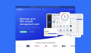
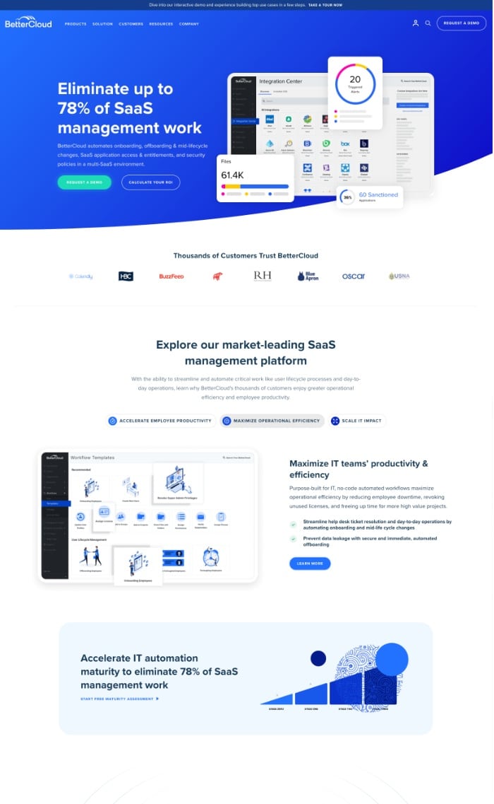
Modern businesses run on dozens of SaaS products, BetterCloud helps streamline activation, deactivation, and security to simplify the management of a company’s entire technology stack.
Key Results:
+50% Demo Requests
-17% Bounce Rate
+49% Pages Per Session
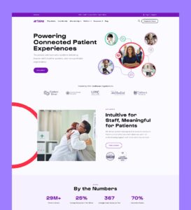
Artera (formerly Well Health) is dedicated to making patients' and providers' experiences painless.
Key Results:
+143% Demo Requests
+75% Website Traffic
+23% Pages Per Session
How can leveraging visual elements enhance my landing page's effectiveness?
To make your landing page look better and keep people interested, use pictures, videos, and pretty colors that all go together.
Images And Videos
Using pictures and videos on custom landing pages can make them more successful. Using good pictures can make people trust and believe your website more. Videos can also teach or show things about a product, which can make more people interested and buy it.
Designing an eCommerce page to sell products needs good images. Multiple angles of high-quality images can help buyers feel more confident about buying.
It's important to make sure graphics on the landing page help the main message, not take away from it. Strategically use visuals to help site visitors reach their goals. Add clear calls-to-action (CTAs) to guide them toward conversion.
Infographics
Infographics work well to show difficult information in a clear and attractive way.
Infographics on custom landing pages can make it easier to understand information quickly. This enhances the user experience and makes it more enjoyable to use.
In addition, pictures and videos catch people's eye more than just words.
Color Scheme
The colors on your landing page can make visitors stay or leave. Using colors that match well together makes you look more professional and consistent. This builds trust with your viewers.
Tech companies often use blue, which gives the impression of being dependable and steady. Green evokes feelings of growth and health, making it suitable for eco-friendly products.
To ensure visitors can easily read the text, balance the background color with the text. Don't make one too overpowering.
You can use Adobe Color Wheel to try different color combos before choosing one.
How can I optimize my landing page for a higher conversion rate?
To boost your sales, try some testing. You can compare two versions of your website or app (A/B testing). Also, see where your customers click the most (heat
A/B Testing
One of the most effective ways to optimize landing pages for better conversion rates is through A/B testing. The process has two or more page versions, which get tested to decide the one that converts the most.
Businesses can use A/B testing to make decisions about their landing pages using real-world data. Marketers can find out which elements are working well or need improvement by regularly measuring the bounce rate and click-through rate of multiple variations.
Heatmaps
Heatmaps are an essential tool for designing custom landing pages that boost conversions. We can see where website visitors click and scroll. This helps us understand their experience and what makes them frustrated.
Heatmaps can show designers which areas of a landing page need improvement. For example, they can identify where visitors are leaving the page.
Heatmaps come in various types, like click, scroll, and attention heatmaps. Each type helps to provide data-driven decisions when making improvements to increase conversions.
To succeed in marketing campaigns, managers should use every available advantage. Examining heatmaps is one way to achieve this goal.
Conversion Funnel Analysis
Designing landing pages that increase conversions is very important. To do this, it's necessary to analyze the conversion funnel. It includes monitoring and studying the actions visitors make on your website. For example, when they buy something or fill out a form.
Many shoppers leave their cart during checkout due to unexpected shipping costs. For instance.
Personalization is also key when it comes to optimizing for conversion rate. You can make your website more interesting and increase the chances of people buying from you by changing how you show your content. Show different things based on where the person is and how they access your entire site beforehand.
How can personalizing your landing pages improve user engagement and conversion rates?
To make your landing pages more engaging and relevant to your visitors, you need to personalize them. This can be done using dynamic content, geolocation targeting, and dividing visitors by demographics.
Dynamic Content
Dynamic content is a powerful tool to customize landing pages and increase conversions. Landing page builders, such as Unbounce, Leadpages, and HubSpot, have many ways to make the user experience personal. They use dynamic routing, AI-powered Smart Traffic, and dynamic text replacement to do so. Explanation
HubSpot's personalization feature can boost leads by 55% - amazing for businesses.
Another approach involves segmenting contacts into different groups based on demographics or behaviors. You can use ConvertFlow's automation features to trigger actions based on visitor behavior. For example, you can set actions to be triggered when visitors click on CTAs.
Marketing managers can utilize this approach in combination event marketing, with features like progressive profiling and website personalization. These tools allow businesses, including eCommerce vendors, to customize messages for customers at various points in their buying experience.
Geolocation Targeting
Geolocation targeting is a useful tool for businesses. It lets them deliver personalized content to visitors based on their location, device, source, and lifecycle stage. Customizing landing pages based on a visitor's location can boost conversions and result in a 55% rise in leads.
One platform that offers effective geolocation targeting features is HubSpot's marketing hub package. Users can make website content specific to where they are based on their contacts and leads using this tool.
Marketers can make better CTAs by using this information. It helps them create promotions and discounts that are only for certain areas.
Businesses can use Wix's free landing page builder, for geolocation targeting. It has over 30 templates to increase conversion rates and tools for easy editing. Even those without coding skills can effectively target visitors based on location.
Segmentation By Demographics
A good way to make landing pages more personal is to group visitors by things like age and gender. Marketers can make better ads by making them specific to who they are for. This will get more people interested and lead to more sales and clicks.
Research shows that personalization can have a significant impact on conversion rates. HubSpot found that personalized calls-to-action perform much better than generic ones - in fact, they do 202% better. Similarly, personalized emails deliver transaction rates six times higher than non-personalized ones do.
Marketers can make pages for each group of people, talking about what they want to hear and need.
How can simplifying my landing page design lead to increased conversions and user engagement?
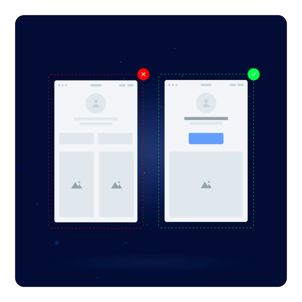
Make your landing page easier to use by keeping it simple. Use a clean layout, leave some space, and get rid of anything that might distract users from what you want them to do.
Minimalistic Layout
A simple layout helps your landing page's call-to-action (CTA) stand out. To make sure people read and act on your message, get rid of things they don't need to know.
A simple design can quicken page loads, making it easier for users to navigate.
Use a basic color scheme and easy-to-read font if you want a minimalist design. Using more white space can improve how your text looks and make it easier to read and understand.
Landing page builders like Swipe Pages or Unbounce can help you make simple and build landing pages that show what you offer to customers. This can improve how many people buy your product over time. These can build landing pages that can have a unique design that fits what you need.
White Space Utilization
Tip 8 for making landing pages that increase sales recommends using white space. Using white space can make a landing page easier to read and understand. This minimalist approach can increase conversion rates.
White space can make a landing page look better. It helps essential parts stand out, giving a balance and harmony to the whole create a landing page designer.
Designing a landing page with white space helps visitors. It makes the full website, or sales or marketing funnel easier to use.
Using this approach can make your design look more elegant and sophisticated.
Eliminate Distractions
To create landing pages that increase sales, it's important to avoid distractions. This can be achieved by following the essential tip of removing distractions from your custom landing pages. Landing pages work best when they have one clear goal. To make that happen, we need to remove anything that might distract visitors.
A good way to avoid distractions is by using simple and clear design with enough space on a page. Removing clutter from your landing page helps create a better design. This makes your CTA button stand out, and visitors can understand what to do next easily.
Many popular companies have used this strategy really well. For example, Dropbox has a simple design with only one button above the fold. Unbounce has a page with only an email sign up form and no other links or distractions.
How can incorporating social proof into my landing page build trust and boost conversions?
To gain customers' trust, add testimonials, case studies, and trust badges to your landing pages.
Testimonials
Testimonials can help your landing pages seem more trustworthy and credible. They're social proof that works well. Real customer reviews are powerful. They can convince potential customers to buy from your brand.
Testimonials can be displayed in different ways. These include written quotes, videos, and star ratings. Showing real reviews that relate to the customer's experience is important. It's better than using reviews that are fake or general.
HubSpot and Wix are the best landing page builders around. They can help add social proof like testimonials to create custom landing pages designs. There are different ways to show that other people trust a product, like badges, stories, or endorsements. These can also make new clients trust it more.
Case Studies
Building trust with customers is essential for landing pages that lead to more sales. Using case studies is a good way to show how your product or service has helped others.
Adding customer reviews to landing pages boosts conversion rates by 34%.
Another case study involved the personalization of email campaigns through dynamic content. The company improved their website's success by making personalized messages and offers. They did this based on who visited the site before and what their information showed. As a result, the click-through rates increased by 29%.
Marketing managers can use IMPORTANT FACTS] to make better decisions when creating website pages that increase sales.
Trust Badges
Trust is crucial for custom landing pages to attract customers. And trust badges are a simple and effective way of doing just that. Trust badges show that a website's payment system is safe. They are symbols on the checkout or product page.
Trust badges build trust and increase sales. They keep customers from deleting items in their cart and help them make purchases. Showing security badges at checkout can boost sales by up to 32%, says Baymard Institute.
If you're making web- offers landing pages for small businesses or big companies, adding famous security logos and good customer reviews can help make people trust your site. This is especially true for people in marketing who want to create a solid landing- page that's reliable for their clients.
How can analyzing and optimizing my landing pages lead to improved performance and higher conversion rates?
You should frequently check and improve your landing pages. This can be done with tools like Google Analytics, conversion rate optimization software, and A/B testing. These tools help ensure that your landing pages are achieving the desired results.
Google Analytics
Designing a custom landing page that boosts conversions is important. To do this, you should use Google Analytics. Marketing managers can use Google Analytics to understand how visitors behave on their own and create unlimited landing pages for page creators and pages. It shows metrics like page views, bounce rates, and conversion rates.
You can use Google Analytics' Behavior Flow report to see how visitors move through your landing pages. This helps you find the parts where they leave.
To make your landing page better and get more people to take action, always check how it's doing with Google Analytics. This helps you see what needs to be fixed so people are more likely to convert. Improve your website by using A/B testing to compare design and content variations. Get insights from Search Console to rank higher in search engines.
Conversion Rate Optimization Tools
If you want more people to take action on your landing pages, using conversion rate optimization tools is vital. These tools can find where visitors are leaving. This helps improve the website to make more sales.
There are tools like Crazy Egg or Hotjar that can show where users click and how far they scroll on a page. They are popular and useful. Platforms such as ConvertFlow do A/B testing that lets marketers try out different designs and text on a page. This helps them find out what works best for the people they want to reach.
Regular Updates And Improvements
It's important to update and improve your landing pages often to ensure they perform well. Regularly test headlines, CTAs, and visuals to improve results.
Regular updates optimize things and keep them fresh. It's not just about existing elements, but also about being up-to-date. You might need to make some changes to your website. Update the words or pictures to suit your business or keep up with the industry. You could also add new stuff or change how it all works based on customer feedback. And don't forget to give your website a fresh new look so it doesn't
Regular updates and improvements are essential components of any successful digital marketing campaign.
Creating unique landing pages is a key part of a good online marketing plan. You can make better landing pages by using these 10 tips. This multi page, unlimited landing pages for sites will help improve user experience, personalize your marketing, and increase conversions.
Make sure you select the correct builder tool and have a clear call-to-action. Your message should be consistent and use visual elements. Test different versions with A/B testing and heatmaps to improve your conversion rate. Lastly, customize your landing pages with dynamic content and segment them by demographics.
Make sure to simplify your page layout and build trust by using social media posts as proof. Finally, remember to analyze and improve your website regularly using tools like Google Analytics or conversion rate optimization platforms.
Why are landing pages important for marketing operations boosting conversions?
Landing and link landing pages are important to turn website visitors into customers. They give a message that is meant for their needs and interests. Custom landing pages can make it easier for people to do what is wanted by the website. By telling them what to do and removing things that might get in the way, users are more likely to do what is desired.
What are some key elements to include in a custom landing page design?
An effective landing page should have clear headlines, good pictures, persuasive writing that focuses on benefits instead of features, important calls-to-action, customer reviews, and a simple yet attractive layout.
How do I choose the right colors and fonts for my custom landing page?
When creating a landing page, choose colors and fonts that match your brand and appeal to your target audience. Avoid anything that's hard to read or too flashy. Remember, colors can make people feel different emotions and think certain things. This can help or hurt how engaged users are, depending on the message you want to send.
Can I use A/B testing to optimize my custom landing pages for better results?
Conducting A/B tests on your very own website or landing page can help you figure out what convinces users to convert. Try testing different things like headlines, CTAs, and layouts to see what works best. You can make better choices about your designs by comparing options with data. Look at performance metrics like CTR and BR to optimize the designs over time.

Helpful Resources
Recent Insights

Conversion Optimization/ Technology/ User Experience


