Skip to content
solar system

Featured Work

HITT

HITT is one of the nation’s largest general contractors, offering lifecycle construction services from small projects to high rises and headquarters campuses.
01-Hero
HITT - Mobile - Hero
solar system

Overview

Client

hitt-logo-white

Year

2022

Platform

WordPress

Key Services

Copywriting, Digital Strategy, Full-Stack Development, Lever Integration, Salesforce Integration, UI/UX Design

The Objective

HITT prides itself on its innovation and craftsmanship within the highly competitive contractor arena. They were seeking a web presence that not only reflected that, but stood out amongst their competitors. A website that firmly placed itself as the industry leader for both prospective customers and employees alike.

solar system

Outcomes & results

+228.87%

Qualified Leads

+22.5%

Time On Page

+81.62%

Pages Per Session

solar system

Testimonial

"HUEMOR has truly seen where we can take the website and make it look significantly different from all of our competitors."

bio_headshots_0043_scott_greenberg_1

Scott Greenberg, Director of Marketing at HITT
Before

hitt-before-gray
arrow-right

After

hitt-after
solar system

01. Design System

Global Design
System

HITT wanted an overall experience that was elevated, but didn’t ignore their roots as an organization. The overall visual design system balances a premium feel with the grit it takes to do the work they do.

HITT - Font-Card-01
HITT - Font-Card-02
HITT - Colors
HITT - UI kit
HITT - Mobile - UI Kit
solar system

02. Research

Research &
Discovery

Most companies come to us clamoring to earn more business with their website. HITT obviously wanted their website to be appealing to customers, but had a very bold ambition for 2022 and 2023…


They needed to add 1,000 people to their organization to keep up with the demand of their projects.


It was paramount that the website spoke as much to prospective employees as it did to clients.


The majority of our research centered around how this website could attract and convince candidates HITT was the right place for them.

HITT - User-Perona-1
HITT - User-Perona-2
HITT - Competitor-Analysis
HITT - Menu Structure
HITT - Mobile Menu Structure
HITT-Wireframes-square
HITT---Moodboard
solar system

03. Creative

Final Designs

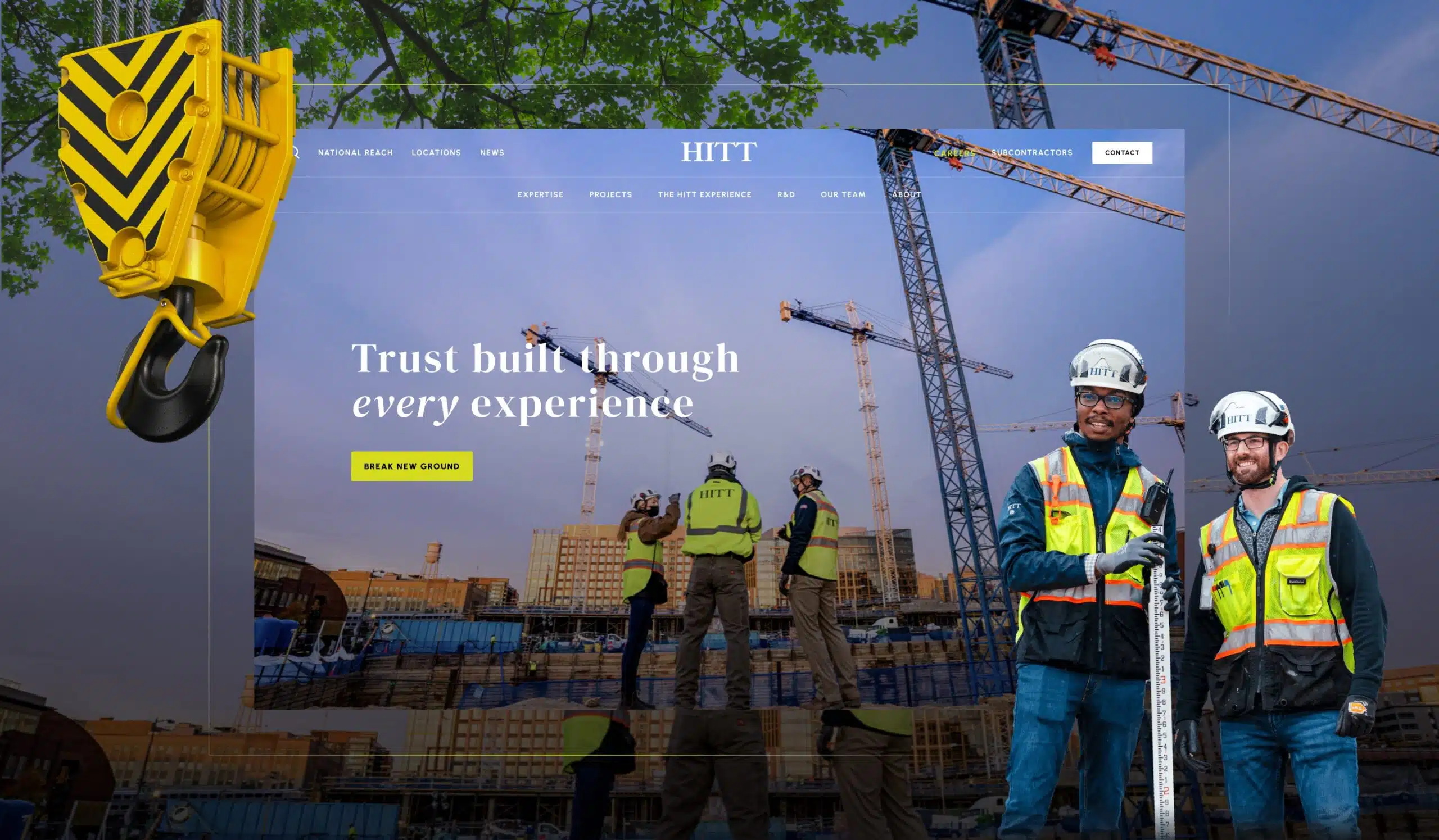
From the second you hit ‘enter’ on your browser, the experience you get with HITT is unique to any other contractor's website.


The intro animation reveals a compelling video of their team at work, showing the scale and sophistication of their operation.


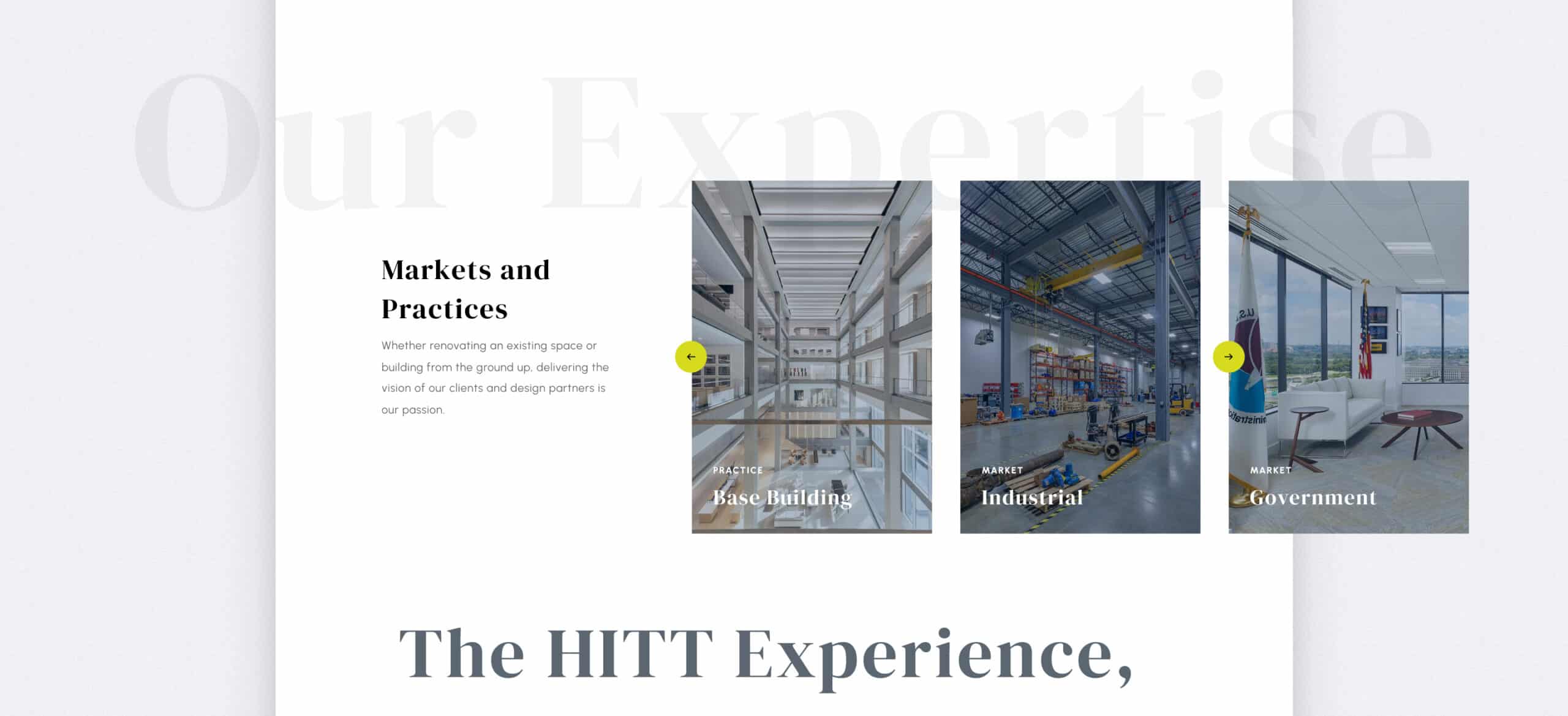
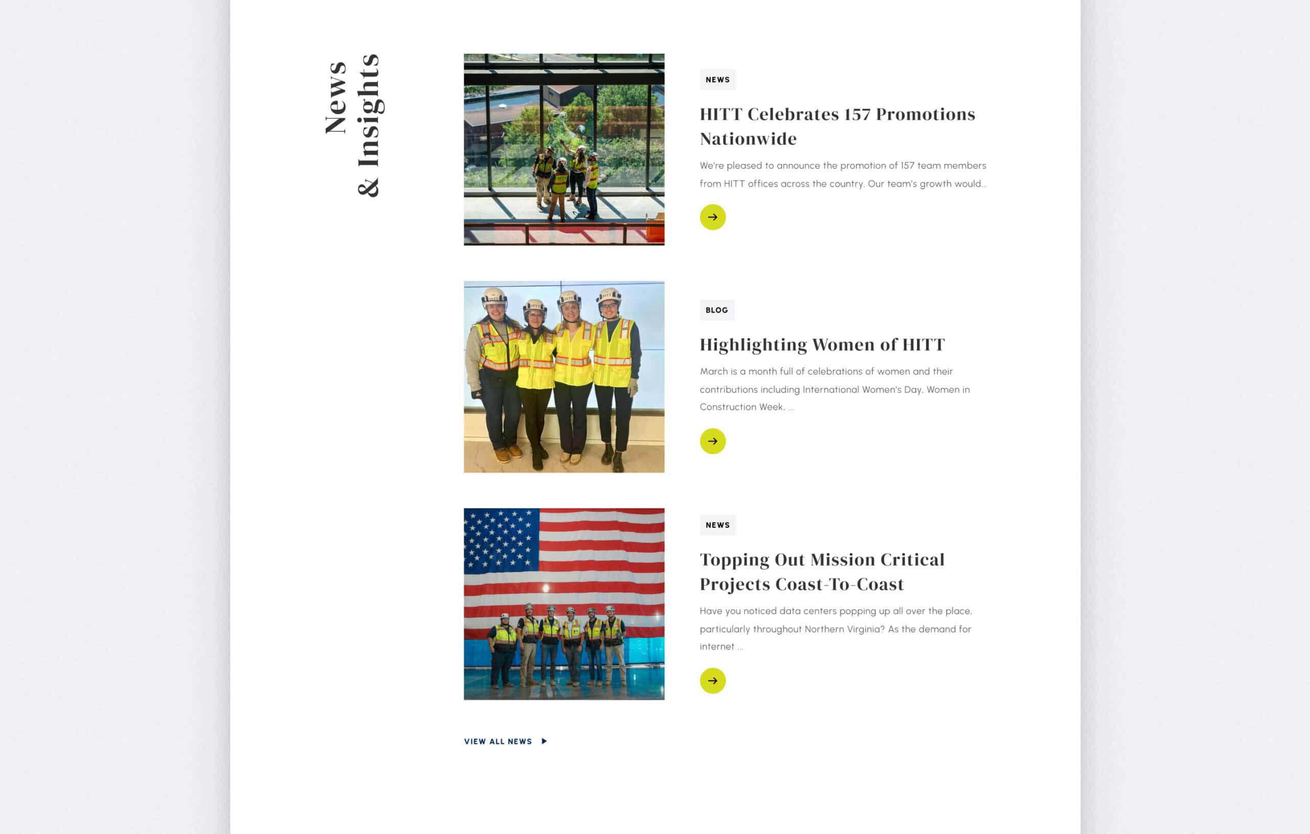
As you scroll down the page we’ve strategically layered various proof points such as highlighted case studies, statistics, and testimonials that appeal to prospective clients and employees alike.

Frame-1411_01
HITT-Desktop-Home_Page_2
HITT-Desktop-Home_Page_3
Frame-1411_03
HITT-Desktop-Home_Page_5
Frame-1411_05
Frame-1411_06
HITT-Desktop-Home_Page_8
Frame-1411_08
HITT - Mobile - Home Page_01
HITT - Mobile - Home Page_02
HITT-Mobile-Home_Page_3
HITT-Mobile-Home_Page_4
HITT-Mobile-Home_Page_5
HITT - Mobile - Home Page_06
HITT - Mobile - Home Page_07
HITT-Mobile-Home_Page_8
HITT - Mobile - Home Page_09

Mobile Experience

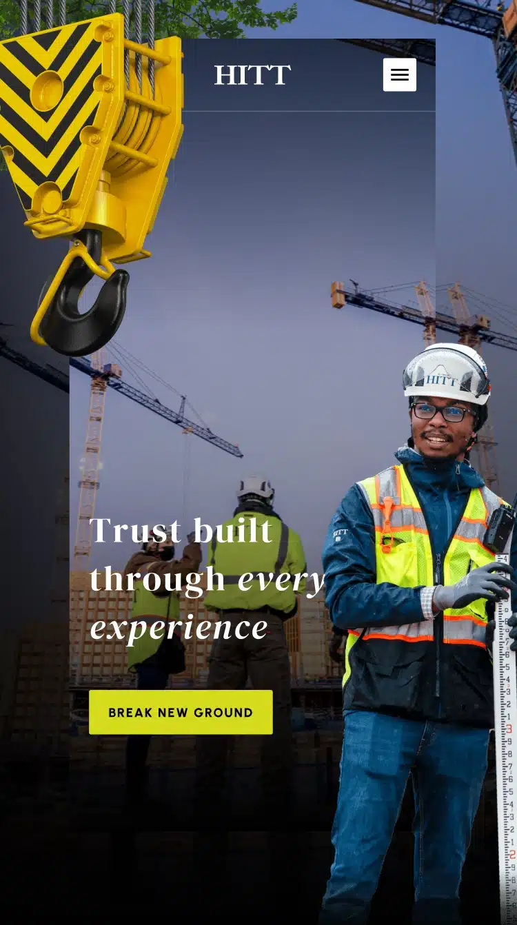
Balancing the desktop and mobile experience for the HITT website was no easy feat. The nuanced animation and effects that make the desktop experience so unique required a great deal of fine-tuning and balancing for the mobile experience.

09-Mobile-Frames

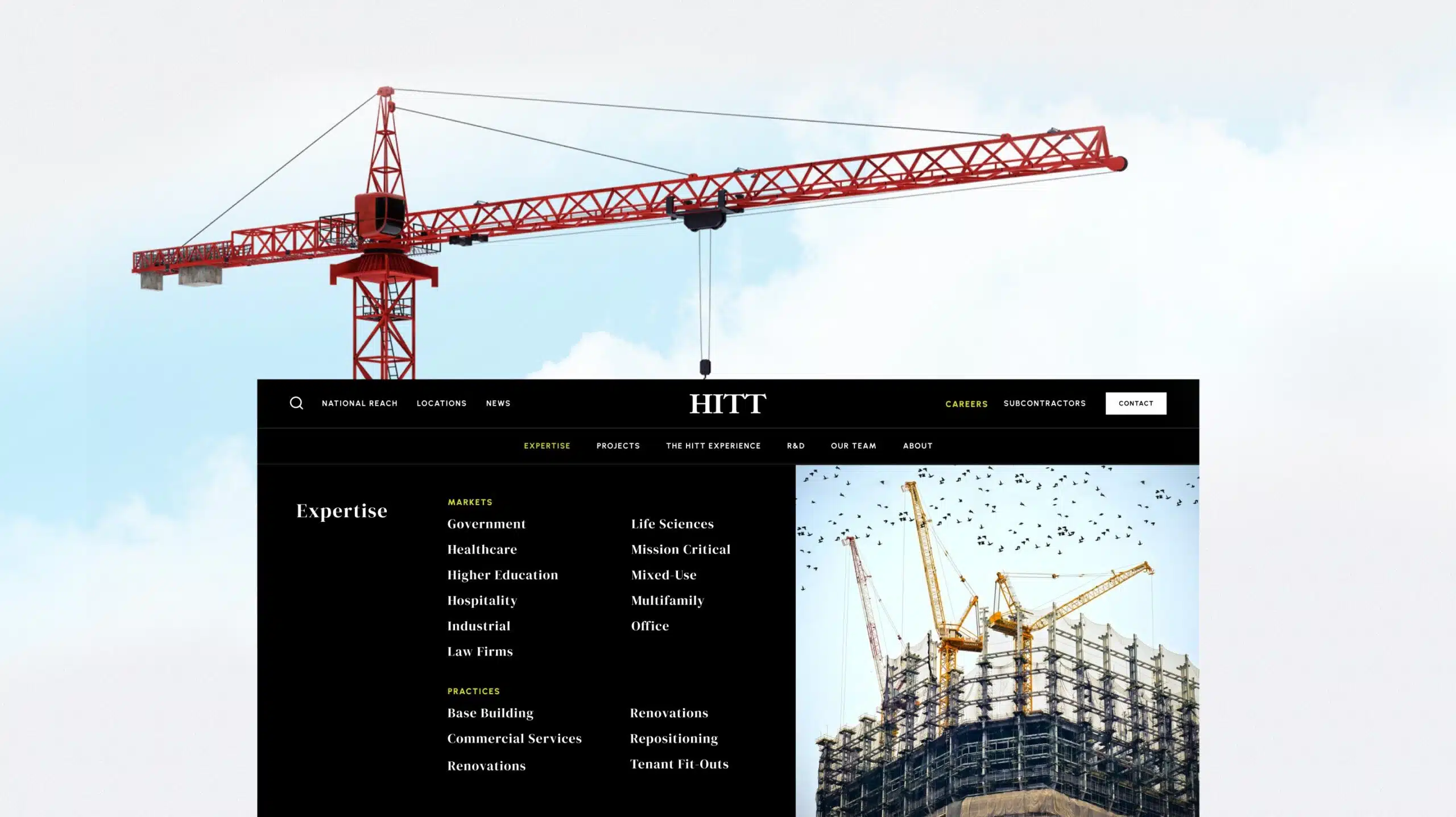
Site Navigation

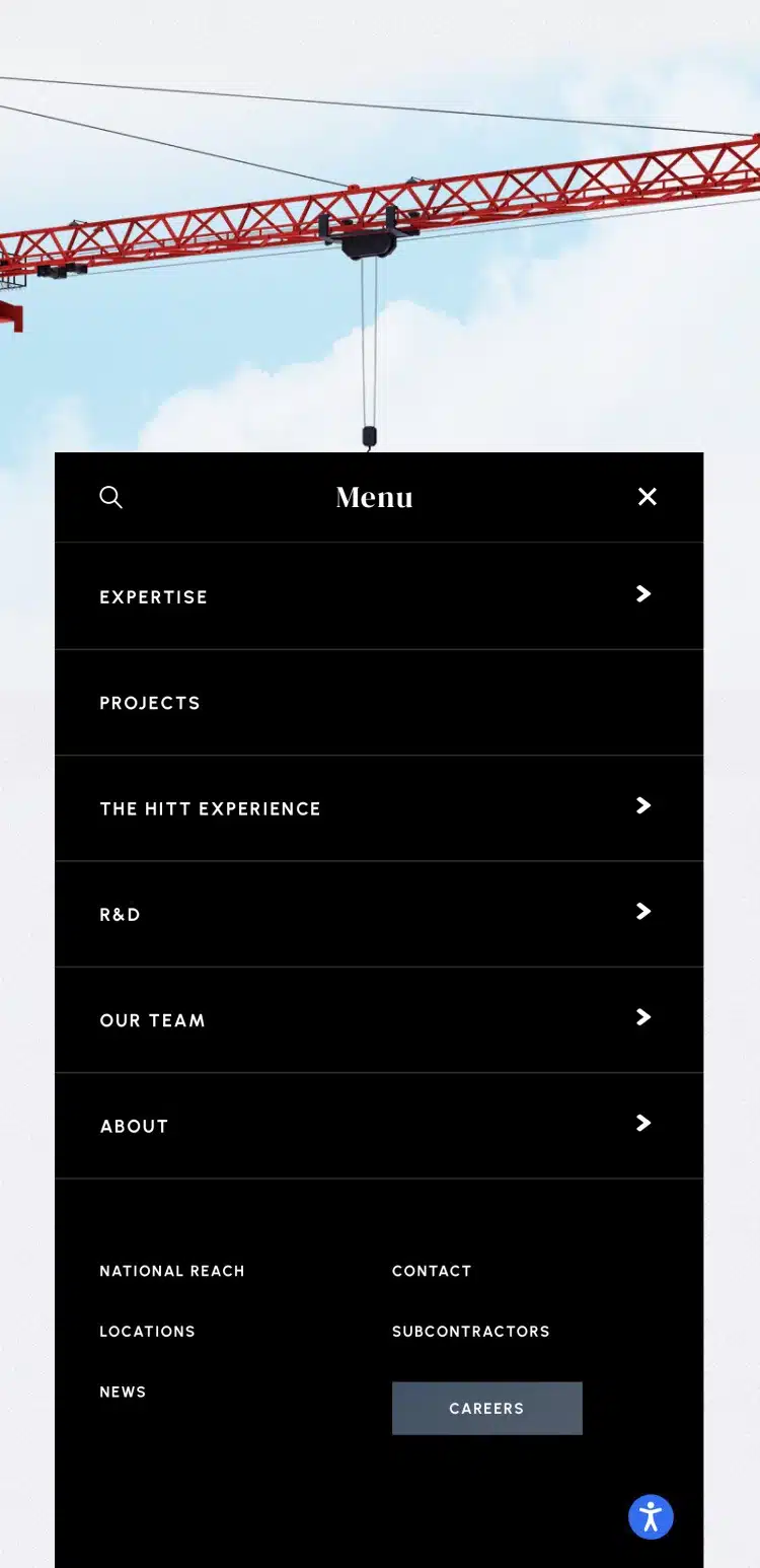
HITT has a massive site. Their navigation needed to work for a variety of different content areas while also being easy to use.


We chose to add the visual to drop-down areas such as markets to preview their work and continue with the visual experience of the site.

10-crane-new (1)
HITT - Mobile - Navigation

Case Studies

HITT needed case studies that not only highlighted the complexity of their projects but highlighted the craftsmanship and thought that went into each one.


Also, continuing with the goal of differentiating them from their competitors we wanted to deliver an experience that no one else had. The horizontal presentation of the work does exactly that.

Who We Are

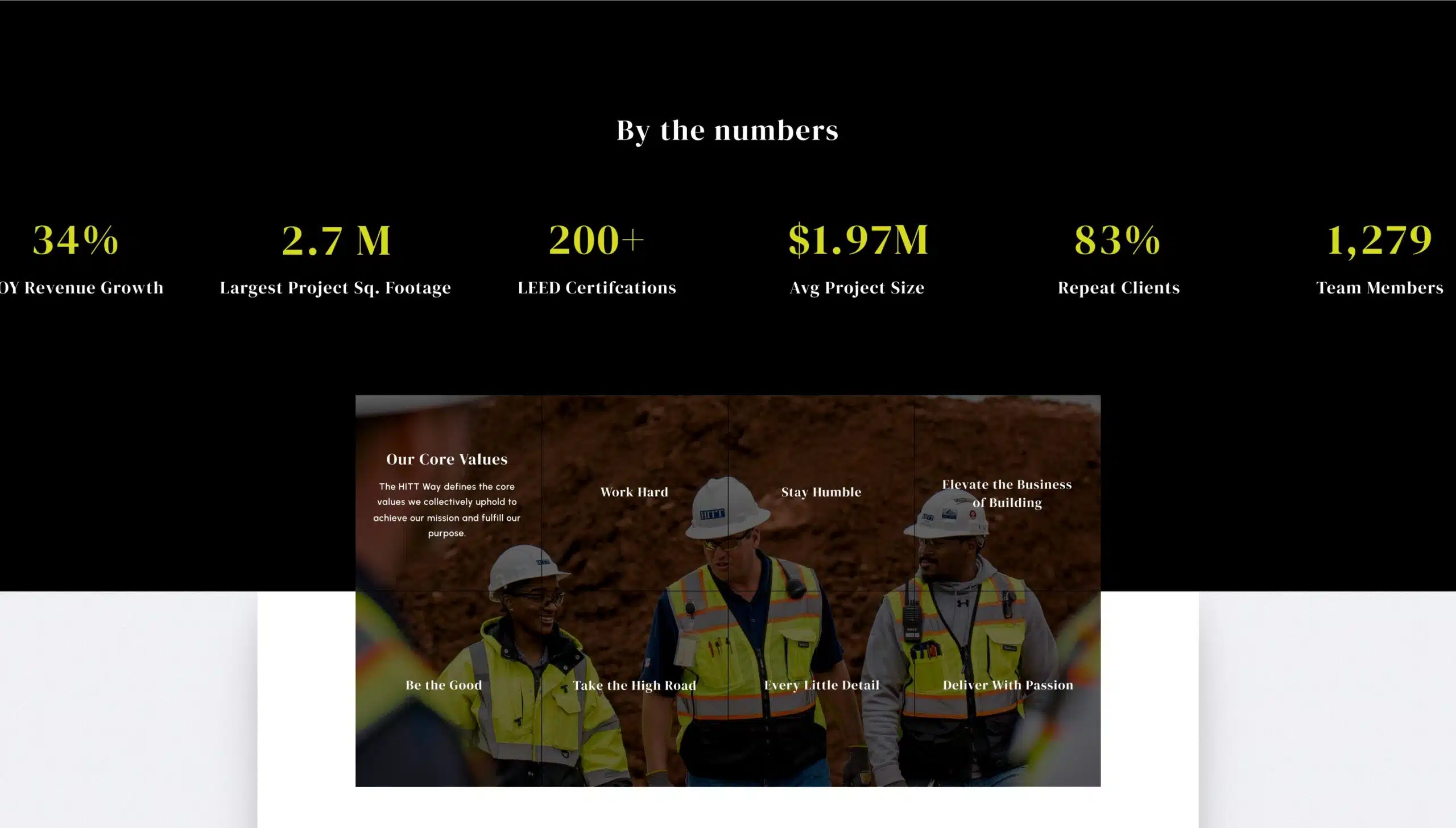
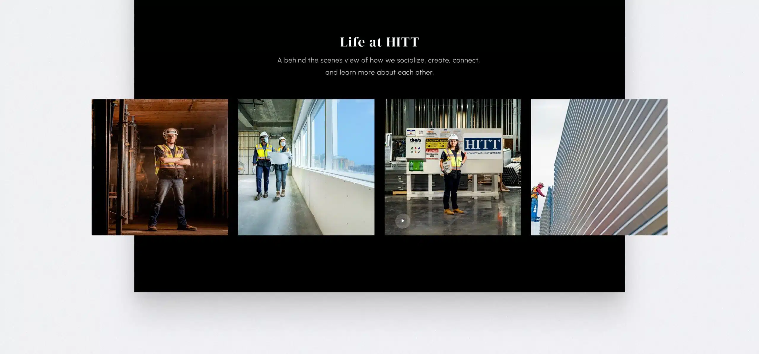
Our objective with the who we are page for HITT was to demonstrate both authority and attitude in a clear and concise way.


Key statistics show the scale of the organization, and values show what qualities they care about most.


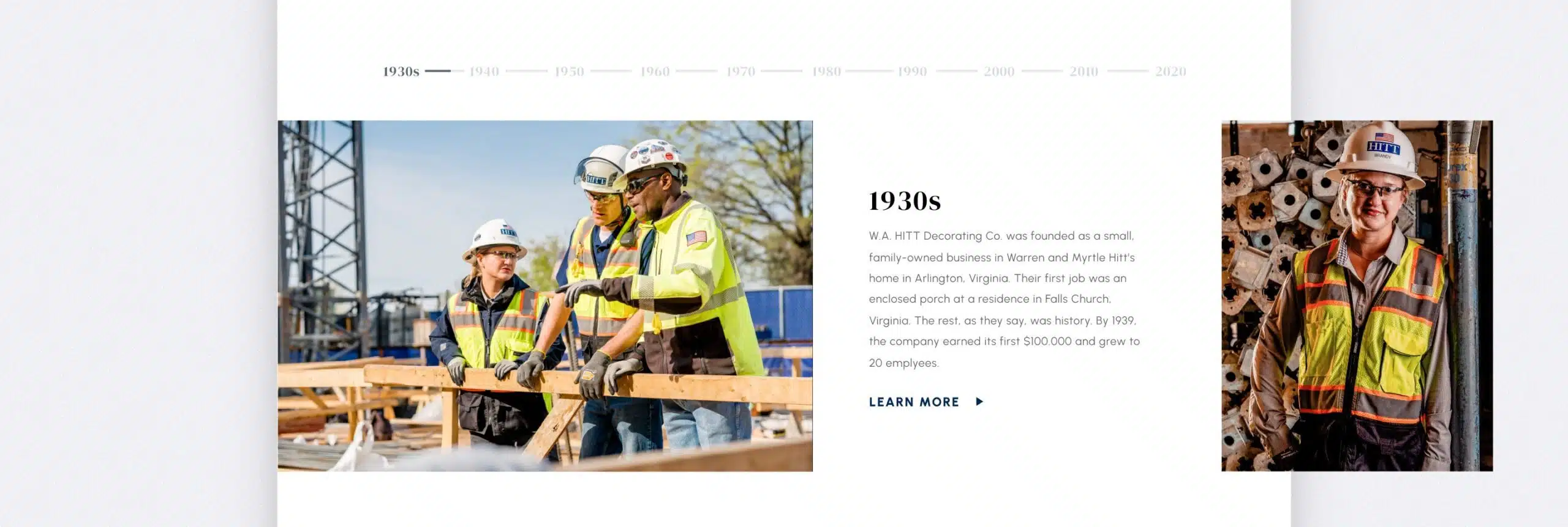
The introduction of their timeline slider also provided them the opportunity to so their longevity and evolution as a contractor.

13-Guy_worker
Who-we-are-Page_01
Who-we-are-Page_02
Who-we-are-Page_03
Who-we-are-Page_04
HITT - Mobile - Who We Are Page_01
HITT - Mobile - Who We Are Page_02
HITT - Mobile - Who We Are Page_03
HITT - Mobile - Who We Are Page_04
HITT - Mobile - Who We Are Page_05
HITT - Mobile - Who We Are Page_06

Qualification Forms

Not every company is a good fit for HITT. Our approach to forms focused on pre-qualifying only those who required the scale HITT can provide. Overall, this led to lead quality improving by 27%.

15-Form
HITT - Mobile - Form
solar system

Get Started Today

Your Website Is Your Marketing Foundation.

Investing in digital marketing without having a great website will only result in lost time, lost revenue, and poor brand perception.


Ready to avoid that headache?

Good, because we're ready to help.