Development
8 minute read
What Is a Good Click Through Rate and How To Boost Yours.
LAST UPDATED:
June 20, 2023


So, you’ve been working on your marketing strategy and your ads and content are finally live. You know your links are solid, but will enough people click on them?
Your click through rate (CTR) is one key performance indicator (KPI) to measure your success.
But do you know what your website’s click through rate is?
Are you tracking your click through rate at the moment? If not, you’re in trouble.
But don’t worry, we’re here to help!
Get your notes out and we’ll help you compare your CTR with what a good CTR should be.
Keep reading to learn what a good click through rate would be for your website!
First, let’s go over everything about click through rates, why they’re essential, and what a good CTR looks like.
What Exactly Is a Click Through Rate?

A click through rate (CTR) is a metric that measures the number of times a user clicks on an ad or link divided by the number of times the ad or link is displayed.
For example, if an ad is shown 100 times and clicked on ten times, the CTR would be 10%.
CTR is important because it helps marketers understand how well their ad or link performs in engagement.
A high CTR typically indicates that users find the ad or link relevant and valuable, while a low CTR may suggest that the ad or link is unsuitable or needs improvement.
Click through rate is just one metric that marketers use to measure the performance of their ads and links, but it’s an important one.
A high CTR can lead to more conversions (sales, leads, etc.), while a low CTR can lead to fewer conversions.
As a result, CTR can significantly impact a marketer’s bottom line.
How Do Click Through Rates Work?

CTRs have a very simple formula: CTR = (click-throughs / impressions) x 100
In other words, it’s the percentage of people who click on your ad out of the total number of people who see it.
For example, if your ad is seen by 1,000 people and 100 of them click on it, its CTR is 10%.
A high CTR is essential for successful online marketing and website development because it means that more people are taking the desired action (clicking on your ad) out of the total number of people who see it.
Several factors can affect your CTR, from the quality of your ad to the relevance of your keywords.
But if you want to increase your CTR, the best thing is to test different ad versions and see which one performs better.
What Is a Good Click Through Rate?
Now that we know what CTRs are and how they work, you’re probably wondering what a “good” CTR looks like.
Unfortunately, there is only a partial answer to this question; the ideal CTR will vary depending on factors like industry, ad type, and even location.
Generally speaking, though, a CTR of 1.9% or higher is considered good.
Anything above 5% is considered to be excellent.
Of course, there are always exceptions to the rule — so don’t be discouraged if your CTR isn’t as high as you’d like it to be.
Just keep working at it and test different strategies until you find one that works.
Now that you know what CTRs are, you may be thinking about how to improve yours. After all, your CTR is an essential component of your website’s success.
Here are some tips that will help you boost your click through rates throughout your website.
Update Your Call to Action Buttons

The best website design turns visitors into customers.
Your CTA buttons are one of the first things visitors see, so it’s vital to ensure they’re eye-catching and effective.
If your CTA buttons are small, bland, or in a location that’s not immediately visible, you will have a harder time getting people to click on them.
Instead, try updating your CTA buttons to be bigger and more attention-grabbing.
Use color contrast to make them stand out from the rest of your page, and place them above the fold, so visitors don’t have to scroll down to find them.
Most importantly, make sure your CTA copy is clear and concise — something like “Buy now,” “Sign up,” or “Download.”
By following these tips, you can ensure that your CTA buttons work hard for you and help you convert website visitors into leads or customers.
Here are additional methods to update your CTAs and improve your CTRs:
- Keep it short and sweet: Your CTA should be clear and concise — users should be able to understand what they need to do in just a few seconds.
- Make it visual: Users are more likely to notice and engage with a CTA if it’s visually appealing. So try using colors and shapes that stand out from — but still complement — the rest of your page.
- Use persuasive language: Your CTA copy should be convincing and make users want to take the desired action. Be sure to avoid any vague or generic language and use powerful words to drive results.
- Offer something valuable: Give users a reason to click on your CTA by offering something they want or need, like a free e-book or an exclusive discount.
- Test, test, test: Always test different versions of your CTAs to see what works best with your audience.

One of the most common mistakes we see are broad calls to action. ‘Learn More’ buttons are often used generically on websites, leading to decreased CTRs and poor search engine result performance. Providing detailed calls to actual action is a simple yet effective solution to increasing click throughs.
Christi Carnahan, Digital Strategist
Update Copy to Headings
Every website has a purpose. Whether you’re selling products, sharing information, or trying to build a community, you need website visitors to take action. Sometimes, the best way is to redesign your website.
Protip
Check out our Website Redesign Project Plan as a guide to redesigning your website!
Sometimes, it just needs a good copy, rewrite or update.
Good copy is intriguing and convincing. It tells visitors what they need to know and motivates them to take the next step.
Whether clicking through to another page, making a purchase, or contacting your company, good copy makes the next step clear and accessible.
If you want to improve your website’s performance, start by updating your document.
The headlines on your website or landing page are important because they tell visitors what they can expect to find on the rest of the page.
If your headlines could be more exciting, then people aren’t going to want to read the rest of your content.
Avoid using powerful words and emotion-evoking language in your headlines.
Make them curiosity-inducing by asking questions or promising results.
Most importantly, keep them short — ideally, no more than six words.
People have short attention spans these days, so you need to be able to grab their attention right away.
Freshen up your copy with these additional tips:
- Use headlines and subheadings: They will break up your text and make it easier to scan. Nobody wants to read huge blocks of text, so use headlines and subheadings to break things up.
- Incorporate bulleted or numbered lists: This will increase readability, making your content more user-friendly and engaging.
- Re-evaluate your headline: Is it attention-grabbing? Does it accurately reflect the content of your page? If not, it’s time for an update.
Make Images Clickable
Just by making your images clickable, you can increase the number of people who click through to other pages on your site.
If an image looks like it should be leading website visitors to another page, make sure that it does indeed connect to the next page.
If the image is not clickable, users may become frustrated and leave your site.
However, if the image leads them to the next page, they will likely stay on your site and continue browsing.
This may seem like a small detail, but it can make a big difference in how many people click through to the next page on your site.
For example, let’s say you have an eCommerce website and want people to click through to product pages.
A great way to do this is by adding clickable images of those products next to your product descriptions.
That way, people can easily click on the image and be taken directly to the product page without having to scroll down or search for it themselves.
But how will you make sure your clickable images get clicked? Here are a few ways to do that:
- Use descriptive filenames: When uploading images to your website, use descriptive filenames that include relevant keywords.
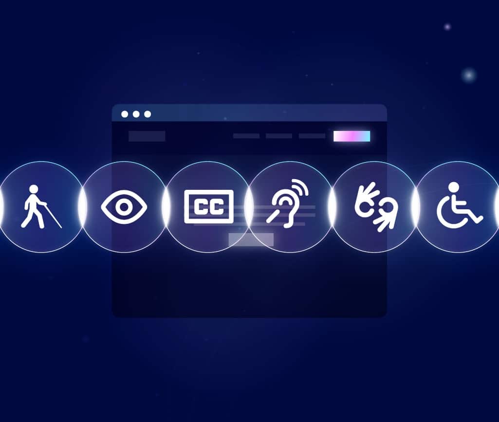
- Optimize your alt text: Besides using keywords in your filenames, include them in your alt text. This will help ensure that your images are accessible to everyone, including those with disabilities.
- Make your buttons stand out: Use a contrasting color or an attention-grabbing font to ensure they’re easy to spot.
- Use high-quality images: Finally, be sure to use high-quality images that are clear and free of distractions. Blurry or low-resolution photos will only serve to frustrate users and hurt your CTR.
Increasing your CTR is vital for the success of your website. Luckily, there are several things you can do to improve it.
Keep all of the tips we gave you in mind and start seeing better results today.
Don’t forget — a little experimentation never hurt anyone. Websites constantly change and evolve, so try out new designs or placements to see which ones work best for your audience.
If you want help implementing these changes or more information about how click through rates can benefit your business, contact us today.
We’re a web design agency that helps businesses earn more customers and improve their online presence.
We’d be happy to chat with you about our services and how we could help increase traffic to your website. We look forward to hearing from you!
Get Memorable Insights.
Sign up to receive actionable web design advice directly in your inbox monthly.
Get Memorable Insights.
Sign up to receive actionable web design advice directly in your inbox monthly.
Author
Jeff Gapinski is the President of Huemor where he helps plan the long-term strategic growth of the agency. Jeff is passionate about UI/UX, demand generation, and digital strategy.
What Do You Think?
Have feedback? Maybe some questions? Whatever it is, we'd love to hear from you.


No comments found