Conversion Optimization
10 minute read
Is Your Website Navigation Hurting Your Conversion Rate? Here’s How You Fix It.
LAST UPDATED:
August 28, 2023


In an ideal world, your users don’t even notice your website navigation. They use it to quickly get where they need to go, flowing through your site and to your conversion points in the exact paths you’ve mapped for them.
Unfortunately, too often, that ideal world doesn’t reflect reality. Navigation in web design becomes a sticking point that frustrates your users and hurts your conversions.
That’s not an uncommon problem, either; even the best web pages have some friction points in their site’s navigation.
It’s time to do something about that. According to one study, 94% of users believe your website needs to be easy to navigate. If it isn’t, 38% of visitors will stop engaging with your site immediately.
And that’s before we even begin to talk about the role that your navigation plays in your SEO efforts.
In other words, unassuming as it might be, your website’s navigation could actually be a major pivot point for your conversion rates and SEO efforts. If you don’t get it right, you risk a significant number of visitors dropping off a different website and failing to convert.
The good news: getting it right is not rocket science. You just need some basic knowledge about navigational structures, and how to avoid some of the most common mistakes made in this area. Let’s get started.
Table of Contents
Chapter 1: 5 Common Types of Website Navigation
Chapter 2: 7 Common Navigation Issues, and How to Fix Them
Chapter 3: Conclusion
At its most basic, your navigation in web design has a simple purpose: to get your website visitors where they need to go, quickly and without complications or confusion.
Do it right, and you’ll get them on a path you want them to go. They’ll quickly get valuable information from your website and perhaps even convert to a lead or customer if they’re ready for that step.
To get there, most sites use one or more of these 5 types of website navigation:
1. The Top Menu
Most readers probably envisioned the top menu immediately upon opening this guide. It’s the most common navigation menu option out there, a simple horizontal bar listing all the main sections of a web page.
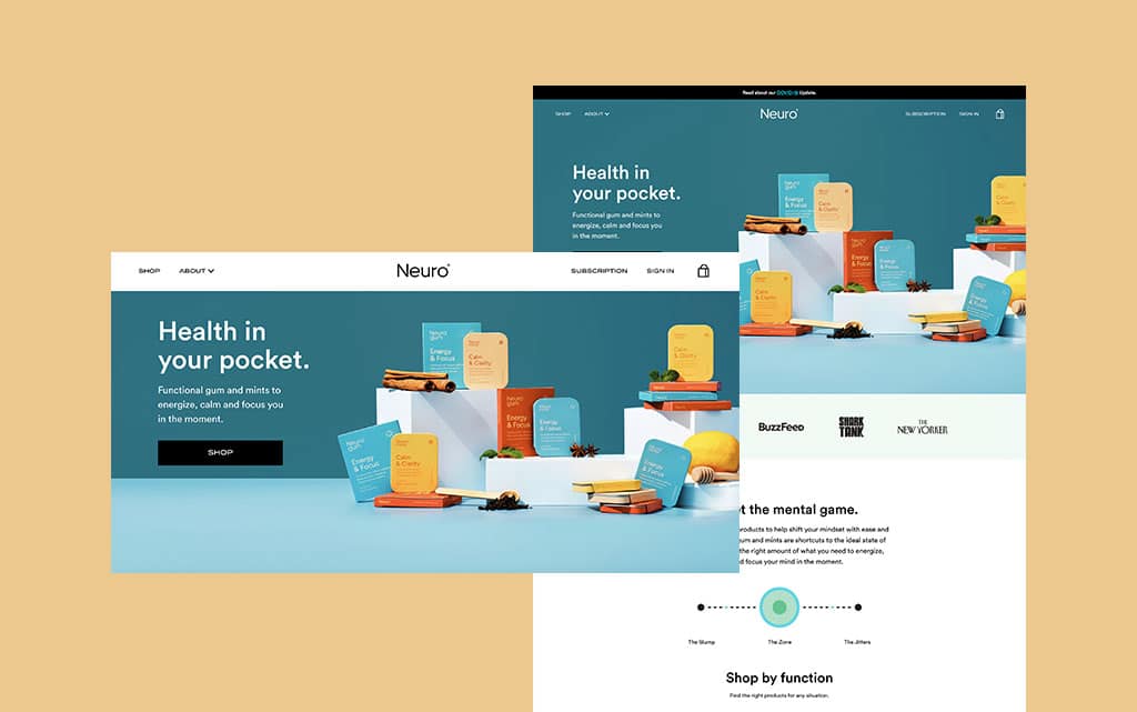
Top menus are so popular because they follow the F-shaped pattern we use to read web pages. It’s also often pinned to the top of the website browser window, staying visible even as visitors begin to scroll past the hero image and pop ups.
To get to more than the few sections that fit into the top navigation menu, many websites use drop-downs off the main items, which become categories. Another common option: the sidebar.
2. The Sidebar
Some websites have their main navigation on the left side of the page. For most, though, the sidebar is a secondary menu once you’re already in a specific category.
It’s a bar, usually on the left but sometimes on the right of the page, that presents subcategories to visitors. For content-rich sites that post plenty of site and social media content, it’s a good way to keep filtering down the search results.
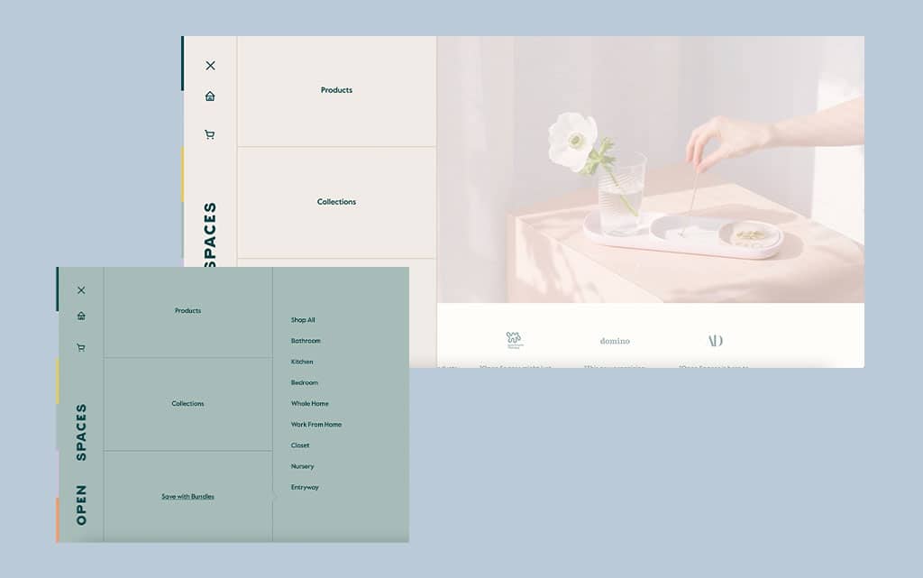
For example, after clicking on a company’s blog, you might find topic areas about related content within the blog in the sidebar.
3. The Footer
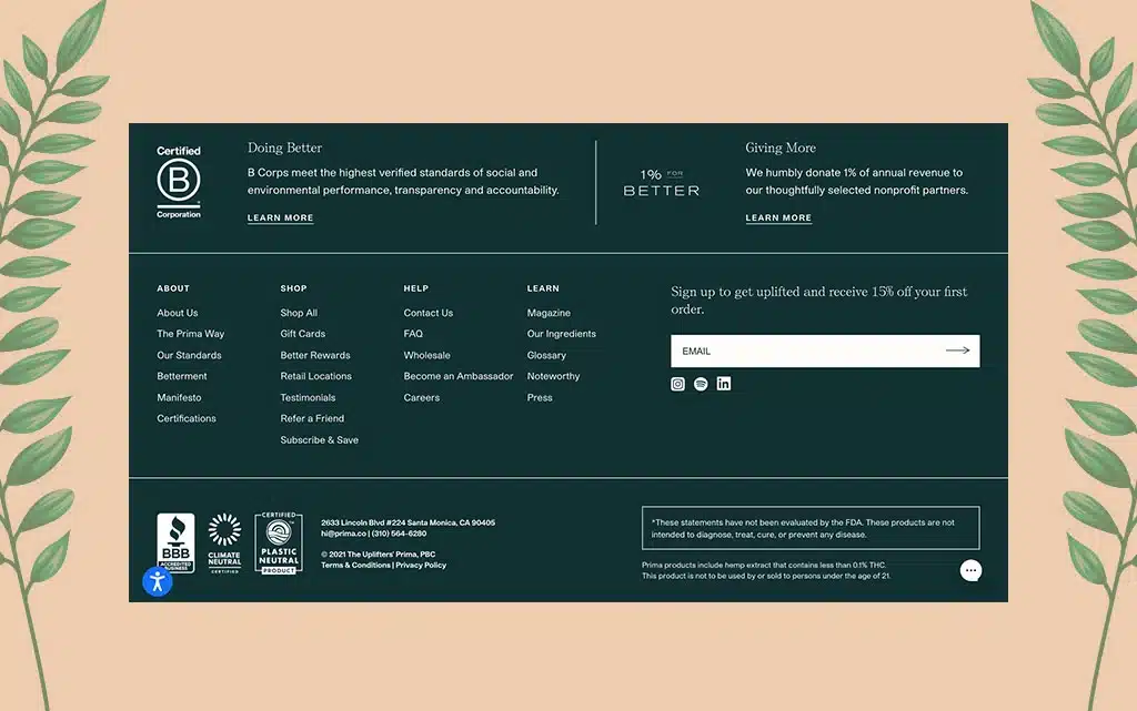
We’ve recently written about best practices for website footers, which are crucial website navigation options for many users. Information and links here shouldn’t duplicate what’s in your main nav, but add to it.
That means reserving it for the type of next steps your users might need once they reach the end of the page. Quick, easy links to conversion-rich pages within the website (and maybe even a secondary call to action) can all find their home in the footer.
4. The Breadcrumbs
These crumbs are not yet another list of links. Instead, they’re an opportunity to show the path to your target audience used to get to your website.
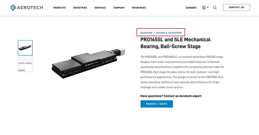
If your website goes deep into subcategories of subcategories, breadcrumbs become increasingly useful. They allow your audience to stay oriented with where they are, and easily go ‘one level up’ again if they need to. It’s a navigational crutch that has the potential to enhance your user experience.
5. The Hamburger Menu
Finally, the rise of mobile-first web design has brought one relatively new type of website navigation into the spotlight: the hamburger menu.
Getting its name from a vague 2D lookalike of a patty between two buns, the hamburger menu started as an option for mobile users for whom a standard navigation would take up the entire web page. Instead, it expands only upon clicking the icon, a kind of navigation-on-demand.
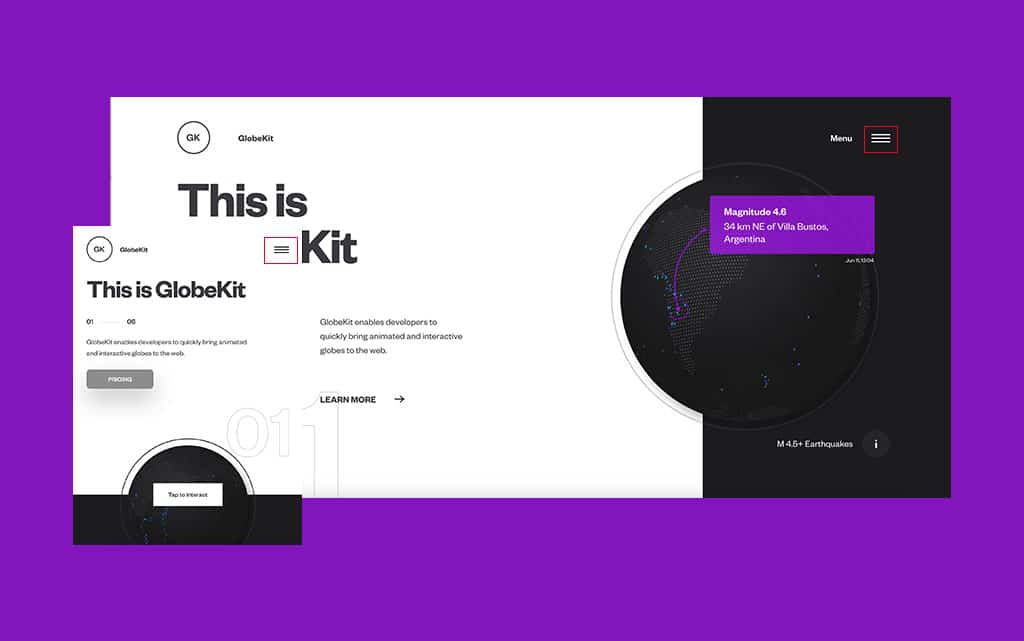
However, perhaps to save valuable screen size, hamburger menus are starting to nudge their way into the standard website navigation menu options, as well. Some UX experts are even starting to recommend it.
Now that you’ve familiarized yourself with the most common types, let’s jump into the most common problems we tend to encounter in the wild. Don’t worry, though. We’ll also provide some best practices in website navigation that can prevent you from making the same (or similar) mistakes.
Issue #1: Hidden Navigation
Your website navigation is so crucial to your overall user experience that you can’t afford to hide it. Research has shown that hidden nav items on a site lengthen the time it takes for visitors to search for what they need, increasing frustration in the process.
Hidden navigation comes in more than one way. It might be in an unexpected spot on your website, or blend in too much with your web design. Or, you could hide your individual items behind web design features like a hamburger menu or a “more” button.
The intention of saving space might be good, and the look might be great to anyone intimately familiar with the site. But if your navigation is hidden and its individual items aren’t obvious and easy to find for new visitors, you have a problem.
How to Fix It: Make it Obvious
Make sure the nav clearly stands out and is not hidden, and fully represents the options your users have at first glance. Some whitespace, between the navigation and the rest of the site as well as between individual nav items, also doesn’t hurt.
Issue #2: Vague Navigation Labels
It’s a mistake so widespread, it might as well be common practice. Navigation items are labeled products, videos, services, or something similar. In other words, your labels are how you’d name your internal folders on a hard drive, if you already knew what was in it.
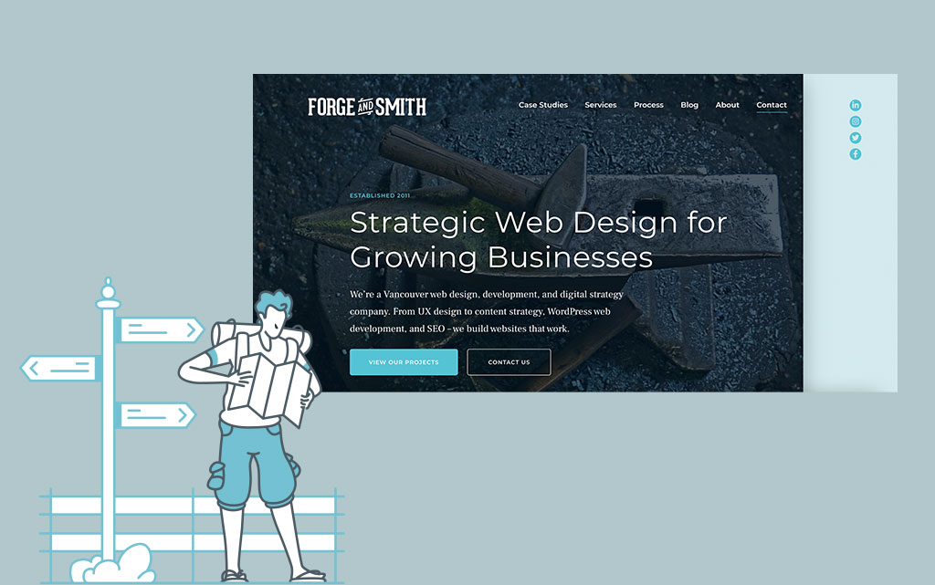
The problem is that your users don’t. They don’t know what services you offer, or what types of videos you’re about to show them. They’ll need to navigate around just to find out—and they won’t appreciate that extra step.
How to Fix It: Make Your Labels Descriptive
Ideally, every item in your navigation should say exactly what it’s about. Instead of services, list the type of service you offer. Instead of videos, highlight that they’re DIY tutorials on specific subjects.
As a bonus, search engines also love descriptive labels. You might even want to use keyword research to understand exactly how to label each nav item. That enhances your search engine optimization, Google Analytics, and your user experience, all at once.
Issue #3: Too Many Options
Who hasn’t come to a website and immediately left because the choices were just so overwhelming? It’s what psychologists describe as the Paralyzing Problem of Too Many Choices. For your website navigation, it could be an absolute killer.
Two reasons for that. One, too many navigational items, especially if not hierarchically sorted into subcategories, are difficult to browse through. Two, too many choices immediately from your landing page can negatively impact your page authority.
Most external pages link to your homepage, which Google consequently considers to have maximum authority. That authority is mainly distributed to pages directly linked from your site homepage. The more you link to, the lower the authority of each, lowering your ranking for those pages.
How to Fix It: Keep Your Main Options to 7 or Less
Seven seems to be a magic number here. Go above, and the negative impact on your visitors confusion and domain authority begins to multiply. In your main menu bar, it’s crucial not to go above.
That doesn’t mean sites can only have seven total pages beyond your homepage at least; just not seven ‘main pages’ just below your homepage. Beyond that, each should be part of an easily understandable sub-category.
Issue #4: Random Nav Item Order
Which items come first, and which come last? You’d be surprised how random that order can be. Some organizations love to list pricing as a priority, others last. About Us tends to go towards the end, as does a client portfolio. But sometimes, it’s services.
In other words, there isn’t an established best practice that everyone seems to follow. That doesn’t mean, of course, that there shouldn’t be. Once again, paying attention to your users’ expectations can go a long way towards finding a fix.
How to Fix It: The Serial Position Effect
Another psychology concept for you: when presented with a series of choices, we tend to remember those that came first and last by far the most.
For your site’s navigation, that means it makes sense that the spots in the middle are actually the least important. Lead your labels with the most important immediate next step (like signing up for a demo or describing your product), before ending with the most important final takeaway (like social proof or pricing).
Issue #5: Confusing Drop-Down Items
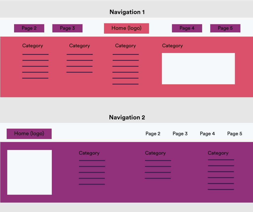
Drop-downs, in isolation, are often necessary—especially if you have more than seven pages on your website. But they can quickly turn from helpful to awful.
The last thing you want is a vague top-level label, followed by either a drop-down so small that it wasn’t even necessary, or a huge dropdown of an alphabetized list. It’s a sure sign to your audience to jump ship.
Search engines also don’t necessarily like drop-downs because of how difficult they are to crawl. So if you use one, you better get it right.
How to Fix It: Structure Your Drop-Downs
First, take a look and make sure that your page count actually needs a drop-down. A secondary sidebar might actually be more beneficial in your scenario. If you do need one, make sure it’s structured right, with intuitive categories and no more than five links within each category.
Issue #6: Navigation/Button Confusion
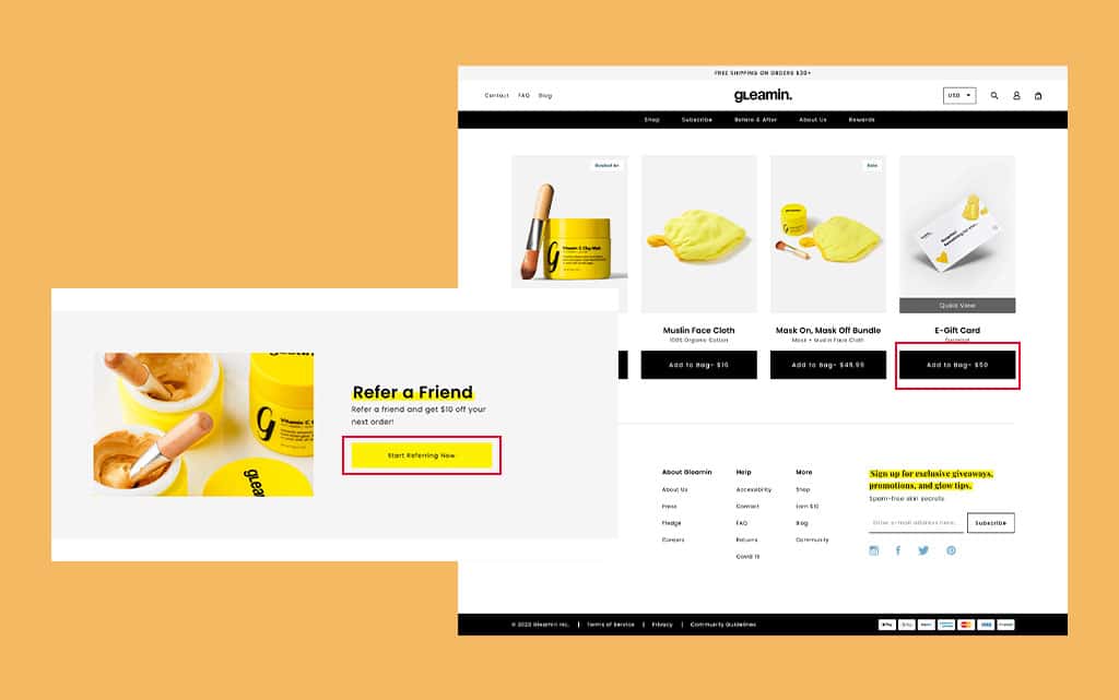
Your website has a navigation for users to get around, and call-to-action buttons for them to convert. Some nav bars or footers even have buttons, too. But it can be fatal to confuse the two, or use one as a substitute for the other.
You might be tempted to use the same colors or shapes in both your buttons and your navigation. But that actually confuses your site users and can turn them away from the conversion paths you’ve built. Websites where the wayfinding and goal seeking are mixed up tend to be a mess to navigate.
How to Fix It: Create a Clear Design Hierarchy
It’s quite simple, actually. Your nav should look one way, and your call-to-action buttons should look another. While they can both fit into a larger branding scheme, their styles should be clearly distinguished in your design hierarchy.
Want to test it out? Place a button directly over your nav bar. Can you still tell that the goal here is separate and different from simple wayfinding? Makes sense, right? If so, your web design hierarchy is working, and your users become much more likely to be confused (and more likely to reach conversion rate optimization).
Issue #7: Mobile Unfriendliness
In 2022, everything about your website needs to be optimized for mobile. Unfortunately, too many websites go 90% of the way, but fall short when it comes to their navigation.
The top bar might be hidden in a hamburger menu, with difficult-to-navigate dropdown sub-categories. The footer text might become too small for touch-based operation. And we haven’t even started talking about the challenges of a secondary navigation (like a sidebar) on a screen too small for it to fit.
So, you get to a system that’s largely mobile-unfriendly and basically non responsive for mobile. That means potentially alienating almost 70% of your site visitors. Not a good look, and certainly not good for conversions with your target audience.
.jpg)
Oh, and you could also get some serious SEO penalties.
How to Fix It: Test Your Mobile Nav System
The initial solution here is actually pretty simple: navigate your own website with your own mobile device. That could give you some serious initial insights.
Then, get some credible third parties to review the same thing from their devices, as well. Only be satisfied when the navigation and site design works as well and is as simple on mobile devices as it does on desktop.
When the goal is to be as unassuming and natural as possible, it’s easy to underestimate just how important website navigation truly is for your users. But it’s issues like the above that make it clear: if you don’t get it right, you will lose valuable credibility, attention, and conversions.
The good news is that each of the most common issues also have relatively simple best practice fixes. Take good care of your website, and you’ll begin to create more interaction, keep your audience’s attention for longer, and drive more customers effectively towards conversions.
Over to you. What common navigational issues have you encountered in your daily browsing? Any great example of a website that stands out positively and shows how it’s done right? Share your first impression and thoughts in the comments below.
FREE ANALYSIS
Request Your FREE Website Analysis
Get Memorable Insights.
Sign up to receive actionable web design advice directly in your inbox monthly.
Get Memorable Insights.
Sign up to receive actionable web design advice directly in your inbox monthly.
Author
Jeff Gapinski is the President of Huemor where he helps plan the long-term strategic growth of the agency. Jeff is passionate about UI/UX, demand generation, and digital strategy.
What Do You Think?
Have feedback? Maybe some questions? Whatever it is, we'd love to hear from you.


No comments found