Design
19 minute read
How To Create a Web Design System for Your Website.
LAST UPDATED:
August 15, 2023

Websites require design teams for successful creation and launch, where documentation is needed to guide your team and to provide everyone with a consistent experience.
Whether you’re building a new website, or undertaking a website redesign, making a design system will help you stay on track.
When it comes to building a design system, consistency is key and is no different from web design, especially when it comes to the design structure of blog content.
Design systems are a set of patterns or web design standards that are consistently used throughout your website’s pages or blog posts. These are created and guided by the requirements of your blog content and even the overall branding for your company.
Essentially, your design system will be a collection of reusable parts for your blog content that will allow your team to get work done faster and more efficiently.
A design system should be the ultimate resource center for your production team that will allow them to keep creating and developing your blog content.
However, many designers will find what exactly they need to include in their design systems. While every organization has different needs, there are a few elements that every content design will need, including:
Patterns and Components
Components refer to the functional elements of your design: think of them as the building blocks of your design systems.
When combined, all of the components you have will form a library that your designers can go back to and use whenever they need to create products. Patterns can provide you with a set of protocols that can form a construction manual for your designers to look into when they need to use components.
Material Design System
Android’s Material Design system is one of the most intuitive and comprehensive design languages available for use on mobile devices. Google’s long-term commitment to Android has resulted in a platform that is not only feature-rich, but also consistently easy to use.
One of the key features of Material Design is its focus on natural motion and realistic lighting effects. This helps to create an immersive experience that feels more like using real-world objects than traditional on-screen elements.
Another key advantage of Material Design is its ability to scale across different screen sizes and form factors. This makes it an ideal choice for use on both phones and tablets. Ultimately, the combination of these two factors makes Material Design one of the most versatile and user-friendly design systems available.
Design System Repo
Repo design is a type of software design that centers around repositories.
Repositories are a fundamental part of the design of many software applications. They provide a central location for accessing data, which can be useful for maintaining the application and decoupling the domain model from the underlying data storage mechanism.
Repositories can also help to improve performance by caching data and reducing the number of database queries that need to be made. In addition, repositories can provide a consistent interface for accessing data, regardless of the underlying technology or platform.
When designing repositories, it is important to consider the tradeoffs between flexibility and performance.
Design System Examples
A design system is a set of rules or guidelines for creating consistent, cohesive user interfaces. There are many different design systems available, and each has its own specific focus and purpose. For example:
Google Material Design System
The Google Material Design System is a comprehensive guide for visual, interaction, motion, and usability design across platforms and devices. Google developed Material Design to provide design resources and a consistent design language for its products, which include Android and the web.
Uber Design System
The Uber Design System is a set of guidelines, libraries, and tools that help teams at Uber create consistent, reliable, and user-friendly products. The system includes best practices for everything from typography and color to layout and buttons, as well as a comprehensive component library. The design philosophy of the Uber Design System is to make it easy for teams to build beautiful products that work together seamlessly.
Apple Human Interface Guidelines
The Apple Human Interface Guidelines are a set of standards developed by Apple to ensure that applications offer a consistent and enjoyable user experience. They cover a wide range of topics, from the overall look and feel of a product to specific details like icon design and button placement. While the guidelines are primarily focused on software design, they also provide recommendations for hardware design and web development. In addition to covering topics such as interface design and interaction, the guidelines also include specific guidance on how to use Apple’s own products and technologies.
Spotify Design System
The Spotify design system is a set of tools, design components, and design guidelines that help designers create consistent, user-friendly experiences across all of Spotify’s products. The system includes everything from branding to typography to layout, and it’s constantly evolving to meet the needs of Spotify’s ever-changing product ecosystem. Perhaps one of the most unique aspects of the Spotify design system is its focus on modularity. Designers are encouraged to break down their designs into small, reusable pieces that can be easily assembled into new designs. This approach not only helps to speed up the design process, but it also ensures that all Spotify products share a common visual language. As a result, users can move seamlessly from one Spotify product to another, regardless of which device they’re using.
Microsoft Fluent Design System
Microsoft’s Fluent Design System is the latest major revision to the company’s design language. First introduced with Windows 10, Fluent Design is a departure from Microsoft’s previous Metro design language. Instead of flat, static shapes, Fluent Design features highly-detailed surfaces and lighting effects that give apps a more natural look and feel. In addition, Microsoft has introduced new animations and transitions that make better use of the available screen real estate. The result is a more aesthetically-pleasing and user-friendly design system that is better suited for the modern era of touch-based computing.
Atlassian Design System
Atlassian’s design system is a set of principles, methods, and tools for creating digital products. It includes best practices for design, development, and testing, as well as a library of reusable components. The system is based on the principle that all digital products should be designed and built in a consistent way, using a common language and set of tools. The system is based on the principle of “atomic design” which breaks down complex designs into smaller, more manageable pieces. This allows UX designers to work on specific parts of a design without having to worry about the overall structure. The system also includes a library of reusable UI components that can be used in any Atlassian product. These components are designed to be consistent with each other and easy to use with any type of UI design. The Atlassian Design System is constantly evolving to keep up with the latest trends and technologies.
Mailchimp Design System
The Mailchimp Design System is a collection of reusable components that can be used to build websites and applications. The Mailchimp pattern library contains a variety of common UI design components and patterns that can be used in your designs. In addition, the system includes a style guide, which provides guidance on how to use the mailchimp brand in your designs. The Mailchimp Design System is an excellent resource for web designers who want to create consistent, high-quality designs.
Design Principles
Design principles refer to the guiding rules that can help your team make the right design decisions. Your design principles will also reflect your whole team’s shared beliefs about content aesthetics.
Design System Tools
Design system tools help developers to create and understand the systems they are designing. Main types of design system tools include:
- A system flow chart shows the main components of a system and how they are interconnected. It is a useful tool for understanding how a system works.
- A data flow diagram (DFD) shows the flow of data through a system. It is a useful tool for understanding how data is processed by a system.
- An entity-relation diagram shows the relationships between entities in a system. It is a useful tool for understanding the structure of a system.
- A context diagram shows the context in which a system operates. It is a useful tool for understanding the environment in which a system operates.
- A decision table shows the possible outcomes of a decision. It is a useful tool for understanding the options available to a decision maker.
- A decision tree shows the possible outcomes of a decision. It is a useful tool for understanding the options available to a decision maker.
- A use case is an illustration of how a user uses a system. It is a useful tool for understanding how users interact with systems.
Depending on the complexity of the design system, multiple tools may need to be used in order to create a complete picture. However, by understanding the strengths and weaknesses of each tool, designers can create an effective design system that meets their specific needs.
Style Guides
Your style guide will refer to the deliverables that revolve around the graphics used in your content, including fonts, colors, and illustrations. A style guide needs to be formulated around your brand values—for example, the use of functional elements like a call-to-action button.
There are numerous reasons and advantages to creating a design system for your ecommerce website, small business website, or enterprise website, but these are the most important:
Keep Everything Similar
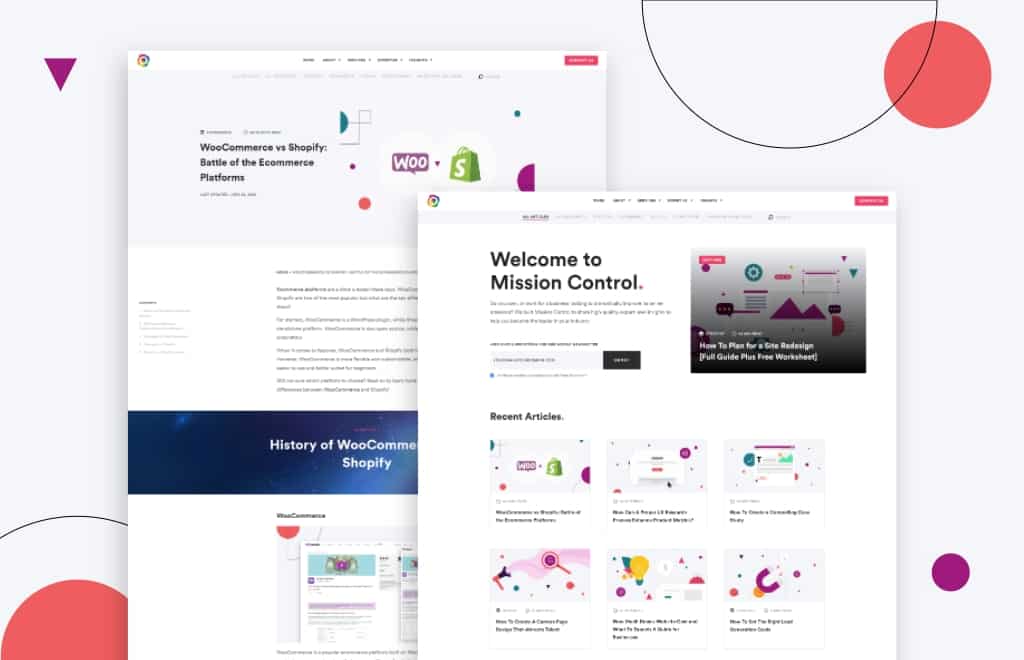
When you keep everything similar, your blog readers will thank you for it. Consistency is important—using the same elements throughout your website will provide users with a better browsing experience.
Because your loyal customers already know what to expect from your website, products, and services, it’s important to be able to deliver the same experience every time.
By using the same components, you will be able to provide viewers with consistency and quality wherever they go to find you. Doing this will also help to decrease the bounce rate, which means that people will stay on your website longer and will be more likely to purchase your product or service.
Visually Appealing
Whether you have a WordPress, Wix, Webflow, Drupal, or Shopify website, an effective design system can help to keep everything in your website or blog visually appealing and familiar to your visitors, making it easier and faster for them to navigate.
By breaking your design elements down into smaller and individualized pieces, having a design system will make the entire process more efficient. Planning, developing, and testing all components ensures that they have uniformity and are streamlined to reduce the amount of work that goes into them.
What If I’m Starting With Nothing?
The first step is to not panic.
Start by evaluating what your content already has and ask yourself the following questions:
- Which elements work well?
- Which elements are you happy with?
- What would you like replaced?
- Are there inconsistencies between the products or pages?
Be sure to review every digital asset you have and look through all of the existing reference materials. It will also help to look at other companies within your industry and see what they are doing.
Look for any established patterns then decide if you would like to do something similar or if you want to change things up to be a stand-out industry leader.
Your end goal is to make a resource library and universal guidebook that your team can go back to and use whenever needed. It should contain everything you need to create your content and consist of the following:
- Your brand colors and how they are used
- Text choices such as your fonts, grammar selections, tone of voice, and other specialized components of the text.
- Icon libraries
- Photo libraries, both custom and stock
- Other graphics, such as your logo — be sure to reevaluate your logo if you’re unsure of your current one
- UI patterns—be sure to take note of which ones need an update
- Themes and page templates
If you have a startup website and you don’t currently have any finalized design elements, now is the time to critically think about each area to determine which options best suit your brand.
You’ll have time to start a master list later, so it will benefit you to decide on more important elements now.
Know Your Audience and Set Objectives
This is by far the most important process of creating your whole content design, and everything will be for nothing if you don’t fully understand your audience and what drives you.
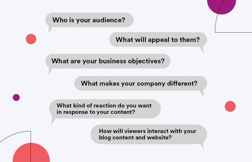
Start by setting clear and direct goals for your team and ask yourself important questions such as:
- Who is your audience?
- What will appeal to them?
- What are your business objectives?
- What makes your company different?
- What kind of reaction do you want in response to your content?
- How will viewers interact with your blog content and website?
Using these questions and doing your UX research will help you determine the objectives you need to set for your blog content. The answers you get from these questions will help you determine your goals.
Go through your analytics and see how long your target audience usually takes to read your content and find out what they’re looking for or what they’re hoping to get from reading your blog.
Assess the Current Situation of Your Web Design System
To fully understand your current website design system, and what you would like to adapt it to, you first have to start reviewing your company’s current design approach and choices.
The best way to do this is to once honestly answer questions such as:
- What are the existing tools currently used by your company?
- What are the details behind these design processes?
- What are the current design processes being followed by your company?
- What kind of tools is your company currently using to achieve these results?
Once you’ve answered these questions, you’ll be able to get a clear understanding of where your company stands and where you can take it from there.
It’s also recommended that you evaluate the level of your product teams’ design maturity. Having this knowledge will allow you to estimate how much time you need to introduce the new system to your company.
During this time, it will also help to look at your branding and to ask yourself more questions, including:
- What is your brand?
- What is your content?
- What are your brand guidelines?
Make sure that you’re telling your audience a coherent story that is consistent throughout all your blogs.
Define Your Look and Feel
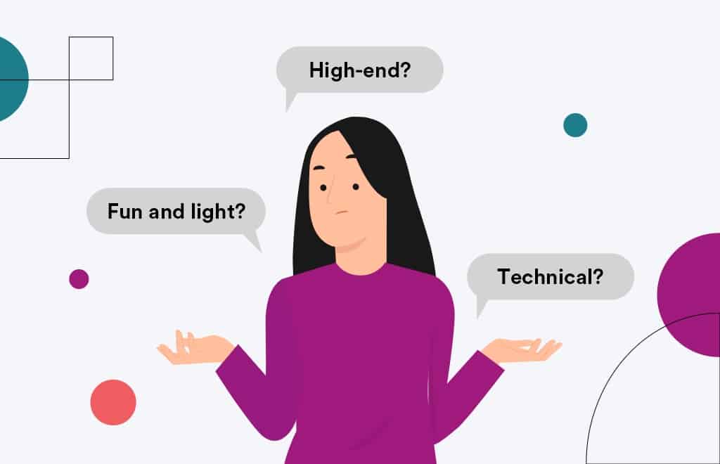
When you’re trying to determine the look and feel of your blog, ask yourself how you want to be perceived. Fun and light? High-end? Technical?
Visual design decisions can sway the viewer’s perception in a variety of ways, so you may want to use illustrations, photography, or a combination of both.
But as a pro tip, we suggest picking one direction or the other instead of both.
This will ultimately allow your content to seem more consistent and take some variation out of the equation.
Note that the “voice” you take will serve as the personality of your company and will be the character that your brand takes on. The tone of your writing will reflect the mood you’re trying to send your readers and could change based on the context.
For example, the tone of your writing for a concert will be different from a topic such as vacuum cleaners.
Decide on Your Process
Ask yourself how your content will be created: will you have everything done by your team or will you look to hire someone to create the content for you? Because writing is a technical profession, it’s essential to stick to the rules.
Be sure to think about the following:
- Banned and preferred keywords and phrases
- Specific terminology that your company uses
- Mechanical and grammar issues
Depending on the nature of your company, you may or may not have a wide range of terminologies—you may or may not need to use different words to describe one thing.
To help your team manage, you can determine which specific words and terms you need to use while trying to stick to these throughout all your channels and blogs to provide a smooth and coherent experience.

“A well-thought design system can help brands expand and adapt their digital experiences with little effort. However, if little effort is put into the design system, a brand will struggle to expand consistently.”
– James Utkovic, Creative Director
Define All the Formats You Need
By having a well-made design, you can simply drag and drop each component you have right into a new blog. The more assets you’re able to clearly define, the faster your workflow for future projects will be.
Don’t forget to include the appropriate documentation that your team may need—even small inclusions will be a huge help during a new development stage.
At a minimum, your website design system should plan for:
- Post thumbnails
- Featured images
- Section headings
- Icons
- Embedded content
Make sure that each format is accounted for, and that all of them have a united thread.
Create Reusable Components
You can make life easier by creating reusable components that can be easily pulled, reworked, and used in each piece of content.
This could be saved items such as:
- Quoted texts
- Pro-tips
- Chapter headings
- Calls to action
- Forms
- Email sign-ups
These are key components that can be used over and over again and can elevate your blog content by making it more engaging and interesting to read.
Protip
Make sure your actual design tool, whether that be Photoshop, Illustrator, Canva, or something else, has pre-made templates added to it to ensure team members can easily pull the right file.
This is an important step in creating a complete design system; documentation and standards are what separate a pattern library from a true design system.
Before beginning work on your design system, take a moment to think about the team you’ll need to bring it to life.
Who needs to be involved? More often than not, you’ll need more than just designers.
Develop the right set of guidelines to improve your blog quality and output, while also limiting costs in the long run.
What Guidelines to Include?
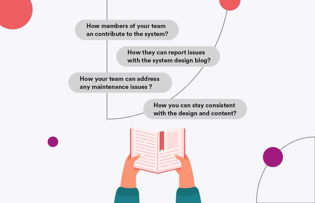
Without a clear guideline on how to build a design system and when to use design elements, you’ll be left with nothing but libraries and elements.
As you make your design system, make sure that you document the shared practices that your whole team can use that can be duplicated and maintained.
Things that you can include in your documentation process include:
- How members of your team can contribute to the system
- How they can report issues with the system design blog
- How your team can address any maintenance issues
- How you can stay consistent with the design and content
It’s also best to keep examples of the various versions of individual elements of your blog such as inner post content, featured images, section banners, and more.
Creating design systems doesn’t have to be difficult; it all depends on the branding of your company, and consistency is key.
Remember that making reusable components can help save time in the future and will help you stay consistent for each blog post.
Moreover, it will be useful to create a brand book with guidelines to convey key expectations of how your content should be presented.
By putting all these to work, you’ll be able to prepare for your future blogs to deliver a better and smoother user experience.
Here are some best practices and further info on website design systems, website development, and website design in general. If you have further questions, don’t hesitate to reach out.
Website Design System FAQ
Questions about how to create a website design system? We try to answer them here.
What is a website design system?
A website design system is a set of refined visual and interactive components that can be used to build websites. It includes things like standardized HTML and CSS code, as well as reusable mobile-ready UI elements such as headers, footers, and navigation menus, that can be assembled to create a unique website.
A good website design system helps to create consistent, responsive, and easy-to-use websites. It can also save time and money by allowing designers to reuse code and assets across multiple projects. In recent years, many companies have adopted design systems as a way to improve the quality and efficiency of their web development process.
Design systems can be used to create both static and dynamic websites. Static websites are typically faster and easier to build, while dynamic websites can provide a more customized experience for users. Design systems can be built using a variety of programming languages, but the most popular ones are HTML, CSS, and JavaScript.
By making it easy for designers to work with standardized code and components, design systems help to create better websites in less time. As a result, they are becoming increasingly popular with both small businesses and large enterprises.
How do you create a web design system?
The goal of a web design system is to create a consistent, cohesive experience for users across all devices and platforms.
Creating a web design system starts with defining the overall look and feel of the website. This includes choosing a color palette, typography, and iconography. Once these elements are defined, they can be coded into reusable modules that can be used throughout the website. The style guide should be regularly updated as the website evolves, so that new designs can be added and existing ones can be modified.
Maintaining a web design system requires ongoing collaboration between designers and developers. Designers need to provide clear specifications for how their designs should be implemented, and developers need to give feedback on what is possible given the constraints of the system. By working together, designers and developers can ensure that the web design system meets the needs of both users and the business.
Whether you want to create a web design system for your WooCommerce store, Shopify site, or B2B website, these tips apply equally across platforms and industries.
Do you need a design system for a website?
If you’re working on a website project, you may be wondering if you need a design system. A design system is a collection of rules and guidelines that dictate how your website should look and function. It can be helpful to have a design system in place so that everyone on the team is on the same page and knows what to expect. However, a design system can also be time-consuming to create and maintain.
Ultimately, whether or not you need a design system for your website project depends on the size and complexity of the project, as well as the preferences of your team.
If you’re working on a small, straightforward project, you may not need a design system. On the other hand, if you’re working on a large, complex project, or if your team prefers to work with clear guidelines, then a design system may be a good idea.
What are examples of design systems?
Design systems are detailed sets of guidelines that explain how to design and develop digital products. They typically include rules for everything from branding and typography to user flows and behavior. Many major tech companies have their own design systems, which are used by their in-house teams and often made available to the public.
Some examples of design systems include Google Material Design, Spotify Design System, Uber’s Design System, Apple’s Human Interface Guidelines, Microsoft’s Fluent Design System, Atlassian’s Design System, Shopify’s Design System, IBM’s Carbon Design System, Mailchimp’s Design System, Salesforce Lightning Design System, and Helpscout’s Design System. While each design system has its own unique quirks, they all share the same goal of providing a consistent and well-designed user experience.
Which is better, WooCommerce or Shopify?
When comparing WooCommerce vs Shopify, there is no clear winner. Each platform has pros and cons, and it comes down to what matters most to you and what you are trying to do with your store. Whether you have a B2B ecommerce website or a beauty brand, you’ll need to dig in deep to understand each ecommerce platform and what it offers. Our article comparing WooCommerce and Shopify is a good place to start.
Can you redesign my website, including the checkout page?
Yes, website redesign is one of our primary specialties. No matter which ecommerce site you’re on, we can redesign your entire site, including the about us page, checkout page, product pages, category pages, and blog.
Further Reading On Website Design and Development.
Looking for web development and design inspiration? These articles should help.
- How Much Does It Cost to Build a Website?
- A Step-by-Step Website Redesign Project Plan
- How to Build a Web Design System
- Our Approach to WordPress Web Design
- Choosing the Right Product Metrics Using UX Research Process
- Our Top Retail Website Examples
- Understanding Web Design vs Web Development
- Our Top Beauty Website Examples
- Our Shopify Speed Guide Checklist
- Guide to Optimizing Shopify Image sizes
- Our Service Page Layout Examples
- Best SaaS Websites of 2022
- Our Approach to HubSpot Website Design
- New Website SEO Foundations
- Our Approach to Startup Website Design and Development
- WordPress Performance Optimization Best Practices
- 100 Ecommerce Website Design Tips
- How to Use Dynamic Website Content
- All About SaaS Website Design
Get Memorable Insights.
Sign up to receive actionable web design advice directly in your inbox monthly.
Get Memorable Insights.
Sign up to receive actionable web design advice directly in your inbox monthly.
Author
Jeff Gapinski is the President of Huemor where he helps plan the long-term strategic growth of the agency. Jeff is passionate about UI/UX, demand generation, and digital strategy.
What Do You Think?
Have feedback? Maybe some questions? Whatever it is, we'd love to hear from you.



No comments found