Conversion Optimization
23 minute read
11 Tricks to Boost User Experience Conversions on Your Website.
LAST UPDATED:
March 27, 2024


People visit websites for a variety of reasons: to find information, to make a purchase, or simply to browse.
No matter the reason, website owners want their visitors to have a positive experience.
There are a number of tricks you can use to improve your site’s UX and encourage more visitors to take a desired action. You will see an immediate improvement in your website’s performance.
This blog post will discuss some of the best UX tricks you can use to improve your user experience in order to improve your website’s conversion rate.
User experience conversions will go up from implementing some or all of the 11 tips below.
UX design is the process of designing products that are both useful and enjoyable to use. This includes everything from the layout of a website to the buttons on a mobile app.
UX design is all about creating websites that are easy to use and provide good customer experiences.
In order to create a good UX design, UX designers need to have a good understanding of both human psychology and visual design principles.
By understanding the different types of user behavior, they can use persuasive design techniques to create an easy-to-navigate website design that matches the user’s needs exactly.
One of the most important things they do is focus on the user’s needs and goals. They also take into account the user’s feedback when designing websites.
UX designers use various techniques to improve website usability and make it more user-friendly.
Website navigation is just one aspect of UX design. To create an effective website navigation system, the UX design team needs to create a customer journey map, starting from the moment users land on the website until the moment they leave.
This can be a daunting task, which is why UX teams use various site design tools to help them, such as wireframes and prototypes.
Wireframes are essentially skeletal versions of a website that show the website’s structure and layout. They are used to map out the UI/UX design elements of the website’s navigation, and content hierarchy.
Prototypes, on the other hand, are more detailed versions of a website that allow designers to test out the website’s interaction design and user flows.
Additionally, UX design can help improve brand loyalty and customer satisfaction, increase engagement and the number of site visits, and decrease bounce rates.
Creating a great user experience involves careful planning and attention to detail.
There are five key elements of UX design: strategy, scope, structure, skeleton, and surface.
- Strategy refers to the overall plan for the design, including the features and functionality that will be included.
- Scope defines what will be included in the design and what will be left out.
- Structure encompasses the organizational hierarchy of the design and how information will be presented.
- Skeleton refers to the wireframes and other low-level visual elements that will be used to build out the design.
- Surface refers to the final visual appearance of the design, including colors, typography, and other aesthetics.
Each of these elements serves a vital role in the overall user experience, and they must be carefully considered in order to create a successful design.
A conversion in marketing is defined as a desired action that a visitor to your website or landing page takes, such as making a purchase, signing up for a newsletter, or requesting more information about your product or service.
In order for a conversion to take place, you need to have targeted traffic coming to your site and an effective call-to-action (CTA) that encourages them to take that desired action.
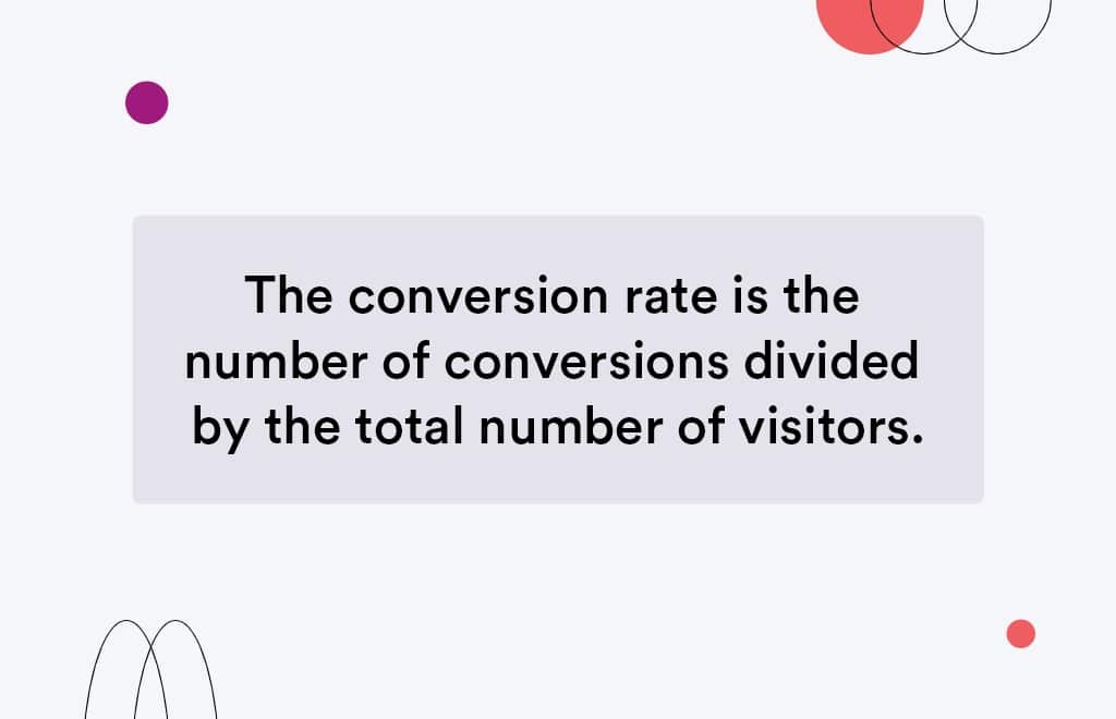
The conversion rate is the number of conversions divided by the total number of visitors.
A website’s conversion rate is an online marketing key performance indicator (KPI) measuring the ratio of a website’s visitors to conversions.
This can be anything from a click on a button to making a purchase and becoming a customer.
A website or a mobile app can have multiple conversion goals, and each will have its own conversion rate. A high conversion rate indicates effective digital marketing, UX strategy, and web design.
Conversion rates can vary widely depending on different business objectives and the type of conversion goal.
For example, conversion rates for online sales are typically much lower than conversion rates for newsletter signups.
Conversion rates also vary depending on the quality of traffic.
For instance, conversion rates from users who come to a site through a paid Facebook ad are usually higher than conversion rates from users who find the site organically.
Conversion rate optimization (CRO) involves testing different elements of a website or app in order to improve conversion rates.
There are a number of factors that can influence the conversion rate, such as the website design, the quality of the product, and the price.
In order to be effective, CRO must be based on data and analytics. That data can come from a variety of sources, including website traffic statistics, user surveys, and A/B testing.
You can look at your analytics data to see where people are dropping off in the conversion process, you can use a survey as a user research tool to find out what visitor pain points are, or you can use heat mapping software to see where people are clicking on your site.
Once you have some ideas, you need to validate them through testing.
Common CRO tests include changes to copy, design, and overall user experience strategy.
By testing different variants and measuring the results, businesses can gradually improve conversions and grow their revenue.
- A/B testing is when you show one group of people one version of a page on your site or app and show another group a different version. The most important thing with the A/B testing design process is that you only change one element of the user interface design at a time. That way, you know which change is responsible for any increase or decrease in conversion rate.
- Multivariate testing is similar to A/B testing but instead of showing two different groups one version each, you show all visitors multiple versions at the same time and track which version performs best.
Website Conversion Rate Formula
The website conversion rate formula is a simple calculation that tells you how many visitors to your site take a desired action. To calculate your website’s conversion rate, divide the number of conversions by the total number of visitors.
For example, if your site had 100 visitors and 10 of them made a purchase, your conversion rate would be 10%.
Conversion rates can be useful for assessing the effectiveness of your website and its various marketing campaigns. However, it’s important to keep in mind that conversion rates can vary depending on factors such as the type of product being sold and the target audience.
As such, it’s always best to track multiple metrics in order to get a comprehensive view of your website’s performance.
Session Conversion Rate vs User Conversion Rate
The two most common types of conversion rate are based on either sessions or users.
A session-based conversion rate simply looks at the number of times an action was completed divided by the total number of sessions. For example, if someone visited your site 10 times and converted twice, your conversion rate would be 2%.
A user-based conversion rate, on the other hand, looks at the number of users who completed an action divided by the total number of users. Using the same example, if two out of 10 people who visited your site converted, your user-based conversion rate would also be 2%.
Which type of conversion rate is more accurate?
It depends on how you define a “conversion.”
If you’re interested in tracking how often an action is completed, regardless of who does it, a session-based conversion rate is a better metric. However, while session conversion rates can be useful for measuring overall performance, they can be misleading if used in isolation.
For example, a high session conversion rate could be due to a low number of sessions, which would make it less meaningful.
Session conversion rates are most useful when compared to other metrics, such as traffic source or device type. When used in conjunction with other data, session conversion rates can give you a better understanding of how well your site or app is performing.
On the other hand, if you’re only interested in tracking how many people take an action, a user-based conversion rate is more appropriate.
Ultimately, the decision of which type of conversion rate to use depends on your specific goals and needs.
Website Conversion Rate by Industry
While conversion rates vary by industry, there are some general trends that can be observed.
For example, conversion rates are typically higher for B2B than for B2C companies. This is likely due to the fact that B2B buyers are usually further along in the sales cycle when they visit a company’s B2B website.
In addition, conversion rates tend to be higher for websites that sell physical goods than for those that provide information or services. This is likely because it is easier to convince a website visitor to make a purchase than it is to get them to sign up for a service.
Marketers tend to spend a lot of time, money, and energy on driving traffic to their websites, but the real challenge is converting as much of that traffic as possible through effective conversion rate optimization.
This is also the most important part, as even the smallest difference in your conversion rate can make a big difference in your bottom line.
If you’re running an eCommerce business, it’s important to benchmark your eCommerce conversion rate against other businesses in your industry. This will give you a good indication of how well your eCommerce website is performing and where there’s room for improvement.
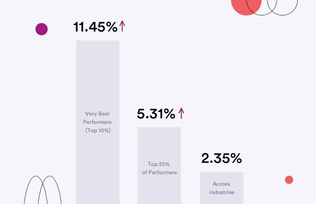
Across industries, the average conversion rate is 2.35%.
The top 25% of performers have conversion rates of 5.31% or higher.
The very best performers, in the top 10%, have conversion rates of 11.45% or higher.
According to Unbounce’s 2021 Conversion Benchmark Report, catering and restaurants have the highest conversion rate, at 9.8%. Agencies and real estate have the lowest conversion rates, at 2.4% and 2.6% respectively.
These benchmarks can be a useful starting point for setting your own KPIs.
How To Track Your Conversions In Google Analytics
Google Analytics is a powerful tool that can help you track your website traffic and understand where your visitors are coming from. However, it can also be used to track conversions, or the actions that visitors take on your site. This information can be incredibly valuable, as it can help you to understand what is working well on your site and what needs to be improved.
For example, if you see that a lot of visitors are coming to your site from search engines, but few of them are taking the desired action, you may need to work on your search engine optimization. On the other hand, if you see that visitors are coming to your site from social media and they are taking the desired action, you know that you are doing something right and you can continue to focus on your social media marketing.
There are a few different ways to set up conversion tracking in Google Analytics.
The most common method is to use so-called “destination goals.” With this approach, you define a specific goal, such as making a purchase or signing up for a newsletter, and then create a corresponding destination URL.
When someone completes the goal, they are redirected to this URL, which is then tracked in Google Analytics.
You can also use event-based goals, which track specific actions that users take on your site, such as clicking on a button or playing a video.
To set up conversion tracking, log in to your Google Analytics account and navigate to the “Admin” section. Then, click on “Goals” and select “New Goal.” From here, you can choose between various goal types and configure the details of your goal.
Once you have created a goal, it will start appearing in your reports and you will be able to track your progress over time. If you want to visualize your reports or compare conversion results from different sources, you can export your data from GA4 to Excel or BI tools.
1. Use Interactive Product Tours
Interactive product tours are a great way to improve your website or app’s user experience (UX).
By providing concise, step-by-step instructions, they can help users learn how to use your product quickly and effectively. Product tours can also highlight new features or updates and guide users through complex workflows, especially for onboarding.
Appcues is an excellent example of interactive product tour software you can use to improve user experience on your website. It can be customized to match the specific needs of your target audience.
Whether designing for first-time or redesigning your website, these interactive product tours can help you create a better UX. If you are looking for the best product tour software to support SaaS Onboarding, you can use Appcues.
2. Use Clear and Concise Headlines
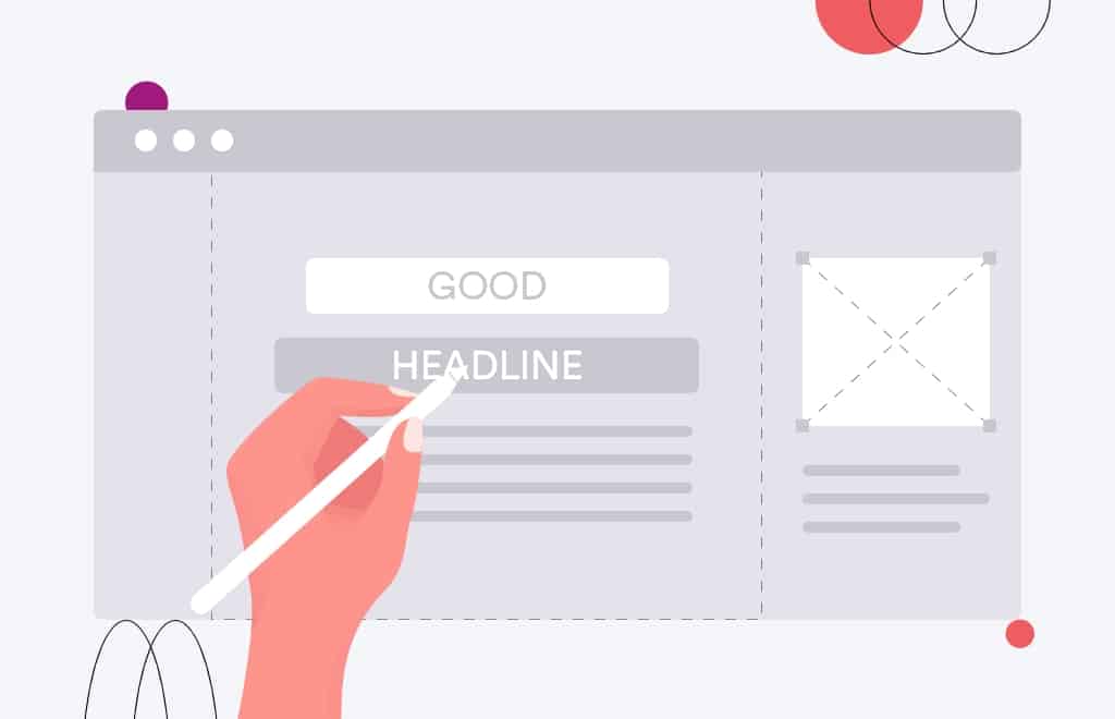
Your website’s headline is one of its most critical elements. It’s the first thing visitors see, setting the tone for the rest of the content. A clear and concise headline can go a long way in boosting your website’s conversion rate.
Here are a few tips to keep in mind:
- Use active voice and actionable language. For example, “Get Started Now” is more effective than “Sign Up Here”
- Keep it short and to the point. A good rule of thumb is to keep your headlines under 20 words
- Use strong keywords that accurately reflect the content of your page. This will help improve your SEO and ensure that visitors are finding what they’re looking for
- Test different headlines to see what works best for your audience. Try A/B testing different versions of your headline to see which one performs better
By following these tips you can create clear, concise, and compelling headlines that drive website conversions.
3. Place Important Information Above the Fold
UX designers know that one of the essential elements of any website is the “fold.” This is the page’s point where a user must scroll down to see more content.
Anything above the fold is immediately visible, making it crucial real estate for designers.
One UX trick to boost website conversion is to place important information above the fold. This could be an eye-catching image, a strong headline, social proof, or a call to action (CTA) button.
By putting critical elements above the fold, you can ensure that your visitors see them as soon as they land on your page.
This can help increase conversion rates by ensuring that as many people see your most important content as possible.
4. Use Easy-To-Navigate Menus
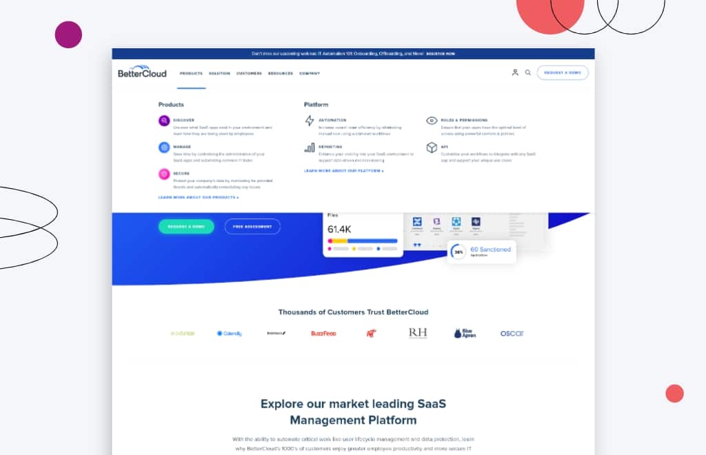
Navigating a website should be easy and intuitive. Users should be able to find what they’re looking for in just a few clicks. That’s why it’s vital to use easy-to-navigate menus when designing your website.
One UX trick to boost website conversion is to use drop-down menus.
Drop-down menus allow users to see all the options available at once. They can then select the option they want without clicking through many different pages.
This makes it much easier for users to find what they’re looking for and increases the chances they’ll convert into customers.
So if you’re looking for a way to improve your website’s UX and conversions, consider using drop-down menus.
5. Offer a Free Trial or Demo
By allowing users to experience the product or service before committing, businesses can increase the likelihood that visitors will convert into paying customers.
Of course, some risks are associated with this approach, as businesses will need to ensure that they can provide adequate support during the free trial period.
However, when done correctly, a free trial or demo can be an effective UX tool for boosting conversion rates.
6. Make Your Website Responsive to Mobile Devices
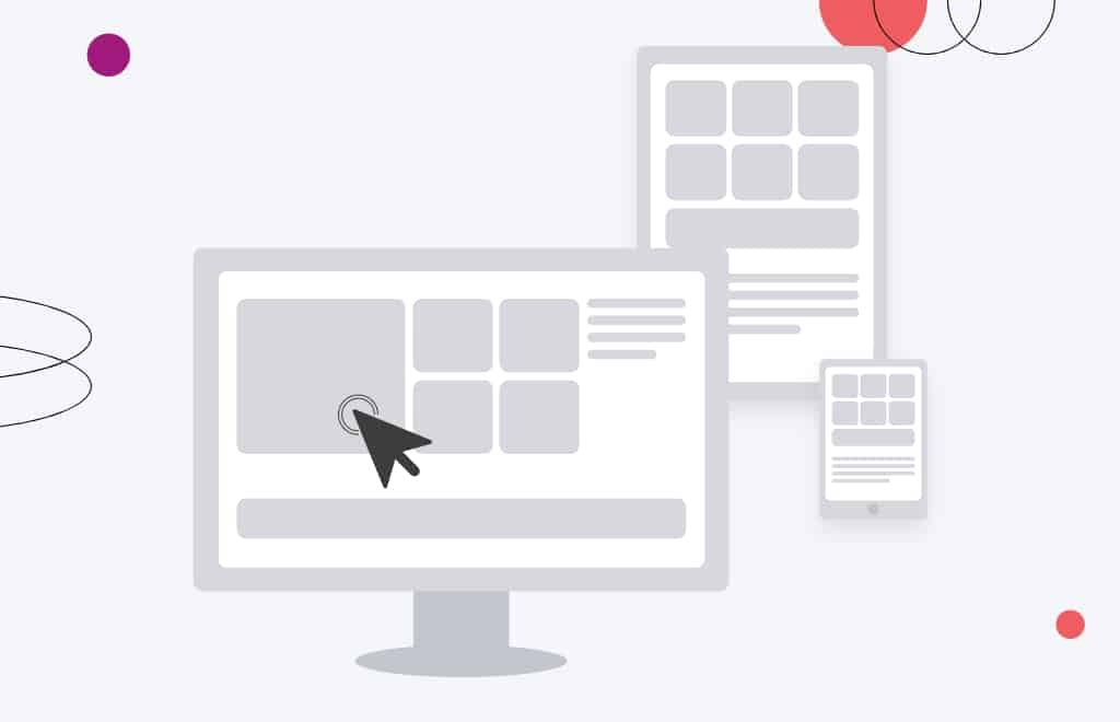
If you want to increase the number of people visiting your website and making a purchase, it’s vital to ensure your site is responsive to mobile devices. That means designating a UX trick to boost website conversion for mobile users.
Studies have shown that people are far more likely to engage with a site that is easy to use on their phone or tablet.
By ensuring that your website is responsive, you’ll be able to attract more visitors and boost your conversion rate.
There are a few different ways to make your site responsive. One common website designing trick is using a hamburger menu, allowing users to navigate your site on a smaller screen easily.
You can also use larger font sizes and buttons to make it easier for mobile users to click on the links they’re interested in. You can encourage more people to visit your site and make a purchase by making a few simple changes.
7. Use Engaging Visuals on Your Landing Page
When it comes to the UX design process, one of the most important things to consider is how you can use visuals to engage your users and encourage them to take the desired action.
One simple but effective UX trick is to use visuals on your landing page. You can grab attention and make a solid first impression using high-quality images and videos.
Additionally, visuals can help explain complex concepts and make your website more accessible. When using visuals on your landing page, it’s important to consider image source.
Using images that are original or that you have the rights to use will ensure that you’re not violating any copyright laws.
When used correctly, visuals can be a powerful UX tool that can help to boost website conversion.

The digital landscape is getting more and more competitive by the day. If you’re not investing in design, you’re doing yourself a major disservice. Great design is the difference between being one of many, and being memorable.
Jeff Gapinski, Co-Founder
8. Test Different Call-To-Action Buttons
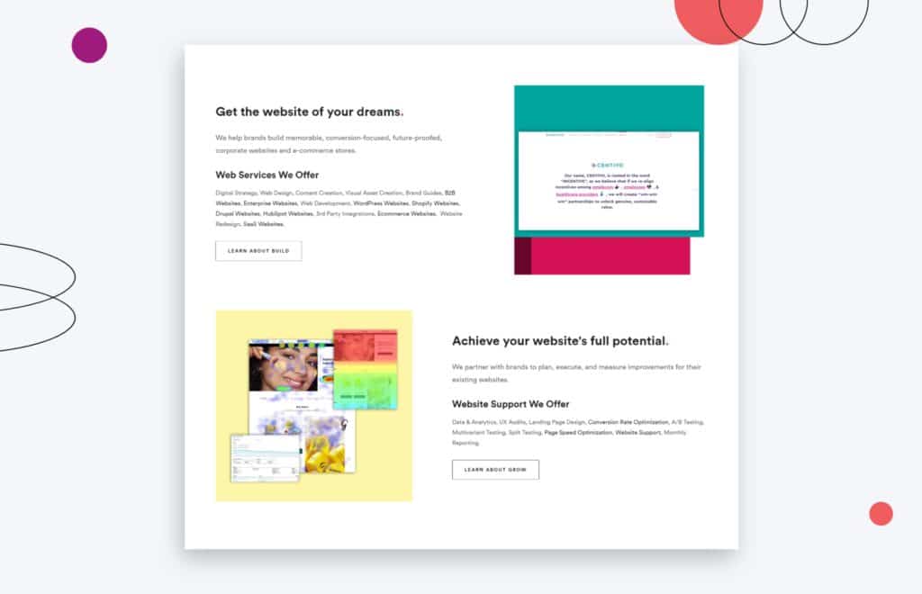
If you’re looking for a UX trick to boost website conversions, consider usability testing different call-to-action buttons.
Even small changes, like the color or placement of the button, can significantly affect how likely users are to take action.
When doing user testing of different buttons, it’s important to track how many users click on the button and what they do after they click.
Are they more likely to complete a purchase? Sign up for a newsletter. Download a white paper?
By carefully tracking the results of your tests, you can find the call-to-action button that works best for your website.
9. Use Customer Testimonials on Your Landing Page
A landing page is a vital part of any website – it’s the first page visitors see when they arrive, and it’s where you make your best case for why they should stay.
So it’s essential to ensure your landing page is as effective as possible.
One trick for improving UX design that can boost your website’s conversion rate is customer testimonials.
Hearing from satisfied customers can be a powerful way to convince visitors that your product or service is worth their time and money. Plus, it helps to build trust and credibility.
So if you’re not already using customer testimonials on your landing page, definitely give it a try. It could make a big difference in your website’s success.
10. Offer Free Shipping or Discounts for First-Time Customers
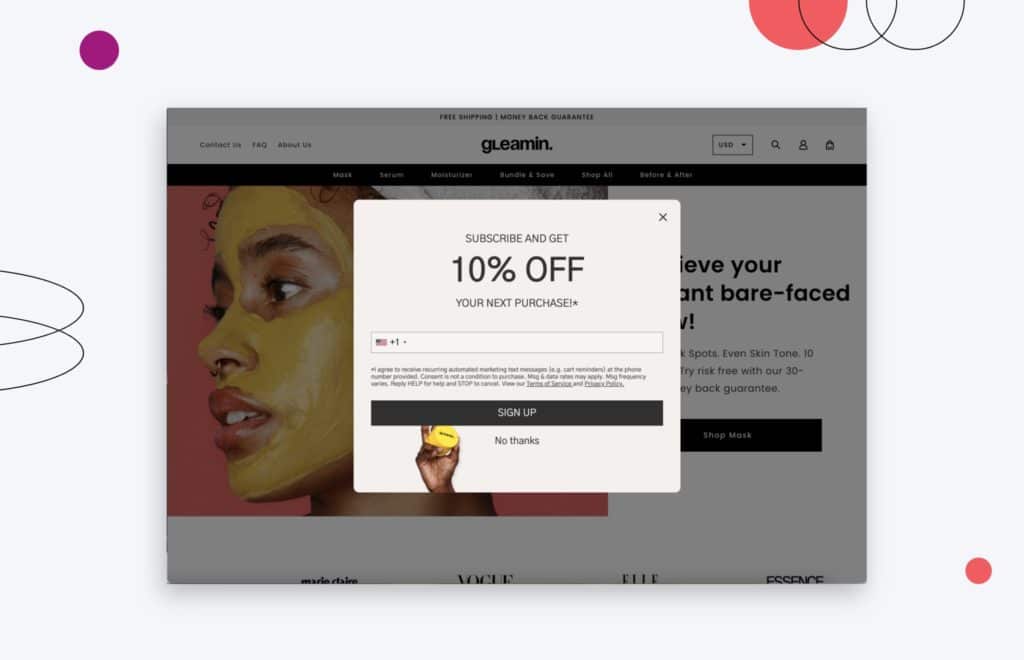
One UX trick that is particularly effective for eCommerce sites is offering free shipping or discounts for first-time customers.
This encourages users to complete a purchase and creates a sense of goodwill that could lead to future sales. Of course, free shipping is not always possible or practical, but even a small discount can make a big difference in conversion rates.
UX designers are always looking for new ways to improve the user experience of websites, and offering free shipping or discounts for first-time customers is a straightforward way to do this.
11. Maintain Consistency of User Flow Throughout
User flow refers to the path users take as they move through your website or mobile app.
By ensuring that user flow is consistent throughout, you can make it much easier for users to find what they’re looking for and take the desired action.
For example, if you have a website with multiple sections, ensure the user flow is consistent from one section to the next.
Don’t force users to backtrack or search for things in different places. And if you have an eCommerce site, make sure the user flow takes users through the checkout process logically.
By keeping user flow in mind, you can make small changes that can significantly impact website conversion rates.
UX design and CRO are two important aspects of any website. While they both have the common goal of improving the user experience, they often conflict with one another.
A common dilemma is whether to prioritize conversion rates or UX design. However, it is possible to find a balance between the two.
By integrating CRO into your UX design solutions, you can create a customer experience that is both compelling and effective. Whether you’re a small business owner or the manager of an enterprise website, a few hours of work can improve your site and give you excellent results.
By considering both conversion rates and UX design, you can create a website that provides an optimal experience for both users and businesses.
By following the tips in this blog post, you can make minor tweaks to your website that will impact your conversion rate. Applying even a few user experience tricks will help you improve your website and boost your bottom line.
Let us know how they worked for you!
Here are some best practices and further info on user experience conversion rate, web development and website design. If you have further questions, don’t hesitate to reach out.
User Experience Conversion Rate FAQ
Questions about how to improve your user experience conversions? We try to answer them here.
How does UX affect conversions?
The user experience (UX) of your website plays a critical role in conversion rates. UX, or user experience, is all about creating a smooth, intuitive, and enjoyable experience for users that makes them want to stay on your site and keep coming back.
All the elements on your site—from the usability of your navigation to the design of your footer, to the design of your contact form—come together to create an overall experience for your visitors.
If that experience is positive, they’re more likely to convert into customers or leads.
By creating a website that is easy to use and navigate, with clear calls to action and engaging copy, you can greatly increase your conversion rates. Here are some specific UX elements that can have a big impact on conversion rates:
- CTA buttons. Make sure your CTA buttons are prominently displayed and easy to find. Use color and/or imagery to make them stand out from the rest of your page. And make sure the text is clear and concise – users should know exactly what will happen when they click the button.
- UX copywriting. Content marketing is one of the most important aspects of any digital marketing strategy. Content that is well-written and relevant to your target audience can boost conversion optimization, improve SEO, and build brand awareness. The way you write your website copy can make a big difference in conversion rates. Be sure to use persuasive language that speaks to the needs of your target audience. And keep your text concise. Long blocks of text are off-putting to most readers.
- Text and typography. The way your text is formatted can also impact conversion rates. Use an easy-to-read font and give your text plenty of white space. This will make it more visually appealing and easier to scan, both of which will improve users engagement and encourage users to stick around longer.
- Website readability. Poorly designed websites can be confusing and frustrating for users, leading them to abandon the website altogether. UX designers can help to increase website readability by eliminating unnecessary elements, and carefully crafting the website’s layout, navigation, and content.
- Navigation. The goal of information architecture is to help users find the information they need in the most efficient way possible. As a part of the information architecture, a well-designed navigation system is crucial for keeping users engaged on your site. Make sure your menus are easy to understand and use clear labeling for each page. Internal links can also be helpful for keeping users on your site longer.
- Site loading speed. Finally, don’t forget about site speed! Users are turned off by slow loading times, so be sure to optimize your website for speed. This includes using caching techniques and compressed images.
By taking the time to create a well-designed website with an easy-to-use interface, you can improve lead generation, drastically increase your conversion rate and make it more likely that users will take the action you desire.
So don’t underestimate the power of UX. It could be the difference between success and failure.
How can I improve my conversion UX?
If you’re looking for proven ways to increase your website’s conversion rate, there are a few key things you can do.
- Craft a compelling homepage that clearly outlines what your website is about and what users can expect to find.
- Make sure your website loads quickly. Users are unlikely to wait more than a few seconds for a page to load.
- Have a clear layout that is easy to navigate.Users should be able to find what they’re looking for without difficulty.
- Make your site accessible from all devices. More and more people are using mobile devices to access the internet, so it’s important that your site can be viewed on a variety of screens.
- Use effective call-to-actions. These can help guide users through the conversion process.
- Add visuals. Images and videos can help break up text and make your site more visually appealing.
- Include a search box and live chat. The search box allows users to quickly and easily find the information they are looking for. The chat box can be helpful for users who have questions or need assistance finding information.
- Provide complete contact information. This will give users confidence that they can reach out if they need to.
By following these tips, you can improve your website’s conversion UX and increase the likelihood that users will take the desired action.
What is a good user conversion rate?
A conversion rate is the percentage of users who take the desired action.
For example, if 100 people visit a website and three of them make a purchase, the conversion rate would be 3%.
When it comes to conversion rates, there is no one-size-fits-all answer. The desired action will vary depending on the business and its goals.
For some businesses, a conversion might mean making a sale, while for others it could mean signing up for a newsletter or downloading an app.
In general, however, a conversion rate of 2-5% is considered to be good. Any conversion rate above 5% is considered to be excellent.
Of course, conversion rates can vary depending on the industry and the type of product or service being offered.
For example, conversion rates for eCommerce websites tend to be lower than those for lead-generation websites.
Ultimately, the best way to determine what constitutes a good conversion rate is to track conversions over time and compare them to your goals.
If you’re seeing a consistent increase in conversions, then you’re on the right track. If not, then you may need to adjust your strategy.
What are the five elements of user experience?
User experience (UX) refers to a person’s overall experience using a particular product, system, or service. It encompasses all aspects of the user’s interaction with the product, including their expectations, perceptions, and emotions. Good UX design involves understanding of the user’s requirements to design user experience that meets those needs in the most efficient and effective way possible while eliminating unnecessary elements.
UX can be affected by factors such as the user’s age, gender, cultural background, and prior experiences.
The five elements of user experience are function, form, content, context, and user interface.
UX designers strive to create products that are both functional and user-friendly, as well as visually appealing.
By taking all of these factors into account, web designers can create products that users will enjoy using and that meet their needs.
How do I convert UI to UX?
The distinction between UI and UX can be confusing, especially since the two terms are often used interchangeably. However, there is a big difference between the two disciplines.
UI, or user interface design, refers to the look and feel of a product. This includes things like the color scheme, typography, and layout.
On the other hand, UX, or user experience design, focuses on how easy it is to use a product. This encompasses everything from navigation to content strategy.
In order to convert UI to UX, designers need to shift their focus from aesthetics to functionality. This means creating prototypes and testing them with users to get feedback on what works and what doesn’t. It’s also important to consider things like accessibility and usability when designing a product.
By taking these factors into account, designers can create a better experience for users that is both easy to use and visually appealing.
What is the eCommerce conversion rate definition?
eCommerce conversion rate is the percentage of visitors to an online store who take action to purchase a product or service. The goal of any eCommerce business is to increase its conversion rate, in order to generate more sales from its online traffic.
There are a number of factors that can influence a store’s conversion rate, including the quality of the products or services, the pricing, the website design and navigation, and the checkout process.
In order to increase its conversion rate, an eCommerce business must first identify its areas of opportunity and then implement changes that will address those issues. With a higher conversion rate, an eCommerce business can generate more revenue and grow its customer base.
Which is better, WooCommerce or Shopify?
When comparing WooCommerce vs Shopify, there is no clear winner. Each platform has pros and cons, and it comes down to what matters most to you and what you are trying to do with your store. Whether you have a B2B eCommerce website or a beauty brand, you’ll need to dig in deep to understand each eCommerce platform and what it offers. Our article comparing WooCommerce and Shopify is a good place to start.
Can you redesign my website, including the checkout page?
Yes, website redesign is one of our primary specialties. No matter which eCommerce site you’re on, we can redesign your entire site, including the about us page, checkout page, product pages, category pages, and blog.
Further Reading On Web Design and Conversion Rates
Interested in learning more about Shopify, WooCommerce, or just about web design and website development in general? Here are some handy resources to get you up to speed.
- How Much Does It Cost to Build a Website?
- A Step-by-Step Website Redesign Project Plan
- How to Build a Web Design System
- Our Approach to Small Business Web Design
- WooCommerce vs Shopify: Who Comes Out as a Winner?
- Choosing the Right Product Metrics Using UX Research Process
- Our Top Retail Website Examples
- Our Top Beauty Website Examples
- The Importance of Shopify Speed Optimization
- Our Shopify Speed Guide Checklist
- 100 eCommerce Website Design Tips
- How to Improve Mobile eCommerce Conversions
- Our Startup Web Development Services
- Common UI/UX Terms Used by Web Designers
- Your Must-Do Checklist For Launching a Website
- Guide to Shopify Image Sizes
- Web Design and Web Development: Understanding the Difference
- The Best Service Page Design Examples
- How to Design an Effective “About Us” Page
- Designing the Best Product Pages
- Understanding Category Page Design
Get Memorable Insights.
Sign up to receive actionable web design advice directly in your inbox monthly.
Get Memorable Insights.
Sign up to receive actionable web design advice directly in your inbox monthly.
Author
Jeff Gapinski is the President of Huemor where he helps plan the long-term strategic growth of the agency. Jeff is passionate about UI/UX, demand generation, and digital strategy.
What Do You Think?
Have feedback? Maybe some questions? Whatever it is, we'd love to hear from you.





No comments found