Design
7 minute read
How To Create the Best SaaS Homepage Design.
LAST UPDATED:
March 21, 2024


It’s hard to imagine a world without Software as a Service (SaaS). It’s become so ubiquitous that it’s easy to forget how far we have come since the days when computers were little more than big, bulky boxes.
Just like cars, SaaS is now available in all different shapes and sizes — from sleek and modern designs to classic models. And with the ever growing diversity in offerings, it’s vital for companies who offer SaaS products to create attractive websites and homepages that stand out from the competition.
But what makes a good SaaS homepage design?
Is it the design? The features? Or is there something else that’s more important? Here is a list of tips to help you create great SaaS homepages and website designs.
Value-forward Design
Unlike e-commerce and retail brands, SaaS companies need to clarify what their product does and why people should use it. This means having a value-forward homepage design that attractively showcases the service’s features. Think about how you can showcase your product’s features on the homepage without overwhelming visitors with too much information.
It’s also essential to clarify any pricing plans or subscription options so visitors know exactly what they are getting for their money.
First Impressions Matter
Homepages need to make a good first impression. This means implementing best practices that draw people in and keep them on the page long enough for them to explore your product.
A well-designed homepage should feature eye-catching visuals, clear headlines, and concise descriptions that introduce visitors to what the site is all about.
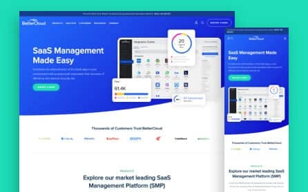
For example, take a look at one of our awesome customers — BetterCloud. The homepage is sleek, eye-catching, and to the point.
Above- and Below-the-Fold Design
One excellent way to keep visitors on your page is to design with both above-the-fold and below-the-fold in mind.
Designs above-the-fold, or content immediately visible upon loading your homepage, should focus on highlighting the key features of your product without overwhelming visitors with too much information. Keep it straightforward, with a few visuals and clear headlines that introduce people to what your SaaS company is all about.
Below-the-fold, where users have to scroll to, your designs should be focused more on providing detailed content, such as pricing plans, subscription options, or customer testimonials. This way, you engage visitors and keep them interested in exploring your product further.
Simple and Concise Descriptions
Just because you’re offering a high-tech solution doesn’t mean you should dump paragraphs of technical jargon onto your homepage. Instead, use simple and concise descriptions to explain what the product does and why people should use it. This helps to create an emotional connection with visitors, which can encourage them to sign up for your service.
Think beyond just your subscription and pricing model. This ties back to adding value, and you can do this through effective branding and the best SaaS website designs. For example, you can share stories about your company’s values, mission, and vision — showcasing the real people behind your product.
Define Value by Comparing and Contrasting SaaS Providers
You’re just one of many who offer SaaS solutions, which is why defining your value proposition is so important. A great way to do this is by comparing and contrasting your product with other solutions on the market.
You can do this in various ways, from highlighting unique features to showing how much money customers can save using your service. Doing this makes it easier for potential customers to choose your SaaS solution over others.
Offering Service Tiers
When offering multiple tiers of services or pricing, think about this: can people see themselves in one of these tiers? It’s not just what’s cheaper or more premium. It’s also about what tier best serves their needs. Are they a one-man show, working on a personal project? Or are they part of a larger team with more complex needs?
Thinking about it this way, you can highlight the features that matter most to each user, making it easier for them to choose the tier they need.
Emphasize What You Can Do (and What Your Competitors Can’t Do)
Here’s the thing: your customers are also checking out your competitors’ sites. As a matter of fact, about 53% of them are before making any kind of purchase. To stand out, you need to emphasize what sets you apart from the competition. This could be anything, such as:
- Special features
- Pricing plans
- Customer service and support
You have to assume that your customers are bombarded with tons of information and that it’s hard to process which SaaS option they should choose. You have to make the process easier for them by highlighting the differences that matter.
If you have testimonials that do the comparing and contrasting, even better! Your potential clients have probably already tried various SaaS solutions in the past before stumbling across yours. They’re looking for reassurance that you are the right choice and not just another one of the same.
Use Your SaaS Homepage Design to Show the Conversations You’re Having
Context is vital when it comes to SaaS marketing. Show visitors your conversations with potential customers, both on and off your website.
Spotlight Your Satisfied Clients
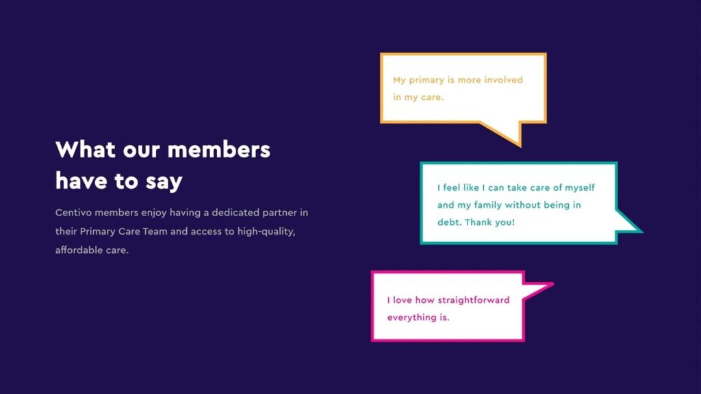
One way to boost customer confidence is by using customer stories directly from your homepage. What does a successful application of your SaaS look like? Why do your customers continue using your solution instead of alternative providers?
Highlighting success stories, like we assisted Centivo in doing, helps potential customers decide whether your product is right for them.
Leverage Your Blogs
Any SaaS website should have a blog section, as this allows you to demonstrate your expertise and showcase what sets your product apart from others on the market. Blogs allow you to explain complex topics in a way that is easy for readers to understand — giving them insight into why they should choose your solution over the competition.
Your customers are experts in their fields, meaning they demand working with someone just as knowledgeable. This is where your blog comes in. By sharing content that addresses their needs, you’ll demonstrate your expertise and build trust with potential customers.
Demonstrate How You Solve Industry-specific Challenges
Your customers don’t always belong in the same industry, so it’s crucial to demonstrate how your SaaS product helps solve specific challenges within each industry. By showing how your solution addresses these unique needs, you make it easier for potential customers to see the value in what you offer.
For example, if you specialize in accounting software, you could discuss how your product helps small businesses keep track of their income and expenses. This shows you understand their industry-specific challenges and can help them solve them.
Similarly, if you offer a project management solution, discuss how it helps teams streamline their processes and collaborate better to reach their goals.
Some industry challenges are also transferable across industries. For example, security is always a concern for businesses regardless of size or industry. Showing how your product helps customers manage and secure their data would benefit all types of customers.
Demonstrating the value you offer to each industry makes it easier for potential customers to understand why they should choose your SaaS solution over the competition.
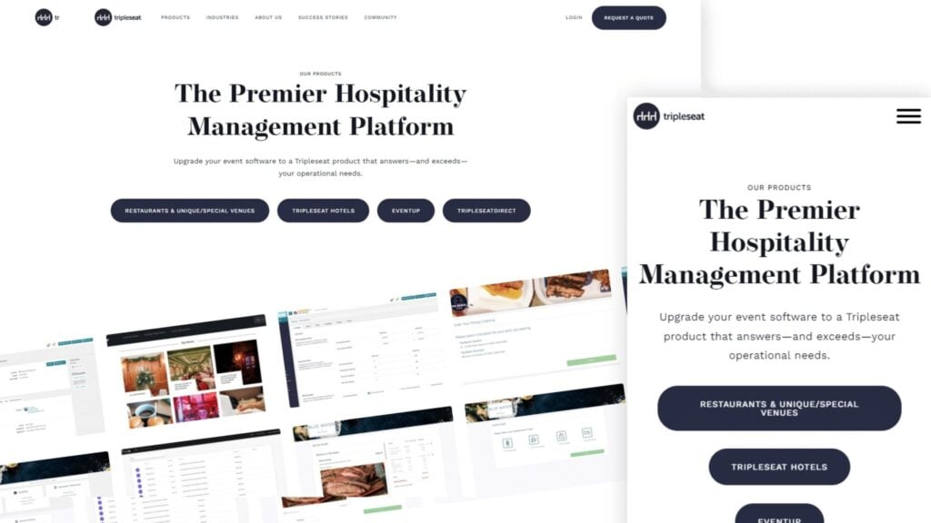
If you’re looking for an example, check out Tripleseat. We helped them create distinct sections on their site so each customer can select which subset of their services they need.
Free Samples: Try Our SaaS Yourself!
The best SaaS website designs talk about more than just the value they offer. They also let customers try it for themselves.
Q&A or Real-time Assistance
Customer service plays a huge role in the buying decision. Customers want to know they can get help when needed, so be sure to have a support page on your website. After reading your blog posts and success stories, users should be equipped to progress on their own, but may need help at any point.
You could add a Q&A page that answers common questions and concerns or offer real-time assistance with live chat. This gives customers confidence in knowing that if they run into issues with your product, someone is available to help them.
Free Trials
Ah, the classic free trial. This is a must-have for any SaaS website as it allows users to test your product before committing to anything. There’s no better way to qualify your lead than to let them try out the product themselves and see if it fits their needs.
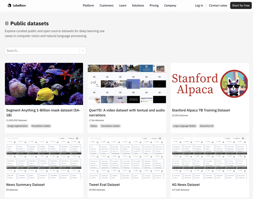
You can also bundle these free trials with a problem they can try solving, such as free datasets, pre-defined samples, or anything that shows customers how your product works.
Your free datasets can even function as lead magnets since customers who try them out will likely be curious to learn more about your product. For example, image annotation tool Labelbox uses free resources to promote their own blogs and other content.
Build Your SaaS Website With Huemor
Designing the perfect SaaS website takes a bit of trial and error, but following these tips should help you create a website that stands out from the competition.
While there are various tools you can use to build your website, there is no better one than Huemor. We specialize in designing custom websites tailored to the needs of SaaS businesses. With our expertise and experience, we’ll help you create a website that engages customers and helps you get more leads.
If you want more tips like this, subscribe to our newsletter. We provide actionable tips each week to help you build bespoke software company websites and a complete digital marketing strategy.
Take your SaaS website design to the next level. Subscribe to our email list or contact us today for more information.
Get Memorable Insights.
Sign up to receive actionable web design advice directly in your inbox monthly.
Get Memorable Insights.
Sign up to receive actionable web design advice directly in your inbox monthly.
Author
Jeff Gapinski is the President of Huemor where he helps plan the long-term strategic growth of the agency. Jeff is passionate about UI/UX, demand generation, and digital strategy.



No comments found