Design
7 minute read
Pricing Page Designs That Translates Into Sales + 6 Examples.
LAST UPDATED:
August 28, 2023

A website’s pricing page is one of the most important elements of a website.
Before a customer purchases your products or services, they would like to know how much they are going to pay.
However, a pricing page design is more than a series of figures used for everyone’s information — it can also be an effective sales strategy when used properly.
Pricing pages are typically used for service-based companies as a one-stop-shop page to list the pricing of their services.
Organizing this kind of information optimally will entice your prospects to make a purchase.
This is a common marketing pricing strategy that will urge your customers to pay for your services instantly. This is because all the prices of each level of service or pricing options are presented on a single page where it is accessible and easy to navigate.
In a nutshell, an effective pricing page design makes comparing service packages easier for the customer and share key features of the product or service they are selling.
This also builds a level of trust that the company is showing its potential customers every detail upfront and transparently.
If you want to learn how to make the best pricing page design and see some examples, read on!
If you want to see concrete examples of the best designs of pricing pages, check out the websites below.
1. Asana
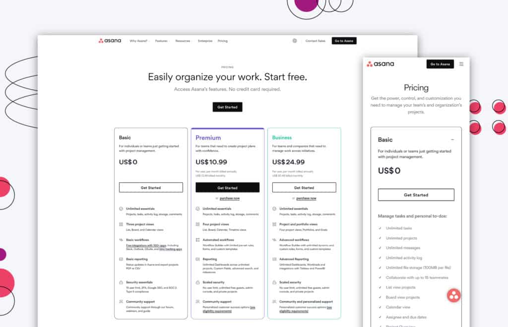
If you want to know what transparency looks like for pricing pages, check out Asana’s page.
You’ll see how the pricing details are so clear that you won’t have to call their customer service representative to ask for more pricing details. You can also click some of the items in the pricing details for a more detailed description
It’s also great how their pricing page matches their overall branding and how each element feels cohesive with the rest of the site.
It is neat, organized, and pleasant to the eyes. The fonts are easy on the eyes and great for reading.
Additional information is also placed below the page to answer possible questions any client may have about pricing.
One of the best parts about Asana’s pricing page is that it’s mobile-friendly.
Try using it on your device, and you’ll find that sections can be collapsed or expanded so that the users can easily view them.
2. Loom
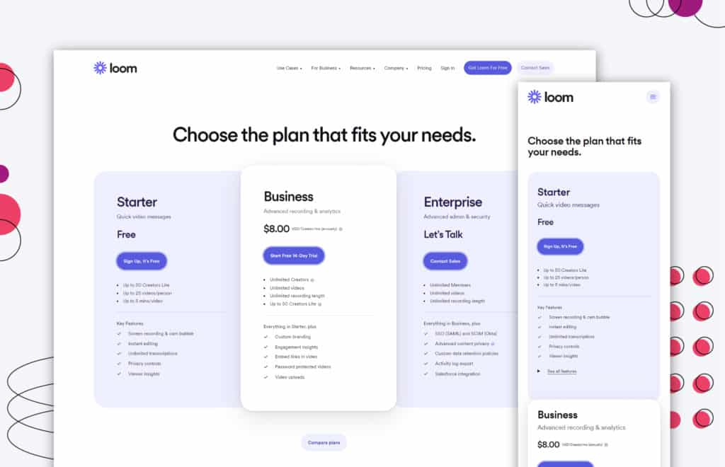
Loom has one of the most user-friendly pricing page designs on this list.
Hover your mouse over the options, and they get larger and glow. It’s an attractive feature for visitors to easily browse their pages. The fonts are also very readable but not too big to the point they are distracting.
You can also see an initial card setup which is indispensable for most pricing pages.
The further you scroll down the page, you’ll find a chart for plan comparisons. This is convenient for users who are still confused about which plan to purchase.
Visitors can easily see the plan name at the top of the page, so it is very clear which plan is indicated above all the features even when scrolling down the page.
Like the plan name, the CTA also stays in place for the users to have easy access to a point of contact from Loom.
Overall, the options are well laid out for the user so they can clearly understand which plan they’re getting.
3. Stripe
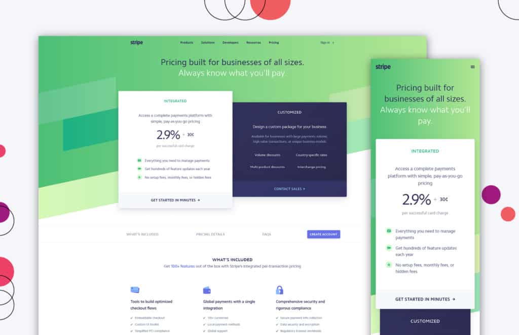
Stripe’s pricing page is set up uniquely, as compared to conventional pricing page designs.
When scrolling down, you’ll see more details not only about their pricing but also other information such as transaction fees, bank verifications, and more. The page has the intention of leading the user to these details since they only have two payment plans in place.
Generally, the page still looks practical design-wise since it does not overload the customers with too much information, only the details the customers would like to know about.
These details combined with their great visuals make the content easier to digest, without looking cluttered.
4. Mural
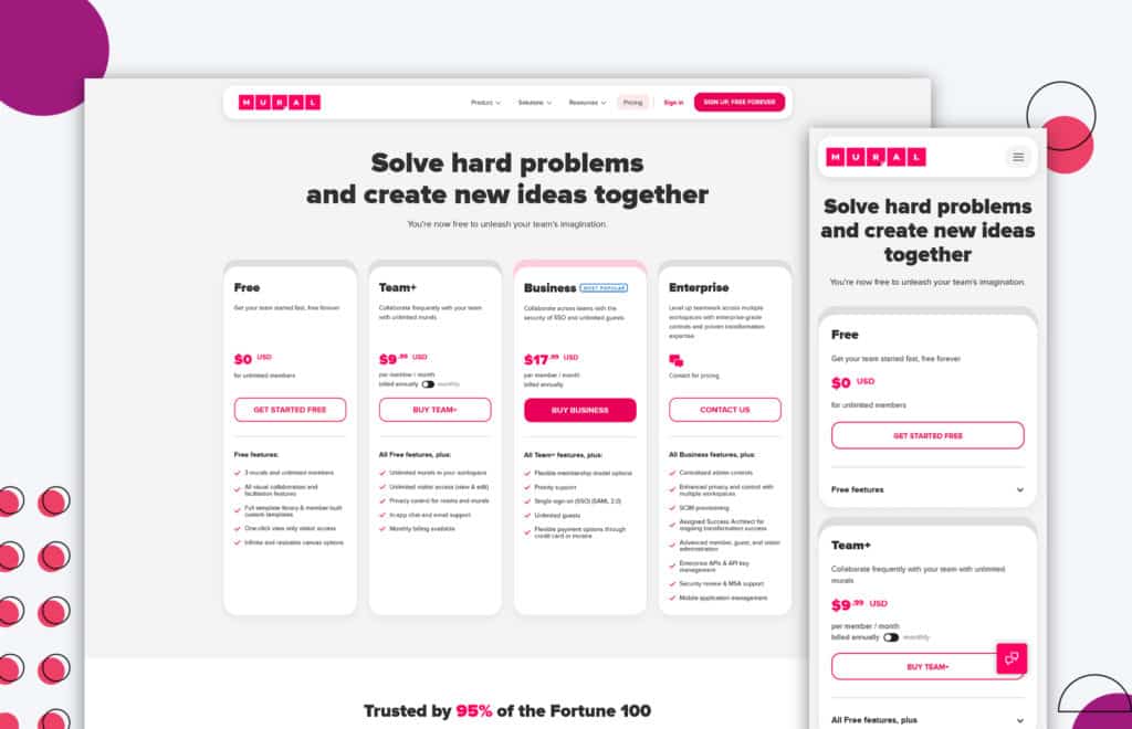
A mix of primary colors with bright colors makes the page a great example of effective highlighting of important information.
Straight lines that divide each element so as not to confuse customers with plan comparisons. The charts are also helpful in organizing pertinent details that help with the customer’s purchasing decisions.
The branding in Mural’s pricing page design is well-highlighted without looking too crowded and overwhelming.
Additionally, the clear visual hierarchy is great for the customers’ quick reading and browsing.
5. Spocket
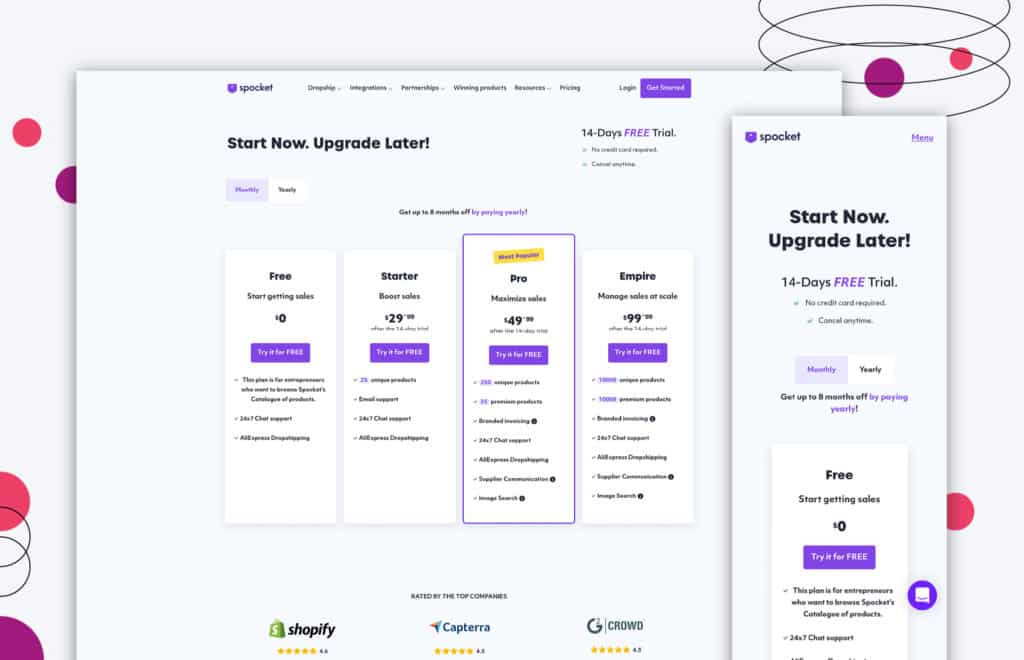
Spocket’s pricing page aims to look clean with its basic elements, fonts, and colors. You can see how the designers used primary colors to avoid overpowering the important details.
The explanations for every plan are also concise and straightforward for an easy read.
The clear and honest CTA will not cause any second thoughts on the part of the customers since the intention is pretty clear.
Information about the free trial is also credibly presented so that customers will not think it’s some sort of clickbait.
6. LiveRecover
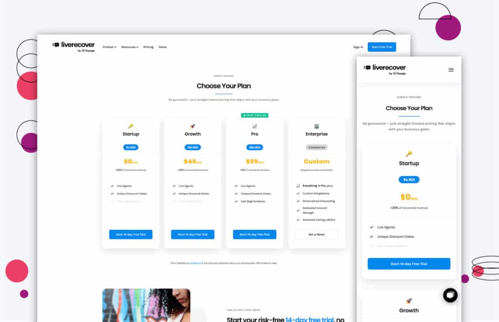
What’s attractive about this page is its emoji-style icons. This shows that LiveRecover is updated with trends without being excessively gimmicky.
These icons can truly catch the visitors’ attention but are not enough to overpower other important information such as details about the plan.
The return on investment (ROI) benefit is highlighted well for the users to gain peace of mind once they click and purchase one of their plans.
The 14-day, risk-free, and free trial is also well-emphasized in their pricing page design and is very inviting for users who are curious about trying their products.
Now that you know what an effective pricing page design looks like, read these best practices to better understand how those pages are ranking through their attractive pricing pages.
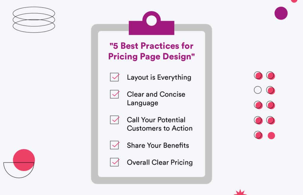
1. Layout is Everything
Based on the examples, it’s clear how layout plays the most crucial role in pricing page design.
A clean and clear page, along with a neatly organized layout, will make the copy easier for potential customers to read and understand.
With an effective layout, you can also better organize the significant details and add supplementary ones below it.
Similar to a well-structured establishment or office, your customers will gain the right mindset of purchasing from you if their visuals are not impaired by clutter or disorder.
Remember to make your pricing page design cohesive with the rest of your website’s design.
2. Clear and Concise Language
Pricing pages are meant to be straightforward and deliver quick information to your potential customers.
So, don’t beat around the bush — say what you mean and mean it!
You have to be honest and transparent with the information you share with your customers and you can do this by including every crucial detail about the pricing.
Make sure that this information makes sense and is stated in clear and concise language.
3. Call Your Potential Customers to Action
Nothing frustrates a potential customer more than a pricing page without CTAs. CTAs are meant to guide them on what to do next.
You’d want them to know how to make a purchase and how much they’re paying.
Adding a CTA at the end of the page and for every plan converts your potential customers to actual customers.
Expect them to contact you for more information once you incorporate these into your pricing page design.
4. Share Your Benefits
What will the customers get out of their transactions with you?
Make sure that the benefits are not only on your homepage but also on other landing pages such as your pricing page design.
Do not add details that don’t benefit your potential customers in any way.
This will put them off and cause them to leave your site without completing a sales transaction.
5. Overall Clear Pricing
Your customers will appreciate it if you’re completely honest about your pricing.
Make sure that there are no hidden charges, and you include everything in your copy or layout. These details should be clear and unequivocal, leaving no room for interpretation.
Otherwise, you may receive multiple complaints about hidden charges.
Like the other pages on your website, the pricing page is just as important in effectively communicating with your potential customers.
You have to learn about their needs and preferences, and you can do this by conducting more research about your target audience.
Pricing page designs should include all the information essential to your customers.
This will save them time, and in turn, make them into happy and satisfied, long-term customers.
Still want to know more about pricing pages? Contact us today for more information and help from the experts!
FREE ANALYSIS
Request Your FREE Website Analysis
Get Memorable Insights.
Sign up to receive actionable web design advice directly in your inbox monthly.
Get Memorable Insights.
Sign up to receive actionable web design advice directly in your inbox monthly.
Author
Jeff Gapinski is the President of Huemor where he helps plan the long-term strategic growth of the agency. Jeff is passionate about UI/UX, demand generation, and digital strategy.
What Do You Think?
Have feedback? Maybe some questions? Whatever it is, we'd love to hear from you.




No comments found