Design
22 minute read
The Key UI / UX Terms Every Marketer Should Know.
LAST UPDATED:
January 11, 2024

If you have designers and developers within your organization, or if you have collaborated with an outside agency, you may feel like they’re speaking a different language.
Customer journey map. High-fidelity mock-ups. 60-30-10 rule. What the hell does any of that even mean?
Every industry has its jargon, but web design has a ton of it.
If you’re working through a critical project—like a website redesign—successful communication between executive teams, marketing, sales, design, and development is paramount to its success.
Luckily for you, we’ve taken the time to pull together common terminology we and our peers use into a single article. In this article we’re:
- Breaking down the terminology by project stage
- Providing concise explanations for each term
- Providing visual examples
Ready to dive in?
Agile
Agile is a software development methodology in which the steps of the process are broken into smaller and more manageable parts. The website is continually improved through multiple iterations that add functionality. The ability to adapt and overcome new challenges is a key benefit to this flexible approach.
Brand Book
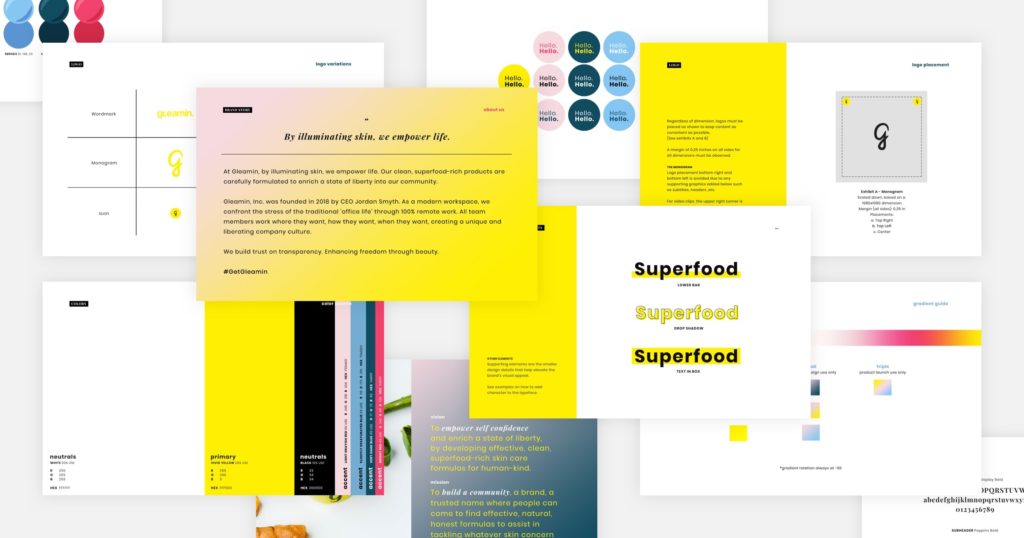
The Brand Book is the document that ensures the message and design of your website to uphold your brand’s standards. This information is crucial to establish the identity of your brand and will help inform many design decisions.
Corporate Identity Guideline
Corporate Identity Guidelines help define how your company is presented to the public. Perhaps similar to a more far-reaching brand book, this guideline includes the design parameters that a website must adhere to. Among other things, it will provide rules for color palettes, logo use, and the typography to be used.
Customer Journey Map (CJM)
The UX term, “Customer Journey Map” is a diagram used to illustrate how customers will interact with your website. Researching this behavior to fill in the CJM will help you understand how to best improve the user experience and address any problems that users might have with your website.
Design Thinking
This is a 5-step method that may help you overcome problems in the design process. Contextualizing the challenge in these discrete steps may help clarify the best course of action for you and your team to carry out.
- Empathize: Understand the problem that users are experiencing.
- Define: Pinpoint the root of the problem.
- Ideate: Brainstorm ways to solve the problem.
- Prototype: Experiment with potential solutions to the problem.
- Test: Test the solutions you come up with and iterate upon them as needed.
Fishbone Diagram
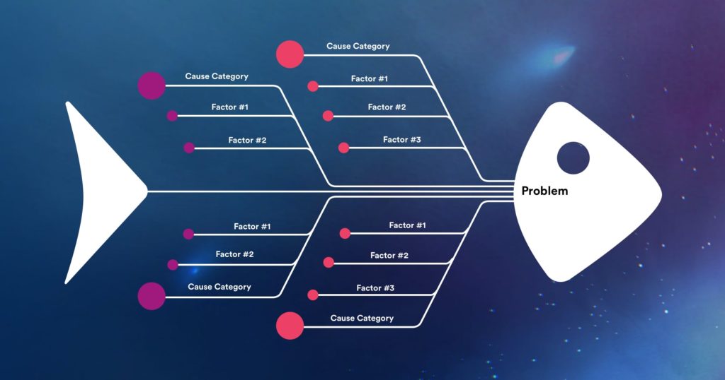
This diagram is another way to visualize a problem and the causes that lead up to it. The problem is written on the “head” of the fish, while its causes and the factors leading up to it are written along its spine.
Flowchart
Flowcharts are used to outline the procedure for a given task on a project. This diagram is useful in visualizing the conditions that need to be fulfilled in order to move forward through subsequent steps.
Gamification
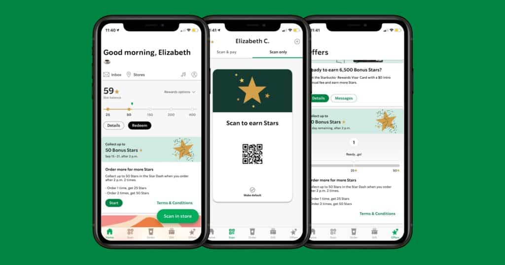
Using ideas and concepts borrowed from game design, gamification is a useful tool to increase user engagement. The idea is to provide some additional motivation that lets users better enjoy your site. This might include some sort of incentivization, such as providing points or goals that users can strive for.
Gestalt Principles
The principles of gestalt theory can apply to design on a broader spectrum but are definitely relevant to UX. This principle establishes that people often visually perceive items as part of a whole rather than individual parts. They tend to observe things in the context of their similarity or difference to their surroundings. With this in mind, consider how all the visual elements of your website interact with each other.
Human-Computer Interaction
This field explores how people design and interact with computer technology. Studying how we use them can provide the basis for exploring different modes of interaction with your site.
Mental Model
The mental model is a diagram used to chart a user’s perception of how something works. Keep in mind, a product that more closely resembles this thought process will be easier to use.
Mindmap
The mindmap is another way to organize information, often around a central idea. Both words and images can be used in this diagram to visualize concepts related to this idea. This can also show how they relate to each other and encourage new ideas to branch out from that initial concept.
Persona
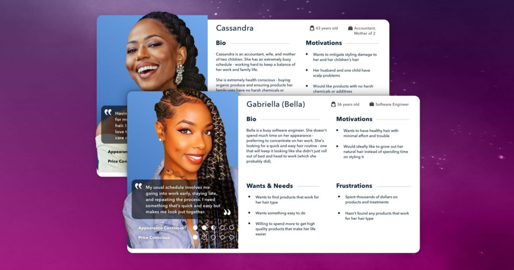
The term “Persona” is common across a few different job focuses (Marketing, Sales, Customer Service, and UX). Personas are essentially mock user profiles to help you imagine what your audience wants. Research helps establish a target audience for you to build your design around. It practically goes without saying, but different groups of people have different goals and interests that they’re seeking, and a bland or generalist design won’t cut it. Having a design that appeals to your audience increases their engagement with your site.
Scrum
Scrum is a type of Agile project methodology. It emphasizes iteration and testing, much like Agile, but it typically includes the particulars of how a project will be completed. Assignments are often doled out across short phases (see “Sprints” below as well), and typically, specific goals are established during each one. Having this structure in your project management can help keep it on track; each sprint of work provides an opportunity to review and iterate on what came before it.
Site map
A site map is a basic visualization of the structure of a website that lists the pages and hierarchy therein. You’ll see this often referenced amongst SEO’s, but is equally important for UX designers.
Sketching
Light freehand drawings can help visualize ideas and start brainstorming ways to design your product. They can help communicate what you’re thinking, but this early in the planning process, they aren’t meant to be very detailed or polished.
Slack
Slack is a popular platform for internal communications. Tools like Slack are incredibly useful in keeping everyone in the loop with the information they need.
Sprints
A defined length of time for an assignment within a project. Particular goals are established in advance, and this period typically lasts a couple of weeks. At the end of a sprint, you can review the work done to acknowledge successes and course-correct any issues that came up. Often times this term is synonymous with software development, but can also be used amongst ux design teams when trying to rapidly solve specific problems for a product or service.
Storyboard
Often a critical tool for a UX designer, storyboards are a way to visually communicate how a user might experience a product. By exploring the circumstances that might bring a user to your website, for example, you can plan your design around a solution to their situation.
Task Analysis
Analyzing the list of steps it takes a user to complete a given task provides insight into their experience and identifies problems in completing that test. Doing this early in product development lets you plan your design to offer solutions to those problems.
User Flow
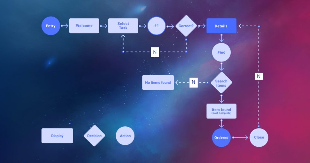
This is another key tool for any UX designer. The user flow displays the intended motions of a user completing a task. Each step is laid out so that there is a logical progression that’s easy to follow. Establishing a clear user flow creates a strong experience to design around as development carries on.
User Research
To best understand your target audience, user research is crucial. It includes any sort of investigation you do when you set out on your project. Qualitative and quantitative data are both useful, and together they can give you a great picture of your users’ behavior.
User/Customer Journey Maps
User/Customer journey maps encompass the entire experience a user has with a product. By fleshing out the journey from beginning to end, developers can start planning how they would realize and enhance this experience.
User Stories
User stories are examples that describe the goals and ideas from the perspective of the user. Creating a clear idea of who this user is by putting yourself in their place is one method of establishing a target audience.
User Scenarios
Creating user scenarios—essentially short stories—can help explain how a customer is going to use it. They’re typically used to describe the situation or context a customer might be in that will lead them to the product. Knowing customers’ goals can help steer the direction of your team’s design.
Whiteboard Interview
Whiteboard interviews, as the name suggests, are tests in which candidates are given a whiteboard to develop the solution to a given problem. This type of interview tests the knowledge and problem-solving skills of the candidate without them relying on a computer.
3-click Rule
In UX, the 3-click rule is the concept that a user is going to leave your website if they can’t accomplish their goal in 3 mouse clicks. If something on your site takes more than 3 clicks to find, it should be worth revisiting the design to make the relevant content easier to access.
5-Second Test
The 5-second test is another way of gauging the effectiveness of a website’s design. In the first 5 seconds of viewing a webpage, the user makes judgments about the page based on their first impressions. Effective UX and design will be able to communicate its essentials within these first few seconds.
60-30-10 Rule
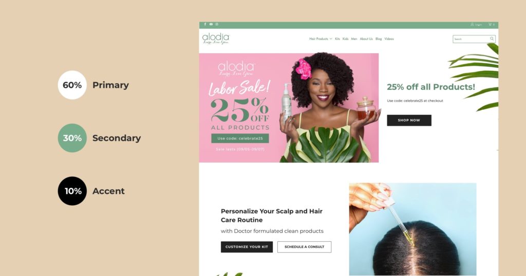
The 60-30-10 rule is a classic method of designing a color palette. The numbers represent the proportionate amount of color in a given space: 60% for the main color, 30% for the secondary, and the last 10% for a tertiary accent.
80/20 Rule
In website design, the 80/20 rule is the theory that 80% of the actions that take place on your website occur from only 20% of the site’s total features.
Accessibility
Accessibility is how easily a website can be used by someone with one or more disabilities. Designing with accessibility in mind is an important part of the design process and absolutely essential for UX.
Adaptive/Responsive
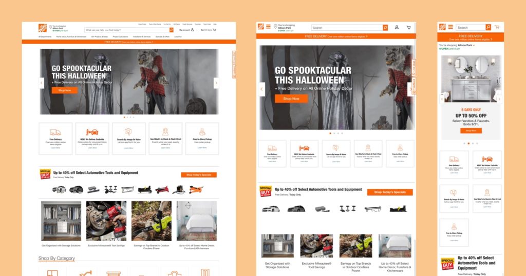
If a website or interface is described as “adaptive,” or “responsive” it typically means that it contains designs that are tailored to different devices. Such websites can detect the platform they’re on, so you would see the relevant version of the site when you access it. This design concept is similar to responsive web design, but adaptive design features distinct layouts for different devices, while responsive design features a single one that adjusts to the size of a given screen.
Affordance
Affordances are indicators of the function of different design elements on your site. They’re typically implemented to make the user experience more intuitive. There are numerous examples of affordances on any given website, including things such as labels or icons over interactive buttons.
Android
Android is one operating system you’ll see in mobile devices and is developed by Google. The operating system of a device is a piece of software that carries out its core functions.
API
API stands for Application Programming Interface. These are functions created to enable software to access information from other sources, such as the operating system or other applications. It’s important to follow API security best practices to protect this exchange of data.
Avatar
The Avatar is an image that represents users on a website, perhaps in the absence of a photo of the user themselves. You’ll typically see them in forums or places designed for community interaction.
Back and Front-End Development
Back-end development refers to work done in areas that an average user wouldn’t see. This includes organizing and storing the data for a website and measures to make sure everything is working on the front end.
Speaking of which, front-end development is the work done for the user-facing website. In other words, front-end development is concerned with how a site functions and how a user interacts with it.
Backlog
A backlog is simply the collection of tasks yet to be done. Naturally, it’s important to organize these remaining tasks to complete them efficiently.
Beacon
The beacon in this capacity refers to the small Bluetooth transmitters that allow compatible devices to communicate with each other. One common implementation is that of smartphones and the various wireless accessories you might connect with them.
Breadcrumbs
Breadcrumbs are an enduring design concept that helps users navigate different levels of a website. They’ll show the user where they are within it as well as provide a clear path back from where they came.
Bug
Bugs are mistakes or problems in a piece of software that can cause it to behave in unintended ways. Of course, careful work and testing should be carried out to minimize the effects any of these mistakes might have.
Cache
Cache memory is data temporarily saved from websites. Accessing sites with already cached data allows your browser to load the page faster, as only new or updated parts of the site need to be retrieved from the site.
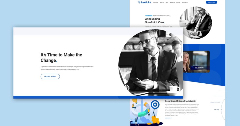
Call to Action (CTA)
The Call to Action is the short phrase or word that beckons the user to interact with a site or product. You might also have a CTA button, a link, or another interactive element that lets users perform the given interaction.
Card Sorting Method
The card sorting method is a way to help designers arrange website elements for easy navigation. Organizing a set of items that are each written out on paper cards lets a designer visualize how to logically group those that are similar to each other.
Chatbot
A chatbot is a software interface with which a user can carry out their queries. They can carry out a text “conversation” and are set up to provide answers in the field they were designed for.
Color Contrast
Simply put, color contrast refers to the difference between two colors and can be differentiated by value, hue, or saturation. It’s another effective tool in website design that helps make elements visually distinct.
Color Wheel
The color wheel is a circle that visually represents the colors and their relationships with each other. It can be a useful reference while determining the color palette of your website.
Data-Driven Design
Data-driven design is exactly what it sounds like: a design that’s backed up by all the studies and research at your disposal. The data helps designers discover new trends and reveals potential challenges that they can focus on overcoming.
Design Debt
Design debt refers to elements in a project that need to be fixed or adjusted later in production. Initial haphazard implementation of any given element, which can happen for any number of reasons, usually creates this debt. Of course, it’s always something to be wary of since design debt will ultimately require more work to resolve.
Dots Per Inch (DPI)
Dots per inch is a method of measuring the density of an image. Measuring how many dots can fit into a square inch of an image is an indicator of its resolution and size. When adjusting images on a website to be clear and effective, the DPI of the images is one factor that a designer must be aware of.
Experience Architecture
Experience Architecture is a visual representation of how a user will carry out their task, from the beginning to completion. It encompasses the various systems and functions that a user would interact with as well as the data and analysis to explain each step of their process.
Fitts’ Law
Fitts’ Law states that the further away and the smaller an object is from a pointer on a screen, the longer it takes for someone to move the pointer to the object. So, users are much more likely to interact with the larger or more prominent elements of a website.
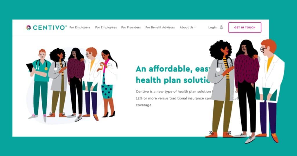
Flat Design
Creating a UI with a flat design entails a minimalistic approach. One benefit of flat design is that clean 2D visuals look appealing without distracting from the content itself.
F-Shaped Pattern
A website with an F-shaped pattern utilizes a user’s tendency to read content horizontally first to catch the headline or the first few lines of a piece of content, then down the left side of the page to quickly scan for other eye-catching elements. When something catches their eye, they read along the line horizontally before resuming the scan down the left side.
GitHub
GitHub is a platform used by developers to remotely collaborate, share files, and ensure proper version control.
Golden Ratio
The golden ratio is a frequently referred-to mathematical concept that, when applied to graphic design, can help create appealing layouts.
Grid
A grid is one way to provide a structure to your design. Aligning elements along vertical and horizontal lines is a common way to make your design appear efficient and consistent.
Hardware
Hardware is another term for the physical components of your computer.
HTML
HTML, or Hypertext Markup Language, is the primary programming language that is used to create websites. It provides the structure for various elements that a site contains.
Hybrid App
A hybrid app has access to both native and web functions. Usually, a web app is essentially given a native shell than can be installed on a device.
Information Architecture (IA)
Information architecture refers to how content is arranged in a product or website. Ideally, this content is organized logically and easily understood for the best possible user experience.
Interaction Design (IXD)
Interaction Design concerns the creation and consideration of interactive experiences. It determines how users access and experience a given interface.
iOS
iOS is the operating system for mobile devices developed by Apple The operating system of a device is a piece of software that carries out its core functions.
IP Address
The “IP” in IP address stands for Internet Protocol. Essentially, the address is a number unique to a given device that utilizes this protocol for communication.
Iterative Design
“Iterative design” is ux terminology that emphasizes building, testing, and revising your product in cycles to continuously improve towards users’ needs. Each iteration is designed to bring incremental improvements over what came before.
Javascript
Javascript is a programming language used for websites, most frequently used to create a site’s interactive elements.
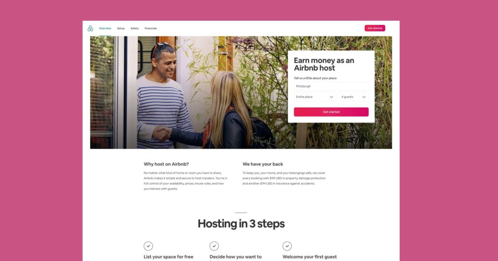
Landing Page
The landing page is what the user will first “land on” when they find your site. By design, it’s going to be the one that comes up in search results or ads, and it’s often very important for producing conversion goals you might have.
Lean UX
Lean UX is an Agile methodology that emphasizes iteration and collaboration to achieve its results. It eschews set-in-stone documentation for short iterative production cycles where the project’s needs can continually be reassessed.
Material Design
This design language was developed by Google for use in Android devices. It may also be referred to as Material.
Micro-Copy
Micro-copy on webpages are the short pieces of text that informs your interaction with it. It can come in many forms, but they’re always designed to make clear the functionality of their associated elements.
Mobile Web
The mobile web just refers to the accessing of the internet from a mobile device. The actual websites available are the same, of course, but the layout of webpages might change depending on the specific device.
Mockup
A mockup is a representation of a website’s final design, although it isn’t interactive. Essentially a picture of the final product, its purpose is to show off what the end-product will look like.
Mood Board
Mood boards are useful tools to define the artistic direction of the project. A collection of different types of media can all be used as inspiration. Because working on a mood board is such an open-ended process, this is the time to explore a wide variety of ideas to see where they lead.
Onboarding
Onboarding is the experience created by a developer for the purpose of attracting and easing new users into what their product has to offer.
Pairing Development/Pairing Programming
Pairing development or programming is the practice of two programmers taking turns to write code and reviewing each other’s work. The goal is to both prevent mistakes and create solutions that are only discovered because of the collaborative effort.
Pixel
The pixel is the smallest discrete element of an image that can be independently adjusted.
Prototype
A prototype is an early model of a product in development that’s used for testing. It should show how site features would function and how a user would interact with it.
Pull Request
While using GitHub, a pull request lets developers share their latest code with their coworkers on the project.
Refactoring
Refactoring is a technique to clean up code while maintaining its functionality. It’s done incrementally during the project’s development so that it can more easily be built upon later.
Responsive Web Design (RWD)
Websites designed to be responsive can adjust the size and layout of their content to fit a variety of devices. It’s somewhat like adaptive websites, but RWD features one flexible page whereas adaptive designs sport distinct versions for different devices.
Software as a Service (SaaS)
Software as a Service is a distribution model that offers the product as a subscription on external servers through the web. This allows users to access a service through the internet instead of needing to install it locally on their computer.
Scalable Vector Graphics (SVG)
SVG is a widely used vector image format that can be adjusted with code. It’s particularly useful in responsive web design because the size of the image can be increased or decreased without losing the image’s quality.
Software
Software simply refers to the programs on your computer rather than its physical components (the hardware).
Software Development Kit (SDK)
SDKs are collections of tools used to create products for a given platform or operating system. An SDK comes “pre-packaged” with the essentials of everything a developer needs to start creating for the given platform. Without an SDK, program development would have to start from scratch.
Technical Debt
Coding solutions that technically work but are actually messy or inefficient will create technical debt. Any number of factors can force these problems to occur, but eventually, they’ll need to be resolved.
User-Centered Design (UCD)
User-centered design maintains the end-user as the focal point of development. Questions asked during work revolve around how they would experience the product and how the experience can be improved.
User Experience (UX)
Broadly speaking, user experience is the sum of a user’s time spent interfacing with a product. It’s what they feel and thinks while using a product.
User Experience Design (UXD)
User experience design, as the name suggests, is the practice of designing end-user products that are appealing to them. UXD is relevant at just about every step of a product’s development; how a user is going to respond to an element is an ever-present question in the process.
User Interface (UI), or Graphical User Interface (GUI)
UI or GUI are the terms for what the user sees on their screen; they include everything the user interacts with.
Vertical Rhythm
Vertical rhythm is the practice of making the size of vertical spaces consistent between different elements of the page.
Waterfall
Waterfall development requires each stage of the process to be complete before moving onto the next. This highly structured approach runs counter to more recent Agile methods, but this structure might still be a boon for certain projects or teams.
Widget
A widget is a UI element that the user can interact with. They can come in many shapes and sizes but can include buttons or contact forms.
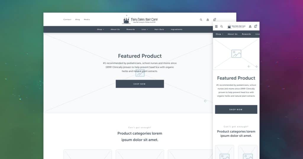
Wireframe
A wireframe is a simplified visualization of your website used to show off only its essential information. The most important elements of your product should be present, but overall, it’s still a bare-bones representation.
White or Negative Space
Empty white or negative space can be used to effectively guide users to focus on the important content on the page. If there isn’t enough white space, the page might feel cluttered and end up distracting the user away from your message.
A/B Testing
A/B testing displays two options for an audience to discover which one is better received. Subsequently, the testers can use this data to proceed and iterate upon the more successful design.
Customer Experience (CX)
The customer experience is the total summation of interactions that a customer participates in with a brand or product they enjoy. One might consider examining CX as user experience with a more explicitly sales-oriented approach.
Clickstream
Analyzing the clickstream, or the tracking of visits to a website enables developers to respond to users’ behavior, improve their site, and address pain points that customers might be experiencing.
Commits
Commits in the context of web development refer to the act of saving permanent changes to a set of codes. Just in case, it’s in your best interest to maintain clear version control and backups for your work.
Context of Use Analysis
Context of use analysis is the practice of observing users’ behavior on a website. This data can then be used to improve the website.
Conversion Rate
Conversion rate is the percentage of users that perform a specific action or transaction on a website. A number of factors can affect conversion, including the design of the website itself or an additional marketing campaign.
Customer Relationship Management (CRM) Software
CRM software is an important tool in managing the various business processes of a company’s online presence, such as sales or customer interactions.
Data Science
Data science is the practice of interpreting numbers and data into meaningful statistics that helps developers make more informed decisions. It ultimately serves as another important tool that helps determine users’ behavior.
Diary Study
Approaching data collection from a qualitative perspective, diary studies request that participant users write about their experiences in relation to the subject at hand over a given period of time. The value of such studies is that they can sometimes paint a more vivid picture for a developer’s research, at least compared to dry empirical data.
End Users
The end-user is who the developer is making the product for. In one way or another, the entire development of a project comes back to them.
Eye Tracking
Specialized tools exist that can measure eye activity when using certain devices. The data generated by these tools let developers know where their designs are most strongly leading the eyes—and thus, the user’s attention. Heat maps are typically used to display specific areas that are looked at more than others.
Focus Group
A focus group might be hosted to test a subject or an aspect of a product. Questions guide the discussion toward how users might feel toward a product or how they’d interact with it. Regardless of the exact questions or setting, the main goal is to gain information to further iterate upon the product.
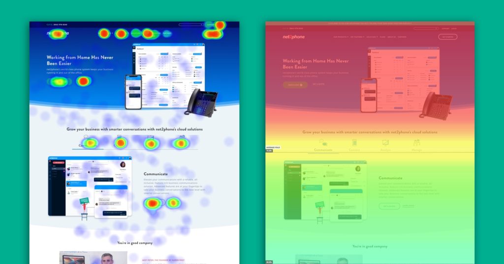
Heat Maps
A visual representation that shows points of interest on a webpage and usually color-coded to represent magnitude. One popular use of heat maps happens in conjunction with eye-tracking software; spots that cause the eyes to linger on a webpage appear more intense.
Key Performance Indicators (KPI)
Key performance indicators are measurements that reveal how well a product is doing. Certain data points on how users are interacting with your site can provide valuable information on what your team is doing well and what they can improve upon.
Minimum Viable Product (MVP)
The MVP is a product with all its important features implemented and typically signifies that the project is ready to launch. Of course, just because it can launch doesn’t mean it can’t or won’t be improved upon—hence the “minimum” in the name.
Pain Points
Pain points refer to the issues that users have when interacting with a website. There are numerous ways to track and look out for pain points in your design, and they are something that a developer always needs to be aware of. Pain points that aren’t resolved will make it more difficult for users to interact with your website and will eventually stop people from coming back.
Search Engine Optimization (SEO)
SEO is the practice of making a website more visible on the web through organic search results. Relevant and useful content with frequently searched phrases helps the website place higher in those search results. If done effectively, traffic to the website will increase as its SEO improves because more people will be able to find the site.
Usability Testing
One method of gauging how easy a product is to use is to conduct usability testing. Gathering a group of users to test this can prove how hard or easy it is and whether the product needs further iteration.
User Engagement
User engagement is a representation of how they interact with a website. The site needs to provide suitable value for the user in order to maintain or increase engagement.
Unit Testing
Unit testing is the process of testing separate small sections of an app to make sure it’s functioning properly. This testing is especially important because if you forego testing and later get an error, it’s going to be much more difficult to find the true source of the mistake.
Web Analytics
Web analytics is the practice of measuring and analyzing internet activity to optimize its usage. It’s one more resource that helps determine users’ behavior.
There you have it. If you read through this list of design terminology, UX terms, and UI terms start-to-finish, congratulations—there’s certainly a lot of information to take in.
Now, beyond expanding your vocabulary, using these terms should help convey your ideas without having to later explain, “Wait, this is what I actually meant.” If you’ve ever caught yourself in this situation, keep this list of ux terms as a handy guide to stay ahead of the game.
After you master the lingo and impress people with your knowledge of ux definitions, there’ll certainly be more questions to answer and problems to solve.
But we’re here to help.
Is there anything else you’d like to find out? Have any questions? Send us an email or let us know in the comment section!
Get Memorable Insights.
Sign up to receive actionable web design advice directly in your inbox monthly.
Get Memorable Insights.
Sign up to receive actionable web design advice directly in your inbox monthly.
Author
Jeff Gapinski is the President of Huemor where he helps plan the long-term strategic growth of the agency. Jeff is passionate about UI/UX, demand generation, and digital strategy.
What Do You Think?
Have feedback? Maybe some questions? Whatever it is, we'd love to hear from you.



1 Comment
Thank you for sharing your thoughts! Reading through your post was not only informative but also an educative experience. It's always nice to show appreciation for the content creators who enrich our digital lives.