Design
10 minute read
How To Improve Your Website (Without a Full Redesign).
LAST UPDATED:
February 12, 2024


Alright, so here’s the scenario. You’re a marketing manager in charge of ensuring certain goals are accomplished for your organization.
There’s a problem, though. You don’t have either the time or the budget to do a complete website redesign.
What do you do?
There are a ton of ways one can go about improving a website, but we’ve taken the liberty to narrow them down to the 10 things we feel will make the BIGGEST impact on your website WITHOUT having to redesign the entire thing from the ground up. So how do you improve your website? Get ready to ways to improve your website design!
User experience is greatly influenced by the speed of a website. Slow-loading sites repel visitors. According to Google, increasing loading times from one to three seconds raises the likelihood of a visitor abandoning the website by 32%.
Site speed also plays a vital role in conversion rates. In fact, research by Google reveals that conversions might drop by up to 20% for every second that a mobile page takes to load. Furthermore, faster websites can lift conversion rates by up to 40%.
In many cases, speeding up your website and website design can be relatively easy to do. Here are some quick fixes that can make your site load faster:
- Compress and optimize your images and videos
- Limit the amount that loads on a single page
- Enable caching
- Use a CDN
Improving website overall page speed is critical for attracting visitors and keeping them interested.
Protip
If you’re interested in learning more about what we can do for you, check out our offers here!
Good website design is all about consistency. The consistency of your website’s design and content is critical if you want to give your visitors a pleasant online experience. It can make the difference between a good and bad user experience.
Even if you’re not in love with your visual design, it may be made worse by being inconsistent. Make sure that fonts, font sizes, font weights, colors, treatments to elements such as corner rounding, and borders are consistent across all pages. This will improve how professional the website appears regardless of whether or not the web design is the best it can be.
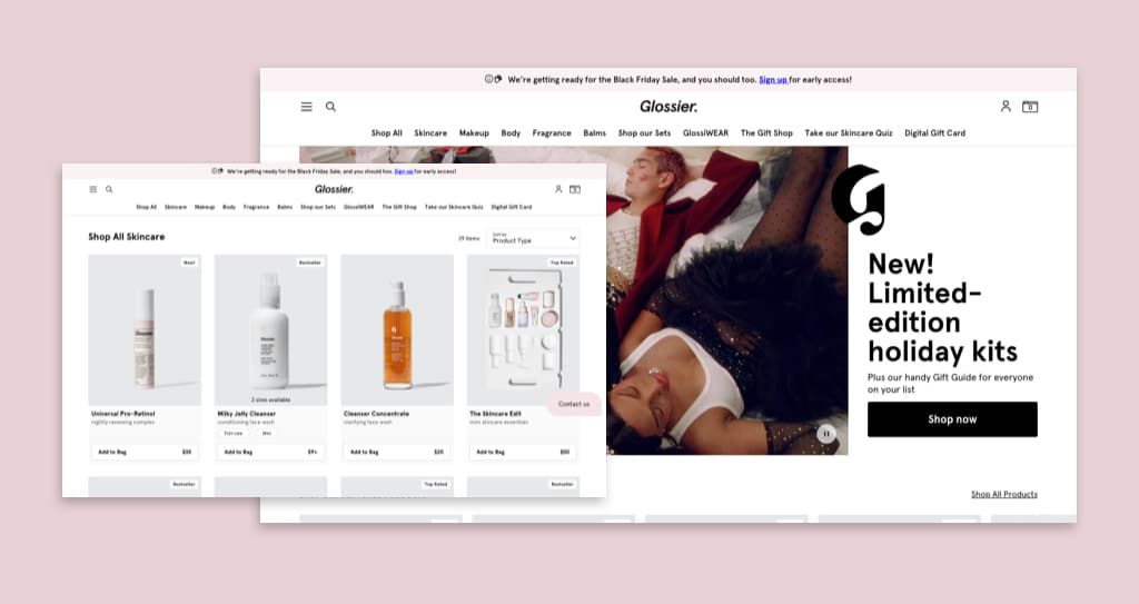
For example, consistency is evident on the Glossier website because it employs a color palette that matches its products. It is also able to add a few splashes of color to each page without going excessive or deviating from its identity. Also make the most of your website’s white space, do not over crowd your website with unneeded content but also do not leave blank canvas blank!
The copy on your homepage has a significant impact on its success. It’ll be the first thing visitors see when they come to your website and can be used as a brief “elevator pitch” to explain the purpose of your site. As a result, your website’s opening statement must be engaging.
You should have a clear opening statement that makes it obvious what you do, who you do it for, and why you do it. If you don’t, then you’re starting off on the wrong foot with your potential customers. Improving this statement will immediately help prospective customers connect with your company.
For instance, Kaber Tech features an excellent opening statement on their website. They have a catchy headline and a statement that illustrates what makes their products different.
One of the most crucial aspects of a website is its navigation. It helps visitors quickly and effortlessly discover the content they’re looking for, such as a blog post or a product page.
To make your website navigation effective, make sure all of your key pages are being represented. What are those key pages? These are areas of your site that are popular with visitors. You can use Google Analytics to help you understand what those pages are. Using the Navigation Summary Report feature, you’ll learn which pages people go to the most. This also ensures that the navigation is intuitive to how your customers would browse the website.
Another crucial factor is to make sure the navigation isn’t overwhelming. The navigation menu on your website is not the place for amusing gimmicks. Use the cleanest design and wording possible to ensure that your audience understands what you’re trying to convey. In addition, the adage “less is more” applies. Don’t bombard guests with too many items on your menu.
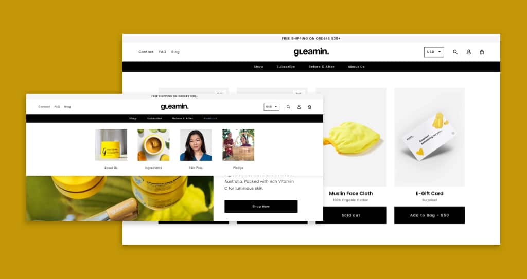
Over time websites grow, but often navigation systems don’t grow with them. As such, it’s essential to update your website navigation regularly for the best possible user experience.
An example of a website that has excellent navigation is Other Stories. The site features clear navigation options that allow users to easily find different product categories.
Protip
Check out our article for more detailed tips on how to design a truly effective website navigation.
Your website will soar if you provide social proof. Social proof is a marketing approach based on the premise that if people witness others doing something, they are more inclined to do it themselves.
If a shopper is undecided about what you’re offering, they will frequently look or ask around to see what others say about it before making a purchase.
Potential buyers get the impression that they’re not by themselves. Social proof lets them know that many people believe in the brand and use it to their advantage. As a result, they have many good reasons to put it to use for themselves as well.
One way to show social proof on your website is to add testimonials or reviews. This can help you gain a lot of new customers.
In fact, 95% of customers read internet reviews before purchasing something.
Furthermore, testimonials can boost sales page conversions by 34%.
Protip
Want to learn more out how to use use testimonials on your website? Read more here!
Including ratings and reviews on your website allows your visitors to see what other people have to say. Make sure they’re on crucial pages, that they serve to reinforce what you’re offering, and that they were made recently by previous customers.
Figs demonstrates how social proof can be used on a website. Their product pages feature a tab where customers can check ratings and reviews.
An effective contact form is one of the most crucial parts of your website. A potential customer has no idea how trustworthy you and your product are. They might have concerns about how to use your product, or they might want to put your customer support to the test by asking a query and seeing what kind of response they get.
Because contact forms are used to link online visitors with their objectives, design and user experience can heavily influence conversion rates. Here are some ways to simplify your contact forms.
Shorter Contact Forms Perform Better
When a form has too many fields, it can be too much for people to handle, and they may abandon it. Reducing the number of needed fields makes it easier to fill out the form and prevents the user from feeling overwhelmed. According to QuickSprout research, a three-field form had a 25% conversion rate. Those percentages were lowered to 20% for up to 5 fields and 15% for more than 6 fields. As a result, the maximum number of fields should be 5, and the tab order should be correct.
Keep What You Need To Know to the Bare Minimum
As a general rule, people are reluctant to share personal details such as their contact number or address. Asking for these details can result in a high rate of form abandonment. According to KoMarketing, phone numbers are the most common piece of information that consumers do not want to enter on a form, at 58%. This is even more relevant nowadays, given the rise in the number of spam calls. Home address closely follows at 53%.
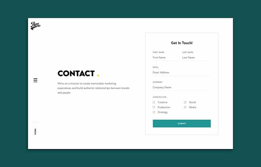
Less Friction = More Conversions
When designing a contact form, you should focus on making it as easy as possible for people to get in touch with you. Ensure that the user can quickly and progressively move through the fields by arranging the tab order. The final tab arrangement of the Submit and Cancel buttons is critical to avoid users from mistakenly canceling the form. Another option to reduce friction is to use in-line validation. Before submitting an inquiry, certain Javascripts can notify visitors if their email address is incorrect. Nothing is more frustrating than having to find an error after you’ve already tried to submit your data.
Not everyone visiting your website will be ready to buy, but they may be in the future. As such, it will be to your advantage if you can collect the contact information of potential leads. Gathering email addresses from your website visitors is vital to building a community of loyal customers. Email marketing has also been proven to have one of the highest returns on investment among digital marketing strategies at 122%.
Here are some improvements you can make on your site that can create additional opportunities for people to reveal who they are:
- Use newsletter opt-in forms on your website: Creating opt-in forms that let users submit their email and sign up for your emails is the easiest and quickest way to gather email addresses.
- Add new forms that offer specific resources or content: This might be in the form of an eBook, white paper, webinar, or anything else that provides consumers with essential knowledge.
Quality content distinguishes your website from the competition and sends the right message to your customers’ hearts and minds. Your website’s success is driven mainly by its content.
As such, you need to focus on creating new content relevant to your target audience. This could be new service pages, new case studies, white papers, ebooks, and blog posts. Fresh content shows you’re still moving forward, are active, and are a successful business.
Building relationships with your customers is one of the main benefits of producing quality content. You’ll be able to answer their inquiries and engage with them. Content has the power to create pleasant customer experiences and encourage them to return for more.
Audiovisual elements such as photographs, illustrations, and videos look fantastic on a website and help engage visitors by breaking up text-heavy sections. However, keeping your media up-to-date is also crucial in improving website performance.
Check the corporate headshots on your site. Are they more than five years out of date? If so, then it’s time to update them. Posting new photos of projects and facilities can also help show growth.
Make sure your visual elements are of the highest quality and relevance. Take note of anything that appears grainy, pixelated, or out-of-date. You can come across photos that aren’t relevant anymore or aren’t consistent with your current branding. Removing or replacing these elements can give your website a new and fresh look. Even if your website template isn’t brand new, new images and videos can still elevate your website. You can try utilizing AI that generates images to effortlessly refresh your visual content.
See our guide to Shopify image sizes, for example.
A 404 error is issued when a server is unable to locate the precise URL that the browser has requested. It’s the dreaded screen that reads: “this page cannot be found.” Individually, 404 errors may appear insignificant, but their cumulative effect on a site can be severe. 404 errors on a business website are a surefire way to lose money and irritate visitors at the same time.
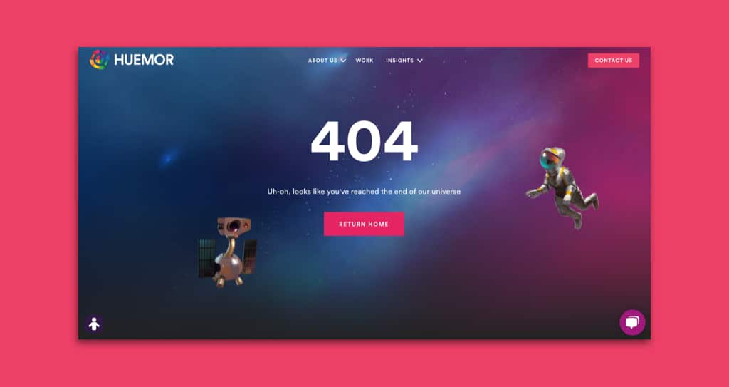
First and foremost, 404 errors hurt SEO. Google and other search engines won’t index pages that return a 404 error code because it means the page doesn’t exist. Furthermore, they also hurt user experience. 404 errors can be frustrating for visitors and cause them to leave a website. Because of this, you’ll see a rise in the bounces and exit rates of your site. Customers and sales can potentially be lost due to 404 errors.
For these reasons, you must identify and fix these broken links. You can achieve this using tools like ahrefs. In addition to these improvements, consider implementing strategies to revamp your website’s SEO performance, ensuring it stays optimized for search engines and continues to attract organic traffic.
Improving your website without having to redesign it might be challenging, but not impossible. If you take the time to adopt the ideas we’ve shared in this article, you can improve website performance, user experience, and conversion rates. We hope these pointers can help you update your website without spending a lot of money on a complete redesign.
Do you have any other suggestions for how to improve a website without having to redesign it? Feel free to share your thoughts and comments!
Get Memorable Insights.
Sign up to receive actionable web design advice directly in your inbox monthly.
Get Memorable Insights.
Sign up to receive actionable web design advice directly in your inbox monthly.
Author
Jeff Gapinski is the President of Huemor where he helps plan the long-term strategic growth of the agency. Jeff is passionate about UI/UX, demand generation, and digital strategy.
What Do You Think?
Have feedback? Maybe some questions? Whatever it is, we'd love to hear from you.




No comments found