Design
7 minute read
What Makes a Good Health and Wellness Website?.
LAST UPDATED:
June 27, 2023

Websites are a dime a dozen these days. It seems like there’s a website for everything and everyone. But what’s the point of having a website?
For businesses, a website is an investment and a marketing tool. It’s a way to reach more people and sell more products or services.
But for health and wellness websites, the purpose is a little different. These websites usually aim to sell a product or service or increase awareness about health and wellness.
The latter is often accomplished through articles, blog posts, and infographics that educate visitors about various topics related to health and wellness.
Sometimes, these websites also sell products, but their primary focus is on providing helpful information to their visitors.
This article will list our top picks for health and wellness websites that do their job well.
Also, we’ll provide tips and tricks health and wellness websites can do to improve their rankings and engage more visitors.
If you’re a marketing manager looking to create a health and wellness website for your company, this article is for you!
Let’s dive in and explore what makes a good health and wellness website.
These health and wellness websites have exciting content, great design, and solid search engine rankings. Here are our top picks.
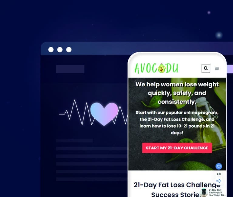
Avocadu

Regarding health and wellness websites, Avocadu does an excellent job of providing users with a pleasing experience. The website’s color scheme is eye-catching and easy on the senses, and its navigation is straightforward.
You can find the information you need without any difficulty, and a useful feature is that the blog posts and resources are shared on the homepage for easy access.
The copy on the website is well-written and effectively conveys the information that the website wants its customers and potential customers to know.
Not only does Avocadu provide free resources for beginners, but they also have yoga guides and probiotics available.
These resources can help users stay on track with health and wellness goals, which is a great way to engage them and keep them coming back.
Bloomnu
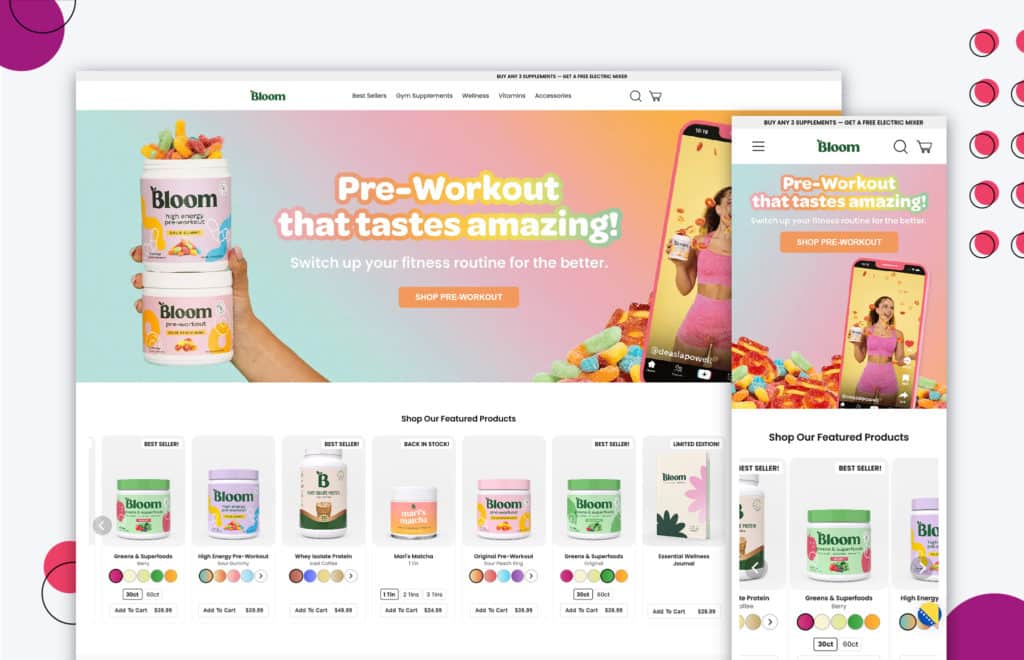
The Bloomnu health and wellness website is an excellent resource for anyone looking to improve their health and well-being. The site offers a wide range of products, from supplements and natural health remedies.
One of the best things about the Bloomnu website is the product cards.
Each card provides detailed information about the product, including ingredients, dosage, and side effects. This makes it easy to compare different products and find the one best suits your needs.
Greatist
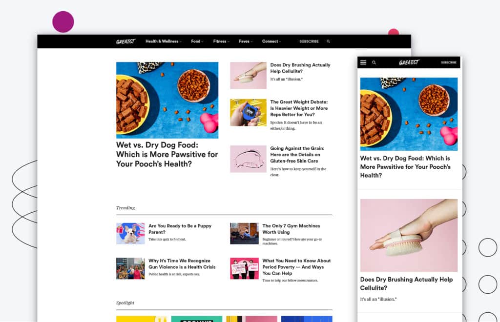
Greatist is a health and wellness website offering various services to its users. The overall website is clean and easy to navigate, with a simple and uncluttered design.
The use of headings and negative space makes the site easy to read and understand, and tabs separating categories, quick links, and tags is an excellent way for users to explore the site.
Greatist also offers a variety of features that make it an inviting and helpful resource for users looking for information on health and wellness.
The site also provides articles on various topics, tools, and resources, such as a calorie calculator and a fitness tracker.
Healthline

Healthline is a trusted resource for trustworthy and accessible health information.
Their website design gives users a clear understanding of their services, the content is easy to understand, and visual elements are used to educate them about physical and mental health.
From the use of images, fonts, illustrations & color choices – the website leaves a lasting impression on those who visit. Its clean look is inviting, and it’s packed with valuable resources on an array of topics.
Healthline strives to provide accurate, up-to-date information to make informed decisions about your health. They are an incredible resource that we highly recommend.
My Fitness Pal
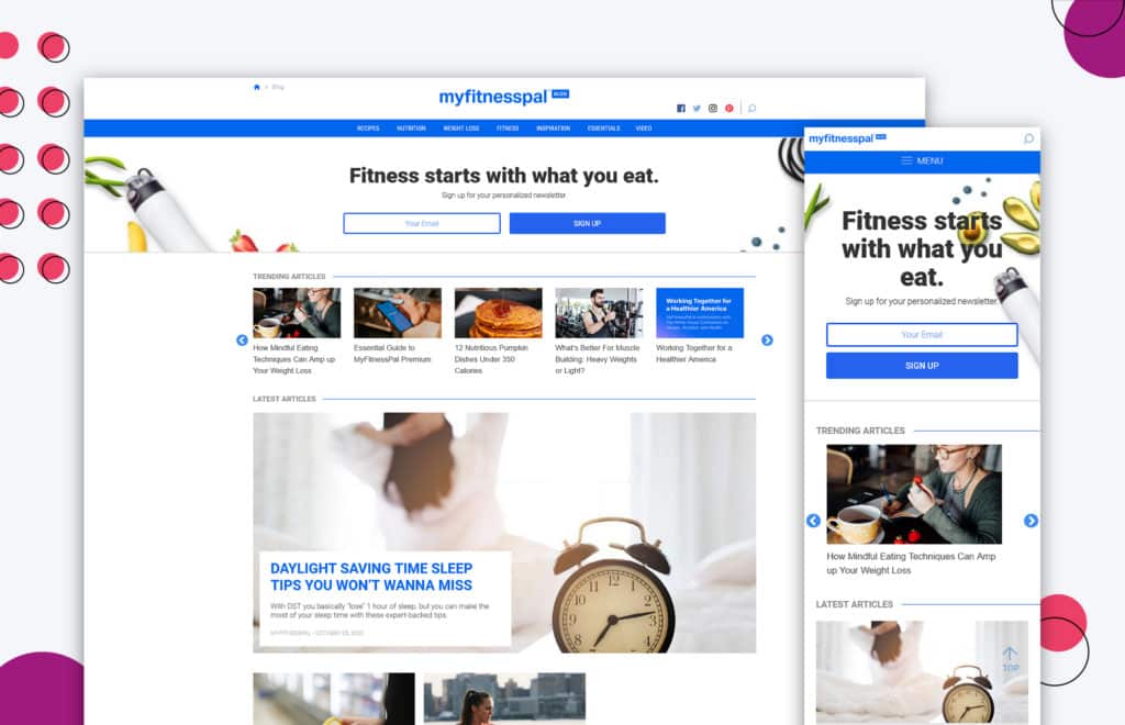
My Fitness Pal app has been around for quite a while to help their users stay on track with their fitness goals.
For those who don’t know, it’s a calorie counter that lets you input the food you eat and the exercise you do so you can better monitor your intake and make healthier choices.
Users appreciate how they also feature blogs and discussion groups on their site. It helps to keep users engaged and motivated, and it’s nice to be able to share stories with others who are going through similar journeys.
The only downside is that the site itself could use a bit of a redesign — it’s a little bit dated and could be more visually appealing.
But overall, the content is excellent and encourages the use of the My Fitness Pal mobile app.
VentureWorks

VentureWorks has created a health and wellness website that is truly unique. The site is designed to be an immersive experience for people with limited hearing abilities.
The hearing aid site has a remarkable landing page functionality that allows users to see and hear the content in a way that is easy to understand.
We like that it is a visual experience that makes it unique for the users in the target audience.
The site also includes interactive features, such as quizzes and games, to keep users engaged.
VentureWorks has done a fantastic job creating a website that is both user-friendly and visually appealing.
Vibrants
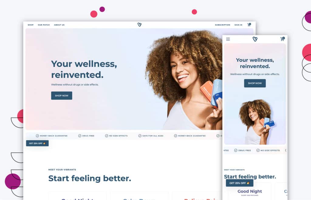
Vibrants is more than just a website — it’s a community dedicated to helping people live their best lives.
From the moment you visit the site, you’re greeted with animation and graphics that are clean and easy to understand. The Mega Menu for Shop is also clear and visual, making it easy to find what you’re looking for.
But Vibrants Health and Wellness isn’t just about selling products. They also offer a wealth of articles and resources on everything from fitness and nutrition to mental health and relationships.
Yoga Journal
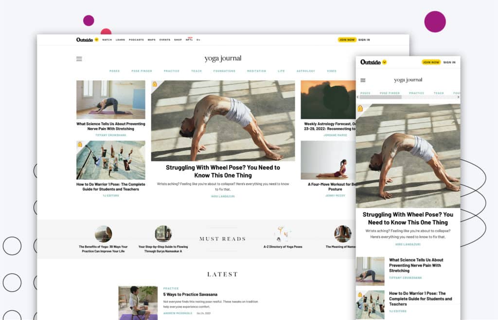
Yoga Journal’s health and wellness website is not only easy on the eyes but also easy to navigate.
The homepage features beautiful imagery which draws the user’s attention to the content and copies that Yoga Journal wants to share.
The navigation bar makes it easier for users to narrow down precisely what they are looking for and easily find it.
For example, suppose a user is interested in finding yoga poses to help relieve anxiety and stress. In that case, they can click on the “Poses” tab, find “Poses by Benefit,” and select “Anxiety.”
Yoga Journal’s health and wellness website is an excellent resource for those looking to improve their physical and mental well-being.
We’ve all visited health and wellness websites that are bulky, outdated, or difficult to navigate.
While these sites may provide valuable health information, they often leave much to be desired regarding design and user experience.
If you’re looking to create a health and wellness website that truly stands out from the crowd, here are some quick tips and tricks that you can do to improve your website.
Copywriting That Engages and Speaks
Excellent copywriting is one of the primary keys to creating a good health and wellness website.
This means writing in a way that speaks directly to your target audience, using language that resonates with them and helps them connect with your content.
Level-up With Good Imagery

“A picture is worth a thousand words.“
While cliché, this saying holds for health and wellness websites. Images are powerful tools that can break up text-heavy content and draw the reader’s attention to important information.
Use high-quality images, infographics, and other visual elements on your website to make it more engaging and user-friendly.
Navigation Is Key
Another important aspect of health and wellness websites is their website navigation.
You want to make it as simple as possible for your users to find what they are looking for, whether it’s a specific product or information on health topics.
This means clear navigation buttons, well-organized content sections, and a user-friendly layout.
Give Your Potential Customers a Reason
Finally, health and wellness websites must give their users a reason to return.
Whether it’s providing the latest health news, running social media campaigns, or offering special discounts or programs, you must find ways to keep your users interested and engaged with your website.
By putting in the time and effort to create a quality health and wellness website, you’ll be able to attract new customers and grow your business.
Is your conversion rate declining rapidly?
Is your bounce rate too high?
Do you feel like your health and wellness website hasn’t been updated in a long time?
It might be time for a redesign.
The average lifespan of a website is two years, so if you’ve had your health and wellness website for longer than that, it’s likely starting to feel a bit tired and outdated.
To stay competitive in today’s marketplace, it’s essential that your website reflects the latest design trends and provides users with an engaging user experience.
As you can see, there are a lot of different factors that go into making a good health and wellness website. It’s essential to have clear and concise information, a solid visual design, and easy navigation.
And, of course, it’s always a good idea to get professional help if you’re unsure how to proceed.
That’s where Huemor comes in. We’re experts in website design, and we know how to create a site that’s both informative and visually appealing.
We’d be happy to assist you if you need help redesigning your health and wellness website. Contact us today to get started!
Get Memorable Insights.
Sign up to receive actionable web design advice directly in your inbox monthly.
Get Memorable Insights.
Sign up to receive actionable web design advice directly in your inbox monthly.
Author
Jeff Gapinski is the President of Huemor where he helps plan the long-term strategic growth of the agency. Jeff is passionate about UI/UX, demand generation, and digital strategy.
What Do You Think?
Have feedback? Maybe some questions? Whatever it is, we'd love to hear from you.


No comments found