Strategy
8 minute read
What Makes an Effective CTA and 6 Good CTA Examples.
LAST UPDATED:
June 22, 2023
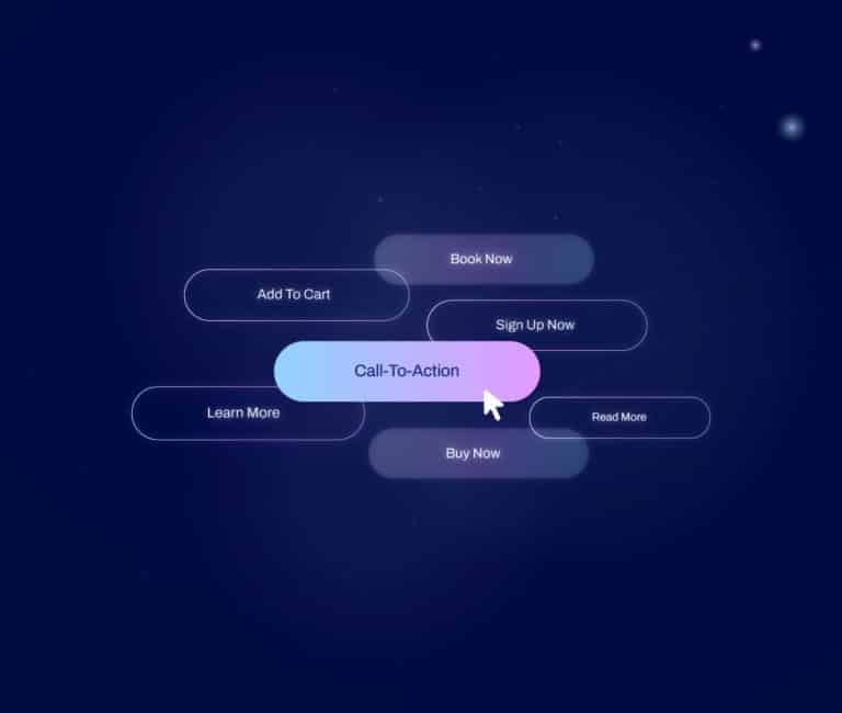

If you’re here, chances are you’ve heard the term CTA or call-to-action thrown around.
Or perhaps you’re looking for a way to spruce up your website and drive traffic.
In short, a CTA is any code in an advertisement, magazine page, website page, or social media post that encourages users to take action.
They come in many shapes and sizes — from buttons on web pages inviting people to click through — to icons that suggest desired actions. They’re an essential part of any web design system.
What are you waiting for? Let’s check out how we can make some CTAs work for you!
One of the copywriting best practices is to choose a CTA relevant to your:
- Business goal
- Purpose for reaching out
- Target audience
You’ll notice almost immediately that there’s an incredible array of CTAs available. Some might be subtle, while others will be far more direct.
No matter your choice, make sure it is helping you reach your goal.
Let’s look at the different types of CTAs you can use on your content.
Sign Up
First is the Sign Up CTA, most commonly used on websites requiring users to create an account before accessing services.
The businesses that use Sign Up CTAs are usually those that provide services like:
- Subscription boxes
- Online courses
- Streaming content
Sign Up CTAs should be placed prominently on your homepage so that users immediately see them when they visit your website.
Subscribe
Subscribe CTAs are slightly different from Sign Up CTAs because they don’t require users to create an account or log in to access services.
Businesses that want their customers to receive regular updates via emails or newsletters use these CTAs.
Placing a subscribe CTA at the bottom of each blog post gives readers an easy way to stay informed about your company’s activities without them having to leave the current page.
Try for Free

Offering a free trial is one of the most effective ways to get customers interested in your product or service.
When customers can try something out before committing, it helps build trust and gives them an idea of what they can expect from your business.
A “Try for Free” CTA can also be very compelling if you’re offering a limited-time offer or exclusive content.
This type of CTA implies urgency and encourages customers to act before they miss out on an opportunity.

One thing I see a lot that is not best practice for CTAs is the word “request” i.e. “Request a Quote.” This inherently feels to the user like their request could be denied. If that’s not the case, “Get a Proposal” is more effective.
DeAnna Klein, Copywriter
Get Started
For businesses that offer subscription services or require customers to create accounts, a “Get Started” CTA is essential.
This type of CTA encourages customers to take their first step towards becoming customers by signing up for an account or registering for access.
It also signals additional steps to complete their purchase or obtain access to your product/service.
Learn More
The purpose of “Learn More” CTAs is twofold:
- It provides potential customers with information about your product/service
- It encourages them to take action by learning more about what you offer
This type of CTA works best when combined with other CTAs like “Sign Up Now” or “Download Now” so that customers can learn more before making their final decision.
Join Us
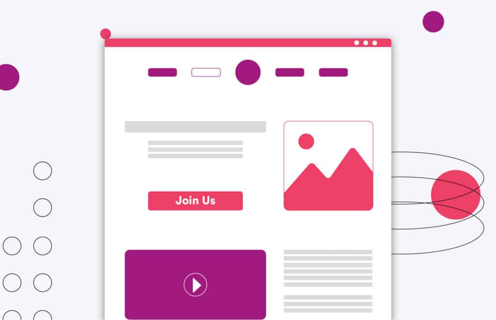
Finally, there is the all-important “Join Us!” CTA.
The Join Us CTA works well because it encourages people who have already tried out your product/service to become part of your community by:
- Joining your company’s loyalty program
- Subscribing to your mailing list
This CTA helps ensure that the positive experiences of your past customers continue long after the initial purchase.
Now that you know the different types of CTAs you can use in your content, let’s look at some tips for making them more effective.
Use Appropriate Word Choice
The words you use in your CTA are crucial — they can be the difference between someone clicking or not clicking.
Make sure you use actionable words to grab people’s attention and encourage them to take action.
Don’t be afraid to use emotion-evoking words or strongly persuasive wording.
Words like “discover,” “shop,” or “explore” are all great options for encouraging clicks from potential customers.
Make an Offer They Can’t Refuse
Your CTA should have an irresistible offer — something that people can’t pass up.
It could be free shipping on orders over $50 or a 50% discount for first-time buyers.
Whatever it is, make sure it encourages people to take action and makes them feel like they can’t miss out on this fantastic deal!
Remove Barriers
It’s also essential to remove any barriers preventing people from clicking your CTA button.
This could include long registration forms to slow loading times on pages with CTAs.
One good barrier to remove is cost. Try offering something free so your potential customers don’t have to pay for every little thing. It doesn’t have to be huge, but it can make a difference.
You won’t have a great CTA if something keeps people from clicking it!
Make sure everything is streamlined and easy for potential customers to navigate before they hit the button.
Use Designs That Make Sense
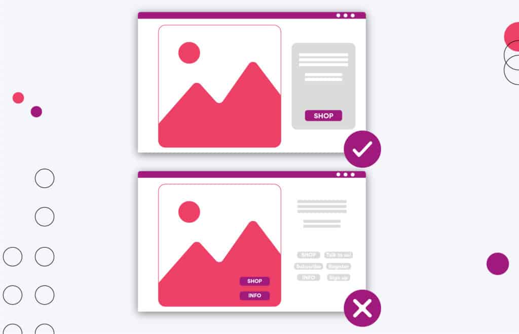
The design of your CTA should be just as important as the copy itself!
Make sure that the design of your CTA reflects what you’re trying to say in your copy — something that looks inviting and encourages clicks from potential customers.
The colors should be clear and bold enough so everyone knows exactly where to click when they see your page!
Colors like red and orange are typically used for CTA buttons because of how they stand out, but be careful to use these colors sparingly, as they can be overwhelming if used incorrectly or too much.
Consider Accessibility
Finally, don’t forget about accessibility when designing your CTAs!
You want everyone who visits your page to easily access and understand the information presented for them to take advantage of any offers or deals in the CTA.
Consider offering alternative formats, such as:
- Audio recordings
- Larger font sizes
These formats ensure that everyone has equal access, regardless of disability status or language preferences. They’ll also help you with ADA compliance.
Need some inspiration? Here are some top brands that we think have nailed it when it comes to their CTAs.
BarkBox
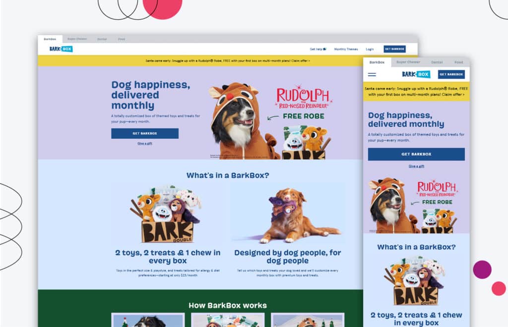
BarkBox has perfected the use of clear and effective CTAs. You can find two buttons on their homepage:
- One inviting customers to buy a BarkBox for themselves
- Another encouraging them to give a gift
With these CTAs, BarkBox lets visitors learn how their subscription service works immediately.
They stand out by keeping their CTAs fun yet professional, so even first-time website visitors can easily decide which option is best for them.
Not only that, but these CTAs make it easy for returning customers to identify what type of purchase or gift they’d like to make from BarkBox.
Evernote
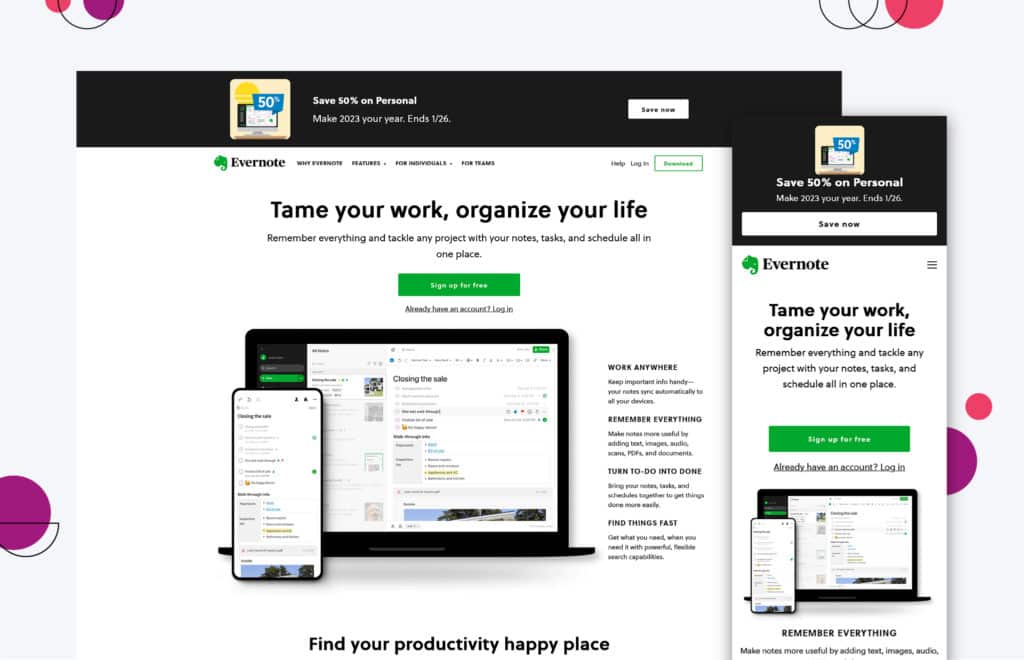
Evernote’s use of persuasive and effective CTAs is spot-on!
The product page’s distinct shades of green, synonymous with the Evernote brand, make for a visually appealing experience and encourage users to sign up for their free subscription service.
The button is easy to spot, and the white text on top of the bright green helps to grab users’ attention.
Additionally, offering a free subscription incentivizes potential customers to try and learn more about the app and its other features.
All in all, Evernote offers an effective means of persuasion to get people on board with their handy note-taking app!
Huemor
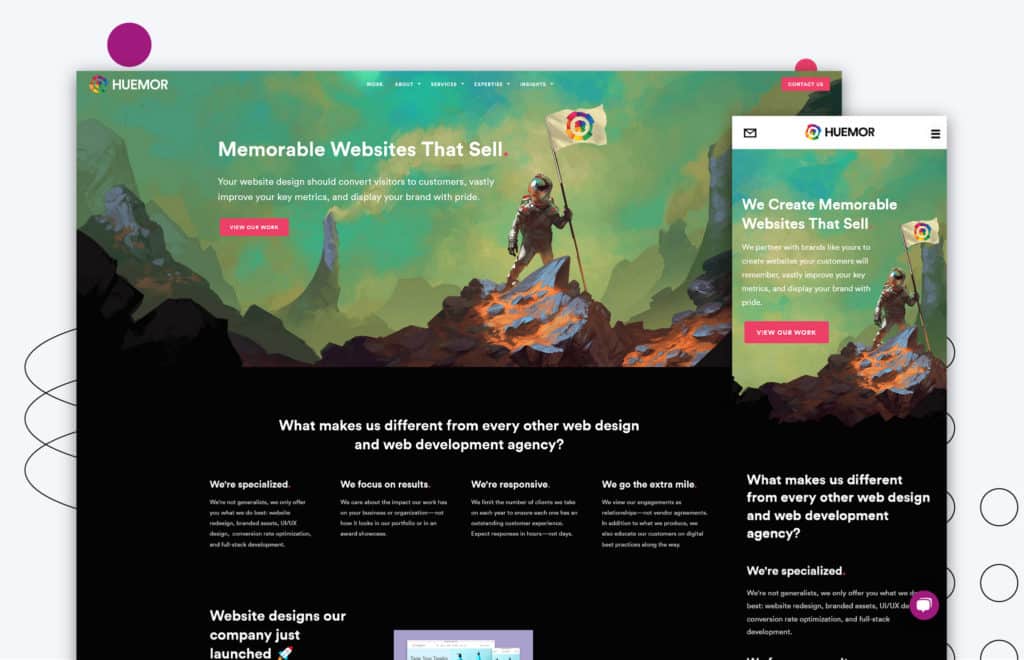
At Huemor, we know that CTAs are essential for good design. (Hey, we can put ourselves on our own list!)
And we’ve gotten pretty good at it. In fact, we’ve made HubSpot’s list of great CTA uses!
When you check our website, take a second to engage with us by clicking one of our CTAs.
From the “View Our Work” button on the homepage to our various service offerings further down, you can learn about Huemor Rocks and our impressive capabilities!
See why so many people have trusted us with their projects — go ahead and get to know more about us today.
Khan Academy
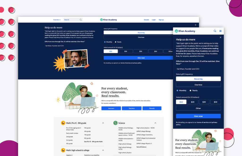
Khan Academy is an incredible, nonprofit organization providing a world-class education to anyone anywhere — and they do so for free!
The genius of their homepage isn’t only the free courses they offer. We can also see it in how they use CTA buttons to provide each type of user with a more personalized experience.
Learners, teachers, districts, and parents — they easily cater to each group by using these strategically placed CTAs.
Khan Academy tailored its website to deliver relevant material while providing a professional yet helpful tone of voice. Free education never looked this good!
Luseta Beauty
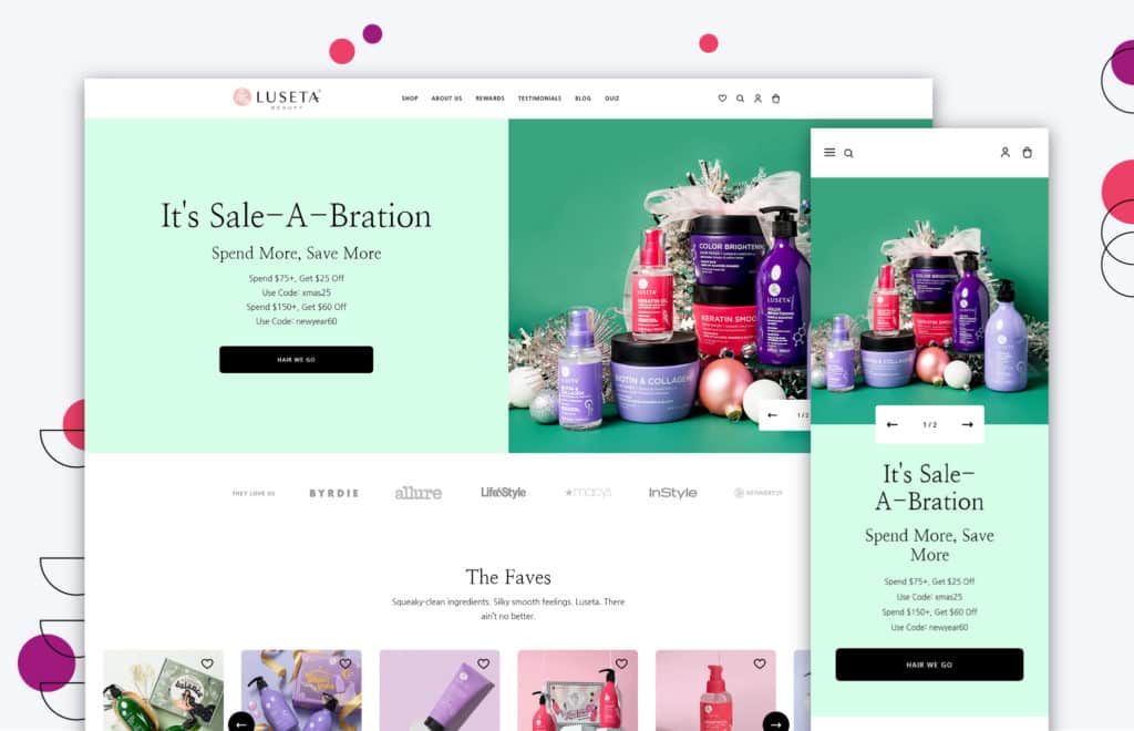
At Luseta Beauty, their mission is simple: to enrich your life with quality hair care products.
This is why the CTAs on their homepage are so important!
Luseta Beauty really understands the power of excellent customer experience and that customer engagement should be easy, fast, and enjoyable.
Customers can receive exclusive offers and discounts with a 10% discount code CTA for email addresses.
Meanwhile, their “Hair We Go!” CTA offers customers access to explore all the latest products on offer.
Their CTAs ensure customers feel informed and appreciated, giving them better access to a range of solutions such as hair masks and conditioners.
Tripleseat
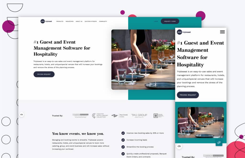
Tripleseat is a great software that helps you keep things organized, from restaurants to hotels and everything in between.
It shows how serious they are about easy customer experience with their call-to-action buttons.
The first CTA of Tripleseat‘s website is direct: they want customers to request pricing information.
But the coolest part happens when you move your cursor over the button: it’s highlighted.
It makes potential customers more engaged with the website. This small but interactive detail shows how much thought they put into their design, making the user experience even more enjoyable.
There you have it! We’ve looked at some of the most creative, persuasive, and effective CTA examples.
From Evernote’s eye-catching green button to Tripleseat’s clever and engaging highlighted call-to-action, we hope these examples inspired you to create effective CTAs.
CTAs are a great way to help move potential customers and leads through your website and ultimately purchase from you.
Let’s practice a call to action: Need help redesigning or developing a website? Contact us! (See what we did there?)
Get Memorable Insights.
Sign up to receive actionable web design advice directly in your inbox monthly.
Get Memorable Insights.
Sign up to receive actionable web design advice directly in your inbox monthly.
Author
Jeff Gapinski is the President of Huemor where he helps plan the long-term strategic growth of the agency. Jeff is passionate about UI/UX, demand generation, and digital strategy.
What Do You Think?
Have feedback? Maybe some questions? Whatever it is, we'd love to hear from you.


![How to Write the Perfect Site Redesign RFP [+Free Template]](https://huejuicyfruit-staging.huemor.rocks/wp-content/uploads/2020/06/2023.06.22.How-to-Write-the-Perfect-Site-Redesign-RFP.jpg)


No comments found