Development
7 minute read
Website Copywriting Best Practices and Examples.
LAST UPDATED:
June 22, 2023


Communication is the foundation of almost everything!
It’s how we exchange thoughts and information with one another and how we form relationships and do business.
It’s also the same as having a website.
When you write copy for your website, it needs to be clear, concise, and focused on the message you want to convey.
Your site’s objective is to captivate visitors and encourage them to take action (like buying or subscribing).
You can use different strategies to achieve this goal, but all of them will rely on good communication between you and your readers.
Good copywriting can make a product or service more appealing and easier to understand.
This is why it’s essential for companies and individuals alike to invest in the best copywriters they can find to improve their websites.
What makes good copywriting? In this blog post, we’ll look at some of the key copywriting best practices for writing effective web content and examples of good copywriting from around the web.
Presentation Is Everything
You’ve got your own website. Now what? How do you persuade users to click and read it?
First of all, determine what kind of copywriting style works best for your brand.
You can’t merely write whatever you want and hope people like it; you have to figure out how to connect with them in the best way possible.
This is where voice, tone, messaging, and the audience come into play.
Voice refers to how you talk about yourself or your product. It’s how you want people to feel when they’re reading about you.
The tone is the attitude that comes through in every word. Is it friendly? Informal? Serious? Your tone should reflect how you want customers to perceive your business.
Messaging is how you convey information about yourself or your product. The words on the page are just one part of the story! The other part involves the attitude behind those words.
Finally, the audience refers to who is reading this content. Who are they? Why should they be interested in what I’m saying? What do they want from me?
Guidelines, Guidelines, & More Guidelines
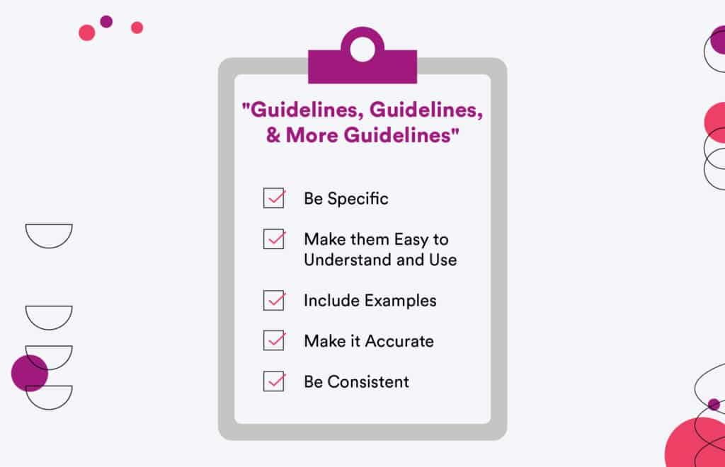
What’s the best way to ensure that your copy is on point?
Create branding guidelines and copy guidelines. These documents will help keep your brand consistent across all mediums, including social media posts and website copy.
Here are some tips for creating copy guidelines for your site:
- Be specific: Don’t just say, “make it fun and friendly.” Define what that means.
- Make them easy to understand and use: If someone else has questions about the brand or wants to make changes, they can do it quickly.
- Include examples: You need examples of how the brand should look and feel on all channels (print, social media, web).
- Make it accurate: Anytime a new piece of content is created (like a blog post or an email), check it against your brand guidelines to ensure it follows them properly.
- Be consistent: Don’t forget about consistency, especially when it comes to tone.
Lose the “We”, “Our Company”, and “Company Name”
When you’re writing for a website, it can be easy to forget that the user is the hero of the story.
The user needs to be the person who succeeds — with your help.
If you don’t write copy that makes that clear, it’s easy to fall into an “us vs. them” mentality, where your company is trying to sell something to a customer who doesn’t know what they need or is interested in buying from you.
The key here is to remember that your job as a copywriter isn’t just about selling your products and services; it’s about helping people solve problems.
If someone visits your website looking for information about a certain topic, make sure you’re talking directly to them about their problem and not just listing off the features of your product or service without addressing why those features matter for them specifically.
Your customers are looking for a particular experience when they come to your site.
They can tell whether or not you’ve created it based on how well the words on your site speak to them.
In order for those words to resonate, you need to make an effort to talk with the potential customer.
The focus should be on features and real benefits.
Features are what make up a product or service — the things that are technically true about it.
Benefits are why people want those features — what they expect from them.
Real benefits are what actually happens when someone uses those features in their lives (or business).
Be Relatable to Your Target Audience
Knowing your target audience is one way of applying your copywriting best practices.
Writing copy for a website isn’t just about ensuring you have all the correct information; it’s about being transparent, hitting your user where it matters, and making a connection.
It starts with figuring out what they want and why they want it. You must ensure that you’re addressing the pain points of the people who will be viewing your site and filling out your forms.
Still, it would be beneficial if you did it in a way that would make them feel safe — like they could trust you with their information.
We’ve all been frustrated when trying to learn new stuff, and there are too many obstacles to jump through or insufficient information on where to start.
It’s frustrating!
You want to use this frustration as an opportunity for humor. This will help keep users engaged as they read through your content.

You can’t create a compelling copy that’s effective if you’re trying to reach everyone. If you want your website to convert, you must tailor your message to the people who buy your products and services.
DeAnna Klein, Copywriter
BaseCamp
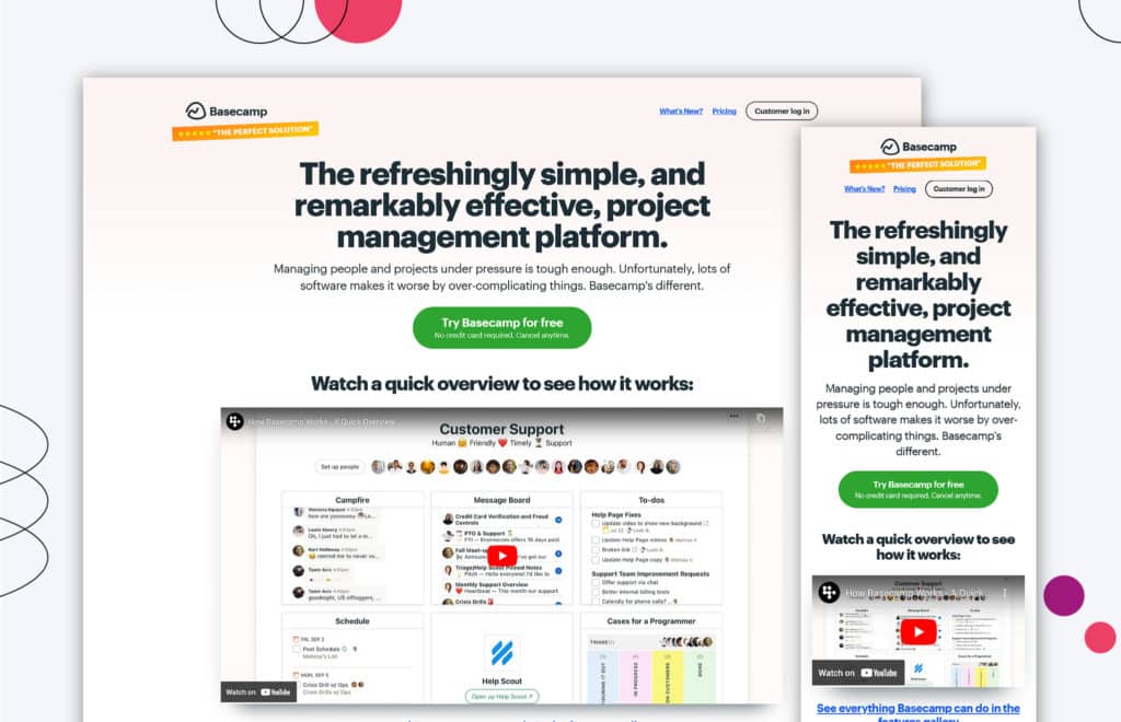
Basecamp has a really great homepage design.
The copy on the web page pops out and encourages visitors to discover more about BaseCamp.
The bonded and yellow-highlighted text stands out and grabs the reader’s attention right away. All of the copy adheres to a consistent design system and standard.
It’s clear that Basecamp put a lot of thought into their design, but they also spent time crafting their copy to ensure that it conveys the same sense of professionalism as their other design elements.
Basecamp has a clear benefit: “Project Management Made Easy.” It reinforces its importance in the user experience.
This isn’t just something they say once at the very beginning of their site; They say this throughout every page on the website — including each step of signing up for an account!
The “Hero” section is one part of Basecamp’s homepage content that stands out from all other pages on their site.
It uses bright colors and bold text to grab attention and highlight important information about what makes them different.
Velocity Partners
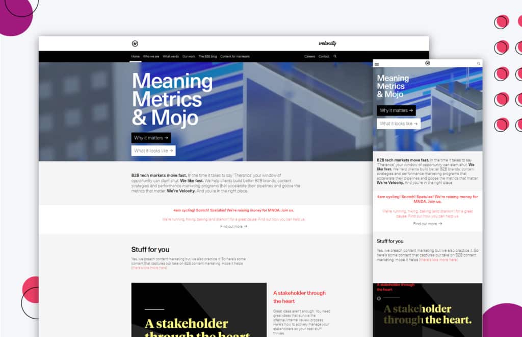
This entire website is entertaining, conversational, and quirky.
The Velocity Partners copywriter clearly had fun writing it, and the company has a great sense of humor.
Because it reads like an actual conversation with a friend, the copy content is effective in capturing the attention of potential customers.
The copywriter also includes some great keywords which are conversational and quirky to ensure that people looking for something similar will find their website.
First Round
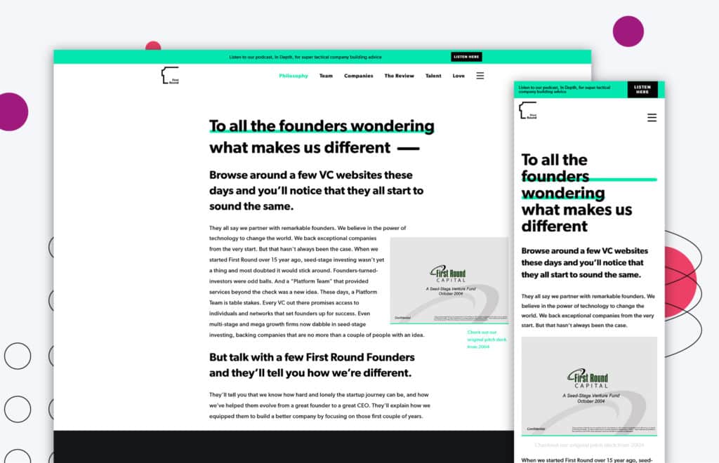
This entire website is fantastic. We adore the home hero, but this philosophy page is brilliant. It demonstrates the pain points and offers a solution.
The bolded text catches the reader’s attention and clarifies that we’re about to discuss something important.
This page is intended to be a gateway into the brand, so you want to ensure that visitors understand what they’re getting into before they begin reading.
If they don’t understand it right away, they may move on to something else rather than diving deeper into your content.
You want them to believe that they can trust you — that you’ll have their back and give them the details they need to achieve whatever goals they set for themselves.
BarkBox
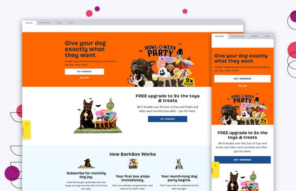
BarkBox is one of the most famous American dog subscription services.
Their website contains many excellent copywriting examples, so it’s no surprise they understand their audience: pet owners.
Their website’s content is geared toward pet owners (and their pets), allowing them to speak directly to the customers and encouraging them to buy.
They also know how to assist potential customers in locating the information they seek, allowing customers to easily navigate their website and find the desired content.
Barkbox’s tone and messaging are lighthearted and approachable.
The copy demonstrates personality and speaks to the company’s brand with captions from two of their “employees” lending a paw!
Bombas
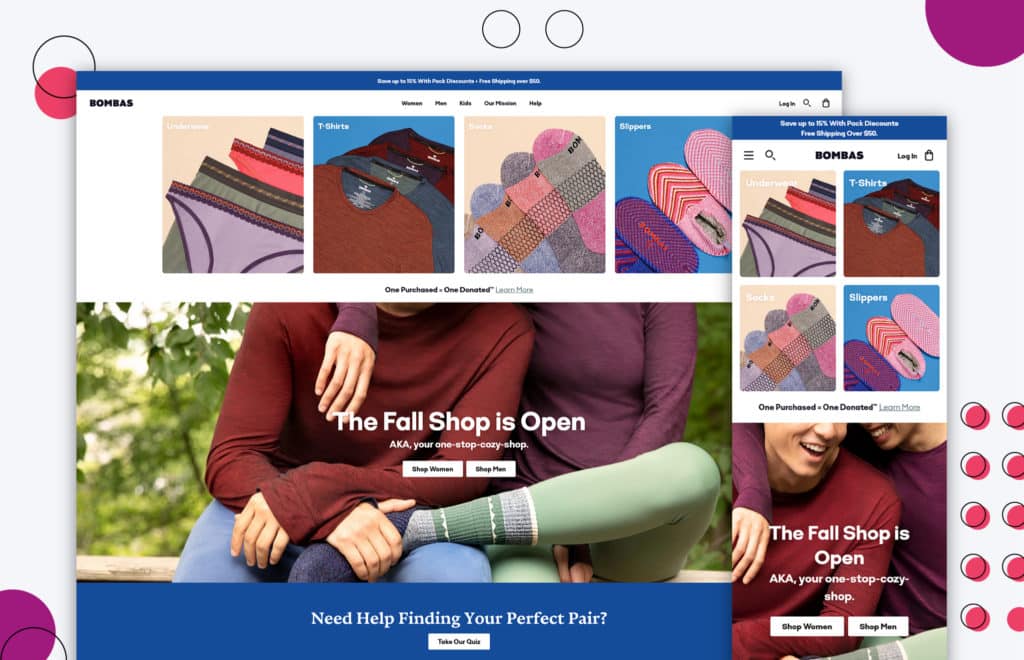
Bombas makes socks, underwear, and t-shirts. They offer up a pair of socks for every pair that is bought from them.
In addition, for every pair you send to a person in need, they will donate an additional pair.
The copy on their website is directly connected to their branding — it’s relatable. It connects with their charitable initiatives and impact.
They don’t use a lot of “we/us/our,” etc. on their website but rather words like “you/your,” etc. to relate to their customers more.
Their idea is simple — “We make socks, underwear, and t-shirts, but you help us donate them.”
They are giving people who are homeless something they really need, which appeals directly to customers and tugs on their heartstrings.
Great copywriting is important! Not only does it help to communicate and engage with your target audience and website visitors but it creates a personal touch to your company.
Copywriting is important to having a digital marketing strategy and creating relevant content marketing plans that speaks your audience’s language all found on your website.
Get Memorable Insights.
Sign up to receive actionable web design advice directly in your inbox monthly.
Get Memorable Insights.
Sign up to receive actionable web design advice directly in your inbox monthly.
Author
Jeff Gapinski is the President of Huemor where he helps plan the long-term strategic growth of the agency. Jeff is passionate about UI/UX, demand generation, and digital strategy.
What Do You Think?
Have feedback? Maybe some questions? Whatever it is, we'd love to hear from you.




No comments found