User Experience
19 minute read
Best Contact Page Design and Practices & 5 Example Pages.
LAST UPDATED:
April 2, 2024


Far too many businesses overlook their contact pages.
However, the truth is that it is one of the most important pages on your website, especially if you’re a B2B business. It will serve as a gateway to new opportunities and potential revenue. That’s why you need to get it right.
The best contact pages tell a bit about the company, answer your questions, and convey the value of a brand.
A good contact page serves as an all-in-one resource for company information such as phone numbers, emails, and addresses which can help capture and generate qualified leads.
If you’re looking for inspiration for your own Contact Us page, we’ve put together a list of some of the best-designed contact page practices as well as some contact form examples you can find online.
Let’s dive right in!
A contact page is more than just a way for people to get in touch with you. It’s an opportunity to make a good first impression, build trust, and set the tone for your relationship with your visitors. That’s why it’s important to take some time to design a contact page that reflects your brand and provides a positive user experience.
There are a few different types of contact us pages, each with its own purpose.
Ecommerce Contact Us Page
While product pages and landing pages get a lot of attention on the ecommerce website, contact pages are often overlooked by ecommerce marketers.
Your ecommerce contact us page is one of the most important pages on your website. It’s the page where customers go when they have questions or problems, and it’s also the page that can potentially turn a prospect into a customer. That’s why it’s so important to make sure that your ecommerce contact us page is up to par.
Here are a few things to keep in mind:
- Make sure that all of your contact information is accurate and up-to-date.
- Include multiple ways for customers to get in touch with you, including phone, email, and live chat.
- Use engaging visuals and clear call-to-actions to guide visitors to the right place.
- Don’t forget to test your contact page regularly to make sure everything is working as it should.
Contact Me Page: Portfolio
A portfolio website is a collection of pages on the web that showcase an individual’s or a business’ work. Your portfolio should be well organized and easy to navigate, and it should include a detailed contact page with your name, email address, and phone number. Prospective clients should be able to easily find your contact information and learn more about your work.
A portfolio website is a valuable tool for any freelancer or small business owner. Investing the time to create a professional-looking website contact page can pay off in terms of new clients and higher revenues.
Contact Us Page: SaaS Companies
When you visit the website of a software company, the first thing you want to know is how to contact the company. After all, if you’re interested in using their software, you’ll likely have questions or need support at some point.
For this reason, it’s important for SaaS companies to have a clear and easy-to-find “contact us” page on their website.
The best contact us pages include a variety of options for getting in touch, such as a phone number, email address, and live chat. This way, no matter what your preference or schedule, you should be able to find a way to get in touch with the company.
The page should provide some basic information about the company’s customer service hours and policies. With this information readily available, you can be sure that you’ll always be able to get the help you need when using a software product.
Design Examples of Contact Pages
Here are some of our favorite examples of contact forms and pages for you to check out:
VRC
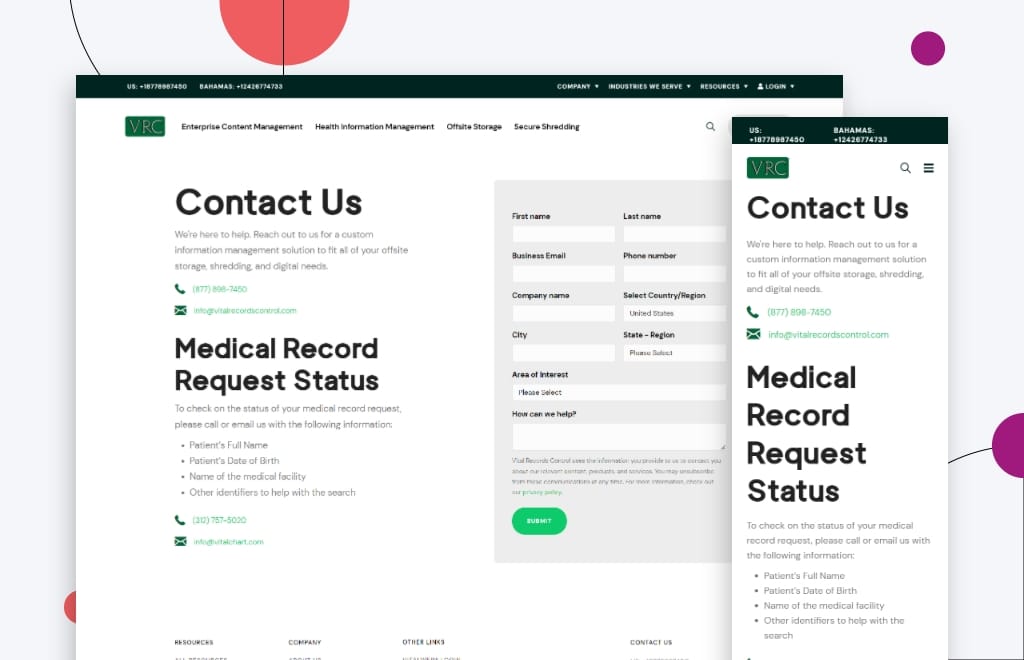
VRC is a record and information management firm that specializes in safeguarding the essential records of other businesses.
What we like about their contact website page is that it’s clean and easy to use. The contact form stands out on the page as a quick way for customers to get their questions answered.
This page also includes a phone number and email address that can be easily found and accessed.
AgAmerica
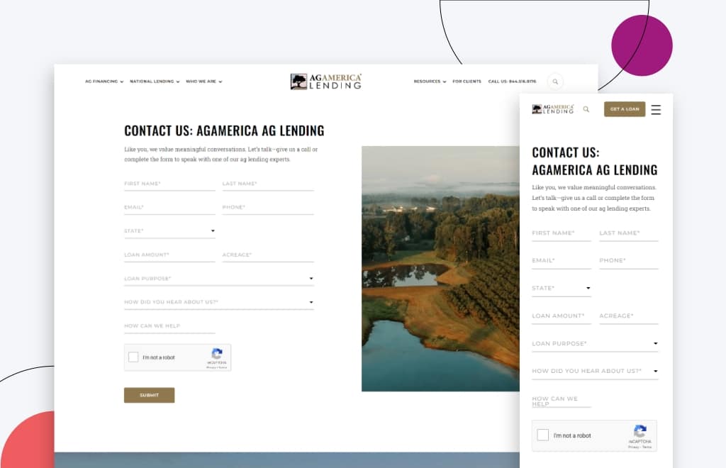
AgAmerica, one of the country’s leading agricultural land lenders, provides a wide range of customizable financing options that help ranchers, farmers, and landowners achieve long-term success.
Their website has a contact page that encourages customers to get in touch with them. Each of their locations is clearly highlighted on a map included on the page.
In addition, their contact form is simple and easy to use.
Huemor
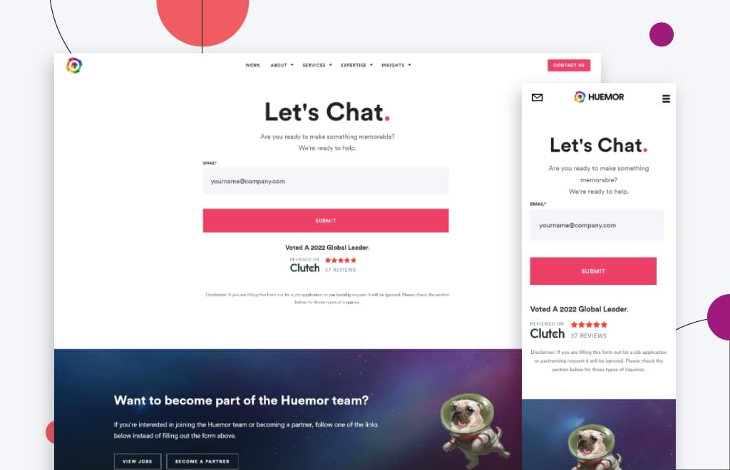
It’s time to be a bit biased and appreciate ourselves a little more.
The Huemor website features a simplistic contact us form that only asks for a couple of pieces of information and makes good use of social proof by displaying reviews from Clutch.
For these reasons, the page also has a section for job inquiries and partnership opportunities in case a site visitor lands on the contact page.
Slack
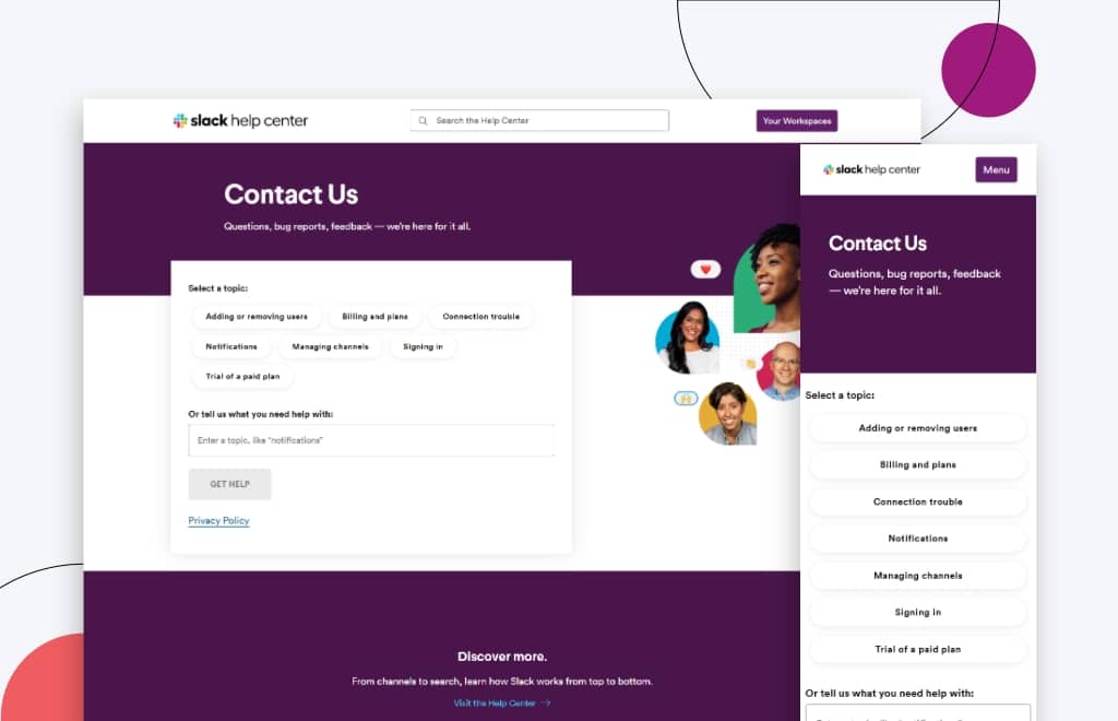
Slack is a platform where the right individuals, information, and technologies are brought together to get the job done.
The company’s contact page encourages customers to start a conversation with them by suggesting possible topics.
They also give the customer the option of suggesting a topic if the ones listed don’t fit their specific issue.
HubSpot
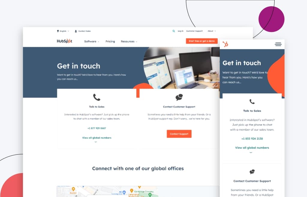
HubSpot platform helps businesses in improving their performance in the areas of marketing, sales, and customer support. It can help your sales team close more deals and boost their productivity. The software provides a range of features, including an email drip campaign tool, a CRM system, and a contact management system.
Their contact page features a live chatbot that helps answer questions or direct customers to solutions. It also displays their sales contact information along with customer service contact information.
In addition, they show off their office locations and provide different phone numbers for each site.
Whether you’re looking to provide customer support or simply want to hear from your audience, a contact form can be an invaluable tool. Plus, setting up a contact form is easy to do and only requires a few simple steps.
First, decide where you want the form to appear on your website. This will typically be on a dedicated “Contact” page, but you can also add a form to other pages such as your home page or About page.
Next, determine what information you want to collect from your visitors. The most basic contact forms will just ask for a name and email address, but you can also request additional information such as phone number, company name, or website URL.
Once you know what fields you want to include, it’s time to create the actual form. There are a number of online tools that can help with this, or you can simply use HTML code.
Finally, don’t forget to add a submit button so that visitors can send their completed form to you.
By taking these steps, you can easily create a form on your contact page that will help you gather valuable information from your website visitors.
Contact Us Page Generator
Creating a contact form from scratch can be a daunting task, especially if you’re not a web developer. That’s where a free contact form generator comes in. With just a few clicks, you can create a customized form that includes all the fields you need, without any of the coding.
If you need to collect leads, feedback, or email list signups through your website, a free contact form builder can help you get the job done quickly and easily.
You’ll just need to drag and drop elements to customize your form, embed it on your site without any coding, and instantly view responses on any device. You can even sync your contacts to popular CRMs, email marketing automation, and other powerful apps.
Because the forms are hosted on the generator’s servers, there’s no need to worry about hosting or security.
Contact Us Page Code
Creating a contact form can be a great way to capture leads and grow your email list, but if you don’t know HTML, it can be a bit of a roadblock. HTML (Hypertext Markup Language) is the standard code used to create most websites and apps, and you’ll need to know at least some basic HTML in order to create a contact form.
Fortunately, there are a number of resources available that can make the process easier.
One of the most popular is Google’s Contact Form Builder. This tool allows you to create a simple contact form without having to write any code.Google’s Contact Form Builder also allows you to integrate Google Maps into your form. This way, visitors can see where your business is located. All you need to do is input your information and choose a submit button. Once you’re done, you can then grab the HTML code and add it to your website.
Another great option is the website builder Wufoo, which offers a similar drag-and-drop interface. With Wufoo, you can also add features like file uploads, CAPTCHA protection, and payment integration.
If you’re looking for something even simpler, there are a number of contact form generators that allow you to create a basic form with just a few clicks.
Once you have your form code, all that’s left to do is add it to your website. With a little bit of effort, you can have a professional-looking contact form up and running in no time.
WordPress is a popular content management system that makes it easy to create and manage a website. Once you have WordPress hosting, you can create a new contact form by following the instructions provided by the plugin.
There are many plugins available that allow you to create contact forms in WordPress. Some of the most popular WordPress forms plugins are Gravity Forms, WPForms, and Contact Form 7. Each plugin has its own strengths and weaknesses, so it is important to choose the one that best suits your needs.
Once you have installed and activated a plugin, you can create a new contact form by following the instructions provided by the plugin. Usually, this involves specifying the fields that you want to include in the form and then embedding the form into a page or post on your website.
Contact Form Examples And Best Practices
When a new visitor has a specific question or concern, the Contact Us page is frequently their first port of call.
It’s where a new and existing customer goes whenever they have a problem and really want to talk to someone at your company.
They’re there to make it easier for visitors to reach you.
A well-designed contact us page can encourage visitors to get in touch with your company, which can lead to increased sales and customer satisfaction.
With this in mind, we compiled a list of practices for your contact page and some tips and tricks for what you should put on your contact page.
Above the Fold
Web design best practices dictate that your site’s most visually appealing elements should be placed above the fold.
The term “above the fold” refers to the area of your site that is visible to visitors as soon as they arrive on a page.
A study by the Nielsen Norman Group found that content placed below the fold was viewed 102% less than those above it.
As such, make sure that your contact form is visible above the fold. This makes it easier for users to find the form and makes them more likely to fill it out.
CTAs
Once site users are on the contact page, DO NOT send them anywhere else.
The only next step they should take is filling out the form.
Calls to Action, or CTAs, are good ways to get potential customers to do something specific but shouldn’t be overused.
As such, don’t distract them with other calls to action.
You should make it clear in your page’s copy that you’re open to receiving calls, emails, or any other typical requests from prospective customers.
Use of Social Proof
The term “social proof” refers to the idea that the actions or opinions of people can be influenced by the testimony of another.
If customers are on the fence about contacting you for an estimate or have another query about your company, they may feel more at ease if they see social proof.
Here are a few ways to incorporate social proof on the best contact forms:
Client Testimonials
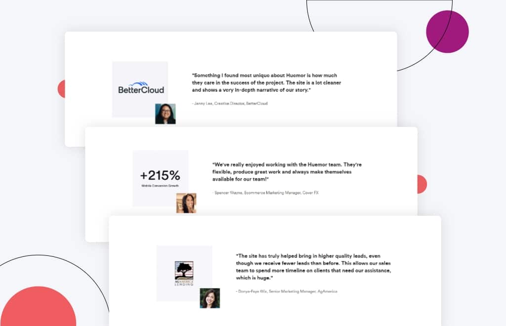
Testimonials can be a great way of removing any final objections a prospective buyer may have.
This social proof can be used to persuade people to complete your contact form.
Real customer testimonials are critical in encouraging prospective clients to provide their personal details.
Highlight Key Statistics
Highlighting key statistics related to their problem is another amazing way to ease any doubt a buyer may have.
Putting numbers on factors like customer success stories or customer service can help develop and maintain confidence.

Data enrichment tools give you a complete view of who is engaging with your brand. This allows us to create forms with less friction that lead to higher conversion rates.
James Utkovic, Creative Director
Highlight Awards
While user testimonies can add value to a brand, business credentials can also increase confidence.
Credentials, such as awards and certifications, can showcase a company’s achievements and qualifications. For example, digital marketing agencies can use their certifications to show that they have the necessary skills and knowledge to execute effective digital marketing campaigns.
These industry awards can be another big confidence booster because they show that you’ve been evaluated and vetted by third-party experts.
Customer Logos
Highlighting key customer logos can be another way to show prospective buyers that you’ve worked with brands just like them.
The key is to make sure that the logos presented represent who you’d like to work with.
Form Design
Consider your contact page as an extension of your company’s brand identity. Get imaginative with your design and copy to give your visitors a sense of what it’s like to work with you.
Since this is usually the first impression customers have of you, the design should be consistent with your brand. As such, stay true to your brand imagery and colors.
When creating a website or doing website redesign, make sure that the best practices for contact form designs are followed. With this perspective, you want your contact page to be consistent with your website design and style.
This means you can’t just put a contact form on an otherwise empty page and be done with it.
In addition, you should also provide a section with resources to help answer questions your potential customer may have.
Protip
If you want to ensure that your contact form is compelling enough to turn visitors into customers, check out our article on example contact forms that convert.
Language
Keep in mind that everybody who contacts you through your website is a prospective customer, and you don’t want to do anything that would discourage them from completing the transaction.
That would mean wasting your potential profit. Because of this, your Contact Us page should be simple and easy to navigate, with no stumbling blocks for your visitors. Make your copy concise and straightforward.
Most importantly, don’t make people hunt for your contact page. Use words that relate and make it easier for your customers to find the page, such as “Contact Us,” “Help,” and “Support.”
Using language that makes sense and is expected helps your customers to find the best place to contact you.
Your customers will be able to find the best way to contact you if you use language that makes sense and is expected.
With your contact page, you can start a conversation with prospective customers and keep in touch with those who already know you.
Because business relationships are built through communication, having a contact page on your website is a necessary first step.
The design of your contact page needs to incorporate the best practices listed above to generate qualified leads.
Make sure the contact form is above the fold so that users are more inclined to complete it. Your CTAs need to be engaging but not overused to avoid confusing visitors.
To encourage prospective customers to provide their info, you can use social proof like testimonials, statistics, awards, and custom logos.
Lastly, consider the design and language used on your contact page.
We’ve also provided a few contact us page examples for your inspiration.
With these in mind, you can generate qualified leads and foster lasting customer relationships in no time!
Here are some best practices and further info on contact page examples, web development and website design in general. If you have further questions, don’t hesitate to reach out.
Contact Page Design FAQ
Questions about how to optimize your contact page? We try to answer them here.
How do I make a nice contact page?
To create a truly effective contact page, make sure to include the following elements:
- Be easy to find. Include your contact information in prominent places on your website, and make it easy for visitors to fill out your form.
- Explain why someone should contact you. What can your business do for them? How can you solve their problems? Be clear and concise in your explanation.
- Include a short form. The shorter the form, the more likely people are to fill it out.
- Have a call to action. Tell visitors what you want them to do, whether it’s buy a product, sign up for a newsletter, or simply learn more about your company.
- Link to social media accounts. This marketing strategy helps customers connect with you on the platform of their choice.
- Redirect to a thank you page after submission. This helps build goodwill and lets customers know that their message has been received. By taking an extra step, you can ensure that your lead generation efforts are as successful as possible.
- Promote helpful content and free resources from your knowledge base. Inbound marketing is all about providing helpful information that leads people to your site. Include links to blog posts, downloadables, and other helpful resources so that visitors can get more value from your site.
With all this in mind, let’s take a look at some examples of well-designed contact us pages:
- Dollar Shave Club’s page is simple and straightforward, with clear instructions on how to get in touch with customer service.
- Deux Huit Huit’s page features a sleek design and customer testimonials, making it clear that the company cares about its customer service.
- Real People Casting’s page includes a helpful FAQ section, ensuring that customers can find the answers they need quickly and easily.
- Choice Screenings’ contact us page is designed to be quick and easy to use, with a minimal amount of information required from the customer.
- The Middle Finger Project takes a more lighthearted approach to customer service, with a fun and irreverent design.
- Urban Influences’ contact page features a clean and modern design, making it easy for customers to find the information they need.
All of these businesses have one thing in common: they understand the importance of customer service and have taken steps to ensure that their contact us pages reflect that commitment.
What should a contact page look like?
A contact page is an important part of any website. It provides a way for visitors to get in touch with the site owner or administrator, and it can also be used to direct customer inquiries to the appropriate department or employee.
For example, a content marketer might use a contact page to collect leads for a new e-book, or a customer service representative might use it to resolve customer complaints.
When designing a contact page, there are a few key elements to keep in mind.
First, be sure to include a double contact option like an email address and a contact form. This will give visitors two easy ways to get in touch.
Second, consider including form fields for additional contact information, such as a business’s office address, phone number, or specific employee/department contact information. This will help to ensure that visitors can always reach the right person.
And third, keep your contact page simple and easy to navigate. Too much information can be overwhelming, so stick to the basics.
Whether you have a Shopify store, a WooCommerce website, or are on a different eCommerce platform, these tips apply equally. By following these guidelines, you can create a perfect contact page that is both user-friendly and effective.
What makes a good contact form?
A contact form is an essential part of any business website. It allows content managers to easily collect user feedback and enables users to get in touch with the site owner with any questions or concerns they may have.
When creating a contact form, the first thing to keep in mind is that less is more. You don’t want to include unnecessary fields that will just require extra work for the user. The goal is to make it as easy as possible for people visiting your webpage to get in touch with you. Further, to avoid spammers and bots from spamming your contact forms, you can implement techniques like form validation.
That said, you should still provide multiple ways for users to contact you. You can include your email address, phone number, and social media buttons leading to your profiles. This way, if someone has a question that they need answered immediately, they can reach out through the channel that works best for them.
Another important element of a good contact form is an FAQ section or link to resources. This will help users who are trying to figure out how to use your product or service. By including this on your contact form, you can save yourself time by avoiding repeat questions.
Don’t forget to optimize your form confirmation page. This is the page that users are taken to after they submit the form. Include a thank-you message and clear instructions on what will happen next. You may also want to include an offer or discount on this page to encourage conversions.
Social media advertising and paid search can also be used to drive traffic to your form confirmation page. By including a call-to-action in your social media ads, you can direct users to this page and increase the chances that they will take the desired action.
By following these tips, you can create a contact form that will help you connect with your audience and grow your business.
What do you put in a contact page portfolio?
When you’re putting together a portfolio, one of the most important pages is the contact page. This is the page where potential employers or clients will go to get in touch with you, so it’s important to make sure that all of the necessary information is included.
At a minimum, your contact page should include your name, email address, and phone number. You may also want to include social media links to your profiles or website. If you have a specific focus or specialty, you may also want to include a brief description of your skills and experience.
By including all of this information on your contact page, you can make it easy for employers or clients to get in touch with you and learn more about your work.
If you’re looking for a tool to help you build a contact page portfolio, there are a few different options available.
TypeForm and Wyfoo are both great choices for creating cool contact forms and collecting customer contact info.
Hubspot CRM and Zapier offer more comprehensive solutions for managing customer inquiries and tracking conversions.
IFTT can be used to automate certain tasks related to your contact page portfolio (such as sending automatic follow-up emails).
When it comes to customer experiences, the right tool can make all the difference. So, whichever tool you choose, make sure that it meets your specific needs and that it’s easy for potential customers to use.
Which is better, WooCommerce or Shopify?
When comparing WooCommerce vs Shopify, there is no clear winner. Each platform has pros and cons, and it comes down to what matters most to you and what you are trying to do with your store. Whether you have a B2B eCommerce website or a beauty brand, you’ll need to dig in deep to understand what these platforms offer. Our article contrasting WooCommerce and Shopify goes into detail on the pros and cons of each eCommerce platform.
Can you redesign my website, including the checkout page?
Yes, website redesign is one of our primary specialties. No matter which eCommerce site you’re on, we can redesign your entire site, including the about us page, checkout page, product pages, category pages, and blog.
Further Reading On Website Design and Development.
Looking for web development and design inspiration? These articles should help.
- How Much Does It Cost to Build a Website?
- A Step-by-Step Website Redesign Project Plan
- How to Build a Web Design System
- Our Approach to WordPress Web Design
- Choosing the Right Product Metrics Using UX Research Process
- Our Top Retail Website Examples
- Understanding Web Design vs Web Development
- Our Top Beauty Website Examples
- Our Shopify Speed Guide Checklist
- Guide to Optimizing Shopify Image sizes
- Our Service Page Layout Examples
- Best SaaS Websites of 2022
- Our Approach to HubSpot Website Design
- New Website SEO Foundations
- Our Approach to Startup Website Design and Development
- WordPress Performance Optimization Best Practices
- 100 Ecommerce Website Design Tips
- How to Use Dynamic Website Content
- All About SaaS Website Design
- How We Approach Drupal Website Design and Development
Get Memorable Insights.
Sign up to receive actionable web design advice directly in your inbox monthly.
Get Memorable Insights.
Sign up to receive actionable web design advice directly in your inbox monthly.
Author
Jeff Gapinski is the President of Huemor where he helps plan the long-term strategic growth of the agency. Jeff is passionate about UI/UX, demand generation, and digital strategy.
What Do You Think?
Have feedback? Maybe some questions? Whatever it is, we'd love to hear from you.


No comments found