Design
20 minute read
38 Of The Best Shopify Stores & Why We Love Them.
LAST UPDATED:
November 13, 2023

A beautiful and functional Shopify website is critical to the success of your ecommerce business.
We have compiled our list of the 38 best Shopify websites anyone seeking an ecommerce website redesign should review. These successful Shopify stores span multiple categories, industries, and products. What they have in common is exceptional design, user experience, brand voice, and story.
For ecommerce stores to climb to the top of the market and be successful, they must be visually pleasing and functionally creative, as well as top-tier in product quality and customer service. Let’s be honest, that’s a pretty tall order to fill for Shopify store owners. For Instance, If you want to buy Wheels and Tires at E-commerce store yo can : Get the Best Deals, Prices, Packages, and Discounts on Wheels & Tires from major Wheels Brands at Elite Wheel Group.
However, despite the obvious challenges, a lot of ecommerce stores built on Shopify have been able to bag fame and fortune both. Let’s have a look at some amazing Shopify stores for inspiration.
1. Negative Underwear

Negative Underwear is defying lingerie trends and working hard towards helping women feel comfortable in their own skin without having to rely on “frills or fluff.” The Shopify theme is neat and minimalist. It has a well-integrated Instagram feed as well as a cheat sheet to help users determine where they should start in looking at their various products.
2. Triangl
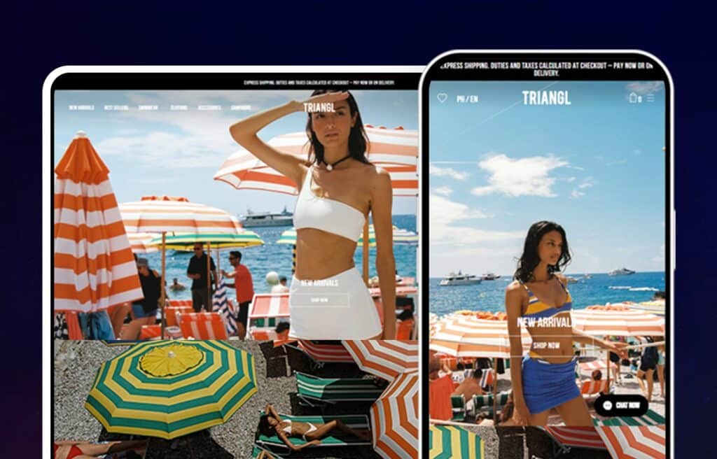
Triangl is a swimwear line launched in December of 2012. The homepage of this ecommerce store features a slideshow of full-screen pictures of their simple but pretty and sporty swimwear for women. The aesthetic of the product itself is reflected in the photography and color palette of the website. The layout isn’t flashy, with the navigational buttons being tucked away until clicked on, and just enough spacing between the beautiful product pictures.
3. Tommy John
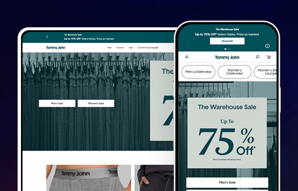
A high-quality picture of a couple of live models wearing their comfortable and simply-designed underwear will greet you as the header of this well-paneled Shopify ecommerce website which has a plain white background. The cool tones of the colors and the well-spaced product images are easy on the eyes. One of the tabs on the homepage includes an online quiz to help customers find exactly what they are looking for as Tommy John curates a selection based upon answers from the quiz.
4. Retrofete
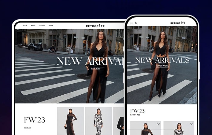
The first thing that stands out on Retrofete’s homepage is the high-quality photography of models in their amazing luxury clothing. Combined with the high-end editorial look, visitors know what to expect. While it changes with the needs of the brand, the current hero links to new arrivals. This is followed by a small offering of the new looks with high-quality images, price, and a hover size bar that links to the product. Below that more great images link to additional collections.
An incredible full-width high-quality video with models in all different styles and places walking, highlighting the Walk the Walk collection. It is very well done, meeting the expectations of a clothing brand at their level. Below that, more outstanding imagery with featured items meant for layering and being purchased together.
Retrofete’s homepage is rounded out by more top-level imagery driving people to different collections and finally a newsletter signup. Get in-depth with Retrofete in our case study.
5. Sarah Flint
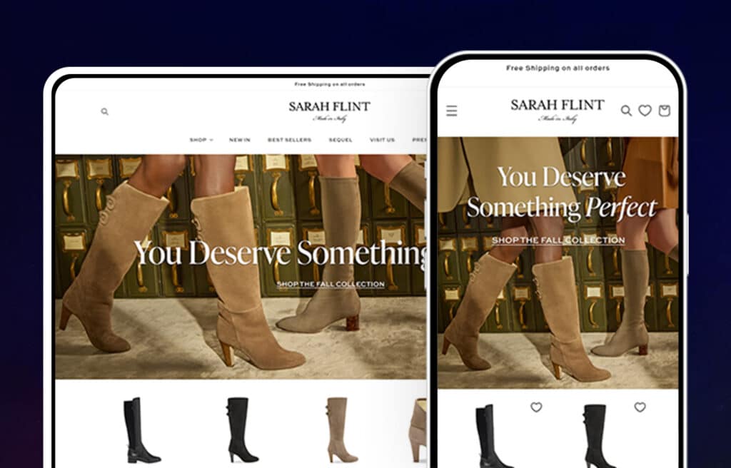
Sarah Flint’s successful Shopify store features a chatbot that helps customers find the right pair of shoes. The site’s earthy color palette complements the shoes’ styles. The homepage features a section entitled “Style without Sacrifice” that explains the process of how the shoes are created to ensure quality as well as a quote from the founder. Overall, this relaxed and calming web design works well with a shoe company.
6. Tanya Taylor
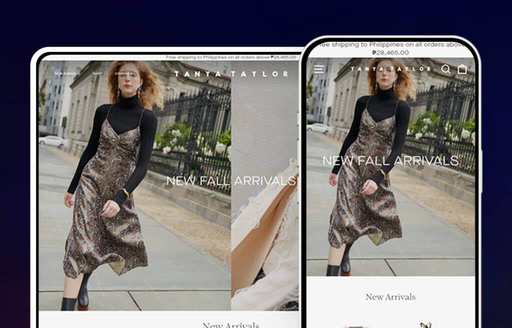
Tanya Taylor’s website is a well-designed Shopify store selling trendy clothes. The homepage includes a section for top picks of the owner’s that pop off the page to their customers. Right below the logo is the navigation bar which displays all of the product category options available.
Each product page includes several images that showcases the product visually as well as an accompanying product description as well as a description of how the item fits. Read more in our case study!
7. UgMonk
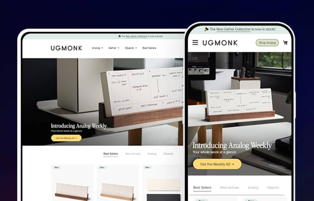
The neutral color palette and simple designs of the product pulls together UgMonk’s website. The The neutral color palette and simple designs of the product pulls together UgMonk’s website. The homepage includes a few examples of their products, each one has a standard stock image until hovered over when the images changes to a simple stylized photo of the product.
Their product pages include multiple images of each product as well as various packaging/bundling offers making it user friendly to any potential customers.Thanks to their well-designed website, UgMonk is able to effectively showcase their products and start building memorable experiences with potential customers from the very first visit.
8. Bombas
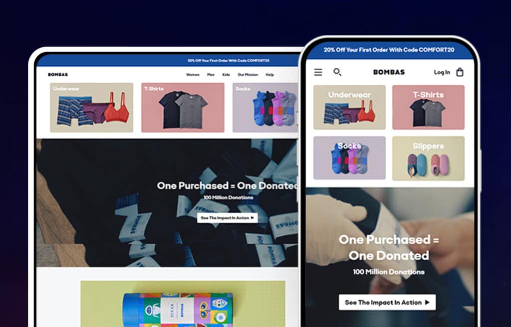
Once on the Bombas homepage you will see three subsections of women, men, and kids to break up their product categories. Their Shopify store is colorful to emphasize the bright colors of their products year round. A key element of their website development that is different from most of the other’s on this list and worth mentioning is that they have included a place easily found at the bottom of their homepage where customers can sign up for their newsletter.
Their product pages have several images of the product as well as well written descriptions. They also include information about their company’s one purchase equals one donated mission. This social proof can be a powerful online marketing tool, and it helps in increasing sales and building customer loyalty.
9. Taylor Stitch
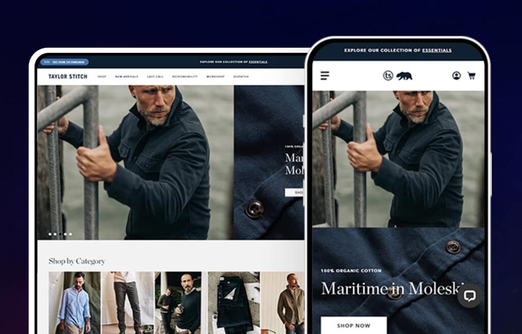
Launched in 2010, with its revenue tripling every year, Taylor Stitch sells custom and tailored Launched in 2010, with its revenue tripling every year, Taylor Stitch sells custom and tailored sophisticated clothing at affordable prices. Their sleek-looking Shopify store displays their products photographed in related settings, along with short descriptions. The product categorization is fantastic and the call-to-action buttons are used creatively. It is considered one of the top Shopify success stories for ecommerce online business.
10. The Ghostly Store
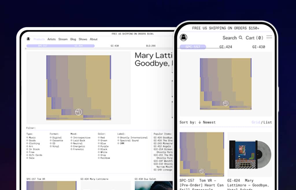
Their ghost logo is printed on every one of their products. The site’s target audiences are music lovers and collectors, who will appreciate the font and simple design of the website. You can filter the products using type, mood, color, label, and format. They sell stuff such as vinyl records, water bottles, tees, art prints, wallets, coffee beans, etc.
11. Leif
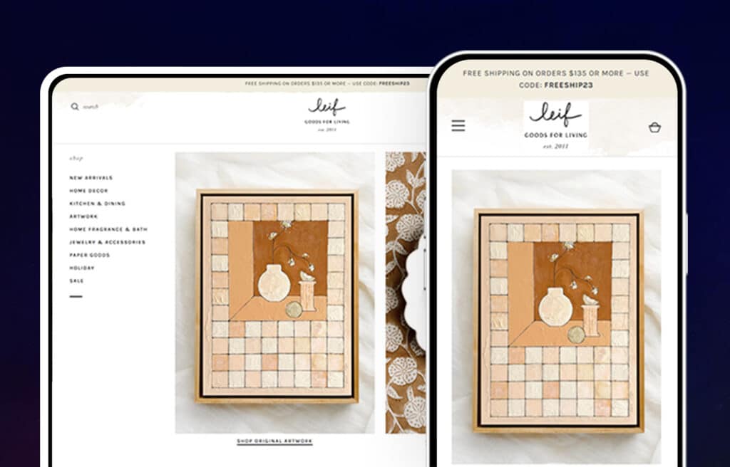
Bring out the homemaker in you with this soft pastel themed Shopify website with easy-to-browse home goods and décor, textiles, jewelry, paper products, apothecary gifts, and more offered by the brand. The preppy but neat layout has efficiently placed buttons and smooth scrolling, with well-organized drop-down menus. All of this contributes to a shopping experience that is both enjoyable and effective.
12. Gitman
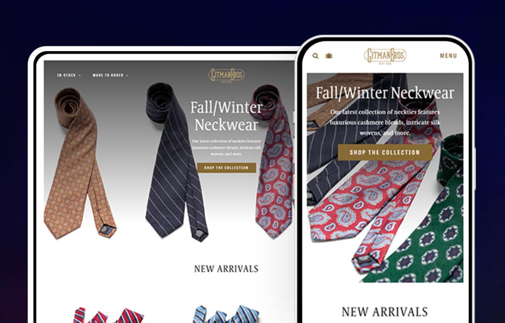
Among the inspiring collection of the best Shopify store examples, the website of this clothing brand draws your attention directly to their products by featuring a clear image of the fabrics used in producing their products. Below the featured image are images of their products. Their use of call-to-action buttons is busting sales while their header, menu and info panel on their landing pages reflect a minimalistic and clean design.
13. Leather Head Sports
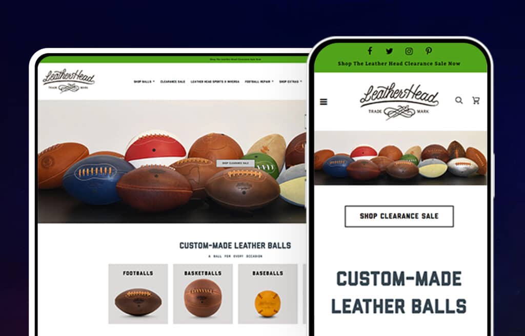
Upon entering the website, you’ll be welcomed by a pop-up offering a discount percentage off of your next order. The classic vibes of the website mesh well with the aesthetic of the custom-made vintage-looking sports goods such as footballs, baseballs, basketballs, etc.
Unmistakable beauty and quality are visible in both the website and the product. Customer experiences are paramount to the Leather Head Sports team. They’re dedicated to ensuring that each and every customer has a positive interaction with their site and its products.
14. Gymshark
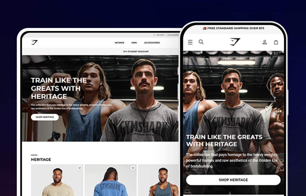
One of the most recognized brands in fitness apparel and accessories, the Gymshark Shopify store displays large and colorful pictures of live models wearing the products with smart call-to-action buttons. Their store is organized in an easy way for customers to find exactly what they are looking for!
15. Chubbies Shorts
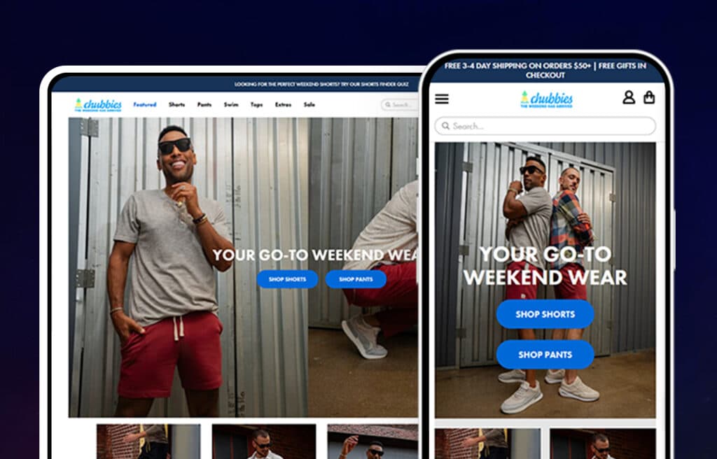
Ecommerce marketers can learn a lot from the Chubbies shorts website. The sporty-casual feel of their offered product is visible in the playful design of the website. Geometrically placed and paneled artistic product pictures serve as links to the catalogs of those products. The menu isn’t cluttered and the drop down isn’t huge and lengthy either. The product pictures displayed generously all feature their products being worn by models as well as flat-lay images of their products.
16. Allbirds
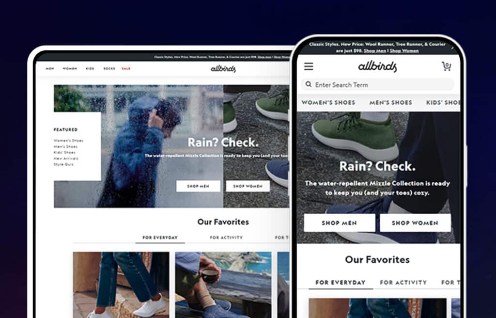
Their website is a blend of neutral colors and fun fonts that illustrates the simple and clean design. The multimedia site is unique and so is the product itself: simple and comfortable footwear made with all natural materials. The website is bright, youthful, and its overall visual appeal makes you want to buy stuff.
17. Chaos
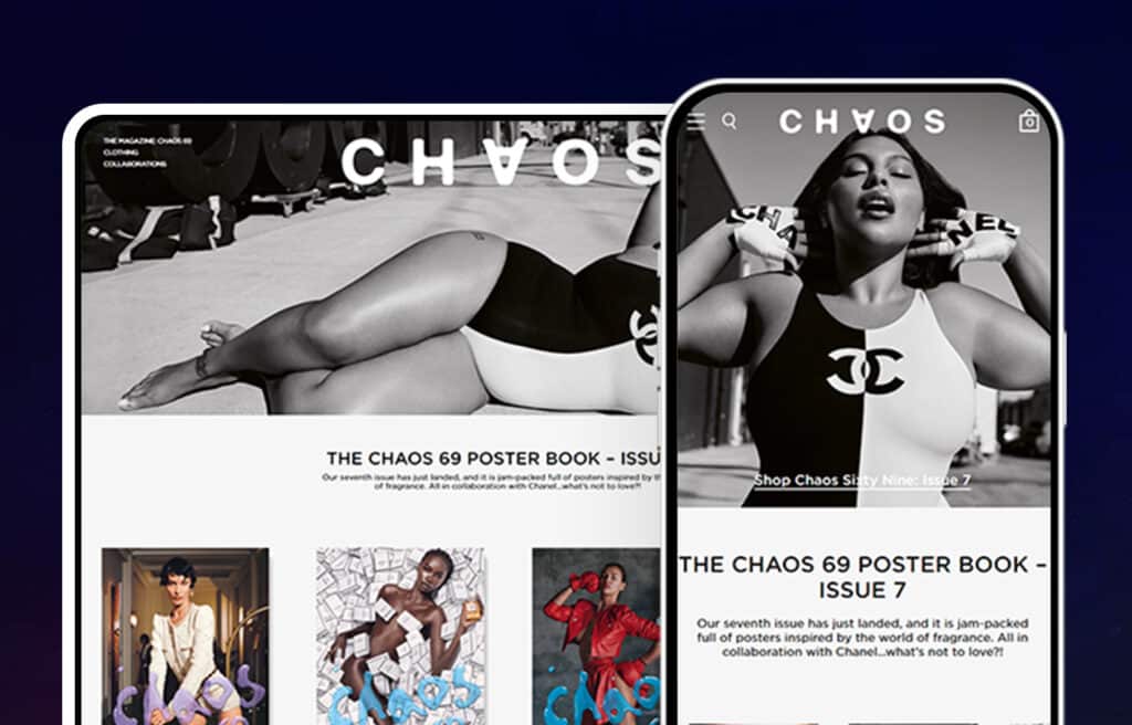
Are you looking to start selling your products online? If so, you’ll need a well-designed website that reflects your brand and helps you stand out from the competition. That’s exactly what Chaos’s Shopify website does.
Chaos is a London-based luxury brand catering to all your modern-day fashion accessorizing needs with a Shopify website which reflects the fun yet classy design of the brand. Punk-y and colorful product pictures are shown in a neat layout you can scroll easily, with sparingly used call-to-action buttons, the product menu in the top center, and the brand info and services links at the bottom of the site.
Chaos has done an excellent job of integrating social media into their website. With a well integrated Instagram feed towards the bottom of their homepage allows customers to “Shop the Look” of Instagram posts highlighting Chaos’ products to sell.
18. MVMT Watches
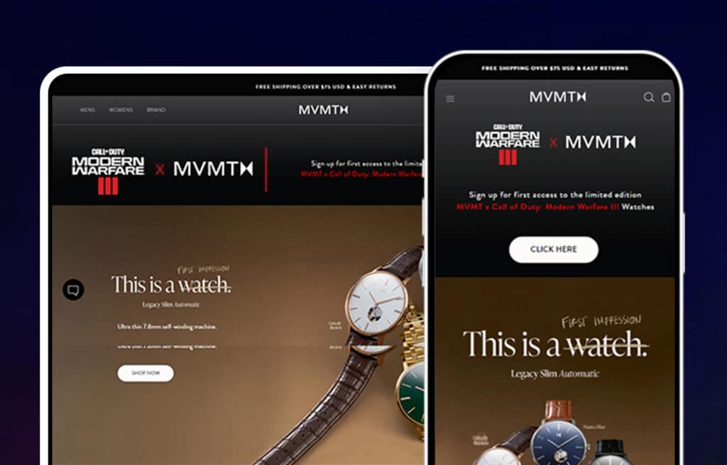
Smart, modern, and sleek are the words which come to mind after taking a look at MVMT’s products as well as their website. The images used to showcase their product effectively convey the modern aesthetic of their brand. A simple, classy, capitalized font—combined with a black and white layout, clear call-to-action buttons, and a detailed menu—makes for a very easy-to-navigate website.
The integrated Instagram shop is an effective marketing tactic. The non-cluttered product pictures are all aesthetically pleasing as well.
19. Sunday Somewhere
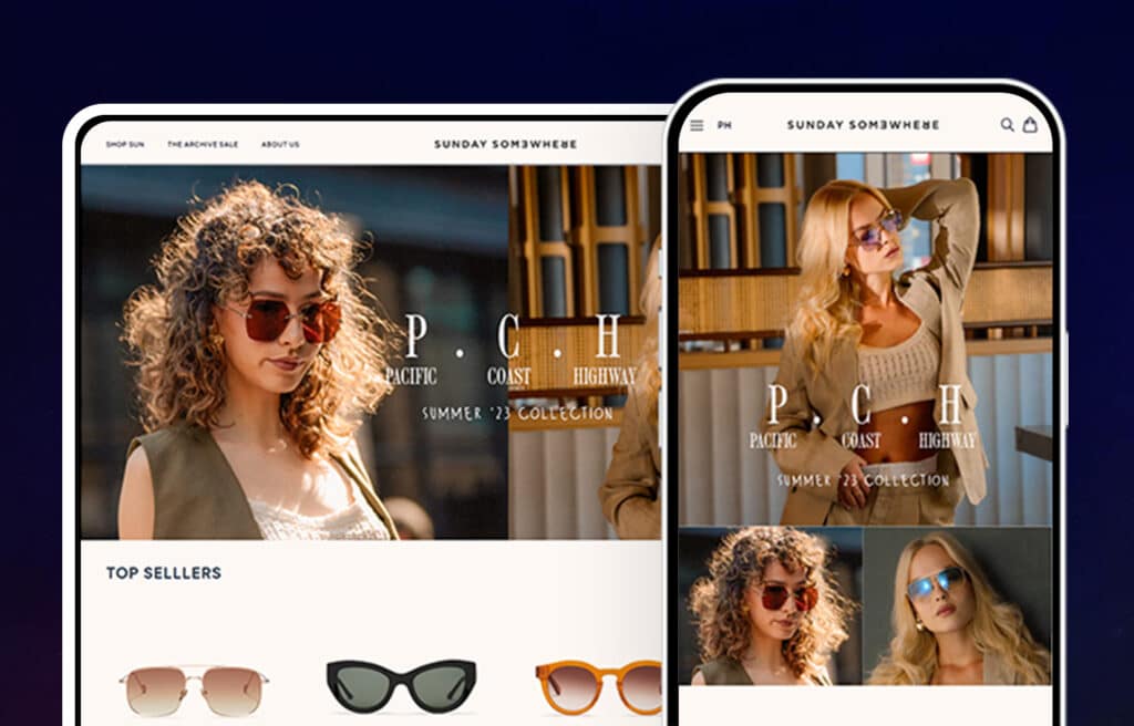
Among the roundup of the top Shopify stores in 2022, this premium eyewear brand was launched on Shopify in 2010 by Dave Allison. The website offers a discount code to welcome guests to their website when they sign up using email. The pictures of live models wearing the product in adventurous settings at different locations add an artistic touch to the otherwise simplistic layout. Its high-quality smooth design makes it very easy to navigate.
20. Tens
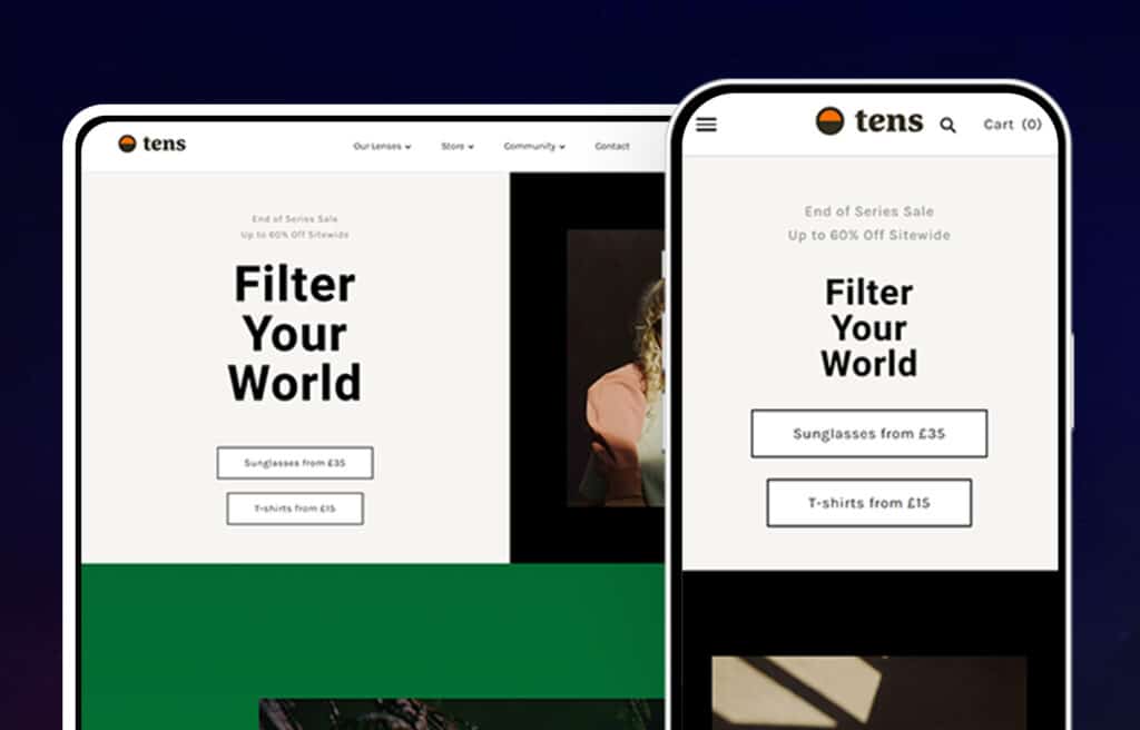
When you first arrive onto Tens’ homepage you are welcomed with a choice between finding one of their store locations or shopping online. There is also a clickable link that takes you to a short 47 second video. The mustard, gray, and white theme is also unique but looks great.
An integrated Instagram panel and professional reviews panel are also featured on the home page along with big, attractive photography. The menu isn’t drop-down and the typography is creative but neat.
21. Zoe Chicco
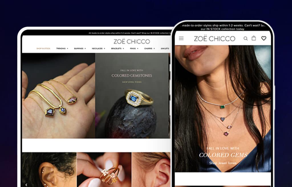
The sleek and minimalistic design and neutral color palette with hints of gold of the product helps to make sure that the product stands out the most on the website. The menu is located right underneath the Zoe Chicco logo making it easy for customers to find.
For each category of jewelry sold there is an image to display the product as just the product and then on a model making it easier for the customer to visualize themselves wearing each piece of jewelry. Read more in our case study!
Shopify Pro Tip
“A lot of times with ecommerce websites, you get either a functional site OR an aesthetically pleasing site. A really stellar Shopify website will have a smooth and intuitive shopping journey while still providing a visually dynamic user experience.”
–Adi, UI/UX Designer, Huemor
22. Gleamin
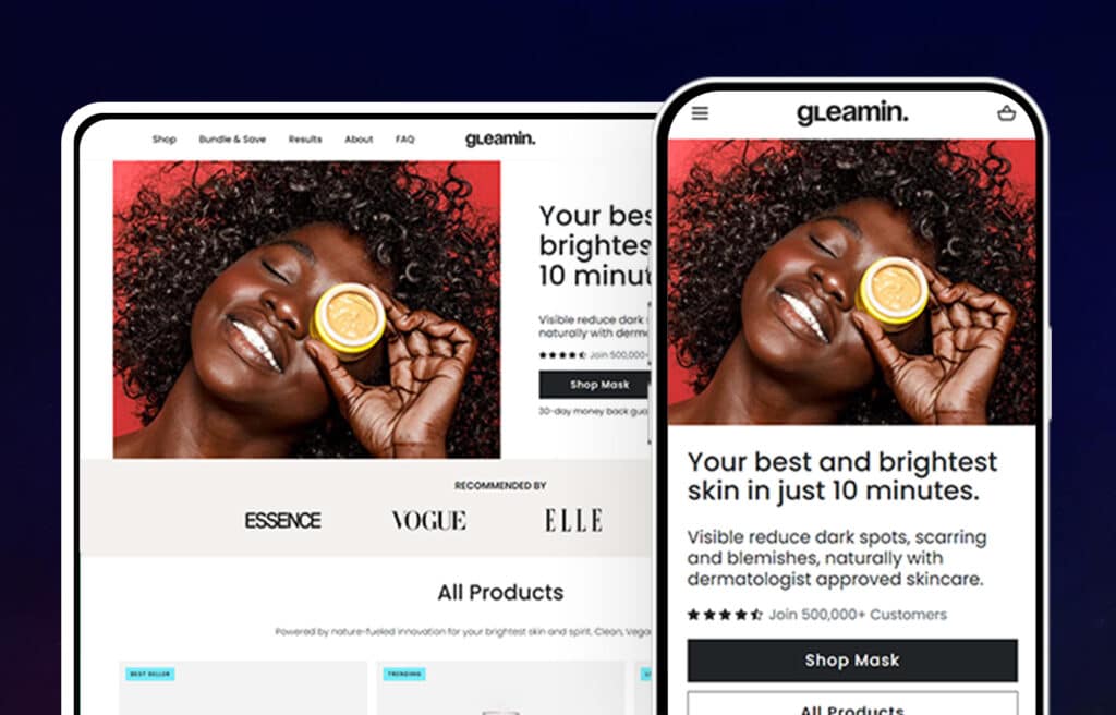
Shopify sites are at their best when they use simple and elegant design, and Gleamin is a great example of this. The use of black and white images, text, and basic color palette of Gleamin’s website makes their product’s yellow pop out and grab the attention of their customers. The homepage displays the product, information about the company, along with photos and reviews from actual happy customers. For more information check out our case study!
23. Briogeo
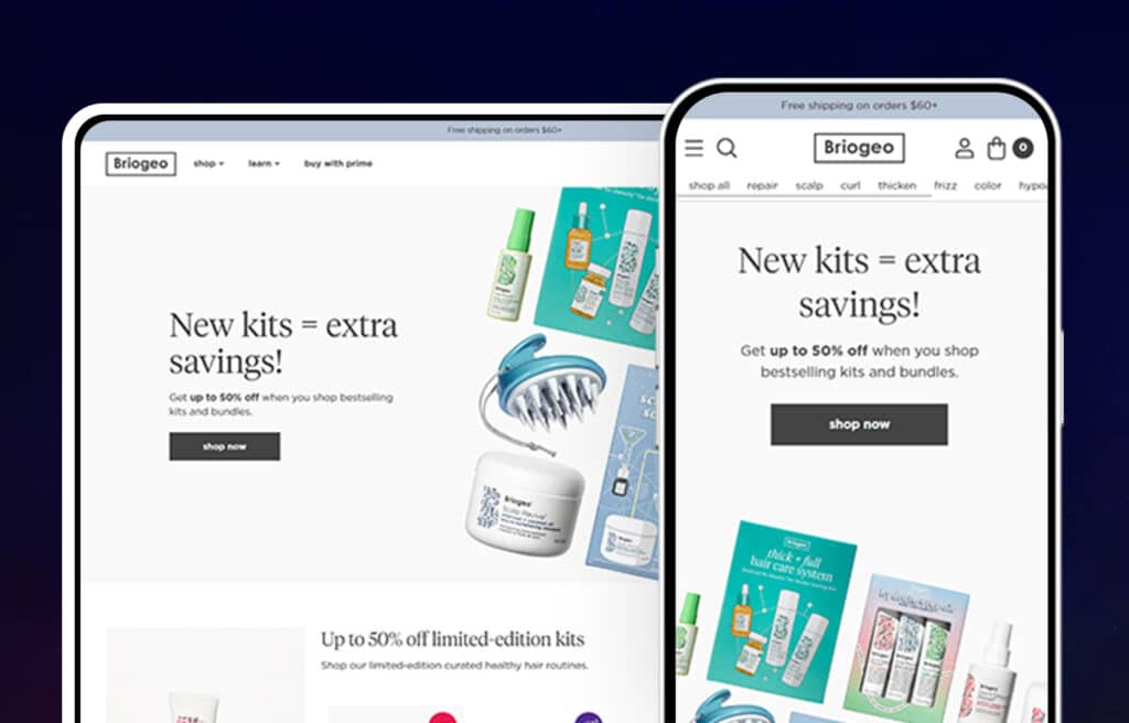
Briogeo’s website emphasizes the ingredients that go into their products along with the ingredients they leave out. There is a scrolling “headline” type of banner right underneath the main header image that describes all of the ingredients not found in Briogeo’s products.
They also emphasize that they can customize their product to the individuals’ needs. A hair type quiz drives this point home, and it also helps customers find what they need. They send a discount code along with their product recommendations to potential customers’ email addresses once they complete the quiz. Briogeo’s focus on customization and quality ingredients sets them apart from beauty brands like Luxy Hair, Kylie Jenner and Kim Kardashian’s make-up products, and Beauty Bakerie cruelty-free cosmetics.
Best selling products are showcased on the homepage with each of the product pages showing several images of what each product does as well as images of the product itself. Check out our case study for more information!
24. Alodia
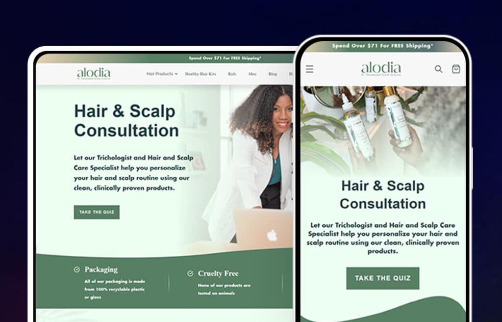
Homepage design is critical for beauty and cosmetics websites because it needs to both inform and engage visitors. Alodia achieves this by prominently featuring their best selling products and linking directly to product pages. This allows visitors to easily learn about and purchase the products they are interested in.
The page also links to Alodia’s Instagram page which is shown through an integrated Instagram feed. The website also does a great job of gaining credibility by telling their story of their founder who is a doctor. For more, check out our case study!
25. Flex
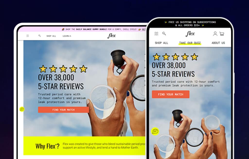
This Shopify offers a tampon alternative which could last up to 12 hours and reduces cramps in 70% of the users. The website has the health pros listed along with the complete product description, pictures, and frequently asked questions to help the users understand the product. The best touch is the quiz the website has to help the customers decide if Flex is for them.
26. Beardbrand
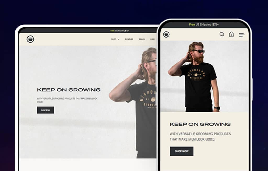
This brand is hoping to change the society’s vision of beards and beardsmen that reflects in the website. Beardband takes advantage of that popularity by bringing in high-quality products like shampoo, oils, etc. for beardsmen using organic products. A somewhat masculine touch is given to the website through its pretty monochromatic color palette.
The site’s design reflects this purpose, and the homepage content reinforces this message. Breadbrand’s website reflects the story laid out on the homepage of their company’s purpose.
In addition to their products, Beardbrand also offers an affiliate program, which allows others to sell their products and earn commission on every sale. This provides an opportunity for anyone interested in beard care to get involved with the company and help promote their message.
27. Carbon Beauty
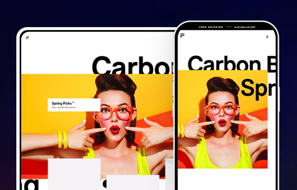
The most beautiful and pleasing thing about this website is how creative its scrolling system is. The header picture stays still as the bold and black brand name and catchphrase shift from right to left till as you adjust your screen size. The bold colors in the header pops and seems to jump out of the screen!
The product display and its carefully spaced product picture features a background slightly darker than the white background of the homepage. Information about their brands and ingredients are also available on the website.
28. Cover FX
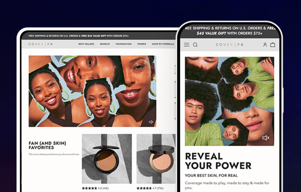
A soft pink, gray, and white theme with bold font adorn the ecommerce homepage design of this cosmetic brand. Customer interaction is encouraged through an online quiz that helps customers find their shade of product. Smart marketing strategy is visible on the homepage as they’ve displayed their new products and bestsellers.
At the bottom of the page, they highlight that they are free of certain allergens and all of the ingredients that their product is free from including. Read more about their website in our case study!
29. Caldera Lab
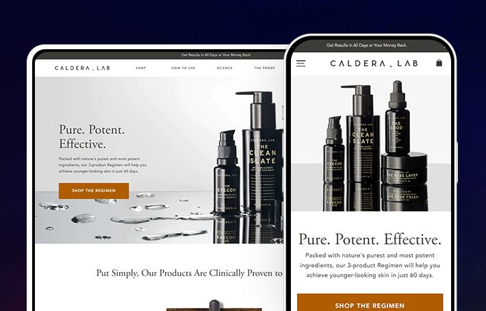
The Caldera Lab’s website starts with a banner above the menu to feature promotions and announcements. The aesthetic is clean and pure, going right into the fact that they can help you look younger in just 60 days and promoting their 3-product regimen. From there, the content continues to be about results and proof for their best-selling products, including links to clinical trials and more great information.
Below the hero and product highlight, there is a scrolling banner with icons that tell the visitor what they want to know. That their products are not tested on animals and are pure. Which leads into reviews and even images of customers with the product, providing essential proof that leads to choosing to buy. More products are featured with the option to add to cart with or without a membership. Below that is a very impactful section with the science, the mission, and ingredients that shows that 100% of participants in their clinical trial for their 3-product regimen experienced improved skin!
From there you can engage with a scrolling Instagram feed then sign up for their newsletter. Make sure to check out their Shopify case study for more information!
30. Luseta Beauty
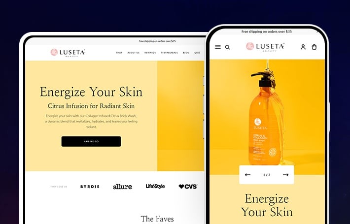
Luseta Beauty wants you to be radiant and their products can make it happen! When you land on their homepage the yellow and orange tones and light feel make you energized and happy. There is a subtle announcement bar at the top, followed by a streamlined menu. The hero image shows the product in and out of the bottle and draws you in with engaging copy. An added feature, visitors are able to click through multiple heroes with intuitive arrow buttons. The call-to-action button features a pun, “HAIR WE GO” which adds to its cheery vibe.
Then you see all of the highly recognized magazines their products are loved by including Allure, Byrdie, Life & Style, CVS, Forbed, and InStyle! This leads into their top products with great images and easy ability to add to cart and even subscribe to some products. When you create an account, you can also “heart” your favorites to check out later or easily order again.
The cheeriness rages on with a coral pink banner with a sunshine that states, “make clean haircare fun.” Below that you can easily choose product categories based on the needs of your hair and scalp. Get further educated with exclusive blogs and adorable icons that let you know Luseta Beauty products are silicone-free, cruelty-free, and more. Keep up with their Instagram with a cool collage style feed and sign up for their newsletter. For more about the website, check out our case study.
31. Mission Stone and Title
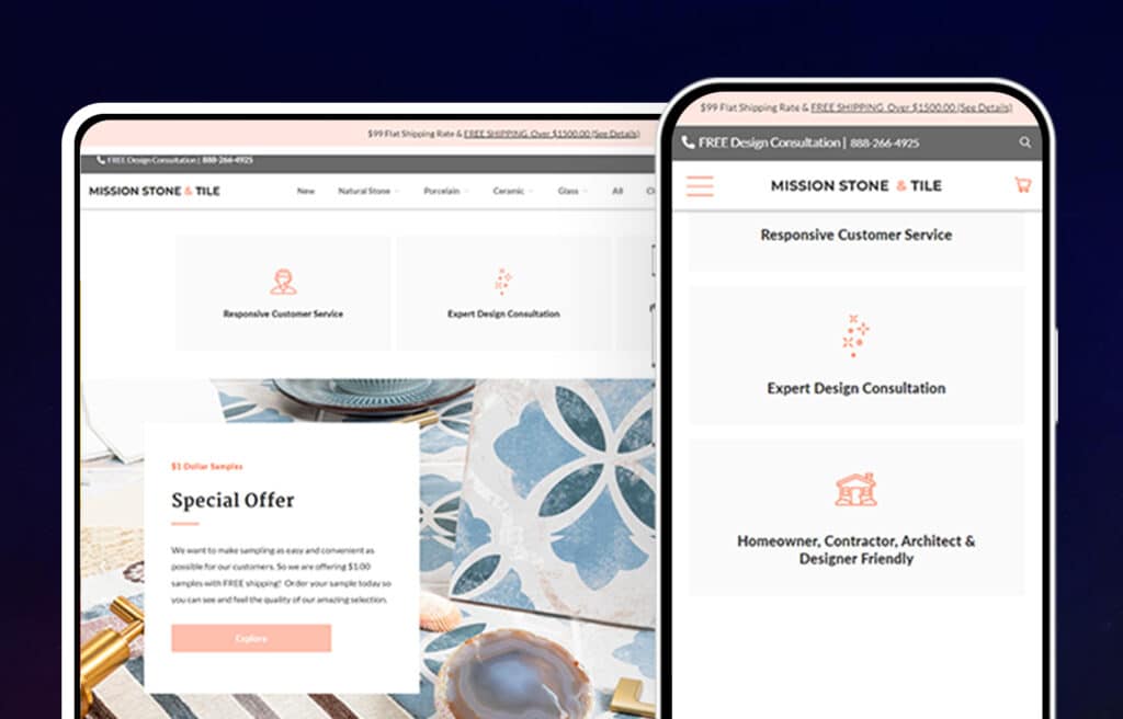
The geometric shapes of the images and graphics used on their website matches closely with their product. The scrolling header at the top of the homepage scrolls through various offers, product images, and useful information for their customers to view.
Their navigation is well throughout as it breaks down the products into subcategories based upon the materials used. This makes finding exactly what a customer is looking for easier to find!
Product pages are broken down into smaller chunks of information making it easier for the customer to understand the product. For more information check out our case study!
32. Goldilocks
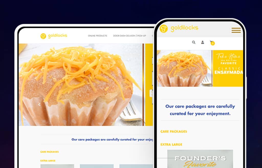
This website is a little different from the other websites highlighted in this article in the sense that their products are different from the others on this list. However, Goldilocks uses similar design techniques as the Chocolate Alchemy and they do a great job with their use of color to make their products pop out of the page.
With a scrolling header, something that is seen with many top Shopify stores, they are able to scroll through and display multiple images. Their navigation makes it easy to find the exact product you are looking for or browse through their selection.
Overall, Goldilocks has used web design standard techniques that are both effective and unique.
33. Brosa
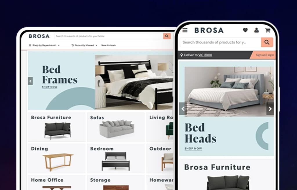
The website’s minimalist but pretty design matches the modern furniture of this modest design studio. They are making beautifully designed and crafted furniture available at affordable prices! The images show what the products look like together to encourage the customer to imagine what their pieces might look like in their home. It is very well-categorized and extremely easy to navigate.
34. Boll and Branch
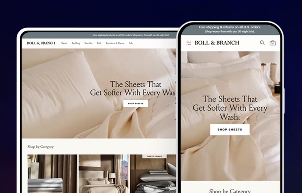
The website has a white theme with hints of blues and light grays. The tucked away menu left of the brand name is organized in sections and subsections that make finding what the customer is looking for easier. The well-organized pictures on the website have brief descriptions as well. Well-lit creative photographs and simple but classy typography are also featured on the site.
35. Miracle Brand
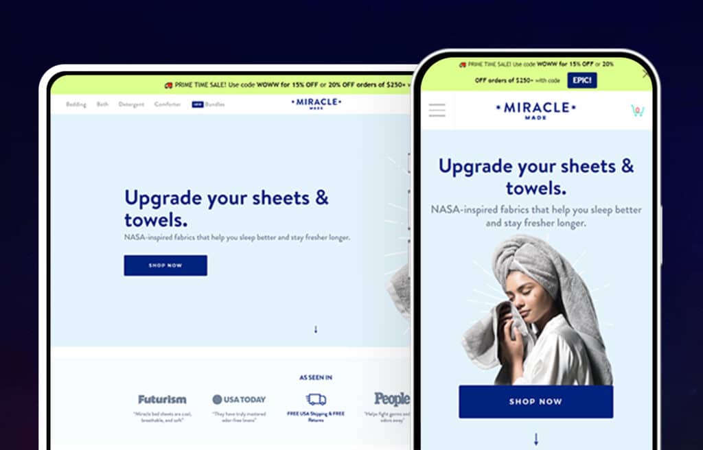
A draw-over spin wheel greets you when you open the website and offers a discount upon signing up. They also emphasize their free shipping with an animated arrow pointing to their free shipping offer.
Further creative marketing is done through call-to-action buttons placed along pictures down the efficient scrolling system. The menu isn’t confusing and the product pictures are accompanied by proper product descriptions. The color scheme used gives off a relaxed, calm, and inviting tone to the website.
Shopify Pro Tip
“Striking the balance between consistent, compelling brand elements and strong focus on products and conversion driven sections is a recipe for ecommerce website success.”
-Adi, UI/UX Designer, Huemor
36. Ratio Coffee
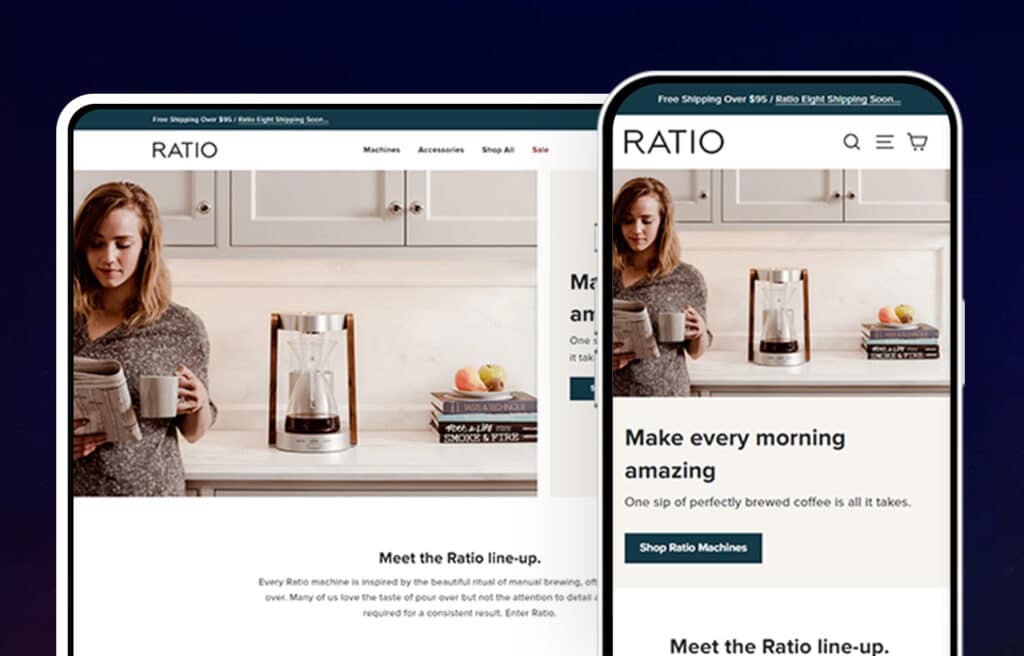
The neutral color palette and smooth navigation of this Shopify Store show the same simplicity and elegance associated with their products. They term their product as a “new approach to coffee.” Its great quality and dynamic design are what sets this brand apart.
User-friendly and easy to navigate layouts, call to action buttons, navigational elements, eye-catching logos, and aesthetically pleasing photos—all combined with amazing quality products and marketing strategies which make ecommerce so awesome and these factors are what makes these above mentioned top Shopify stores so loved and successful (monetarily and otherwise).
37. Hurom
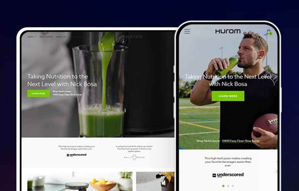
The logo, background, and font are simplistic, but the website is brought to life by the vibrant and visually pleasing photography, which is displayed on the header as well as with every mentioned panel. The pops of light blue here and there also gives a youthful life to the website.
The menu is underneath the header, as well at the bottom of the website. Multimedia such as videos and photos provide information related to all the products. There is even a quiz for customer engagement to find out what juice recipes are just right for them!
38. Studio Neat
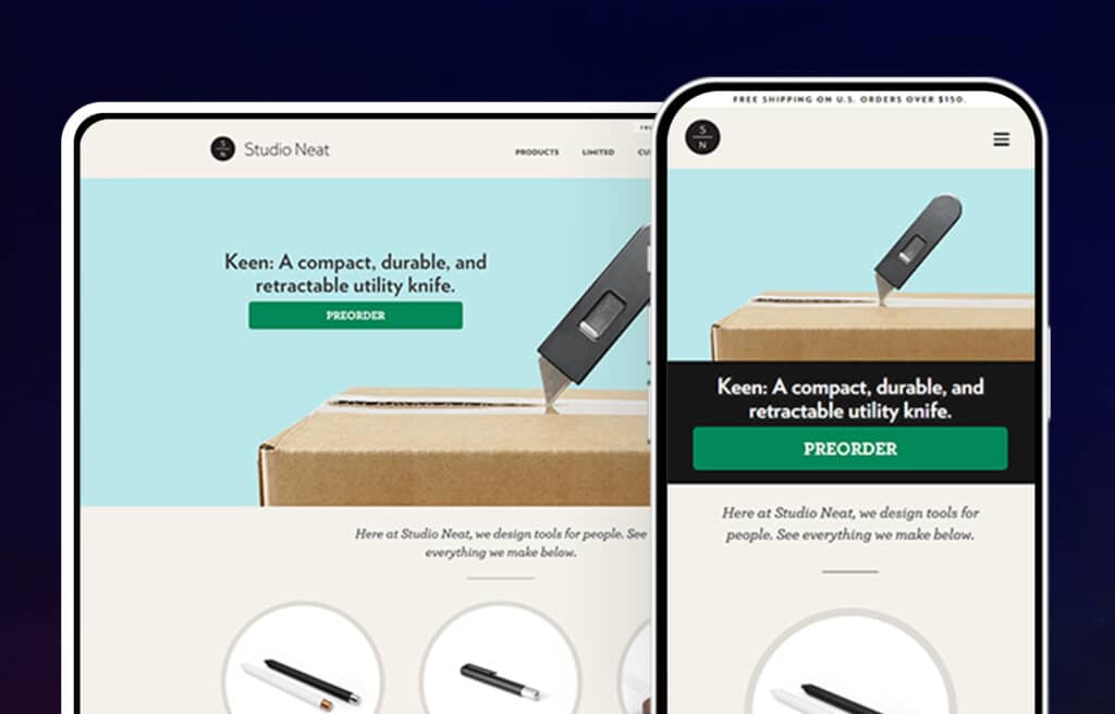
The pastel beige layout and the simplistic logo do justice to the product name as the entire website looks exactly as you would expect a neat and artistic studio to look like. A bunch of products ranging from tablet stands to simple maple syrup kits is featured on the home page as a two-columned and two rowed display of round-bordered images complete with names and brief descriptions.
Having an Amazing Shopify Website
Shopify is a platform that enables businesses of all sizes to create an online store. Shopify Plus is the enterprise version of Shopify and offers additional features and support. It takes keen design, user experience, copy, and direction to truly be a best-in-class online store.
There are thousands of Shopify stores out there, and we’ve done our best to narrow down to those we feel are truly the best across multiple categories. That being said, we’re sure there are plenty of other gems out there!
Know, or own a store you feel belongs on this list? Comment below and let us know.
Want your Shopify website to be amazing? Talk to us about our website redesign services.
A List of Shopify Stores Design Examples
Thinking about growing your business on Shopify? Here are some additional resources and information. If you have further questions don’t hesitate to reach out.
Questions about the Top 100 Shopify Stores?
Here we cover common questions about Shopify stores every beginner will ask.
What is the number 1 Shopify store?
There is no definitive answer to this question, as there are a multitude of factors that can contribute to a Shopify store’s success.
However, some best practices that are often cited include having a well-designed website, offering a unique selection of products, and providing an excellent customer experience.
Additionally, it is important to market your store effectively and to always be on the lookout for ways to improve your business. By following these best practices, you give yourself the best chance of creating a successful Shopify store.
What websites can I use Shopify with?
There are a number of websites that you can use Shopify with. You can use Shopify with any website, though it is most commonly used for ecommerce stores where customers place orders and pay for those orders via a shopping cart.
Whether you’re starting a brand new site, or are looking to migrate an existing site from a platform such as WordPress, Shopify can be a great option for your online store. Shopify provides a comprehensive set of tools for managing your inventory, processing orders, and tracking shipping information.
As a result, it is an ideal platform for businesses of all sizes. Whether you are just starting out or you have an established website, Shopify can help you take your business to the next level.
What Shopify stores make the most money?
Successful Shopify stores share some common characteristics. They typically have a clean, user-friendly design, and they offer a well-curated selection of products. They also tend to be very focused on their niche, offering customers a unique shopping experience.
While there are many successful Shopify stores like Kylie Cosmetics, Nick Mayer Art, Press London, Skinny Teatox, Pure Cycles, Rebecca Minckoff, Meow Meow Tweet, Jane Motorcycles, or Fresh Heritages, the ones that make the most money tend to have a few things in common.
First, they have a large number of visitors. This can be due to strong marketing efforts or word-of-mouth recommendations.
Second, they have high conversion rates, meaning that a large percentage of their visitors become paying customers.
Finally, they have average order values that are significantly higher than the norm. By selling high-priced items or offering add-ons and upsells, these successful stores are able to generate a lot of revenue per customer.
Is Shopify a good place to build a website?
Shopify is a website builder that allows businesses to create an online store. The platform offers a wide range of features, including website templates, product listing, payment processing, and shipping integration.
Shopify also provides a management system for businesses to track their website’s performance. In addition, Shopify provides 24/7 customer support and a 14-day free trial.
Overall, Shopify is an excellent platform for businesses that want to build a website quickly and efficiently.
Further Reading On Shopify Website Design and Development
Looking for ecommerce web development and design inspiration? These articles should help.
- Get Our Micro Shopify speed audit
- Top Shopify Speed Optimization Tips
- Reasons Brands Move From Magento to Shopify Plus
- Our Shopify Speed Guide Checklist
- Design Essentials for Ecommerce Conversion
- Our Shopify Web Design Process
- Designing the Best Product Pages
- How to Design an Effective “About Us” Page
- Website Footer Design Best Practices
- Ecommerce Web Design Tips You Need to Boost Sales
- Proven Ways to Boost Your Mobile Ecommerce Conversion Rate
- 24 Great Website Examples for 2022
- Tips to Make Your Ecommerce Business Successful
- Our Top Picks for The Best Shopify Stores
- Understanding Category Page Design
- Checkout Page Design Optimization Tips
Get Memorable Insights.
Sign up to receive actionable web design advice directly in your inbox monthly.
Get Memorable Insights.
Sign up to receive actionable web design advice directly in your inbox monthly.
Author
Jeff Gapinski is the President of Huemor where he helps plan the long-term strategic growth of the agency. Jeff is passionate about UI/UX, demand generation, and digital strategy.
What Do You Think?
Have feedback? Maybe some questions? Whatever it is, we'd love to hear from you.




No comments found