Design
11 minute read
9 Best Cosmetic Websites and How They Exude Beauty.
LAST UPDATED:
May 7, 2024

Many cosmetics companies want to create an online presence that will WOW their customers, but they may not know how to make their website look glamorous and professional.
The purpose of a cosmetic website is usually to sell beauty and skincare products, and a website is seen as an investment and marketing tool by many in the industry.
Creating a beautiful website is essential for any cosmetics company that wants to succeed online.
Luckily, with creativity and the right tools, creating a stunning site to impress potential customers is easy.
This blog post will discuss the best ways to create a cosmetic website that looks amazing and will help attract new customers.
We’ll also provide examples of beautiful cosmetic websites for inspiration.
Redesigning your cosmetic website can be daunting if you don’t know where to start. We’ve compiled these best practices for creating or improving your existing website.
Use Engaging Copywriting That Speaks
Cosmetic websites always aim to sell products or educate potential customers about current products.
And one of the best ways to reach out and engage with potential customers is by using copywriting best practices.
Your website copy should be attention-grabbing and explain why someone should buy your product.
It needs to make people want to learn more about your product and why it’s worth their hard-earned money.
To do this, focus on the benefits of using your product.
Why will it make their life better? How will it solve a problem they’re currently facing?
If you can answer these questions effectively, you’re well on your way to writing compelling website copy.
It’s also essential to ensure your copy is on-brand and speaks directly to your target audience.
For example, if you’re selling natural cosmetic products, highlight that your products are made with ingredients that are good for the earth.
On the other hand, if you’re targeting a younger demographic, make your copy more casual and fun.
Kick It Up a Notch With Great Imagery

People are visual creatures, so it’s crucial to have high-quality images on your website.
In addition to lifestyle photos that show people using your product in real life, include plenty of close-ups of your products so potential customers can see all the details.
Don’t forget about using before-and-after photos to boost user experience and give people a sense of what they can expect from using your product.
Including videos on your site is also beneficial in demonstrating the results of using your product.
People love seeing examples of what they can expect and videos are a great way to show off your products.
Just be sure that all of your visuals are clear, professional, and consistent with the overall branding of your site.
Another important consideration for website visuals is alternative text (or “alt text”).
This text appears instead of an image if the image doesn’t load for some reason.
Alt text is vital to augment the SEO for a new website and ADA compliance.
Navigation Is Key
When someone lands on your website, they should be able to easily find what they’re looking for — whether that’s information about a specific product or customer service contact information.
After all, if people can’t easily find what they’re looking for, they’re likely to give up and move on to another site.
This is especially true for cosmetic websites, where people are looking for specific products or information.
A well-designed website navigation system is essential to ensure visitors can quickly and easily find what they need.
Navigation menus should be short and sweet without being overwhelming or cluttered.
Each menu item should lead to a relevant page on the website so that visitors can get where they need to go with minimal effort.
Give Your Potential Customers a Reason To Buy
Before making a purchase, most people want to know what others think about a product or service.
This is especially true regarding cosmetics, as people are often reluctant to try new products.
One way to build trust with potential customers is to use social proof.
Customer testimonials and reviews show people that they can trust your website to provide quality products.
Another way to keep people returning to your site is to offer value.
This could be in the form of free samples, discounts, or valuable content. You can encourage people to return to your site by offering something they want. You can even use a flyer maker and make use of great-looking templates for offsite marketing.
Lastly, valuable content can also help to spread the word about your website.
Creating informative articles or product videos can inspire people to share your site with others.
But do you need a cosmetic website redesign? If you’re doing well, the answer is likely no.
However, it’s challenging to understand what “well” means, so here are some telltale signs that you need a website redesign.
Your Conversion Rate Is Declining
If you’re noticing that fewer people are completing the actions you want them to take on your website — such as subscribing to your email list or making a purchase — it could be due to a lack of trust.
Users are becoming savvier, and they can spot a dated or untrustworthy website from a mile away. If your website looks like you made it in the 1990s, it’s time for an update and website redesign!
Your Bounce Rate Is Too High
Your website’s bounce rate is the percentage of visitors who leave after viewing only one page.
A high bounce rate is usually a product of poor product page design, unhelpful or irrelevant content, or a user-unfriendly interface.
If you’re seeing an increase in your bounce rate, it’s time to take a closer look at your website and see what could be improved.
Sales Have Been Decreasing Quarter Over Quarter
If you’re selling products or services through your website, declining sales could be another sign that it’s time for a redesign.
A dated design can make users question whether your products are also out-of-date.
At the same time, an unoptimized purchase flow can frustrate potential customers and cause them to abandon their carts altogether.
If you want people to buy from you, you need to give them a smooth and seamless purchase experience, starting with having a well-designed website.
Your Website Is More Than 2 Years Old
Even if your website isn’t showing any of the other signs listed above, it’s still important to keep its design fresh — especially if your competitors’ websites are starting to look newer and more modern than yours.
A good rule of thumb is to give your website a complete overhaul every two years, so it doesn’t start to look outdated next to the competition.
We’ve done our research, and the average website lifespan is around two years.
A website redesign can be an excellent opportunity to focus on improving the user experience.
By streamlining the design, eliminating unnecessary elements, and making the site easier to navigate, businesses can encourage customers to stick around — and maybe even make a purchase.
In short, a redesigned website that puts the user first is likely more successful than one that doesn’t.
Do you need some inspiration for your cosmetic website redesign project plan?
Here are some of the best websites that showcase what’s possible. We’ll discuss what makes these websites successful and show you all the best practices we’ve discussed earlier.
Aavrani
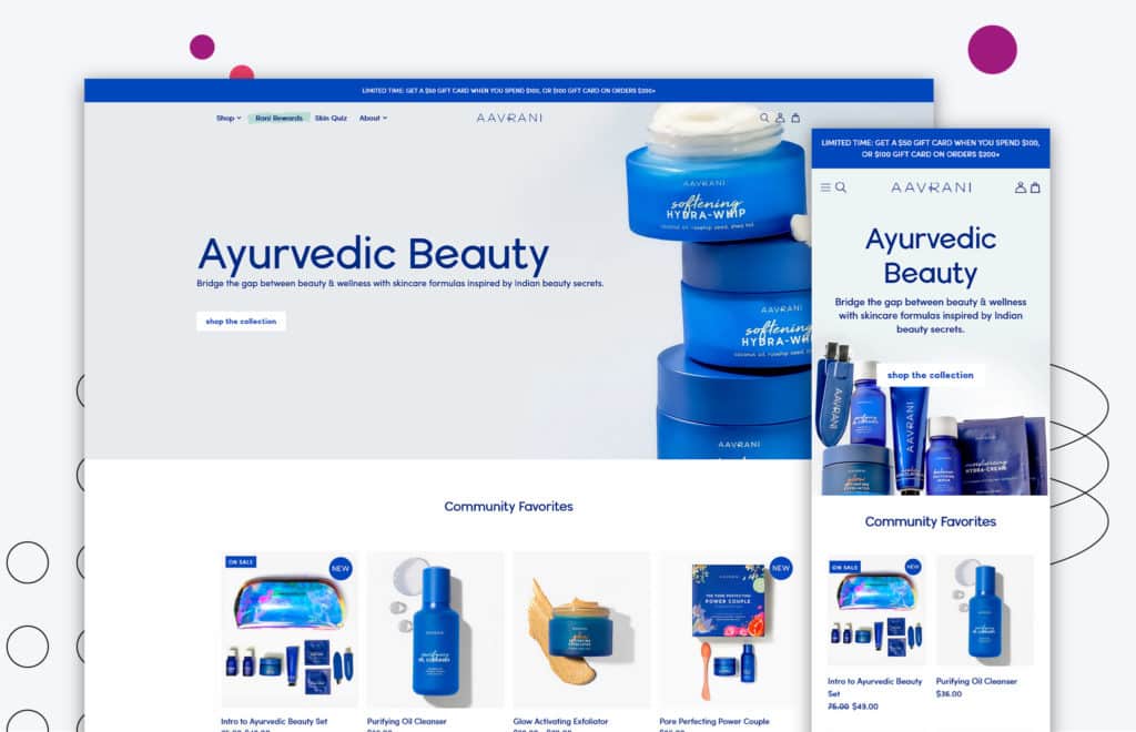
First on this list is Aavrani.
The blue hues they’ve chosen are both refreshing and relaxing, making it a pleasure to browse their selection.
But the real selling point of the site is the copy. It’s well-written and speaks directly to their target audience, highlighting their experience using Aavrani products. This engages potential customers and makes them want to learn more.
The site is also good at using testimonials and press mentions, which helps establish trust and credibility.
To top it all off, they offer a gift card with purchase — an incentive to convince anyone on the fence to buy from Aavrani.
Navigation is simple and easy, so you can quickly find what you’re looking for without hassle.
Caldera Lab
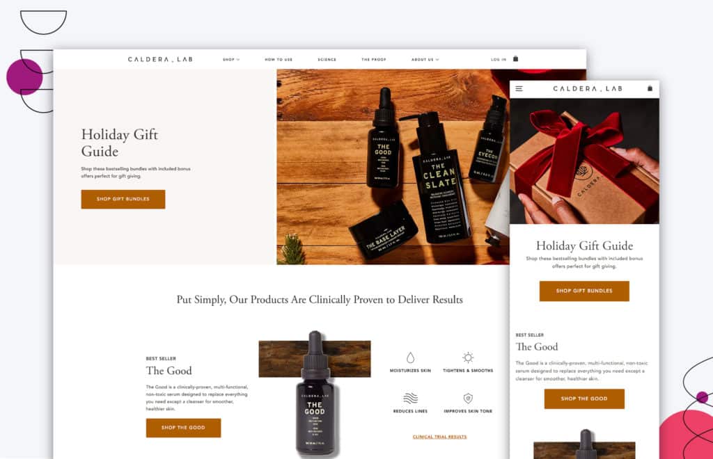
In terms of the overall design, Caldera Lab’s cosmetic website is clean and minimalistic. Their product pages make use of strong imagery — both in terms of graphics and photographs — to speak louder than words.
Additionally, their navigation makes it easy to move from page to page. This is important because it ensures that visitors can quickly find the information they need without becoming frustrated.
Not only does this help to improve the overall user experience, but it also increases the likelihood that visitors will make a purchase.
Caldera Lab also offers a holiday gift guide to help visitors browse their best products. This is an excellent way to encourage spending during a busy shopping period.
Finally, their customer review section also gives their visitors the confidence they need to buy from their website. All these factors combine to create a website that is attractive and functional.
ColourPop
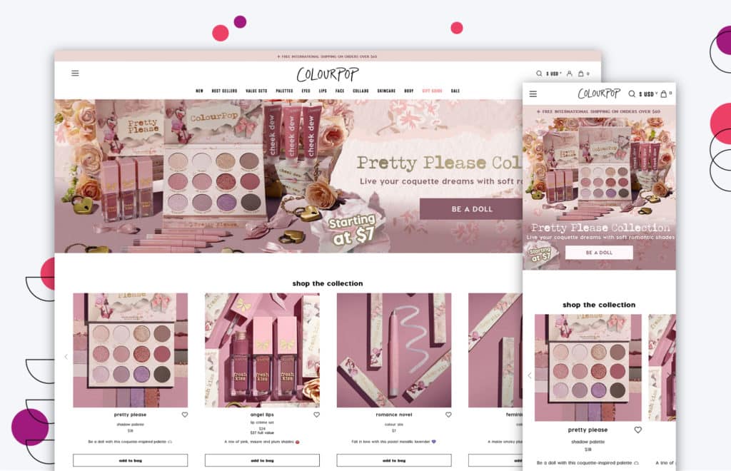
If you’re looking for a fun and colorful cosmetic website, you’ll want to check out ColourPop. Their web pages are full of the colors that matches their latest new products, which makes them stand out from the rest.
Their product images are not only visually appealing, but they also showcase how you can use their products. This is helpful when customers are trying to figure out which product is right for them.
Plus, their on-brand colors, fonts, and images make the whole experience cohesive and fun.
CoverGirl
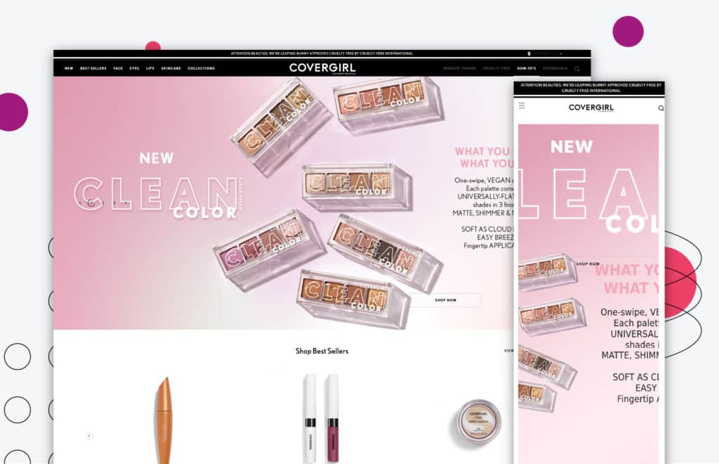
There are many things to love about CoverGirl’s website, but the hero header is one of the standouts. Not only does it showcase the products visually appealingly, but it also includes copy that is both informative and creative.
It’s clear that CoverGirl put a lot of thought into how it wanted to present its products, which paid off.
We also love CoverGirl’s reviews section. Here, customers can read about the actual results of CoverGirl’s products. This is incredibly helpful in deciding which product is right for you.
Finally, the guides and how-to’s are an excellent resource for anyone new to using makeup or just wanting to learn more about the products they’re using. CoverGirl has thought of everything regarding its website, and it shows.
Dior
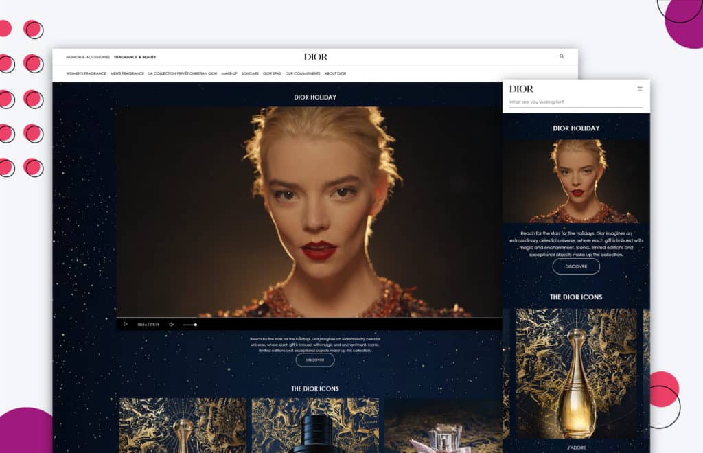
Dior is a luxury brand known for its high-quality products and opulent feel. Their website is no different, exuding extravagance and sophistication.
The product images are editorial, further emphasized by the copy corresponding with each image. The copy is in a smaller font size, making it less obtrusive while providing necessary information.
The navigation is straightforward, making it easy for users to navigate to their desired pages. Overall, Dior’s website is an enjoyable browsing experience and makes it easy to find the products you’re looking for.
ella+mila
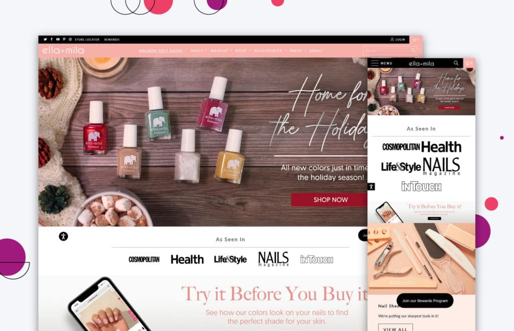
ella+mila’s cosmetic website is great for finding unique and high-quality vegan and plant-based cosmetics.
One thing that makes their site stand out is their use of product videos.
These videos give you a better idea of what the product looks like in action, which can be helpful for customers who are trying to decide whether or not to make a purchase.
In addition, the images on their product pages are well-done and provide a good sense of what the product looks like.
Another plus for ella+mila’s website is that they provide social proof for their products.
On each product page, you’ll see badges that show that the product is vegan or plant-based, as well as customer reviews and ratings.
This helps to build confidence in the potential customer and makes them more likely to purchase from ella+mila.
Finally, their best sellers are prominently displayed on the website, so users can easily find the products that other customers love.
Luseta Beauty
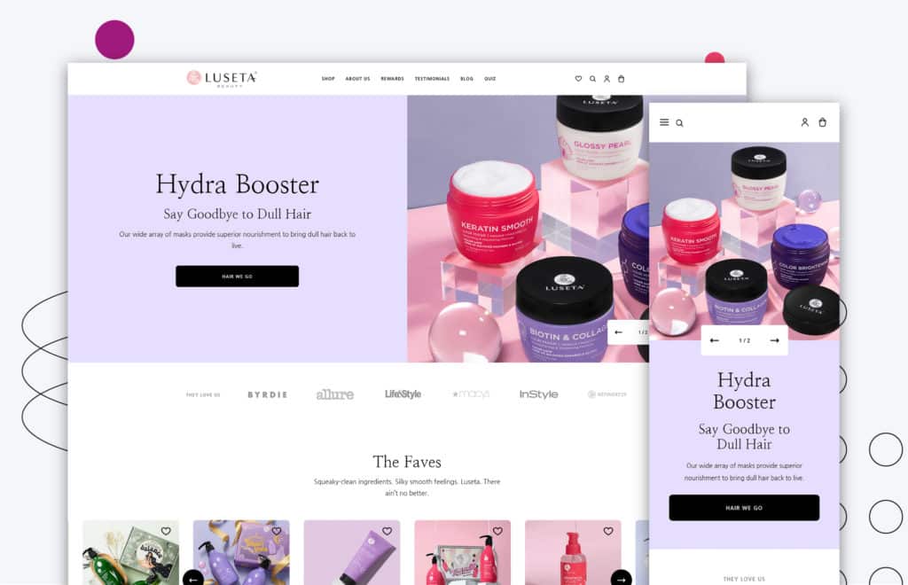
Luseta Beauty understood the assignment. They give their potential customers a reason to purchase from them immediately. Their hero header has copy and wording that stands out and grabs the website visitor’s attention.
Product imagery is also engaging and encourages potential customers to add something to their cart!
Their page points users toward the brand’s other social accounts so they can see what the company is up to.
In short, Luseta Beauty checks all the boxes when creating an excellent cosmetic website.
Lush
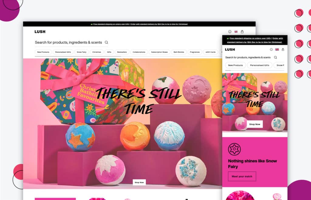
Lush’s cosmetic website immediately engages due to the bright colors used throughout the design. The navigation is also interesting and easy to use, with a slider allowing you to scan through their category page design quickly.
The products are staggered on each page, creating a more visually appealing design.
If you know what you’re looking for, there’s also a handy search bar.
But in addition to being visually appealing, the website is also full of excellent copy that makes it even more engaging.
Whether the user is looking for makeup, skincare, or hair care products, Lush’s website makes it easy to find what they’re looking for.
NYX
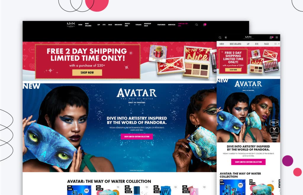
NYX’s cosmetic website does a great job of enticing potential customers and providing relevant and trending information.
When you enter the website, you’re given a percentage off your purchase — who doesn’t love a good deal?
The product images are also appealing and show off the bright colors of their products. In addition, they have themed products displayed on their homepage design, making their cosmetic line relevant to visitors.
Their website also offers trending gifts and recommends their top products, making it easier for visitors to choose what cosmetics to buy.
NYX has done a great job with its website, making navigating easy and enjoyable.
If you’re looking to create a website that will help drive customers to your cosmetic products, be sure to take inspiration from the websites we’ve highlighted in this article.
They all effectively use engaging visuals and well-written copy to convince potential customers to purchase.
If you’re looking to redesign your website but can’t do it in-house, that’s okay!
At Huemor, we specialize in helping businesses create beautiful, effective beauty websites.
We’ll work with you to understand your goals for the redesign, and then we’ll create a custom plan to make your vision a reality.
Plus, our team has experience with various platforms, so we can help you choose the right one for your needs.
If you’re considering a website redesign, don’t hesitate to contact us! We’re here to help you achieve your goals.
Get Memorable Insights.
Sign up to receive actionable web design advice directly in your inbox monthly.
Get Memorable Insights.
Sign up to receive actionable web design advice directly in your inbox monthly.
Author
Jeff Gapinski is the President of Huemor where he helps plan the long-term strategic growth of the agency. Jeff is passionate about UI/UX, demand generation, and digital strategy.
What Do You Think?
Have feedback? Maybe some questions? Whatever it is, we'd love to hear from you.



No comments found