Ecommerce
10 minute read
20 Expert Tips For Building The Perfect Product Page.
LAST UPDATED:
February 27, 2024


In the quest for ecommerce domination, it’s the details that make all the difference. Providing your customers with an excellent user experience is the key.
The easier it is to browse your site, research, and buy products on your platform, the more likely they are to become loyal to your brand. To that end, you could think of your product pages as the ultimate secret weapon. The more fine-tuned those pages are, the better they will perform – and that translates straight back to the bottom line.
Below are our top tips for building product pages that convert:
01 Be consistent
- The consistency of layout and design is something you should strive for throughout your website. Product pages are no exception.
- The user experience should be the same across every possible device and every product.
- Just because a product is less popular does not mean that the layout and content of the page should be lacking in any way.
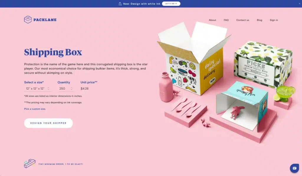
The inner product pages of Packlane all follow the same format in different styles. Above is the inner page for their shipping boxes.
02 Mobile optimization
- Beyond having a fully responsive site, product image galleries should be optimized for easy viewing and navigation on a mobile device. If they can’t get the information they need with a few taps they will be looking elsewhere before you know it.
- Product image sliders should be swipeable and zoomable so that users can see details.
- All product information that is included on the desktop site should also be included on the mobile site.
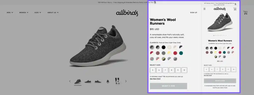
From desktop to mobile, Allbirds manages to keep its layout consistent. Above you can see a side-by-side comparison of the company’s wool runners on both desktop and mobile.
03 Include prominent CTAs
- Your “Add to Cart” CTA should be the most prominent visual on the page. Don’t make your customer go searching for it.
- You might also want to think about including a “Buy Now” button that allows them to bypass multiple levels of the purchase process, unless, of course, your average customer tends to purchase multiple products at a time, in which case a “Buy Now” button might reduce your order volume.
- Ensure there is a clear and obvious “Add to Cart” notice that appears as soon as a product is selected.
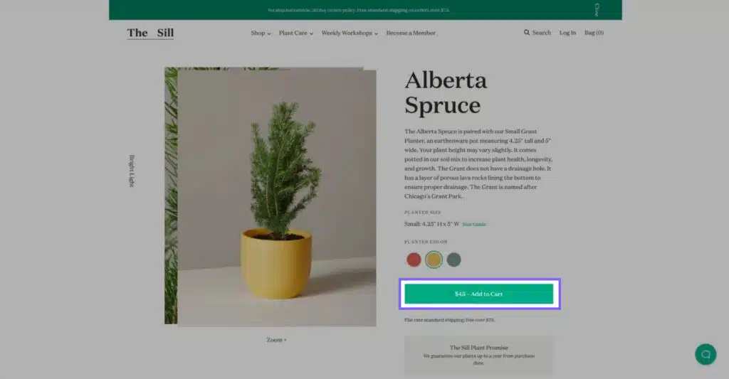
The Sill uses a green add-to-cart CTA on their product page to attract the user’s attention.
04 Break up your copy into easily digestible chunks of text
- All product copy should be clearly written in plain English.
- If there is a lot that needs to be said about the item, break up the content into several smaller chunks.
- A brief, branded message located high on the page, plus a more detailed writeup lower on the page is recommended.
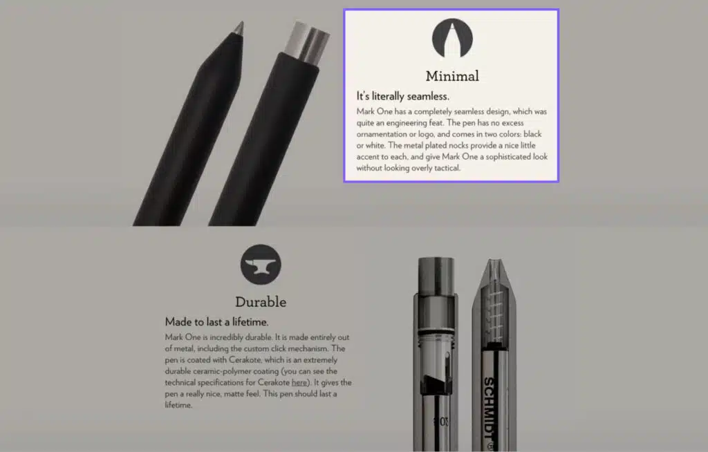
Studio Neat breaks up the features of their Mark One pens into digestible sections.
05 Provide as much relevant info as possible
- To help your customers make more educated decisions, product variants like color or size should be super-clear and labeled if needed.
- Reviews should never be hidden – people are going to find out what others think of your product somewhere, so you might as well lead the conversation.
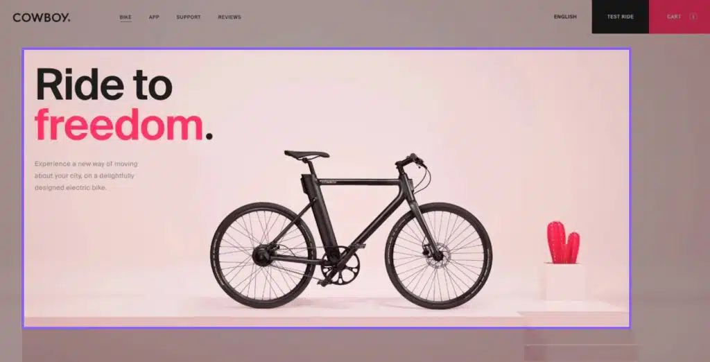
Cowboy uses short but alluring phrasing in their messaging to tell their brand story.
06 Tell your brand’s story
Tell and show your brand’s story in both subtle and more obvious ways:
- Subtle may include small details such as icons or your choice of words in product descriptions.
- Obvious brand messaging could include your photography style and the overall messaging/wording.
07 Shipping and returns
- Clearly highlight your shipping and returns policy and all relevant details that pertain to it.
- Most people these days expect free shipping but, depending on your product, they may not mind paying. This can be determined through user research to make sure your messaging is justifying the price point and shipping options as they pertain to the target audience.
- People want reassurance that if they are unhappy with their purchase they won’t be stuck with something they don’t like and no recourse to return or exchange.
08 Organize and prioritize content
- While you might absolutely love your products and want to talk about every little aspect, new users may not want to sift through a mountain of content.
- Find out what is special about your product and what your customers care about, and place these key points front and center.
- Put less important or more specific details (for instance, details that are not necessary to all users) elsewhere on the page or under a separate “more information” tab.
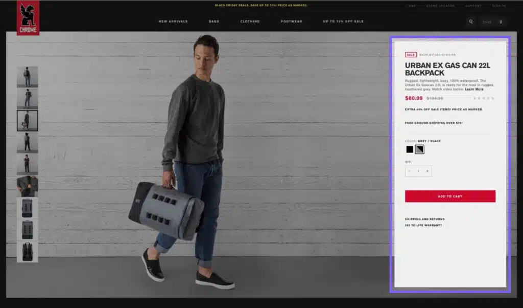
Chrome Industries breaks up their information so that the most important information appears at the top of the page. Anyone looking for more can simply scroll down for further details.
09 Use quality images
Always strive for a high-quality representation of your products – that applies to images as well as text and the general layout of the pages.
- Use clear, high-quality product images that can be enlarged and that highlight product details.
- Where appropriate, use lifestyle photographs that show the product in action (so to speak) and that represent the product and reflect the brand in the best possible light.
- Apply photographic principles that integrate into your website design. Some great examples of this include:
- SAXX
- Allbirds
- Chrome Industries
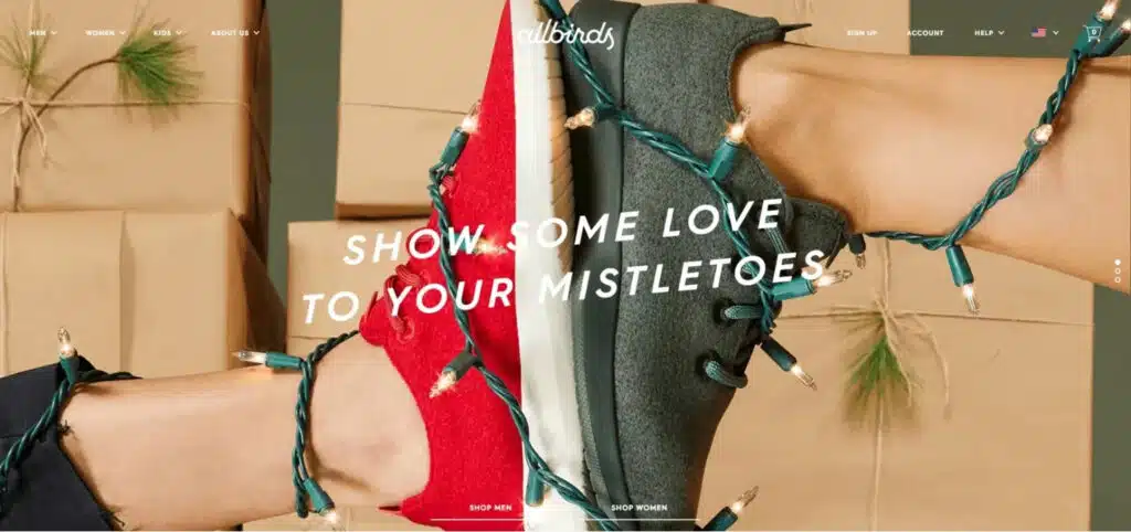
Allbirds uses quality images of both lifestyle and product shots throughout their website. Above is one of the photos featured on their homepage.
10 Important information should be easy to find
- Your customers should be able to immediately identify important information such as price, available colors, and other variants with a fast visual scan.
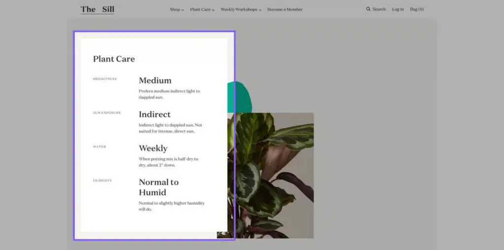
The Sill breaks out all of their information at the bottom of the product page including information about the product and the required care.
11 Don’t clutter the page
- “Deep” information, like product-specific care or shipping details, should be accessible without cluttering up the page. Examples of this:
- SAXX uses tabs at the bottom of the product description box to place deep info.
- Outdoor Voices leverages collapsible menus.
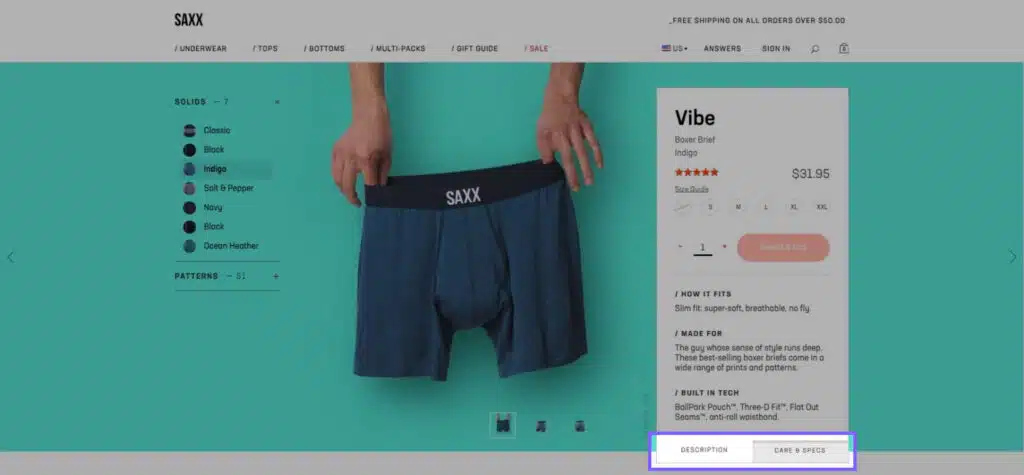
SAXX uses tabs at the bottom of the product description box to place deep info.
12 Take Advantage of FAQs
- Anticipate the kinds of pertinent information your customers will be looking for and present it in such a way that it is both easy to digest and complete.
- FAQ: anticipate what your users might want to know and answer their questions in a FAQ format.
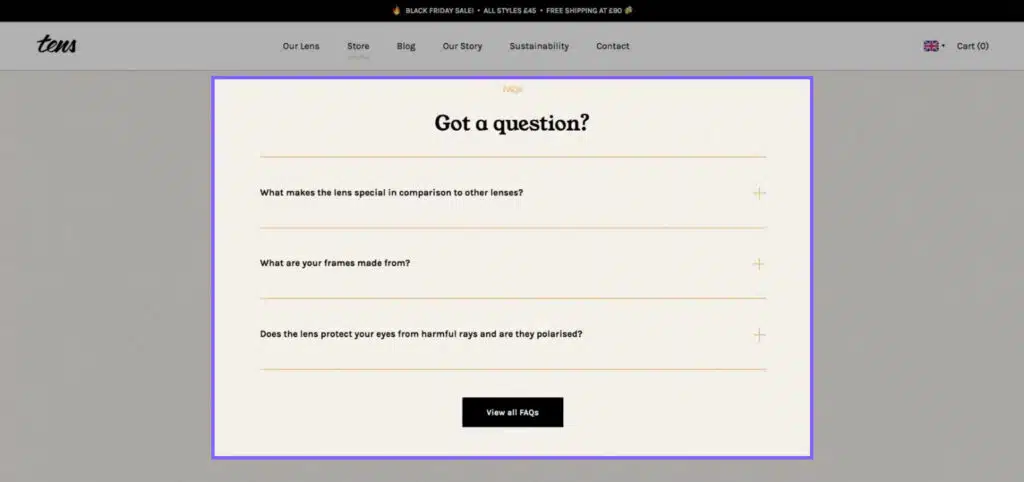
Tens places an FAQ section at the bottom of the product page that covers questions that potential buyers might be wondering.
13 Feature Detail Images
- Feature highlighted images that allow you to zoom into the tiniest detail. Allbirds, for example, includes a “learn more” hyperlink that anchors to some awesome “extra” details about the shoe. When you click on the link, the shoe itself breaks out to show its various parts (sole, insole, and upper part of the shoe) so you can really get a sense of how they’re made.
- You will also notice that under the shoe details, there are links to shop other areas of the site – “shop insoles” and “shop laces”.
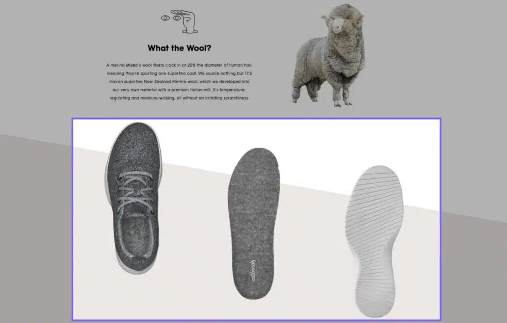
Allbirds separates the shoe to show customers what their products are made of.
14 Use Icons Effectively
- Use icons to represent the top features of your product. Allbirds is also a good example here; if you scroll to the bottom of the product page, you will see eight icons that denote features of the shoe that people will be most interested in.

Allbirds uses a consistent icon style throughout their website as part of their branding.
15 Your brand story can be told using lifestyle images and messaging
- Lifestyle photos stimulate an emotional response. Lifestyle images are all about telling the brand story. Your product images can (and should) have a lot of punch on their own, but product images against a white or solid background do not stir the kind of emotions that they do “in action”. Incorporating a background remover can seamlessly integrate your products into dynamic lifestyle settings, enhancing emotional appeal and resonating with your audience on a deeper level. Lifestyle photos tell potential buyers about the kinds of people who buy the product. They help potential buyers to make that connection and give meaning to their purchase.
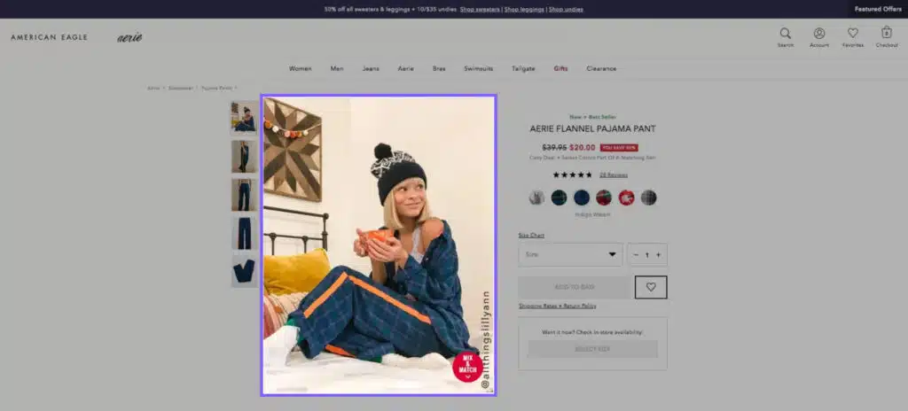
Aerie uses lifestyle photos on many of their products.
16 Your brand story can be told using lifestyle images and messaging
- Messaging – meaning how you tell the story of your brand – sets the foundation for all of your marketing efforts. It’s an essential tool that combines information with emotion in a way that sticks in people’s heads and motivates them to take action.
- Using color is another way to tell your brand story. Tens Sunglasses uses earth-tone colors combined with quirky images, videos, and icons to lend a sense of nostalgia. This design aesthetic is also reflected in their social feeds, maintaining consistency throughout.
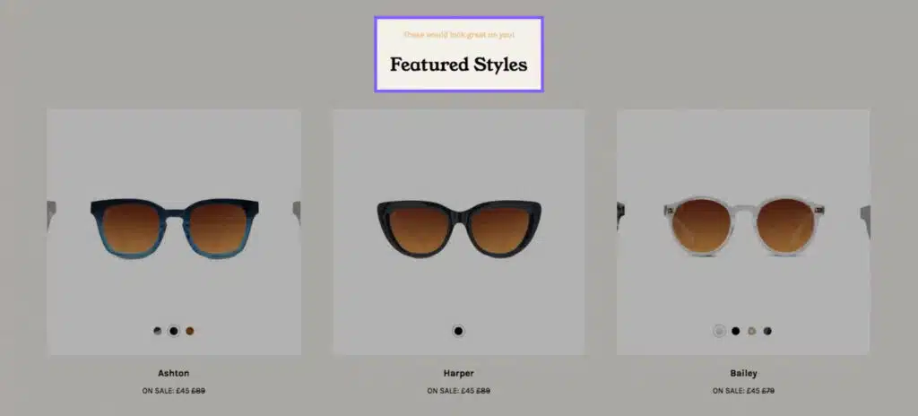
Tens messaging feels as though it’s speaking directly to you while browsing, offering a more personal online shopping experience.
Product and company reviews are a great way to gain some traction in the search engines, but it also provides your customers with the proof they need to inform their buying decision.
Here are a few reasons why you should encourage customer reviews and engage them on social media:
17 Customer comments are always valid
- Product descriptions and feature highlights can be limited. They usually talk about the product only from the brand’s perspective. Reviews, on the other hand, allow customers to read others’ experiences and glean information from them that they might not otherwise get.
- For instance, you might see comments like: “the shoe was stiff and took about a week to break in” or “the color was slightly darker than how it looked in the photo” or “the material is even softer than I expected” and so on.

Outdoor Voices displays their reviews at the bottom of the product page.
18 Social engagement builds trust and credibility
- Social media is amazing, both for customer service and for connecting directly to your audience. Depending on the platform (Facebook, Instagram, etc.), you have the ability to respond to any reviews that come in and to address questions and negative reviews in a timely manner. This shows other customers that you truly care and will work to resolve issues. It also helps to build trust and credibility over time, two things you simply cannot buy.

Allbirds uses a social Instagram feed on each product page so customers can see photos of other people wearing the shoes they’re looking at.
19 User-generated content builds authenticity
- User-generated content (UGC) – content that your customers (or influencers) post of themselves or others using your products – helps to build authenticity. It allows the brand to seem more accessible because it shows that there are real people using it.
- UGC is also a way for the brand to amass great content and imagery they might not otherwise have. Brands such as MVMT thrive off UGC on their Instagram and PDPs. It’s a mainstay of many luxury brands and a fun way to mobilize your audience.
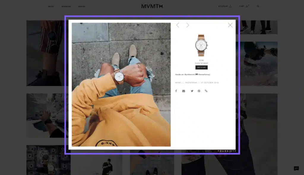
MVMT uses a shoppable Instagram gallery to inspire customers to buy certain products with lifestyle imagery posted by other buyers.
20 Cross-Sell and Upsell
Upselling is an easy way to introduce your customer to new products they may not have considered.
Once you have their attention, why not suggest products that would either complement their selection—like an accessory—or suggest similar products that would increase your AOV?
Some cross-sell and upsell ideas:
- Pair relevant products together.
- Suggest a better quality alternative, such as the same item in an upgraded material.
- Build out a complete package for the customer by showing them products they might not have otherwise seen.
By including a range of such products for your customers to browse, you are providing alternate paths for them to explore your site further and learn more about what other products you have to offer.
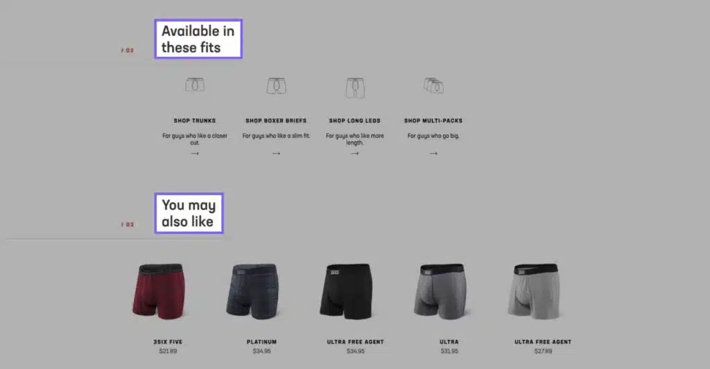
SAXX shows customers other fits and products that they may be interested in at the bottom of each product page.
21 Optimize Page Load Speeds
Nobody likes to wait for a slow website. It’s imperative that you do everything you can to optimize the speed of your ecommerce website.
- Compress and combine HTML, JavaScript, and CSS files.
- Reduce the use of individual images where possible.
- Compress your images using an image compression tool, such as TinyImage.
- Use Google Tag Manager to serve your scripts.
- Use third-party video hosting to serve videos.
GET THE GOODS
Download Your Ultimate Website Optimization Checklist
Wrapping Up
In conclusion, building the perfect product page isn’t something that’s going to cost you a lot of money – but it can make you a lot of money if you do it right. It’s all in the details. Try to see your brand through your audience’s eyes and craft your product pages like micro-sites in and of themselves. Keep it simple, give them quality, and have fun with it.
If you’re looking for more information on how to build a project page, check out our guide on product page design.
Get Memorable Insights.
Sign up to receive actionable web design advice directly in your inbox monthly.
Get Memorable Insights.
Sign up to receive actionable web design advice directly in your inbox monthly.
Author
Jeff Gapinski is the President of Huemor where he helps plan the long-term strategic growth of the agency. Jeff is passionate about UI/UX, demand generation, and digital strategy.
What Do You Think?
Have feedback? Maybe some questions? Whatever it is, we'd love to hear from you.


No comments found